Intro to Graphix
Graphix is a programming language using the dataflow paradigm. It is particularly well suited to building user interfaces, and interacting with resources in netidx. Dataflow languages like Graphix are “reactive”, like React or Vue, except at the language level instead of just as a library. A Graphix program is compiled to a directed graph, operations (such as +) are graph nodes, edges represent paths data can take through the program. A simple expression like,
2 + 2
will compile to a graph like
const(2) ──> + <── const(2)
The semantics of simple examples like this aren’t noticibly different from a normal programming language. However a more complex example such as,
let x: i64 = sys::net::subscribe("/foo")?;
print(x * 10)
compiles to a graph like
                                  const(10)
                                      │
                                      │
                                      ▼

const("/foo") ──> sys::net::subscribe ──> * ──> print
Unlike the first example, the value of sys::net::subscribe isn’t a
constant, it can change if the value published in netidx changes. If
that happens the new value will flow through the graph and will be
printed again. If the published value of “/foo” is initially 10, and
then the value of “/foo” changes to 5 then the program will print.
100
50
It will keep running forever, if “/foo” changes again, it will print more output. This is a powerful way to think about programming, and it’s especially well suited to building user interfaces and transforming data streams.
Dataflow but Otherwise Normal
Besides being a dataflow language Graphix tries hard to be a normal functional language that would feel familiar to anyone who knows Haskell, OCaml, F# or a similar ML derived language. Some of it’s features are,
- lexically scoped
- expression oriented
- strongly statically typed
- type inference
- structural type discipline with nominal abstract types
- parametric polymorphism
- algebraic data types
- pattern matching
- first class functions, and closures
- late binding
Installing Graphix
To install the Graphix shell from source you need to install a rust build environment. See here for instructions on how to do that for your platform. Once you have that set up, you can just run
cargo install graphix-shell
That should build the graphix command and install it in your
~/.cargo/bin directory. Windows and Mac OS should work out of the box
as long as you have the prerequisites for rust installed.
Linux Prerequisites
Debian/Ubuntu
You need to install
- clang
- libkrb5-dev
On Fedora
You need to install
- clang-devel
- krb5-devel
Netidx
Graphix uses netidx to import and export data streams. Netidx works with zero configuration for local use on a single machine - separate Graphix processes can communicate with each other out of the box.
For more advanced setups involving multiple machines, authentication, or custom resolver configurations, see the netidx book for details on setting up a netidx environment.
Editor Setup
Graphix ships with a Language Server Protocol (LSP) implementation and
tree-sitter grammar, so any editor with LSP support can give you
diagnostics, completion, hover, and go-to-definition for .gx and .gxi
files.
The LSP server is built into the graphix binary itself — there is no
separate graphix-lsp executable to install. Editors launch it by
running:
graphix lsp
It speaks LSP over stdin/stdout, so make sure graphix is on the PATH
that your editor sees.
Editor-specific configurations live in
ide/editors/
in the source tree. The sections below summarize how to install each
one. None of them are published to upstream package registries yet —
the modes for Emacs, Helix, and Zed are intended for upstream submission
in a future release, but until then they install from the repo.
Prerequisites
Make sure the graphix binary is on your PATH:
cargo install graphix-shell
# or, from a checkout:
cargo install --path graphix-shell
Then verify:
graphix lsp --help
If your editor cannot find graphix, point its config at the absolute
path of the binary (~/.cargo/bin/graphix on a typical Cargo install).
VS Code
The extension lives in ide/editors/vscode/. It bundles a TextMate
grammar for syntax highlighting and a thin client that launches
graphix lsp.
cd ide/editors/vscode
npm install
npm run compile
Then either symlink the directory into ~/.vscode/extensions/graphix
or open it in VS Code and press F5 to launch a development
host.
The extension exposes a single setting, graphix.server.path, which
defaults to graphix. Override it if the binary is not on your
editor’s PATH.
Neovim
The Neovim plugin in ide/editors/nvim/ registers the filetype, wires
up the LSP via nvim-lspconfig (with a fallback to the built-in
vim.lsp.start when lspconfig is missing), and registers the
tree-sitter grammar.
Drop the nvim/ directory into your config or your plugin manager,
then call:
require('graphix').setup()
To install the tree-sitter grammar, run :TSInstall graphix after
nvim-treesitter has picked up the registered parser config.
You can disable either piece independently:
require('graphix').setup({ lsp = true, treesitter = false })
Vim
For traditional Vim (8+), ide/editors/vim/ provides regex-based
syntax highlighting and filetype detection. Tree-sitter is Neovim-only,
so this is the right config for plain Vim.
mkdir -p ~/.vim/pack/graphix/start
ln -s "$PWD/ide/editors/vim" ~/.vim/pack/graphix/start/graphix
LSP setup depends on your client. With vim-lsp:
if executable('graphix')
  au User lsp_setup call lsp#register_server(#{
    \ name: 'graphix',
    \ cmd: ['graphix', 'lsp'],
    \ allowlist: ['graphix'],
    \ })
endif
With coc.nvim, add to
coc-settings.json:
{
  "languageserver": {
    "graphix": {
      "command": "graphix",
      "args": ["lsp"],
      "filetypes": ["graphix"]
    }
  }
}
Emacs
ide/editors/emacs/graphix-mode.el provides two modes:
graphix-mode— regex-based fallback for Emacs < 29 or when the tree-sitter grammar is not installed.graphix-ts-mode— tree-sitter mode for Emacs 29+. Selected automatically when the grammar is available.
Drop the file on your load-path and require it:
(require 'graphix-mode)

;; Eglot (built-in, Emacs 29+):
(add-to-list 'eglot-server-programs
             '(graphix-mode . ("graphix" "lsp")))
(add-hook 'graphix-mode-hook #'eglot-ensure)
(add-hook 'graphix-ts-mode-hook #'eglot-ensure)
To install the tree-sitter grammar:
M-x graphix-ts-mode-install-grammar
This compiles the grammar from the GitHub repo via
treesit-install-language-grammar. Once it succeeds, opening a .gx
file will route to graphix-ts-mode automatically.
lsp-mode users can replace the eglot-* lines with the equivalent
lsp-mode registration; the LSP command is the same.
Helix
Helix has no plugin system, so language support has to be added by
copying queries into your runtime path and appending blocks to
languages.toml. The repo ships a script that does both:
cd ide/editors/helix
./install.sh
The script:
- Copies tree-sitter queries to
~/.config/helix/runtime/queries/graphix/. - Appends
[[language]],[language-server.graphix-lsp], and[[grammar]]blocks to~/.config/helix/languages.toml(idempotent — it skips if a graphix entry already exists). - Runs
helix --grammar fetch && helix --grammar buildto compile the parser.
Re-running the script is safe; it overwrites the queries (so updates
land) but leaves your languages.toml alone after the first install.
To verify, open a .gx file and run :tree-sitter-scopes,
:lsp-restart, or helix --health graphix.
If you’re hacking on the grammar locally, edit the [[grammar]] block
in your languages.toml to point at your checkout instead of the git
URL. See ide/editors/helix/README.md for the exact form.
Zed
The Zed extension lives in ide/editors/zed/. For development:
ln -s "$PWD/ide/editors/zed" ~/.config/zed/extensions/installed/graphix
Restart Zed. The extension auto-detects .gx and .gxi files,
launches graphix lsp, and ships its own copy of the tree-sitter
queries.
The query files under languages/graphix/ are duplicates of the
canonical ones in ide/tree-sitter-graphix/queries/ because Zed
packages each extension as a self-contained directory. If you change
the upstream queries, copy them across:
cp ide/tree-sitter-graphix/queries/{highlights,indents,locals}.scm \
   ide/editors/zed/languages/graphix/
What the LSP currently supports
| Feature | Status |
|---|---|
| Diagnostics (parse + type errors) | ✓ |
| Completions from the active environment | ✓ |
| Hover with type and doc information | ✓ |
| Go-to-definition | ✓ |
Find references, rename, code actions, and formatting are not yet implemented. File issues at graphix-lang/graphix if something specific would unblock you.
Reporting editor issues
Editor configs live in the same repo as the compiler, so bugs in
syntax highlighting, indentation, or LSP behavior all belong in the
same issue tracker. When filing one, mention which editor and which
mode (graphix-mode vs graphix-ts-mode, vim vs nvim, etc.) you’re
using, plus a minimal .gx snippet that triggers the problem.
Getting Started
Welcome to Graphix! This tutorial will get you up and running in about 10-15 minutes. You’ll learn how to use the interactive REPL, write your first expressions, and create a simple reactive program.
By the end of this guide, you’ll understand the basics of Graphix’s reactive dataflow model and be ready to explore the language in depth.
Prerequisites
Make sure you’ve already installed Graphix. You can verify your installation by running:
graphix --version
Starting the REPL
The Graphix shell provides an interactive Read-Eval-Print Loop (REPL) where you can experiment with the language. Start it by running graphix with no arguments:
graphix
You’ll see a prompt that looks like this:
Welcome to the graphix shell
Press ctrl-c to cancel, ctrl-d to exit, and tab for help
〉
The REPL evaluates expressions and shows you both the type and the value. The output format is:
-: Type
value
Let’s try it!
Your First Expressions
Arithmetic
Type some simple arithmetic at the prompt:
〉2 + 2
-: i64
4
The -: i64 line tells you the result is a 64-bit integer, and 4 is
the value. You may be wondering why you don’t get the 〉 prompt after
running this expression. This is because, being a dataflow language,
expressions are pipelines that can output more than one value, they
will run until you stop them by hitting ctrl-c. Do this now to get the
prompt back.
Since ctrl-c is used to stop the currently running pipeline, if you want to exit the REPL press ctrl-d.
Try a more complex expression:
〉10 * 5 + 3
-: i64
53
〉2.5 * 4.0
-: f64
10.0
Notice that integer arithmetic produces i64 (integer) results, while floating-point arithmetic produces f64 (float) results.
Strings
Strings are written in double quotes:
〉"Hello, Graphix!"
-: string
"Hello, Graphix!"
String Interpolation
Graphix supports string interpolation using square brackets. Any expression inside [...] in a string will be evaluated and inserted:
〉"The answer is [2 + 2]"
-: string
"The answer is 4"
〉"2 + 2 = [2 + 2], and 10 * 5 = [10 * 5]"
-: string
"2 + 2 = 4, and 10 * 5 = 50"
This is incredibly useful for building dynamic strings!
Variables with Let Binds
Use let to create named bindings:
〉let x = 42
〉x
-: i64
42
〉let name = "World"
〉"Hello, [name]!"
-: string
"Hello, World!"
You can reuse the same name to create a new binding (this is called shadowing):
〉let x = 10
〉let x = x + 5
〉x
-: i64
15
The second let x creates a new binding that references the previous value of x.
Functions
Functions in Graphix are first-class values. Create them with the lambda syntax |args| body:
〉let double = |x| x * 2
〉double(21)
-: i64
42
You can add type annotations if you want to be explicit:
〉let add = |x: i64, y: i64| x + y
〉add(10, 32)
-: i64
42
Functions can capture variables from their surrounding scope:
〉let multiplier = 3
〉let times_three = |x| x * multiplier
〉times_three(14)
-: i64
42
Creating Your First File
Now let’s write a real Graphix program! Create a file called hello.gx with this content:
use tui;
use tui::text;

let counter = count(sys::time::timer(duration:1.s, true));

text(&"Count: [counter]")
This program demonstrates Graphix’s reactive nature:
sys::time::timer(duration:1.s, true)produces an event every secondcountfrom the core library tallies the events into a reactive integercounterupdates whenever the timer fires, so the text widget rerenders- The last expression creates a text widget displaying the count
Running Your File
Run your program with:
graphix hello.gx
You’ll see a terminal UI that displays the count increasing every second! The screen updates automatically because Graphix tracks dependencies and propagates changes through the dataflow graph.
To stop the program, press Ctrl+C.
A Simpler Example
If you want to see the reactive behavior without the TUI, try this simpler version (counter.gx):
let counter = count(sys::time::timer(duration:1.s, true));
"Count: [counter]"
Run it with graphix counter.gx and you’ll see the count printed to the console every second.
Understanding the Output
In Graphix programs:
- The last value is what determines what the shell displays
- If it’s a
Tuitype (like our text example), then it is rendered as a TUI - Otherwise, the value is printed to the console every time it updates
- If it’s a
- Use
printorprintlnfor explicit output during execution - Programs run forever unless they explicitly exit - they’re reactive graphs that respond to events
The Dataflow Model
The key insight: when the timer fires, count produces a new tally, which propagates to counter, which the text widget depends on, so the widget re-renders. The entire chain reacts automatically. You describe what should happen, not when or how to update things.
This is very different from traditional imperative programming where you’d need loops and manual state management. In Graphix, you build a graph of dependencies and the runtime handles updates for you.
Try It Yourself
Experiment with these ideas:
- Modify the counter to count down instead of up
- Make it count by 2s or 10s instead of 1s
- Change the timer interval to 0.5 seconds
- Display multiple values that update independently
- Try arithmetic on the count (show doubled value, squared value, etc.)
Next Steps
Now that you’ve experienced Graphix’s reactive nature, you’re ready to dive deeper:
- Core Language - Learn the fundamental language constructs
- Functions - Master functions, closures, and higher-order programming
- Building UIs - Create rich terminal user interfaces
- Standard Library - Explore built-in functions and modules
The best way to learn Graphix is to experiment! Keep the REPL open as you read through the documentation and try out the examples. Every code snippet in this book is designed to be runnable.
Core Language
This chapter introduces the core constructs that make Graphix work. If you’re coming from imperative languages like Python, Java, or C, some of these concepts will feel familiar—but the reactive twist makes them work differently than you might expect.
Types: Strong but Flexible
Graphix has a powerful static type system, but you’ll rarely write type annotations. The compiler infers types for you using structural typing—types are compared by their shape, not their name. A struct {x: i64, y: i64} is the same type whether you call it Point or Vector or don’t name it at all.
The Fundamental Types section covers the built-in numeric types (i64, f64, u32, etc.), booleans, strings, durations, and more. You’ll learn how arithmetic works across different numeric types, how string interpolation works with [...] brackets, and why division by zero doesn’t crash your program.
Reading Type Signatures teaches you how to read the type annotations you’ll see throughout the documentation. Function types like fn(a: Array<'a>, f: fn(x: 'a) -> 'b) -> Array<'b> tell you exactly what a function expects and returns, including what errors it might throw.
Binding Values and Building Blocks
In Graphix, you create bindings with let. Unlike variables in other languages, these bindings can update over time—they’re more like pipes that different values flow through.
Let Binds explains how to create bindings, how shadowing works, and why every binding in Graphix is potentially reactive. When you write let x = 42, you’re not just storing a value—you’re creating a node in the dataflow graph.
Blocks shows how to group expressions with {...} to create scopes, hide intermediate bindings, and build up complex expressions. Blocks are expressions too—they evaluate to their last value.
Use lets you bring module names into scope so you can write map(arr, f) instead of array::map(arr, f). Simple, but essential as your programs grow.
Connect: The Heart of Reactivity
This is where Graphix becomes special. The <- operator (connect) is the only way to create cycles in your dataflow graph, and it’s the key to writing reactive programs and loops.
Connect is the most important section in this chapter. When you write:
let count = 0;
count <- timer ~ (count + 1)
You’re telling Graphix: “When timer updates, increment count for the next cycle.” Connect schedules updates for the future, which is how you build everything from simple counters to complex state machines. It’s also the only looping construct in Graphix—there’s no for or while, just connect and select working together.
Select: Powerful Pattern Matching
The select expression is Graphix’s answer to switch, match, and if/else. It lets you match on types, destructure complex data, and ensure at compile time that you’ve handled every case.
Select shows you how to:
- Match on union types and ensure you handle all variants
- Destructure arrays with slice patterns like
[head, tail..] - Match structs with patterns like
{x, y} - Guard patterns with conditions like
n if n > 10 - Build loops by combining select with connect
The compiler checks your select expressions exhaustively—if you forget a case, it won’t compile. If you match a case that can never happen, it won’t compile. This eliminates entire classes of bugs.
Error Handling: Exceptions, Done Right
Graphix has first-class error handling with try/catch and the ? operator. Errors are just values with the special Error<'a> type, and they’re tracked through the type system.
Error Handling explains:
- How
?throws errors to the nearest try/catch in dynamic scope - How error types are checked at compile time—you can’t forget to handle an error type
- How the
$operator silently swallows errors (use with caution!) - How error chains track the full context of where errors originated
Every error that gets raised with ? is wrapped in an ErrChain that captures the file, line, column, and full stack of previous errors. No more mystery exceptions.
How It All Fits Together
These constructs combine to create the Graphix programming model:
- You create bindings that hold values
- You build expressions that compute new values from old ones
- You use select to handle different cases and make decisions
- You use connect to update bindings when events occur
- The type system ensures everything is safe and correct
- Errors propagate cleanly through try/catch
The result is a language where you describe relationships between values, and the runtime automatically maintains those relationships as things change. A temperature value updates, and the Fahrenheit conversion updates automatically. A timer fires, and your counter increments. A network subscription delivers new data, and your UI reflects it instantly.
Fundamental Types
Graphix has a few fundamental data types, the Graphix shell is a good way to
explore them by trying out small Graphix expressions. You can run the Graphix
shell by invoking graphix with no arguments.
Numbers
i32, u32, i64, u64, f32, f64, and decimal are the fundamental
numeric types in Graphix. Literals are written with their type prefixed, except
for i64 and f64 which are written bare. for example, u32:3 is a u32
literal value.
decimal is an exact decimal representation for performing financial
calculations without rounding or floating point approximation errors.
The basic arithmetic operations are implemented on all the number types with all the other number types.
| Operation | Unchecked | Checked |
|---|---|---|
| Add | + | +? |
| Subtract | - | -? |
| Multiply | * | *? |
| Divide | / | /? |
| Mod | % | %? |
Unchecked operators log an error and return bottom (no value) on overflow, underflow, or division by zero. The expression simply stops updating until the inputs change to values that produce a valid result.
Checked operators return a union type [T, Error<ArithError(string)>], allowing you to handle arithmetic errors explicitly using ?, $, or select`.
The compiler will let you do arithmetic on different types of numbers directly without casting, however the return type of the operation will be the set of all the types in the operation, representing that either type could be returned. If you try to pass this result to a function that wants a specific numeric type, it will fail at compile time.
〉1. + 1
-: [i64, f64]
2
〉let f = |x: i64| x * 10
〉f(1. + 1)
error: in expr

Caused by:
    0: at: line: 1, column: 3, in: (f64:1. + i64:1)
    1: at: line: 1, column: 3, in: (f64:1. + i64:1)
    2: type mismatch '_1046: i64 does not contain [i64, f64]
With unchecked operators, division by zero and overflow log an error and return bottom – the expression produces no value until the inputs change. This means downstream expressions simply stop updating until the arithmetic becomes valid again.
〉0 / 0
-: i64
No value is printed because the division by zero produces bottom. If the divisor later changes to a non-zero value, the expression will resume producing values.
With checked operators, you get an explicit error value you can handle:
〉0 /? 0
-: [i64, Error<`ArithError(string)>]
error:["ArithError", "attempt to divide by zero"]
You can use ? to propagate, $ to swallow, or select to match on the result:
〉(0 /? 0)?
-: i64
// throws ArithError to nearest try/catch

〉(0 /? 0)$
-: i64
// logs warning, returns bottom

〉u32:0 -? u32:1
-: [u32, Error<`ArithError(string)>]
error:["ArithError", "attempt to subtract with overflow"]
v32, z32, v64, z64
These number types are the same as the normal types except when they are sent over the wire via netidx (or written to a file) they use variable width encoding instead of normal encoding. The number of bytes used varies for 64 bit numbers to between 1 and 10. Small numbers (below 127) are encoded in 1 byte, larger number use more bytes. The type correspondence is,
| Compact | Normal |
|---|---|
| v32 | u32 |
| z32 | i32 |
| v64 | u64 |
| z64 | i64 |
Number Sets
There are a few sets of number types that classify numbers into various kinds.
Number being the most broad, it contains all the number types. Int contains
only integers, Real contains only reals (decimal plus the two float types),
SInt contains signed integers, UInt contains unsigned integers.
Bool
Boolean literals are written as true and false, and the name of the boolean
type is bool.
Boolean expressions using &&, ||, and ! are supported. These operators
only operate on bool. They can be grouped with parenthesis. For example,
〉true && false
-: bool
false
〉true || false
-: bool
true
〉!true
-: bool
false
〉!1
error: in expr

Caused by:
    0: at: line: 1, column: 2, in: i64:1
    1: type mismatch bool does not contain i64
Duration
A time duration. The type name is duration, and the literals are written as,
duration:1.0s, duration:1.0ms, duration:1.0us, duration:1.0ns. Durations
can be added, and can be multiplied and divided by scalars.
〉duration:1.0s + duration:1.0s
-: duration
2.s
〉duration:1.0s * 50
-: duration
50.s
〉duration:1.0s / 50
-: duration
0.02s
DateTime
A date and time in the UTC time zone. The type name is datetime and literals
are written in RFC3339 format inside quotes. For example,
datetime:"2020-01-01T00:00:00Z". You can add and subtract duration from
datetime.
〉datetime:"2020-01-01T00:00:00Z" + duration:30.s
-: datetime
2020-01-01 00:00:30 UTC
You can enter datetime literals in local time and they will be converted to UTC. For example,
〉datetime:"2020-01-01T00:00:00-04:00"
-: datetime
2020-01-01 04:00:00 UTC
String
Strings in Graphix are UTF8 encoded text. The type name is string and the
literal is written in quotes "this is a string". C style escape sequences are
supported, "this is \" a string with a quote and a \n". Non printable
characters such as newline will be escaped by default when strings are printed
to the console, you can use print to print the raw string including control
characters.
String Interpolation
String literals can contain expressions that will be evaluated and joined to the string,
such expressions are surrounded by unescaped [] in the string. For example,
〉let row = 1
〉let column = 999
〉"/foo/bar/[row]/[column]"
-: string
"/foo/bar/1/999"
Values in an interpolation need not be strings, they will be cast to a string
when they are used. You can write a literal [ or ] in a string by escaping
it.
〉"this is a string with a \[ and a \] but it isn't an interpolation"
-: string
"this is a string with a [ and a ] but it isn't an interpolation"
Any
The Any type is a type that unifies with any other type, it corresponds to the
underlying variant type that represents all values in Graphix (and netidx). It
is not used very often, as it provides very few guarantees, however it has it’s
place. For example, Any is the type returned by sys::net::subscribe, indicating
that any valid netidx value can come from the network. Usually the first thing
you do with an Any type is call cast to turn it into the type you expect (or
an error), or use a select expression to match it’s type (more on select later).
Null
Null is nothing, just like in many other languages. Unlike most other languages
null is a type not a catch all. If the type of a value does not include null
then it can’t be null. The set ['a, null] (alias Option<'a>) is commonly
used to represent things that will sometimes return null.
Array
Arrays are immutable, contiguous, and homogeneous. They are
parameterized, Array<string> indicates an array of strings. Arrays
are zero indexed a[0] is the first element. Array elements can be
any type, including other arrays at arbitrary levels of nesting. There
is a special array type that acts like Array<Any>, that represents
the fundamental array type in the underlying value representation.
Array literals are written like [x, y, z]. There are many functions
in the array module of the standard library for working with arrays.
Array Slicing and Indexing
Graphix supports array subslicing, the syntax will be familiar to Rust programmers.
a[2..]a slice from index 2 to the end of the arraya[..4]a slice from the beginning of the array to index 3a[1..3]a slice from index 1 to index 2a[-1]the last element in the arraya[-2]the second to last element in the array
..= is not supported however, the second part of the slice will always be the
exclusive bound. Literal numbers can always be replaced with a Graphix
expression, e.g. a[i..j] is perfectly valid.
Mutability and Implementation
Arrays are not mutable, like all other Graphix values. All operations that “change” an array, actually create a new array leaving the old one unchanged. This is even true of the connect operator, which we will talk more about later.
There are a couple of important notes to understand about the implementation of Arrays.
-
Arrays are memory pooled, in almost all cases (besides really huge arrays) creating an array does not actually allocate any memory, it just reuses a previously used array that has since become unused. This makes using arrays a lot more efficient than you might expect.
-
Arrays are contiguous in memory. This means they are generally very memory efficient, each element is 2 machine words, and O(1) to access. However there are a few cases where this causes a problem, such as building up an array by appending one element at a time. This is sadly an O(n^2) operation on arrays. You may wish to use another data structure, such as a map (which would be O(n log(n)) if you need to build a large data structure this way.
-
Array slices are zero copy, and also pooled. They simply create a light weight view into the array. This means algorithms that progressively deconstruct an array by slicing are O(N) not O(N^2) and the constants are very fast.
Tuples
Tuples are written (x, y), they can be of arbitrary length, and each element
may have a different type. Tuples may be indexed using numeric field indexes.
Consider
let x = (1, 2, 3, 4);
x.0
Will print 1.
Map
Maps in Graphix are key-value data structures with O(log(N)) lookup, insert, and
remove operations. Maps are parameterized by their key and value type, for
example Map<string, i64> indicates a map with string keys and integer values.
There are many functions for working with maps in the map standard library
module
Map Literals
Maps can be constructed using the {key => value} syntax:
〉{"a" => 1, "b" => 2, "c" => 3}
-: Map<'_1893: string, '_1895: i64>
{"a" => 1, "b" => 2, "c" => 3}
Keys and values can be any Graphix type, for example here is a map where the key
is a Map<string, i64>.
{{"foo" => 42} => "foo", {"bar" => 42} => "bar"}
-: Map<'_1919: Map<'_1915: string, '_1917: i64>, '_1921: string>
{{"bar" => 42} => "bar", {"foo" => 42} => "foo"}
Map Indexing
Maps can be indexed using the map{key} syntax to retrieve values:
〉let m = {"a" => 1, "b" => 2, "c" => 3}
〉m{"b"}
-: ['_1907: i64, Error<`MapKeyError(string)>]
2
If a key is not present in the map, indexing returns a MapKeyError:
〉m{"missing"}
-: ['_1907: i64, Error<`MapKeyError(string)>]
error:["MapKeyError", "map key \"missing\" not found"]
Mutability and Implementation
Like all Graphix values, maps are immutable. All operations that “change” a map actually create a new map, leaving the original unchanged. Maps are memory pooled and very efficient - creating new maps typically reuses existing memory rather than allocating new memory.
Maps maintain their key-value pairs in a balanced tree structure, ensuring O(log(N)) performance for all operations regardless of map size.
Error
Error is the built in error type. It carries a type parameter indicating the
type of error, for example Error<MapKeyError(string)>is an error that carries a ``MapKeyError `` variant. You can access the inner error value
using e.0 e.g.,
〉let e = error(`MapKeyError("no such key"))
〉e.0
-: `MapKeyError(string)
`MapKeyError("no such key")
More information about dealing with errors is available in the section on error handling.
Reading Type Signatures
Throughout this book and in the standard library documentation, you’ll encounter function type signatures. This guide will help you understand what they mean. Don’t try to memorize everything here - just use this as a reference when you encounter unfamiliar notation.
Basic Function Signatures
The simplest function signature looks like this:
val double: fn(x: i64) -> i64
This breaks down into:
fn(...)- this is a functionx: i64- takes one parameter namedxof type i64 (64-bit integer)-> i64- returns a value of type i64
Every positional parameter in a function type carries a name as well as a type. The name is documentation for the reader and is what your editor shows in hover and completion popups; it does not change the call (you still pass arguments positionally, in order).
Another example:
val concat: fn(a: string, b: string) -> string
Takes two strings, returns a string.
Type Parameters (Generics)
Type parameters (like generics in other languages) are written with a single quote followed by an identifier: 'a, 'b, 'e, etc.
Simple Type Parameters
val identity: fn(x: 'a) -> 'a
This means: “takes a value of any type 'a and returns a value of the same type 'a”. The identity function could work with integers, strings, or any other type.
val first: fn(a: Array<'a>) -> 'a
This means: “takes an array of any type 'a and returns a single element of type 'a”. If you pass an Array<string>, you get back a string. If you pass an Array<i64>, you get back an i64.
Multiple Type Parameters
val map: fn(a: Array<'a>, f: fn(x: 'a) -> 'b) -> Array<'b>
This function takes:
- An array of type
'a - A function that transforms
'ainto'b - Returns an array of type
'b
The types 'a and 'b can be the same or different.
Optional Labeled Arguments
Arguments prefixed with ?# are optional and labeled:
val text: fn(?#style: Style, content: string) -> Widget
This function can be called in two ways:
text("Hello")                           // style uses default value
text(#style: my_style, "Hello")        // style is specified
Order Flexibility
Labeled arguments can be provided in any order, but must come before positional arguments:
val widget: fn(?#width: i64, ?#height: i64, content: string) -> Widget

// All of these are valid:
widget("text")
widget(#width: 100, "text")
widget(#height: 50, #width: 100, "text")
widget(#height: 50, "text")
Required Labeled Arguments
Arguments with # but no ? are required but labeled:
val input_handler: fn(
    #handle: fn(e: Event) -> Response,
    w: &Widget
) -> Widget
You must provide #handle, but it doesn’t have to be in the first position. However, it must come before the unlabeled &Widget argument:
input_handler(#handle: my_handler, &my_widget)
Variadic Arguments
The @args notation means a function accepts any number of arguments:
val sum: fn(@args: i64) -> i64
You can call this with any number of integers:
sum(1, 2, 3)
sum(1, 2, 3, 4, 5, 6, 7, 8, 9, 10)
Variadic with Required Arguments
Sometimes a function requires at least one argument:
val max: fn(first: 'a, @args: 'a) -> 'a
The first 'a is required, then any number of additional arguments of the same type.
Reference Types
An ampersand & before a type means “reference to” rather than the value itself:
val text: fn(content: &string) -> Widget
This takes a reference to a string, not the string value directly. References are important for:
- Efficiency - avoid copying large data structures
- Reactivity - updating a referenced value triggers updates without rebuilding entire structures
Create a reference with & and dereference (get the value) with *:
let s = "Hello";
let r = &s;      // r is a reference to s
let v = *r;      // v is the value "Hello"
In function signatures, &T in a parameter position means the function expects a reference. In widget examples, you’ll often see:
block(#title: &line("My Title"), &my_widget)
The &line(...) creates a reference to the line, and &my_widget is a reference to the widget.
For a deeper dive, see References.
Error Types (throws)
When a function can throw errors, the signature includes throws:
val divide: fn(a: i64, b: i64) -> i64 throws `DivideByZero
This function returns i64 if successful, but might throw a DivideByZero error.
Multiple Error Types
A function can throw multiple error types:
val parse_and_divide: fn(num: string, denom: string) -> i64 throws [`ParseError, `DivideByZero]
Generic Error Types
Often error types are parameterized:
val filter: fn(v: 'a, f: fn(x: 'a) -> bool throws 'e) -> 'a throws 'e
This means: the filter function itself doesn’t throw errors, but if the function you pass to it throws errors of type 'e, then filter will also throw those same errors.
Result Type
The Result type is a convenient way to represent success or error:
type Result<'r, 'e> = ['r, Error<'e>]
So a function signature like:
val parse: fn(s: string) -> Result<i64, `ParseError>
Returns either an i64 (success) or an Error<ParseError>` (failure).
See Error Handling for complete details on working with errors.
Set Types
Square brackets [...] denote a set type - the value can be any one of the types in the set:
val process: fn(x: [i64, string]) -> string
This function accepts either an i64 or a string, and returns a string.
Optional Types (Nullable)
The pattern [T, null] means “T or nothing”:
val find: fn(haystack: Array<string>, needle: string) -> [string, null]
Returns a string if found, null if not found. This is aliased as Option<T>:
type Option<'a> = ['a, null]
val find: fn(haystack: Array<string>, needle: string) -> Option<string>
Nested Sets
Types can nest arbitrarily:
val sum: fn(@args: [Number, Array<[Number, Array<Number>]>]) -> Number
This accepts numbers, arrays of numbers, or even arrays of (numbers or arrays of numbers). The flexibility allows you to call:
sum(1, 2, 3)
sum([1, 2], [3, 4])
sum(1, [2, 3], 4)
Function Constraints
Type variables in functions can have constraints:
let sum<'a: Number>(@args: 'a) -> 'a
This is subtly different from the sum examples earlier. This says,
sum is a function that takes any number of arguments of the same
type and returns the same type, and that type must be some kind of
number.
Auto Parameters
The compiler often infers type variables (and constrains them) by itself during the type inference process.
if we compile a function with no type constraints, such as:
let f = |x, y| x + y
It’s type will be something like:
val f: fn<
  '_2069: Number,
  '_2067: Number,
  '_2071: Number
>(x: '_2067, y: '_2069) -> '_2071
The compiler has inferred a bunch of properties here,
- both arguments must be of type
Number, that’s what the constraints on'_2067: Numberand_2069: Numbermean. - both arguments need not be the same type, hence they are different type variables
- the return type will also be a number, hence
'_2071: Number, but it may not be the same type of number as either of the arguments.
Because unchecked arithmetic operators like + log errors and return
bottom on overflow rather than throwing, there is no throws clause
in the type signature.
In the shell this type signature is made a bit more complex by the
shell also telling you what type variables are currently bound to, or
unbound if they aren’t bound. So in the shell this pops out as,
〉f
-: fn<'_2069: unbound: Number, '_2067: unbound: Number, '_2071: unbound: Number>(x: '_2067: unbound, y: '_2069: unbound) -> '_2071: unbound
The constraint '_2069: unbound: Number is read as. _2069 is not
currently bound to a type but is constrained to type Number. This is
all useful information, even though it’s intimidating at first it’s
worth putting in the work to learn to decipher it.
Putting It All Together
Let’s decode some complex real-world signatures:
Example 1: TUI Table Widget
val table: fn(
    ?#header: &Row,
    ?#selected: &i64,
    ?#row_highlight_style: &Style,
    ?#highlight_symbol: &string,
    rows: &Array<&Row>
) -> Widget
Breaking it down:
?#header: &Row- optional labeled argument, reference to a Row?#selected: &i64- optional labeled argument, reference to selected index?#row_highlight_style: &Style- optional labeled argument, reference to a Style?#highlight_symbol: &string- optional labeled argument, reference to symbol stringrows: &Array<&Row>- required positional argument, reference to array of row references-> Widget- returns a Widget
All parameters are references because the table needs to react to changes without rebuilding.
Example 2: Filter Function
val filter: fn(v: 'a, pred: fn(x: 'a) -> bool throws 'e) -> 'a throws 'e
Breaking it down:
v: 'a- a value of any typepred: fn(x: 'a) -> bool throws 'e- a predicate function that:- Takes the same type
'a - Returns bool
- Might throw errors of type
'e
- Takes the same type
-> 'a- returns the same type as inputthrows 'e- propagates any errors from the predicate
Example 3: Queue Function
val queue: fn(#clock: Any, v: 'a) -> 'a
Breaking it down:
#clock: Any- required labeled argument of any type, just used as an event sourcev: 'a- a value of any type-> 'a- returns values of the same type
Call it like: queue(#clock: my_timer, my_value)
Example 4: Array Map
val map: fn(a: Array<'a>, f: fn(x: 'a) -> 'b throws 'e) -> Array<'b> throws 'e
Breaking it down:
a: Array<'a>- array of any type'af: fn(x: 'a) -> 'b throws 'e- transformation function that:- Takes type
'a(array element type) - Returns type
'b(result element type) - Might throw errors of type
'e
- Takes type
-> Array<'b>- returns array of transformed typethrows 'e- propagates errors from the transform function
Quick Reference Table
| Notation | Meaning | Example |
|---|---|---|
'a, 'b, 'e | Type parameter (generic) | fn(x: 'a) -> 'a |
'_23, '_24, '_25 | Inferred type parameter (generic) | fn(x: '_23) -> '_23 |
name: T | Named positional argument | fn(x: i64) -> i64 |
?#param | Optional labeled argument | fn(?#x: i64 = 0) |
#param | Required labeled argument | fn(#x: i64) |
@args | Variadic (any number of args) | fn(@args: i64) |
&T | Reference to type T | fn(s: &string) |
throws 'e | Can throw errors of type ’e | fn() -> i64 throws 'e |
[T, U] | T or U (set/union type) | [i64, null] |
-> | Returns | fn(x: i64) -> string |
Array<T> | Array of T | Array<string> |
Map<K, V> | Map with keys K, values V | Map<string, i64> |
Error<'e> | Error containing type ’e | Error<\ParseError>` |
Result<'r, 'e> | Success ’r or Error ’e | Result<i64, \Err>` |
Option<'a> | Value ’a or null | Option<string> |
Tips for Reading Signatures
- Start with the basics - identify parameters and return type
- Look for type parameters - they tell you about genericity
- Check for optional/labeled args - they indicate flexibility in calling
- Note reference types - important for reactivity
- Watch for throws - you’ll need error handling
- Don’t panic at complexity - break it down piece by piece
Remember: you don’t need to memorize these patterns. As you use Graphix, you’ll naturally become familiar with common signatures. This guide is here whenever you need a reminder!
See Also
- Fundamental Types - Built-in types and type sets
- Functions - Creating and using functions
- Error Handling - Working with errors and the throws system
- References - Deep dive into reference types
- User Defined Types - Structural typing and custom types
Let Binds
Let bindings introduce names that are visible in their scope after they are defined.
let x = 2 + 2 + x; // compile error x isn't defined yet
let y = x + 1 // ok
The same name can be used again in the same scope, it will shadow the previous value.
let x = 1;
let x = x + 1; // ok uses the previous definition
x == 2 // true
You can annotate the binding with a type, which will then be enforced at compile time. Sometimes this is necessary in order to help type inference.
let x: Number = 1; // note x will be of type Number even though it's an i64
let y: string = x + 1; // compile time type error
You can use patterns in let binds as long as they will always match.
let (x, y) = (3, "hello"); // binds x to 3 and y to "hello"
x == 3; // true
y == "hello" // true
You can mix type annotations with pattern matches
let (x, y): (i64, string) = (3, "hello")
To document the public API of a module, use /// documentation comments in
interface files. Documentation is displayed in the
shell during tab completion and made available by the LSP server.
Connect
Connect, written x <- expr is where things get interesting in Graphix. The
sharp eyed may have noticed that up until now there was no way to introduce a
cycle in the graph. Connect is the only graph operator in Graphix, it allows you
to connect one part of the graph to another by name, causing the output of the
right side to flow to the name on the left side. Consider,
let x = "off"
x <- sys::time::timer(duration:1.0s, false) ~ "on"
print(x)
This program will first print off, and after 1 second it will print on. Note
the ~ operator means, when the expression on the left updates return the
current value of the expression on the right (called the sample operator). The
graph we created looks like,
const("off") ────────────────> "x" ──────> print
                                 ▲
                                 │
                                 │
           sys::time::timer ──> sample
                            ▲
                            │
                            │
                      const("on")
We can also build an infinite loop with connect. This won’t crash the program, and it won’t stop other parts of the program from being evaluated,
let x = 0;
x <- x + 1;
print(x)
This program will print all the i64s from 0 to MAX and then will wrap around. It will print numbers forever. You might notice, and you might wonder, why does it start from zero, shouldn’t it start from 1? After all we increment x BEFORE the print right? Well, no, not actually, it will start at 0, for the same reason this infinite loop won’t lock up the program or cause other expressions not to be evaluated. Graphix programs are evaluated in cycles, a batch of updates from the network, timers, and other IO is processed into a set of all events that happened “now”, then the parts of the program that care about those particular events are evaluated, and then the main loop goes back to waiting for events.
What connect does is it schedules an update to x for the next cycle, the
current cycle proceeds as normal to it’s conclusion as if the connect didn’t
happen yet, because it didn’t. In the above case the event loop would never
wait, because there is always work to do adding 1 to x, however it will still
check for other events every cycle.
When combined with other operations, specifically select, connect becomes a powerful general looping construct, and is the only way to write a loop in Graphix. A quick example,
let count = {
  let x = 0;
  select x {
    n if n < 10 => x <- x + 1,
    _ => never() // never() never updates
  };
  x
};
count
This program creates a bind count that will update with the values 0 to 10. If
you put it in a file test.gx and execute it using graphix test.gx it will
print 0 to 10 and then wait.
$ graphix test.gx
0
1
2
3
4
5
6
7
8
9
10
Is Connect Mutation?
Connect causes let bound names to update, so it’s kind of mutation. Kind of. A
better way to think about it is that every let bound value is a pipe with
multiple producers and multiple consumers. Connect adds a new producer to the
pipe. The values being produced are immutable, an array [1, 2, 3] will always
and forever be [1, 2, 3], but a new array [1, 2, 3, 4] might be pushed into
the same pipe [1, 2, 3] came from, and that might make it appear that the
array changed. The difference is, if you captured the original [1, 2, 3] and
put it somewhere, a new [1, 2, 3, 4] arriving on the pipe can’t change the
original array.
Blocks
A block is a group of code between { and } that has it’s own scope, and
evaluates to the last value in the block. Expressions in a block are ;
separated, meaning every expression except the last one must end in a ; and
it is illegal for a block to have just one expression (it will not parse).
You can use blocks to hide intermediate variables from outer scopes, and to group code together in a logical way.
let important_thing = {
  let x = 0;
  let y = x + 1;
  43 - y
};

x; // compile error, x isn't in scope
y; // compile error, y isn't in scope
important_thing
This program won’t compile because you can’t reference y and x from outside the block scope. Blocks are valid anywhere an expression is valid, and they are just expressions. They will become very important when we introduce lambda expressions.
Use
Use allows you to bring names in modules into your current scope so they can be used without prefixing.
sys::net::subscribe(...); // call subscribe in the sys::net module
use sys::net;
subscribe(...) // same function
Use is valid anywhere expressions are valid
let list = {
  use array;
  map([1, 2, 3, 4, 5], |x| x * 2)
};
list
will print [2, 4, 6, 8, 10]
let list = {
  use array;
  map([1, 2, 3, 4, 5], |x| x * 2)
};
map(list, |x| x * 2)
will not compile, e.g.
$ graphix test.gx
Error: in file "test.gx"

Caused by:
    at line: 5, column: 1 map not defined
Use paths are always absolute — they are resolved from the root of the
module tree, not relative to the current module. For example, if you are
inside the sys::net module and want to use the sys::time module, you
must write use sys::time, not use time.
// inside sys::net
use sys::time;     // correct — absolute path
A submodule can reference bindings from its parent directly, but
only if the mod declaration comes after those bindings in the
parent’s interface file.
Use shadows earlier declarations in it’s scope. Consider,
let map = |a, f| "hello you called map!";
let list = {
  use array;
  map([1, 2, 3, 4, 5], |x| x * 2)
};
(list, map(list, |x| x * 2))
prints
$ graphix test.gx
([2, 4, 6, 8, 10], "hello you called map!")
Select
Select lets us create a graph node with multiple possible output paths that will choose one path for each value based on a set of conditions. Kind of like,
                     ┌─────────────────────> if foo > 0 => ...
                     │
                     │
ref(foo) ──> select ─┼─────────────────────> if foo < 0 => ...
                     │
                     │
                     └─────────────────────> otherwise => ...
is written as
select foo {
  n if n > 0 => ...,
  n if n < 0 => ...,
  n => ...
}
select takes an expression as an argument and then evaluates one or more “arms”. Each arm consists of an optional type predicate, a destructuring pattern, and an optional guard clause. If the type predicate matches, the pattern matches, and the guard evaluates to true then the arm is “selected”. Only one arm may be selected at a time, the arms are evaluated in lexical order, and first arm to be selected is chosen as the one and only selected arm.
The code on the right side of the selected arm is the only code that is evaluated by select, all other code is “asleep”, it will not be evaluated until it is selected (and if it has netidx subscriptions or published values they will be unsubscribed and unpublished until it is selected again).
Matching Types
Consider we want to select from a value of type [Array<i64>, i64, null],
let x: [Array<i64>, i64, null] = null;
x <- sys::time::timer(duration:1.s, false) ~ [1, 2, 3, 4, 5];
x <- sys::time::timer(duration:2.s, false) ~ 7;
select x {
  Array<i64> as a => array::fold(a, 0, |s, x| s + x),
  i64 as n => n,
  null as _ => 42
}
This program will print 42, 15, 7 and then wait. The compiler will check that you have handled all the possible cases. If we remove the null case from this select we will get a compile error.
$ graphix test.gx
Error: in file "test.gx"

Caused by:
    missing match cases type mismatch [i64, Array<i64>] does not contain [[i64, null], Array<i64>]
If you read this carefully you can see that the compiler is building up a set of types that we did match, and checking that it contains the argument type. This goes both ways, a match case that could never match is also an error.
let x: [Array<i64>, i64, null] = null;
x <- sys::time::timer(duration:1.s, false) ~ [1, 2, 3, 4, 5];
x <- sys::time::timer(duration:2.s, false) ~ 7;
select x {
  Array<i64> as a => array::fold(a, 0, |s, x| s + x),
  i64 as n => n,
  f64 as n => cast<i64>(n)?,
  null as _ => 42
}
Here we’ve added an f64 match case, but the argument type can never contain an
f64 so we will get a compile error.
$ graphix test.gx
Error: in file "test.gx"

Caused by:
    pattern f64 will never match null, unused match cases
The diagnostic message gives you an insight into the compiler’s thinking. What
it is saying is that, by the time it’s gotten to looking at the f64 pattern,
the only type left in the argument that hasn’t already been matched is null,
and since f64 doesn’t unify with null it is sure this pattern can never
match.
Guarded patterns can always not match because of the guard, so they do not subtract from the argument type set. You are required to match without a guard at some point. No analysis is done to determine if your guard covers the entire range of a type.
let x: [Array<i64>, i64, null] = null;
x <- sys::time::timer(duration:1.s, false) ~ [1, 2, 3, 4, 5];
x <- sys::time::timer(duration:2.s, false) ~ 7;
select x {
  Array<i64> as a => array::fold(a, 0, |s, x| s + x),
  i64 as n if n > 10 => n,
  null as _ => 42
}
This will fail with a missing match case because the i64 pattern is guarded
and no unguarded pattern exists that matches i64.
$ graphix test.gx
Error: in file "test.gx"

Caused by:
    missing match cases type mismatch [null, Array<i64>] does not contain [[i64, null], Array<i64>]
This is the same error you would get if you omitted the i64 match case
entirely.
Matching Structure
The type predicate is optional in a pattern, and the more commonly used pattern is structural. Graphix supports several kinds of structural matching,
- array slices
- tuples
- structs
- variants
- literals, ignore
NB: In most contexts you can match the entire value as well as parts of it’s
structure by adding a v@ pattern before the pattern. You will see this in many
of the examples.
Slice Patterns
Suppose we want to classify arrays that have at least two elements vs arrays that don’t, and we want to return a variant with a triple of the first two elements and the rest of the array or `Short with the whole array.
let a = [1, 2, 3, 4];
a <- [1];
a <- [5, 6];
select a {
  [x, y, tl..] => `Ok((x, y, tl)),
  a => `Short(a)
}
This program will print,
$ graphix test.gx
`Ok((1, 2, [3, 4]))
`Short([1])
`Ok((5, 6, []))
The following kinds of slice patterns are supported,
-
whole slice, with binds, or literals, e.g.
[1, x, 2, y]matches a 4 element array and binds it’s 2nd and 4th element toxandyrespectively. -
head pattern, like the above program, e.g.
[(x, y), ..]matches the first pair in an array of pairs and ignores the rest of the array, binding the pair elements toxandy. You can also name the remainder, as we saw, e.g.[(x, y), tl..]does the same thing, but binds the rest of the array totl -
tail pattern, just like the head pattern, but for the end of the array. e.g.
[hd.., {foo, bar}]matches the last element of an array of structs with fieldsfooandbar, bindinghdto the array minus the last element, andfooto field foo andbarto field bar.
Structure patterns (all of the different types) can be nested to any depth.
Tuple Patterns
Tuple patterns allow you to match tuples. Compared to slice patterns they are
fairly simple. You must specify every field of the tuple, you can choose to bind
it, or ignore it with _. e.g.
("I", "am", "a", "happy", "tuple", w, _, "patterns")
Struct Patterns
Struct patterns, like tuple patterns, are pretty simple.
{ x, y }if you like the field names then there is no need to change them{ x: x_coord, y: y_coord }but if you need to use a different name you can{ x, .. }you don’t have to write every field
Consider
let a = {x: 54, y: 23};
a <- {x: 21, y: 88};
a <- {x: 5, y: 42};
a <- {x: 23, y: 32};
select a {
  {x, y: _} if (x < 10) || (x > 50) => `VWall,
  {y, x: _} if (y < 10) || (y > 40)  => `HWall,
  {x, y} => `Ok(x, y)
}
does some 2d bounds checking, and will output
$ graphix test.gx
`VWall
`HWall
`VWall
`Ok(23, 32)
You might be tempted to replace y: _ with .. as it would be shorter.
Unfortunately this will confuse the type checker, because the Graphix type system
is structural saying {x, ..} without any other information could match ANY
struct with a field called x. This is currently too much for the type checker
to handle,
$ graphix test.gx
Error: in file "test.gx"

Caused by:
    pattern {x: '_1040} will never match {x: i64, y: i64}, unused match cases
The error is slightly confusing at first, until you understand that since we
don’t know the type of {x, ..} we don’t think it will match the argument type,
and therefore the match case is unused. This actually saves us a lot of trouble
here, because the last match is exhaustive, if we didn’t check for unused match
cases this program would compile, but it wouldn’t work. You can easily fix this
by naming the type, and for larger structs it’s often worth it if you only need
a few fields.
type T = {x: i64, y: i64};
let a = {x: 54, y: 23};
a <- {x: 21, y: 88};
a <- {x: 5, y: 42};
a <- {x: 23, y: 32};
select a {
  T as {x, ..} if (x < 10) || (x > 50) => `VWall,
  T as {y, ..} if (y < 10) || (y > 40)  => `HWall,
  {x, y} => `Ok(x, y)
}
Here since we’ve included the type pattern T in our partial patterns the
program compiles and runs.
$ graphix test.gx
`VWall
`HWall
`VWall
`Ok(23, 32)
Note that we never told the compiler that a is of
type T. In fact T is just an alias for {x: i64, y: i64} which is the type
of a. We could in fact write our patterns without the alias,
{x: i64, y: i64} as {x, ..} if (x < 10) || (x > 50) => `VWall
The type alias just makes the code less verbose without changing the semantics.
Variant Patterns
Variant patterns match variants. Consider,
let v: [`Bare, `Arg(i64), `MoreArg(string, i64)] = `Bare;
v <- `Arg(42);
v <- `MoreArg("hello world", 42);
select v {
  `Bare => "it's bare, no argument",
  `Arg(i) => "it has an arg [i]",
  x@ `MoreArg(s, n) => "it's big [x] with args \"[s]\" and [n]"
}
produces
$ graphix test.gx
"it's bare, no argument"
"it has an arg 42"
"it's big `MoreArg(\"hello world\", 42) with args \"hello world\" and 42"
Variant patterns enforce the same kinds of match case checking as all the other pattern types
let v: [`Bare, `Arg(i64), `MoreArg(string, i64)] = `Bare;
v <- `Arg(42);
v <- `MoreArg("hello world", 42);
select v {
  `Bare => "it's bare, no argument",
  `Arg(i) => "it has an arg [i]",
  x@ `MoreArg(s, n) => "it's big [x] with args \"[s]\" and [n]",
  `Wrong => "this won't compile"
}
yields
$ graphix test.gx
Error: in file "test.gx"

Caused by:
    pattern `Wrong will never match [`Arg(i64), `MoreArg(string, i64)], unused match cases
Literals, Ignore
You can match literals as well as bind variables, as you may have noticed, and
the special pattern _ means match anything and don’t bind it to a variable.
Missing Features
A significant missing feature from patterns vs other languages is support for multiple alternative patterns in one arm. I plan to add this at some point.
Select and Connect
Using select and connect together is one way to iterate in Graphix. Consider,
let a = [1, 2, 3, 4, 5];
let len = 0;
select a {
  [x, tl..] => {
    len <- len + 1;
    a <- tl
  },
  _ => len
}
produces
$ graphix test.gx
5
This is not normally how we would get the length of an array in Graphix, or even
how we would do something with every element of an array (see array::map and
array::fold), however it illustrates the power of select and connect together.
Error Handling
Errors in Graphix are represented by the Error<'a> type. A new instance of
which can be created with the error function. e.g.
〉error(`Foo)
-: Error<'a: `Foo>
error:"Foo"
Try Catch and ?
While errors are normal values, and can be matched in select, they can also be
thrown and handled like exceptions. The ? operator throws errors generated by
the expression on it’s left to the nearest try catch block in dynamic scope. for
example,
〉let a = [1, 2, 3, 4]
〉try a[15]? catch(e) => println(e)
-: i64
error:[["cause", null], ["error", ["ArrayIndexError", "array index out of bounds"]], ["ori", [["parent", null], ["source", "Unspecified"], ["text", "try a[15]? catch(e) => println(e)"]]], ["pos", [["column", i32:5], ["line", i32:1]]]]
Catches the array index error and prints it’s full context to stdout. Every
error raised with ? is wrapped in an ErrChain struct, the full definition of
which is,
type Pos = {
    line: i32,
    column: i32
};

type Source = [
    `File(string),
    `Netidx(string),
    `Internal(string),
    `Unspecified
];

type Ori = {
    parent: [Ori, null],
    source: Source,
    text: string
};

type ErrChain<'a> = {
    cause: [ErrChain<'a>, null],
    error: 'a,
    ori: Ori,
    pos: Pos
}
This gives the full context of where the error happened, and whether it was previously caught and reraised, giving the full history back to the first time it was ever raised.
The scope is dynamic, not lexical, mirroring exception systems that unwind the stack,
〉let div0 = try |x| (x /? 0)? catch(e) => println(e ~ "never triggered")
〉try div0(0) catch(e) => println(e)
-: i64
error:[["cause", null], ["error", ["ArithError", "attempt to divide by zero"]], ["ori", [["parent", null], ["source", "Unspecified"], ["text", "let div0 = try |x| (x /? 0)? catch(e) => println(e ~ \"never triggered\")"]]], ["pos", [["column", i32:20], ["line", i32:1]]]]
The catch surrounding the function call site, not the definition site, is the
one triggered. Note the use of the checked division operator /? combined with
? to propagate the error – unchecked / would simply return bottom on
division by zero rather than throwing.
Try Catch Block Value
The try catch block always evaluates to the last value inside the try catch, never to the value of the catch block. An error being raised to try catch does not stop the execution of nodes in the try catch.
Checked Errors
Graphix function types are annotated by the type of error they might raise. In
most cases this is automatic, but for some higher order functions it may be
necessary to specify it explicitly. For example array map has type
fn(a: Array<'a>, f: fn(x: 'a) -> 'b throws 'e) -> Array<'b> throws 'e indicating that
while the map function itself does not throw any errors, it will throw any
errors the function passed to it throws. This is all in the service of being
able to statically check the type of thrown errors, for example,
let a = [0, 1, 2, 3];
try (a[0]? +? a[1]?)?
catch(e) => select (e.0).error {
    `ArithError(s) => println("arithmetic operation error [s]"),
    `ArrayIndexError(s) => println("array index error [s]")
}
There are two types of errors that can happen in this example: the array
indexing can produce an ArrayIndexError, and the checked addition +? can
produce an ArithError. The compiler knows both, and if you were to omit one of
them, then the example would not compile.
Suppose we remove the pattern for ArrayIndexError, we would get,
Error: in file "test.gx"

Caused by:
    0: at: line: 3, column: 13, in: select (e.0).error {`ArithError(s) => ..
    1: missing match cases type mismatch `ArithError('_1897: string) does not contain '_1895: [`ArithError(string), `ArrayIndexError(string)]
You’ll recognize that this is just the normal select exhaustiveness checking at work. Since errors are just normal types, the important point is the compiler knows the type of every error at compile time, everything else flows from there.
Unhandled Errors
By default when evaluating a file, the compiler will print a warning whenever an
error raised by ? is not handled explicitly by a try catch block. Using -W
flags you can change the compilers behavior in this respect.
The $ Operator, aka Or Never
The $ operator goes in the same position as ?, and is best described as “or
never”. If the expression on it’s left is a non error, then $ doesn’t do
anything, otherwise it logs the error at the warn! log level and returns
nothing. This is a concise way of writing,
select might_fail(1, 2, 3) {
  error as _ => never(),
  v => v
}
can instead be written as,
might_fail(1, 2, 3)$
The $ operator logs errors rather than silently discarding them, making it
easier to debug issues while still allowing execution to continue.
Functions
Functions are first class values. They can be stored in variables, in data structures, and they can be passed around to other functions. Etc. They are defined with the syntax,
|arg0, arg1, ...| body
This is often combined with a let bind to make a named function.
let f = |x, y| x + y + 1
f is now bound to the lambda that adds it’s two arguments and 1. You can also
use structure patterns in function arguments as long as the pattern will always
match.
let g =|(x, y), z| x + y + z
Type annotations can be used to constrain the argument types and the return type,
let g = |(x, y): (f64, f64), z: f64| -> f64 x + y + z
Functions are called with the following syntax.
f(1, 1)
Would return 3. If the function is stored in a data structure, then sometimes you need parenthesis to call it.
(s.f)(1, 1)
Would call the function f in the struct s.
Labeled and Optional Arguments
Functions can have labeled and also optional arguments. Labeled arguments need not be specified in order, and optional arguments don’t need to be specified at all. When declaring a function you must specify the labeled and optional arguments before any non labeled arguments.
let f = |#lbl1, #lbl2, arg| ...
In this case lbl1 and 2 are not optional, but are labeled. You can call f with
either labeled argument in either order. e.g. f(#lbl2, #lbl1, a).
let f = |#opt = null, a| ...
opt need not be specifed when f is called, if it isn’t specified then it
will be null. e.g. f(2) is a valid way to call f. You can also apply type
constraints to labeled and optional arguments.
let f = |#opt: [i64, null] = null, a| ..
Specifies that opt can be either an i64 or null and by default it is null.
The compiler implements subtyping for functions with optional arguments. For
example if you write a function that takes a function with a labeled argument
foo, you can pass any function that has a labeled argument foo, even if it
also has other optional arguments. The non optional and non labeled arguments
must match, of course. For example,
let f = |g: fn(#foo: i64, x: i64) -> i64, x: i64| g(#foo: x, x);
let g = |#foo:i64, #bar: i64 = 0, x: i64| foo + bar + x;
f(g, 42) // valid call
outputs
$ graphix test.gx
84
Lexical Closures
Functions can reference variables outside of their definition. These variables are captured by the function definition, and remain valid no matter where the closure is called. For example,
let f = {
  let v: i64 = sys::net::subscribe("/local/foo")$;
  |n| v + n
};
f(2)
f captures v and can use it even when it is called from a scope where v
isn’t visible. Closures allow functions to encapsulate data, just like an object
in OOP.
Functions are First Class values
We can store a function in a structure, which can itself be stored in a data structure, a file, or even sent across the network to another instance of the same program. Here we build a struct that maintains a count, and a function to operate on the count, returning a new struct of the same type with a different count.
type T = { count: i64, f: fn(t: T) -> T };
let t = { count: 0, f: |t: T| {t with count: t.count + 1} };
(t.f)(t)
when run this example will output,
{count: 1, f: 158}
158 is the lambda id, it’s the actual value that is stored to represent a function.
Late Binding
Functions are always late bound. Late binding means that the runtime actually
figures out which function is going to be called at runtime, not compile time.
At compile time we only know the type of the function we are going to call. This
complicates the compiler significantly, but it is a powerful abstraction tool.
For example we can create two structs of type T that each contain a different
implementation of f, and we can use them interchangibly with any function that
accepts a T. In this simple example we create one implementation of f that
increments the count, and one that decrements it.
type T = { count: i64, f: fn(t: T) -> T };
let ts: Array<T> = [
  { count: 0, f: |t: T| {t with count: t.count + 1} },
  { count: 0, f: |t: T| {t with count: t.count - 1} }
];
let t = array::iter(ts);
(t.f)(t)
when run this example will output,
{count: 1, f: 158}
{count: -1, f: 159}
You can clearly see that f is bound to different functions by the runtime since the lambda ids (158 and 159) are different. While Graphix is not an object oriented language, you can use closures and late binding to achieve some of the same outcomes as OOP.
Polymorphism
While the compiler does a pretty good job of inferring the types of functions, sometimes you want to express a constraint that can’t be inferred. Suppose we wanted to write a function that you can pass any type of number to, but it has to be the same type for both arguments, and the return type will be the same as the argument type. We can say that using type variables and constraints in our annotations.
〉let f = 'a: Number |x: 'a, y: 'a| -> 'a x + y
〉f
-: fn<'a: unbound: Number>(x: 'a: unbound, y: 'a: unbound) -> 'a: unbound
160
In type annotations of lambda expressions,
- The constraints come before the first
|, separated by commas if there are multiple constrained type variables. e.g.'a: Number - Each argument may optionally have a
: Typeafter it, and this will set it’s type, e.g.x: 'a - After the second
|you can optionally include an-> Typewhich will set the return type of the function, e.g.-> 'a - After the return type, you can optionally specify a throws type,
throws Type, which will set the type that is thrown by the function
When a function type is printed, the stuff between the fn<> are the
type constraints, the syntax in this readout is a colon separated list
of,
- type variable name, for example ’_2073
- current value, or unbound if there is no current value
- constraint type
fn<'a: unbound: Number>
(x: 'a: unbound, y: 'a: unbound) -> 'a: unbound
We can remove the (unbound) current values and it becomes easier to read,
fn<'a: Number>
(x: 'a, y: 'a) -> 'a
We just have one variable now, 'a representing both argument types
and the return type. Because unchecked + returns bottom on overflow
rather than throwing, there is no throws clause. We can
still call this f with any number type,
〉f(1.212, 2.0)
-: f64
3.2119999999999997
However notice that we get back the explicit type we passed in,
〉f(2, 2)
-: i64
4
In one case f64, in the other i64. We can’t pass numbers of
different types to the same call,
〉f(1, 1.2)
error: in expr

Caused by:
    0: at: line: 1, column: 6, in: f64:1.2
    1: type mismatch 'a: i64 does not contain f64
Here the compiler is saying that 'a is already initialized as i64 and i64
doesn’t unify with f64.
Higher Order Functions
Since functions are first class, they can take other functions as arguments, and even return functions. These relationships can be often inferred automatically without issue, but sometimes annotations are required.
〉 let apply = |x: 'a, f: fn(x: 'a) -> 'b throws 'e| -> 'b throws 'e f(x)
〉 apply
-: fn<'e: unbound: _>(x: 'a: unbound, f: fn(x: 'a: unbound) -> 'b: unbound throws 'e: unbound) -> 'b: unbound throws 'e: unbound
163
Here we’ve specified a single argument apply, it takes an argument, and a
function f, and calls f on the argument. Note that we’ve explicitly said
that whatever type of error f throws, apply will throw as well. That was
constrained by the compiler to _ meaning basically this could throw anything
or also not throw at all, it just depends on f.
We can see a more practical example in the type of array::map (this
implementation of which I will not repeat here), which is,
fn(a: Array<'a>, f: fn(x: 'a) -> 'b throws 'e) -> Array<'b> throws 'e
So map takes an array of 'a, and a function mapping 'a to 'b and possibly
throwing 'e and returns an array of 'b possibly throwing 'e.
Implicit Polymorphism
All functions are polymorphic, even without annotations, argument and return types are inferred at each call site, and thus may differ from one site to another. Any internal constraints are calculated when the definition is compiled and are enforced at each call site. For example consider,
〉let f = |x, y| x + y
〉f
-: fn<'_2069: unbound: Number, '_2067: unbound: Number, '_2071: unbound: Number>(x: '_2067: unbound, y: '_2069: unbound) -> '_2071: unbound
159
The type is a bit of a mouthful, lets format it a bit so it’s easier to read.
fn<'_2069: unbound: Number,
   '_2067: unbound: Number,
   '_2071: unbound: Number>
(x: '_2067: unbound, y: '_2069: unbound) -> '_2071: unbound
Removing the unbounds,
fn<'_2069: Number,
   '_2067: Number,
   '_2071: Number>
(x: '_2067, y: '_2069) -> '_2071
Here we can see that '_2067, '_2069, and '_2071 represent the two
arguments and the return type of the function. They are all unbound, meaning
that when the function is used they can have any type. They are also all
constrained to Number, and this will be enforced when the function is called,
it’s arguments must be numbers and it will return a number. We learned this
because internally the function uses +, which operates on numbers, this
constraint was then propagated to the otherwise free variables representing the
args and the return type.
So in plain English this says that the arguments to the function can by any type as long as it is a number, and the function will return some type which is a number. None of the three numbers need to be the same type of number.
Because unchecked + returns bottom on overflow rather than throwing,
there is no throws clause in the type. If you want arithmetic errors
to be part of the type, use the checked operator +? instead, which
returns [T, Error<ArithError(string)>]`.
We can indeed call f with different number types, and it works just fine,
〉f(1.0, 1)
-: Number
2
The type we get back really depends on the values we pass. For example,
〉f(1.1212, 1)
-: Number
2.1212
Wherever we use f the compiler will force us to handle every possible case in
the Number type
Recursion
Functions can be recursive, however there is currently no tail call optimization, so you can easily exhaust available stack space. With that warning aside, lets write a recursive function to add up pairs of numbers in an array,
let rec add_pairs = 'a: Number |a: Array<'a>| -> Array<'a> select a {
  [e0, e1, tl..] => array::push_front(add_pairs(tl), e0 + e1),
  a => a
}
running this we see,
〉add_pairs([1, 2, 3, 4, 5])
-: Array<'a: i64>
[3, 7, 5]
Detailed Semantics
In the chapter on connect (<-) we introduced the idea that Graphix executes code in cycles. In this chapter we will really dive into this concept in order to understand all the implications. By the time we finish we will be able to write code that does exactly what we want it to do, and we’ll understand when connect is appropriate and where it should not be used.
The Function Execution Model
A function call site becomes a graph at compile time, the function’s arguments are connected to the arguments passed in at the call site, and it’s output is connected to the call site itself. All the local variables are unique and invisible to the outside, and the types are resolved at compile time for each call site. Consider,
let f = |x, y| x + y + y;
let n: i64 = sys::net::subscribe("/hev/stats/power")$;
f(n, 1)
Here there is one call site for f, this builds a graph at the call
site that connects n to argument x, 1 to argument y, and the
output of f to the output of the program. Whenever
"/hev/stats/power" updates, n updates which causes x to update
which causes x + y + y to update which causes the call site to
return x + y + y, which causes the program to print x + y + y
Lets transform this program into something closer to the actual graph that is executed,
let n: i64 = sys::net::subscribe("/hev/stats/power")?;
n + 1 + 1
Here we’ve essentially inlined out f so that we can see the
execution flow of the graph, these two programs output will be
identical.
Functions, Cycles, and Connect
Lets revisit an earlier example where we used select and connect to find the length of an array. Suppose we want to generalize that into a function,
let len = |a: Array<'a>| {
  let sum = 0;
  select a {
    [x, tl..] => {
      sum <- sum + 1;
      a <- tl
    },
    _ => sum
  }
}
Now this is a very contrived example, meant to illustrate the
semantics of connect when combined with functions, normally you’d use
a sequential iterator like array::fold for a job like
this. Nevertheless, lets carry on
let a = [1, 2, 3, 4, 5];
len(a)
and when we run this we get,
$ graphix test.gx
5
However if we do,
let a = [1, 2, 3, 4, 5];
a <- [1, 2, 3];
a <- [1, 2];
len(a)
this results in,
$ graphix test.gx
4
This happens because connect (<-) operates across multiple cycles,
each connect schedules an update for the next cycle, and because we’ve
used it to iterate, we’ve created an iteration that takes multiple
cycles to complete. However since the argument to len is also updated
for the next two cycles, this results in an iteration that is
interrupted with a new a argument before it can complete. A detailed
breakdown of what happens is as follows,
- the first cycle we add 1 to
sumand set the inneratotl(it’s not the same variable as the outera, which is why the chaos isn’t even greater). But the outeraalso gets set to[1, 2, 3]and that overwrites the inner set because it happens after it (because that’s just the way the runtime works). - the second cycle we add 1 to
sumand set the innerato[2, 3]and the outerato[1, 2] - the third cycle we add 1 to
sumand set the innerato[2] - the 4th cycle we add 1 to
sumand setato[] - the 5th cycle we update our return value with
sum, which is now 4
Synchronous Iterators, the Right Way
As mentioned above len is a contrived example, the right way to get
the length of an array is to call array::len, and the right way to
compute something like the length, or sum, etc over an array is to use
a synchronous iterator such as array::fold (or write a built-in in
rust if you require high performance). Synchronous iterators compute
the entire result in one cycle.
let len = |a: Array<'a>| array::fold(a, 0, |acc, x| x ~ acc + 1);
let a = [1, 2, 3, 4, 5];
a <- [1, 2, 3, 4, 5];
a <- [1, 2];
len(a)
This will output
$ graphix test.gx
5
3
2
Advanced Cycle Programming
Synchronous iterators aside, sometimes, such as when controlling IO
devices, you want to use the cycle semantics to achieve a particular
semantics. For these cases there is the queue function (and
friends), which allows you to control how updates to a variable are
processed.
val queue: fn(#clock: Any, v: 'a) -> 'a
Every time clock updates queue allows a ’a through. If no ’a is queued, it still remembers to allow that many through when they arrive.
Lets use it to write two different subscription functions with different but equally valid and useful semantics.
let f = |path| sys::net::subscribe(path)$;
let path = "/local/baz0";
path <- "/local/baz1";
path <- "/local/baz2";
f(path)
Now suppose we have published
| path | value | +———––+—––+ | /local/baz0 | “baz0 | | /local/baz1 | “baz1 | | /local/baz2 | “baz2 |
This program will always return “baz2”
$ graphix text.gx
"baz2"
This is because every time the argument to sys::net::subscribe updates it
drops the previous subscription and starts a new one. This is useful,
for example, if the user is typing this path into a UI element, they
probably only care about the most recent one.
Moreover, if one of these paths doesn’t exist, or the publisher is dead, we may not want to wait for that dead path before moving on to the next one.
Now suppose you want to subscribe to all the paths one at a time in order, and you want to wait for each one to return a value before moving on to the next one. We can use queue to achieve this.
let f = |path| {
  let clock = "";
  let path = queue(#clock, path);
  let res = sys::net::subscribe(path)$;
  clock <- uniq(res ~ path);
  res
};
let path = "/local/baz0";
path <- "/local/baz1";
path <- "/local/baz2";
f(path)
This will sequence the subscriptions and result in,
$ test.gx
"baz0"
"baz1"
"baz2"
Fixing Our Contrived Len
Advice about not using <- in iteration aside, if you understand cycles
then you can do it if you wish, and maybe in advanced examples there
is even a reason to. Lets fix our len function to be cycle aware and
work in any situation using queue.
let len = |a: Array<'a>| {
  let clock = once(null);
  let q = queue(#clock, a);
  let sum = 0;
  select q {
    [x, tl..] => {
      sum <- sum + 1;
      q <- tl
    },
    _ => {
      clock <- null;
      sum <- 0;
      once(sum)
    }
  }
}
Now we can see our very verbose and inefficient len is now correct
$ graphix cycle_iter.gx
5
3
2
User Defined Types
You can define your own data types in Graphix. This is useful for many tasks, such as enforcing interface invariants, and modeling data. As a data modeling language Graphix supports both structures, so called conjunctive types, where you are modeling data that always appears together, and variants, or so called disjunctive types, where a type can be one of many possible types drawn from a set. This contrasts with other languages, for example Python, which only support conjunctive types.
Structural Typing
In most languages types are dealt with by name, meaning that two structs with exactly the same fields are still different types if they have a different name. The obvious implication of this is that all types need to be given a name, and thus declared. Graphix works differently. Types in Graphix are structural, meaning that types that are structurally the same are the same type. In fact types in Graphix don’t formally have names, there can be aliases for a large type to cut down on verbosity, but an alias is always resolved to the structural type when type checking. Because of this you don’t need to declare types before using them.
Set Based Type System
The Graphix type system is based on set operations. For example, a function
could declare that it can take either an i32 or an i64 as an argument by
defining the set, [i32, i64] and annotating it’s argument with this type.
let f = |a: [i32, i64]| ...
When this function is called, the type checker will check that the type of
argument a is a subset of [i32, i64], and will produce a type error if it is
not. Pretty much every operation the type checker performs in Graphix is one of,
or a combination of, simple set operations contains, union, difference, etc.
The combination of structural typing, set based type operations, and aggressive type inference is meant to make Graphix feel like an untyped scripting language most of the time, but still catch a lot of mistakes at compile time, and make it possible to enforce interface contracts.
Structs
Structs allow you to define a type that groups any number of fields together as one data object. The fields are accessible by name anywhere in the program. For example,
{ foo: string, bar: i64 }
defines a struct with two fields, foo and bar. foo has type string and
bar has type i64. We can assign a struct of this type to a variable, and
pass it around just like any other data object. For example,
let s = { foo: "I am foo", bar: 42 }
println("the struct s is [s]")
will print
the struct s is {bar: 42, foo: "I am foo"}
Field References
Struct fields can be referenced with the .field notation. That is,
〉s.foo
-: string
"I am foo"
A more complex expression that results in a struct (such as a function call), must be placed in parenthesis before the .field. For example,
〉let f = || s
〉(f()).foo
-: string
"I am foo"
Mutability and Functional Update
Structs are not mutable, like everything else in Graphix. However There is a quick way create a new struct from an existing struct with only some fields changed. This is called functional struct update syntax. For example,
{ s with bar: 21 }
Will create a new struct with all the same fields as s except bar which will be set to 21. e.g.
〉{ s with bar: 21 }
-: {bar: i64, foo: string}
{bar: 21, foo: "I am foo"}
Notice that the type printed is the full type of the struct, this is because of structural typing.
Implementation
Structs are implemented as a sorted array of pairs, the field name being the first element of the pair, and the data value being the second. The array is sorted by the field name, and because of this it is not necessary to do any matching when the field is accessed at run time, the index of the field reference is pre computed at compile time, so field references are always O(1). The reason why the fields are stored at all is so they can be used on the network and in files without losing information. Because structs are array backed, they are also memory pooled, and so making a new struct does not usually allocate any memory, but instead reuses objects from the pool.
The cast operator can cast an unsorted array of pairs where the first element
is a string to a struct type. For example,
〉cast<{foo: string, bar: i64}>([["foo", "I am foo"], ["bar", 42]])$
-: {bar: i64, foo: string}
{bar: 42, foo: "I am foo"}
Structs along with cast can be used to communicate complex values over the
network as long as the two sides agree on what the type is supposed to be.
Variants
Variants allow you to define a case that belongs to a set of possible cases a value is allowed to be. For example we might categorize foods,
[`Vegetable, `Fruit, `Meat, `Grain, `Other(string)]
Here we’ve defined a set of variants that together cover all the cases we want to model. We can write a function that will only accept a member of this set,
let f = |food: [`Vegetable, `Fruit, `Meat, `Grain, `Other(string)]| ...
and the type checker will ensure that it is an error caught at compile time to pass any other type of value to this function. The most interesting variant in this set is probably
`Other(string)
Because it carries data with it. Variant cases can carry an zero or more values with them (types separated by commas, e.g. `Other(string, i64)). We can use pattern matching to extract these values at run time. Lets write the body of our food consuming function,
let f = |food: [`Vegetable, `Fruit, `Meat, `Grain, `Other(string)]| select food {
  `Vegetable => "it's a vegetable",
  `Fruit => "it's a fruit",
  `Meat => "it's meat",
  `Grain => "it's grain",
  `Other(s) => "it's a [s]"
};
f(`Other("foo"))
If we copy the above into a file and run it we will get,
$ graphix test.gx
"it's a foo"
In this example the type checker will ensure that,
- every item in the set is matched by a non guarded arm of the select (see the section on select)
- no extra items that can’t exist in the set are matched
- you can’t pass anything to f that isn’t in the set
Singleton variant cases like `Other(string) are actually a perfectly valid type in Graphix, although they are much more useful in sets. Once we start naming types (in a later section), they will become even more useful.
Tuples
Tuples are like structs where the field names are numbers, or like Arrays where every element can be a different type and the length is known at compile time. For example,
(string, i64, f64)
Is an example of a three tuple.
Field Accessors
You can access the fields of a tuple by their field number, e.g. .0, .1, .2, etc.
〉let t = (1, 2, 3)
〉t.0 == 1
-: bool
true
Tuple fields may also be bound in a pattern match in a let bind, a select arm, or a function argument. For example,
〉let (f0, f1, f2) = t
〉f0
-: i64
1
Named Types
You can name types to avoid having to type them more than once. Named types are just aliases for the full structure of the type they reference. The fully written out type is the same as the alias and visa versa. Lets go back to our foods example from the section on variants.
type FoodKind = [
  `Vegetable,
  `Fruit,
  `Meat,
  `Grain,
  `Other(string)
];

let v: FoodKind = `Vegetable;
let f = |food: FoodKind| ...
Aliases are very useful for more complex types that are used many times. Selective annotations can also help the type checker make sense of complex program structures.
In the next section you’ll see that we can do a lot more with them.
Parametric Polymorphism
We can define type variables as part of the definition of named types and then use them in the type definition in order to create type aliases with type parameters. For example, suppose in our foods example we wanted to specify that `Other could carry a value other than a string,
type FoodKind<'a> = [
  `Vegetable,
  `Fruit,
  `Meat,
  `Grain,
  `Other('a)
];
let v: FoodKind<`Cookie> = `Other(`Cookie);
v
if we paste this program into a file and run it we get,
$ graphix test.gx
`Other(`Cookie)
We can even place constraints on the type that a type variable can take. For example,
type Point3<'a: Number> = {x: 'a, y: 'a, z: 'a};
let f = |p: Point3<'a>, x: 'a| {p with x: p.x + x};
f({x: 0., y: 1., z: 3.14}, 1.)
Running this program we get,
$ graphix test.gx
{x: 0, y: 1, z: 3.14}
However, consider,
type Point3<'a: Number> = {x: 'a, y: 'a, z: 'a};
let v: Point3<'a> = {x: "foo", y: "bar", z: "baz"};
v
Running this, we can see that 'a is indeed constrained, since we get
$ graphix test.gx
Error: in file "test.gx"

Caused by:
    0: at: line: 2, column: 21, in: { x: "foo", y: "bar", z: "baz" }
    1: type mismatch Point3<'a: [Int, Real]> does not contain {x: string, y: string, z: string}
Indicating that we can’t construct a Point3 with the type parameter of string,
because the constraint is violated.
Recursive Types
Type aliases can be used to define recursive types, and this is a very powerful
modeling tool for repeating structure. If you want to see an advanced example
look no further than the Tui type in graphix-shell. Tui’s are a set of
mutually recursive types that define the tree structure of a UI. For a less
overwhelming example consider a classic,
type List<'a> = [
  `Cons('a, List<'a>),
  `Nil
]
This defines a singly linked list as a set of two variant cases. Either the list
is empty (nil), or it is a cons cell with a 'a and a list, which itself could
be either a cons cell or nil. If you’ve never heard the term “cons” and “nil”
they come from lisp, the original functional programming language from the late
1950s. Anyway, lets define some functions to work on our new list type,
type List<'a> = [
  `Cons('a, List<'a>),
  `Nil
];

// cons a new item on the head of the list
let cons = |l: List<'a>, v: 'a| -> List<'a> `Cons(v, l);

// compute the length of the list
let len = |l: List<'a>| {
  let rec len_int = |l: List<'a>, n: i64| select l {
    `Cons(_, tl) => len_int(tl, n + 1),
    `Nil => n
  };
  len_int(l, 0)
};

// map f over the list
let rec map = |l: List<'a>, f: fn(x: 'a) -> 'b| -> List<'b> select l {
  `Cons(v, tl) => `Cons(f(v), map(tl, f)),
  `Nil => `Nil
};

// fold f over the list
let rec fold = |l: List<'a>, init: 'b, f: fn(acc: 'b, x: 'a) -> 'b| -> 'b select l {
  `Cons(v, tl) => fold(tl, f(init, v), f),
  `Nil => init
}
You can probably see where functional programming gets it’s (partly deserved) reputation for being elegant and simple. Lets try them out,
let l = cons(cons(cons(cons(`Nil, 1), 2), 3), 4);
l
running this we get,
$ graphix test.gx
`Cons(4, `Cons(3, `Cons(2, `Cons(1, `Nil))))
Lets try something more complex,
map(l, |x| x * x)
results in
$ graphix test.gx
`Cons(16, `Cons(9, `Cons(4, `Cons(1, `Nil))))
as expected. Finally lets sum the list with fold,
fold(l, 0, |acc, v| acc + v)
and as expected we get,
$ graphix test.gx
10
So with recursive types and recursive functions you can do some really powerful things. When you add these capabilities to the data flow nature of Graphix, it only multiplies the power even further.
References
A reference value is not the thing itself, but a reference to it, just like a pointer in C. This is kind of an odd thing to have in a very high level language like Graphix, but there are good reasons for it. Before we get into those lets see what one looks like.
〉let v = &1
〉v
-: &i64
727
The & in front of the 1 creates a reference. You can create a reference to
any value. Note that the type isn’t i64 anymore but &i64 indicating that v
is a reference to an i64. Just like a function when printed the reference id
is printed, not the value it refers to. We get the value that this reference 727
refers to with the deref operator *.
〉*v
-: i64
1
But Why
Now that we’ve got the basic semantics out of the way, what is this good for? Suppose we have a large struct, with many fields, or even a struct of structs of structs with a lot of data. And suppose every time that struct updates we do a bunch of work. This is exactly how UIs are built by the way, they are deeply nested tree of structs. Under the normal semantics of Graphix, if any field anywhere in our large tree of structs were to update, then we’d rebuild the entire object (or at least a substantial part of it), and any function that depended on it would have no way of knowing what changed, and thus would have to do whatever huge amount of work it is supposed to do all over again. Consider a constrained GUI type with just labels and boxes,
type Gui = [
  `Label(string),
  `Box(Array<Gui>)
]
So we can build labels in boxes, and we can nest the boxes, laying out the labels however we like (use your imagination). We have the same problem as the more abstract example above, if we were mapping this onto a stateful GUI library then every time a label text changed anywhere we’d have to destroy all the widgets we had created and rebuild the entire UI from scratch. We’d like to be able to just update the label text that changed, and we can, with a small change to the type.
type Gui = [
  `Label(&string),
  `Box(Array<Gui>)
]
Now, the string inside the label is a reference instead of the actual string. Since references are assigned an id at compile time, they never change, and so the layout of our GUI can never change just because a label text was updated. Whatever is actually building the GUI will only see an update to the root when the actual layout changes. To handle the labels it can just deref the string reference in each label, and when that updates it can update the text of the label, exactly what we wanted.
Connect Deref
Suppose we want to write a function that can update the value a passed in reference refers to, instead of the reference itself (which we can also do). We can do that with,
*r <- "new value"
Consider,
let f = |x: &i64| *x <- once(*x) + 1;
let v = 0;
f(&v);
println("[v]")
Running this program will output,
$ graphix test.gx
0
1
We were able to pass v into f by reference and it was able to update it,
even though the original bind of v isn’t even in a scope that f can see.
Modules
Graphix has a module system for organizing code into projects and controlling what parts of a module are publicly accessible.
Current features include:
- module hierarchies
- implementation files (
.gx) for module code - interface files (
.gxi) for defining module APIs and controlling visibility - modules stored in files or netidx
- modules dynamically loadable at runtime
Note: module renaming on use is not yet supported but may be added in a future
release.
Implementation Files
Module implementations are stored in .gx files. A module may be defined in
either a file or by a value in netidx.
For files, the file name must end in .gx and the part before that is the name
of the module. For example a file m.gx contains the expressions defining the
module m. The name of the module is taken from the filename.
Modules may optionally have an interface file (.gxi) that defines their public
API. See Interface Files for details.
In netidx, the naming convention is the same as for files: implementations end
in .gx and interfaces end in .gxi. For example, to publish a module named
strops, you would publish the implementation at /libs/graphix/strops.gx and
optionally the interface at /libs/graphix/strops.gxi.
Here is a simple example,
$ ls
m.gx  test.gx
test.gx is the program that we will run, m.gx is a module it will load.
test.gx
mod m;

m::hello
m.gx
let hello = "hello world"
running this we get,
$ graphix test.gx
"hello world"
Module Load Path
The graphix shell reads the GRAPHIX_MODPATH environment variable at startup
and appends it’s contents to the built in list of module paths. The syntax is a
comma separated list of paths. Paths that start with netidx: are netidx paths,
otherwise file paths are expected. The comma separator can be escaped with \.
For example,
GRAPHIX_MODPATH=netidx:/foo,/home/user/graphix-modules,/very/str\,ange/path
would add
- netidx:/foo
- /home/user/graphix-modules
- /very/str,ange/path
to the Graphix module path
Default Module Path
By default the module resolve path has several entries,
-
the parent directory of the program file passed on the command line. e.g. if we are running
/home/user/test.gxthen Graphix will look for modules in/home/user -
the Graphix init directory. This is a platform specific directory where you can put Graphix modules.
- On Linux
~/.local/share/graphix - On Windows
%APPDATA%\Roaming\graphix - On Mac OS
~/Library/Application Support/graphix
- On Linux
In REPL mode, which is when it’s given no argument, the graphix command will
try to load the module init. If no such module exists it will silently carry
on. You can use this to load commonly used utilities in the repl automatically.
Modules in Netidx
We can publish the same code as the files example in netidx and use it in Graphix directly. First lets publish it,
$ printf \
  "/local/graphix/test.gx|string|%s\n/local/graphix/m.gx|string|%s" \
  "$(tr \n ' ' <test.gx)" "$(tr \n ' ' <m.gx)" \
  | netidx publisher
Graphix doesn’t care about whitespaces like newline, so we can just translate them to spaces to avoid confusing the command line publisher. Lets see if we published successfully.
$ netidx subscriber /local/graphix/test.gx
/local/graphix/test.gx|string|"mod m;  m::hello"
Looks good, now lets run the code. We need to add to the resolve path to tell the Graphix shell where it should look for modules.
$ GRAPHIX_MODPATH=netidx:/local/graphix graphix test
"hello world"
Module Hierarchies
Module hierarchies can be created using directories. To create m::n you would
create a directory m and in it a file called mod.gx and a file called n.gx.
Optionally, you can add interface files (mod.gxi, n.gxi) to define the public
API of each module.
$ find .
.
./m
./m/mod.gx
./m/mod.gxi   # optional interface for module m
./m/n.gx
./m/n.gxi     # optional interface for module n
./test.gx
test.gx is the root of the hierarchy
mod m;

m::n::hello
m/mod.gx is the root of module m
mod n
m/n.gx is the m::n module
let hello = "hello world"
if we run the program we get,
$ graphix test.gx
"hello world"
Module Hierarchies in Netidx
Module hierarchies in netidx work the same as in the file system. To replicate the above example we’d publish,
/lib/graphix/test.gx     <- the contents of test.gx
/lib/graphix/m/mod.gx    <- the contents of m/mod.gx
/lib/graphix/m/mod.gxi   <- the contents of m/mod.gxi (optional)
/lib/graphix/m/n.gx      <- the contents of m/n.gx
/lib/graphix/m/n.gxi     <- the contents of m/n.gxi (optional)
Interface Files
Interface files (.gxi files) define the public API of a module. They serve a
similar purpose to .mli files in OCaml or header files in C: they declare what
a module exports without revealing the implementation details.
Why Use Interface Files?
Interface files provide several benefits:
- API Documentation: They serve as clear documentation of a module’s public API
- Encapsulation: Implementation details not in the interface are hidden from users
- Type Checking: The compiler verifies that implementations match their interfaces
- Stability: Changing internals won’t break dependent code as long as the interface is preserved
File Naming Convention
For a module named foo:
- Implementation file:
foo.gx - Interface file:
foo.gxi
For hierarchical modules using a directory:
- Implementation file:
foo/mod.gx - Interface file:
foo/mod.gxi
The interface file must be in the same directory as the implementation file.
Interface Syntax
Interface files contain declarations of what the module exports. There are four types of declarations:
Value Declarations (val)
Declare exported values and their types using val:
val add: fn(a: i64, b: i64) -> i64;
val greeting: string;
val config: Array<i64>;
The implementation must provide bindings with matching names and types.
Type Definitions (type)
Export type definitions that users of the module can reference:
type Color = [`Red, `Green, `Blue];
type Point = { x: f64, y: f64 };
type Result<'a, 'e> = ['a, Error<'e>];
type Abstract;
Types can be polymorphic and recursive, just like in regular Graphix code.
Module Declarations (mod)
Declare sub-modules that the module exports:
mod utils;
mod parser;
Each declared sub-module should have its own implementation file (e.g.,
utils.gx) and optionally its own interface file (utils.gxi).
Use Statements (use)
Re-export items from other modules:
use other::module;
A Complete Example
Let’s create a simple math utilities module with an interface.
math.gxi (interface):
/// Add two numbers
val add: fn(a: i64, b: i64) -> i64;

/// Subtract the second number from the first
val sub: fn(a: i64, b: i64) -> i64;

/// Common mathematical constants
type Constants = {
    pi: f64,
    e: f64
};

val constants: Constants;
math.gx (implementation):
let add = |a, b| a + b;
let sub = |a, b| a - b;

let constants = { pi: 3.14159265359, e: 2.71828182845 };

let internal_helper = |x| x * 2
Note that the Constants type is defined in the interface and automatically
available in the implementation - it doesn’t need to be repeated. Also,
internal_helper is not in the interface, so it is not accessible to users of
the module.
main.gx (usage):
mod math;

let result = math::add(1, 2);
let pi = math::constants.pi;

// This would be an error - internal_helper is not exported:
// math::internal_helper(5)
Interface and Implementation Relationship
When a module has an interface file:
-
Type definitions,
modstatements, andusestatements declared in the interface automatically apply to the implementation. You do not need to duplicate them in the.gxfile. -
Value declarations (
val) specify what bindings must exist in the implementation with matching types. -
Extra items allowed: The implementation may contain additional items not in the interface; these are simply not accessible to users of the module.
If the implementation doesn’t match the interface, you’ll get a compile-time error.
Documentation Comments
Interface files support documentation comments using ///. These comments
document the exported items and are the primary place to document your module’s
public API:
/// Filter an array, keeping only elements where the predicate returns true.
///
/// The predicate function is called for each element. Elements for which
/// the predicate returns true are included in the result.
val filter: fn(a: Array<'a>, f: fn(x: 'a) -> bool throws 'e) -> Array<'a> throws 'e;
Polymorphic Functions
Interface files fully support polymorphic type signatures:
/// Transform each element of an array using function f
val map: fn(a: Array<'a>, f: fn(x: 'a) -> 'b throws 'e) -> Array<'b> throws 'e;

/// Fold an array into a single value
val fold: fn(a: Array<'a>, init: 'b, f: fn(acc: 'b, x: 'a) -> 'b throws 'e) -> 'b throws 'e;
Type variables (like 'a, 'b, 'e) work the same as in regular type
annotations.
Module Hierarchies
For module hierarchies, each level can have its own interface. Here’s an example structure:
mylib/
  mod.gx      # Root implementation
  mod.gxi     # Root interface
  utils.gx    # Sub-module implementation
  utils.gxi   # Sub-module interface
  parser/
    mod.gx    # Nested module implementation
    mod.gxi   # Nested module interface
The root interface (mod.gxi) declares the sub-modules:
// mod.gxi
type Config = { name: string, version: i64 };
val config: Config;

mod utils;
mod parser;
Sub-module Visibility
Sub-modules can see everything in their parent that was declared before the
mod statement that declared them. This includes private items not exported in
the interface.
The position of the mod statement controls what the sub-module can see:
-
Module declared only in interface: The sub-module can see everything declared before the item it follows in the implementation. For example, if the interface has
val foo; mod child; val bar;, and the implementation haslet foo = ...; let bar = ...;, thenchildcan seefoobut notbar. -
Module declared only in implementation: The sub-module can see everything declared before its
modstatement, but it is not exported (not accessible to users of the parent module). -
Module declared in both: The position in the implementation controls what the sub-module can see, while the interface declaration exports it. Use this for precise control over sub-module visibility.
Example:
// parent.gxi
val public_helper: fn(x: i64) -> i64;
mod child;
// parent.gx
let private_setup = ...;
let public_helper = |x| x + 1;

mod child;  // child can see private_setup and public_helper
Interfaces with Netidx Modules
Interface files also work with modules stored in netidx. The naming convention
is the same as for files: if your module implementation is at
/libs/graphix/mymodule.gx, the interface would be at
/libs/graphix/mymodule.gxi.
Interfaces and Dynamic Modules
Interface files work with static (file-based and netidx) modules. For dynamic
modules loaded at runtime, use the inline sig { ... } syntax described in the
Dynamic Modules chapter. The signature syntax in dynamic modules
uses the same declaration forms (val, type, mod) as interface files.
Abstract Types
Abstract types allow you to hide the concrete representation of a type from users of your module. This is a powerful encapsulation mechanism that lets you change the internal representation without affecting code that uses your module.
Declaring Abstract Types
In an interface file, declare an abstract type by omitting the = definition part:
type Handle;
type Container<'a>;
type NumericBox<'a: Number>;
The implementation file must provide a concrete definition for each abstract type:
type Handle = { id: i64, name: string };
type Container<'a> = Array<'a>;
type NumericBox<'a: Number> = { value: 'a };
How Abstract Types Work
When code outside the module references an abstract type, it sees only the type name, not the underlying representation. This means:
- Users cannot construct values of the abstract type directly
- Users cannot pattern match on the internal structure
- Users must use functions exported by the module to create and manipulate values
This provides true encapsulation - the implementation can change the concrete type without breaking any code that uses the module, as long as the exported functions still work.
Example: Encapsulated Counter
counter.gxi:
/// An opaque counter type
type Counter;

/// Create a new counter starting at the given value
val make: fn(x: i64) -> Counter;

/// Get the current value
val get: fn(c: Counter) -> i64;

/// Increment the counter every time trig updates
val increment: fn(#trig: Any, c: &Counter) -> null;
counter.gx:
// Implementation detail: counter is just an i64
// We could change this to a struct later without breaking users
type Counter = i64;

let make = |x: i64| -> Counter x;
let get = |c: Counter| -> i64 c;
let increment = |#trig: Any, c: &Counter| -> null { *c <- trig ~ *c + 1; null }
main.gx:
mod counter;

let c = counter::make(0);
counter::increment(#trig:null, &c);
let value = counter::get(c)  // 1
Parameterized Abstract Types
Abstract types can have type parameters, allowing generic containers:
// interface
type Box<'a>;
val wrap: fn(x: 'a) -> Box<'a>;
val unwrap: fn(b: Box<'a>) -> 'a;
// implementation
type Box<'a> = { value: 'a };
let wrap = |x: 'a| -> Box<'a> { value: x };
let unwrap = |b: Box<'a>| -> 'a b.value
Constrained Type Parameters
Type parameters on abstract types can have constraints. The interface and implementation must have matching constraints:
// interface - constraint required
type NumericWrapper<'a: Number>;
val wrap: fn(x: 'a) -> NumericWrapper<'a>;
val double: fn(w: NumericWrapper<'a>) -> 'a;
// implementation - same constraint required
type NumericWrapper<'a: Number> = 'a;
let wrap = |x: 'a| -> NumericWrapper<'a> x;
let double = |w: NumericWrapper<'a>| -> 'a w + w
Abstract Types in Compound Types
Abstract types can be used within other type definitions in the interface:
type Element;
type List = [`Cons(Element, List), `Nil];
type Pair = (Element, Element);
type Container = { items: Array<Element> };
This allows you to export complex data structures while keeping the element type opaque.
Abstract Types vs Type Aliases
Don’t confuse abstract types with type aliases:
| Declaration | Meaning |
|---|---|
type T; | Abstract type - concrete definition hidden |
type T = i64; | Type alias - T is publicly known to be i64 |
Use abstract types when you want encapsulation. Use type aliases when you want to give a convenient name to a type that users can still see and use directly.
Best Practices
- Document in interfaces: Put documentation comments in the
.gxifile since that’s what users see - Minimal interfaces: Only export what users need; keep implementation details private
- Stable interfaces: Think carefully before changing an interface, as it may break dependent code
- Type aliases: Export type aliases in the interface to give users convenient names for complex types
- Use abstract types for encapsulation: When you want to hide implementation details and reserve the right to change them, use abstract types instead of exposing concrete types
Dynamic Modules
Graphix programs can dynamically load modules at runtime. The loaded code will be compiled, type checked, and the loader will return an error indicating any failure in that process. Because Graphix is a statically typed language we must know ahead of time what interface the dynamically loaded module will have. We do this by defining a module signature. We can also define what the dynamically loaded module is allowed to reference, in order to prevent it from just calling any function it likes (aka it’s sandboxed). Lets dive right in with an example,
// the module source, which we will publish in netidx
let path = "/local/foo";
let source = "
    let add = |x| x + 1;
    let sub = |x| x - 1;
    let cfg = \[1, 2, 3, 4, 5\];
    let hidden = 42
";
sys::net::publish(path, source)$;

// now load the module
let status = mod foo dynamic {
    sandbox whitelist [core];
    sig {
        val add: fn(x: i64) -> i64;
        val sub: fn(x: i64) -> i64;
        val cfg: Array<i64>
    };
    source sys::net::subscribe(path)$
};
select status {
    error as e => never(dbg(e)),
    null as _ => foo::add(foo::cfg[0]$)
}
running this we get,
$ graphix test.gx
2
In the first part of this program we just publish a string containing the source code of the module we want to ultimately load. The second part is where it gets interesting, lets break it down.
mod foo dynamic declares a dynamically loaded module named foo. In the rest
of our code we can refer (statically) to foo as if it was a normal module that
we loaded at compile time. There are three sections required to define a dynamic
module, they are required to be defined in order, sandbox, sig, and source,
- a
sandboxstatement, of which there are three typessandbox unrestricted;no sandboxing, the dynamic module can access anything in it’s scopesandbox whitelist [item0, item1, ...]the dynamic module may access ONLY the names explicitly listed. e.g.sandbox whitelist [core::array];would allow the dynamic module to access onlycore::arrayand nothing else.sandbox blacklist [item0, item1, ...]the dynamic module may access anything except the names listed.sandbox blacklist [super::secret::module];everything except super secret module would be accessible
- a
sigstatement is the type signature of the module. This is a special syntax for writing module type signatures. There are four possible statements,- a val statement defines a value and it’s type,
val add: fn(x: i64) -> i64is an example of a val statement, it need not be a function it can be any type - a type statement defines a type in the loaded module, e.g.
type T = { foo: string, bar: string }val statements that come after a type statement may use the defined type. The type statement is identical to the normal type statement in Graphix (so it can be polymorphic, recursive, etc). - an abstract type statement declares a type without defining it, e.g.
type T;The loaded module must provide a concrete definition, but that definition is hidden from the loading code. This provides encapsulation - see the Abstract Types section for details. - a mod statement defines a sub module of the dynamically loaded module. A sub
module must have a sig.
mod m: sig { ... }defines a sub module.
- a val statement defines a value and it’s type,
- a
sourcestatement defines where the source code for the dynamic module will come from. It’s type must be a string.
The mod foo dynamic ... expression returns a value of type,
[null, Error<`DynamicLoadError(string)>]
The runtime will try to load the module every time the source updates. If it
succeeds it will update with null, if it fails it will update with an error
indicating what went wrong. Regardless of the outcome the previous loaded
module, if any, will be deleted. If compilation succeeded the new module will be
initialized, possibly causing values it exports to update.
Obviously the loaded module must match the type signature defined in the dynamic mod statement. However, the signature checking only cares that every item mentioned in the signature is present in the dynamic module and that the types match. If extra items are present in the dynamic module they will simply be ignored, and will be inaccessible to the loading program.
The Graphix Shell
The Graphix shell (graphix) is the primary way to interact with Graphix programs. It provides both an interactive REPL for experimentation and a runtime for executing Graphix scripts. This chapter explores the shell’s behavior in depth, covering topics like output handling, module resolution, and project structure.
Running Modes
The shell operates in several distinct modes:
REPL Mode
When you run graphix with no arguments, it starts an interactive Read-Eval-Print Loop:
graphix
In REPL mode:
- Input is read line by line from the user
- Each line is compiled and executed immediately
- Completion is available via the Tab key
- The value and type of output expressions are
- built into TUIs if they are of type Tui
- printed to stdout if they are not
Ctrl+Ccancels the currently running expression/tuiCtrl+Dexits the shell
REPL mode is designed for interactive exploration. It doesn’t enable warnings by default to keep the experience lightweight.
Script Mode
When you pass a file path, directory path, or netidx url to graphix, it runs in script mode:
graphix ./myprogram.gx
graphix ./myapp # my app is a directory containing a main.gx
graphix netidx:/path/to/my/program
In script mode:
- The entire program source is loaded, compiled, and executed
- The value of the last expression is
- built into a TUI if it is of type Tui
- printed to stdout as it updates if it is not
Ctrl+Cexits the program- Warnings are enabled by default (unused variables, unhandled errors)
Script mode is for running complete programs. The shell stays running to handle the reactive graph’s ongoing updates.
Check Mode
Check mode compiles a program but doesn’t execute it:
graphix --check ./myprogram
You can pass the same program sources to check mode as you can to script mode.
This is useful for:
- Verifying syntax and types without running side effects
- Integrating with editors and build tools
- Quick validation during development
Package Management
The shell includes a built-in package manager for extending Graphix with
additional functionality. Use graphix package to search for, install, and
manage packages:
graphix package search http       # search for packages
graphix package add mypackage     # install a package
graphix package remove mypackage  # remove a package
graphix package list              # list installed packages
Adding or removing a package rebuilds the graphix binary with the new set of
packages compiled in. See Packages for full details.
Understanding Output
One of the most important concepts to understand about the shell is its output behavior. Not all expressions produce output, and expressions that do produce output can update multiple times.
Output vs Non-Output Expressions
The shell only prints values from expressions that are considered “output expressions.” The following expression types are not considered output and will not print anything:
- Bindings:
let x = 42defines a variable but doesn’t output - Lambdas:
|x| x + 1defines a function but doesn’t output - Use statements:
use sys::timeimports a module but doesn’t output - Connect operations:
x <- yschedules updates but doesn’t output - Module definitions:
mod m { ... }defines a module but doesn’t output - Type definitions:
type Point = {x: f64, y: f64}defines a type but doesn’t output
Everything else is considered an output expression:
- Values:
42,"hello",true - Arithmetic:
2 + 2 - Function calls:
sys::time::now() - Variable references:
x - Struct/variant/tuple construction:
{x: 10, y: 20} - Blocks with output expressions as their last value
This is why you can type let x = 42 in the REPL and not see any output - it’s a binding, not an output expression.
Why Programs Keep Running
Graphix programs are reactive dataflow graphs. When you run an expression that produces output, that output can update over time as upstream values change. The shell keeps the program running to display these updates.
For example:
let count = 0;
let timer = sys::time::timer(duration:1.s, true);
count <- timer ~ (count + 1);
count
The last line count is an output expression. Its value changes every second as the timer fires. The shell stays running, printing each new value.
To stop watching the output and return to the REPL prompt, press Ctrl+C. In script mode, Ctrl+C exits the entire program.
Non-Terminating Expressions
Most useful Graphix programs don’t terminate naturally because they’re reactive systems responding to events. The program runs until you explicitly stop it with Ctrl+C.
However, some expressions produce a single value and effectively “complete”:
〉2 + 2
-: i64
4
Even though this printed its value immediately, the shell is still waiting for potential updates. Since 2 + 2 can never update, nothing more will happen, but you still need Ctrl+C to return to the prompt.
Script Output Behavior
When you run in script mode only the last top-level expression produces output. Consider this file:
let x = 10
let y = 20
x + y
print("Hello")
x * y
This file has multiple top-level expressions. The first two are
bindings (no output). The third (x + y) is an output expression but
not the last. The fourth calls print which has side effects but
returns _ (bottom). The fifth and final expression (x * y) is the
output expression that the shell will print.
When you run this file:
print("Hello")will print “Hello” as a side effect- The shell will print the value of
x * y(200) as the program output
Special Output TUIs
When the type of the output expression is a Tui then instead of printing the expression to stdout the Graphix shell will switch to TUI mode and will render the output expression as a tui. For example,
〉let count = 0
〉count <- sys::time::timer(1, true) ~ count + 1
〉tui::text::text(&"count is [count]")
won’t print the expression returned by tui::text::text(&"count is [count]") to stdout, it will build a tui,
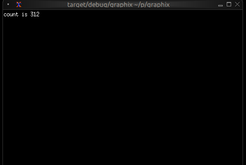
When you type Ctrl+C the shell will exit TUI mode and return to the
normal shell mode. You can use this behavior to experiment with TUI
widgets interactively.
Module Resolution
A crucial feature of the shell is its automatic module path configuration. Understanding how this works is essential for organizing larger projects.
Running a Local File
When you run a local file, the parent directory of that file is automatically added to the module search path:
graphix /home/user/myproject/src/main.gx
This automatically adds /home/user/myproject/src to the module path. Any .gx files in that directory can be loaded as modules.
For example, if you have:
/home/user/myproject/src/
  main.gx
  utils.gx
  math.gx
Then main.gx can use:
mod utils;
mod math;
utils::helper()
The shell will find utils.gx and math.gx because they’re in the same directory.
Running a Local Directory
When you run a local directory, the shell looks for main.gx in that directory and executes it. The directory is also added to the module search path.
For example, with this structure:
/home/user/myproject/src/
main.gx
utils.gx
math.gx
You can run:
graphix /home/user/myproject/src
This executes main.gx and adds /home/user/myproject/src to the module search path, so main.gx can load utils and math modules.
This is useful for organizing projects where you want both a runnable program (main.gx) and a library interface (mod.gx) for the same set of modules.
Running from Netidx
When you run a program from netidx, the netidx path is added to the module search path.
If you run:
graphix netidx:/my/graphix/modules/myprogram
The shell:
- subscribes to
/my/graphix/modules/myprogram - Loads and executes it
- Adds
netidx:/my/graphix/modules/myprogramto the module search path
So if myprogram contains mod utils, the shell will look for
netidx:/my/graphix/modules/myprogram/utils.
Module Search Path Priority
The complete module search path, in order of priority:
- File parent directory (if running a local file)
- Netidx path (if running from netidx)
- GRAPHIX_MODPATH entries (from the environment variable)
- Platform-specific init directory:
- Linux:
~/.local/share/graphix - Windows:
%APPDATA%\Roaming\graphix - macOS:
~/Library/Application Support/graphix
- Linux:
The shell searches these paths in order, returning the first match found.
The GRAPHIX_MODPATH Environment Variable
You can extend the module search path by setting GRAPHIX_MODPATH:
export GRAPHIX_MODPATH=netidx:/shared/modules,/home/user/graphix-lib
graphix myprogram.gx
The syntax is a comma-separated list of paths:
- Paths starting with
netidx:are netidx paths - Other paths are treated as filesystem paths
- Escape literal commas in paths with
\
Example:
GRAPHIX_MODPATH=netidx:/foo,/home/user/lib,/path/with\,comma
This adds:
netidx:/foo/home/user/lib/path/with,comma
Structuring Larger Projects
Understanding module resolution makes it straightforward to structure larger projects.
Single-Directory Projects
For small to medium projects, keep all .gx files in a single directory:
myproject/
main.gx
ui.gx
logic.gx
utils.gx
Run with:
graphix myproject/main.gx
The module resolution will automatically find the other .gx files in myproject/.
Hierarchical Projects
For larger projects, use directory hierarchies:
myproject/
main.gx
ui/
mod.gx
widgets.gx
layout.gx
logic/
mod.gx
handlers.gx
state.gx
In this structure:
ui/mod.gxdefines theuimodule (loads submodules)ui/widgets.gxdefines theui::widgetsmodulelogic/mod.gxdefines thelogicmodulelogic/handlers.gxdefines thelogic::handlersmodule
From main.gx:
mod ui;
mod logic;
ui::widgets::button("Click me")
The shell will:
- Find
ui/mod.gxfor theuimodule - Find
ui/widgets.gxwhenui/mod.gxdoesmod widgets - Similarly for the
logichierarchy
Shared Libraries
To share code across multiple projects, use the init directory or GRAPHIX_MODPATH:
Option 1: Init Directory
Place shared modules in your platform’s init directory (e.g., ~/.local/share/graphix on Linux):
~/.local/share/graphix/
common.gx
mylib.gx
Any Graphix program can then use:
mod common;
mod mylib;
Option 2: GRAPHIX_MODPATH
Keep shared libraries elsewhere and point to them:
export GRAPHIX_MODPATH=/opt/graphix-libs
graphix myproject/main.gx
Option 3: Netidx
Publish shared modules to netidx for organization-wide sharing:
# Publish the library
netidx publisher /shared/graphix/mylib < mylib.gx
# Use it from any program
GRAPHIX_MODPATH=netidx:/shared/graphix graphix myprogram.gx
The Init Module
In REPL mode only, the shell automatically tries to load a module named init. If found, it’s loaded before the REPL starts. If not found, the shell continues silently.
Create an init.gx file in your init directory to:
- Define commonly used utilities
- Set up default imports
Example ~/.local/share/graphix/init.gx:
// Commonly used stdlib modules
use sys::time;
use str;
use array;
// Personal utilities
let debug = |x| { print("DEBUG: [x]"); x };
let clear = || print("\x1b[2J\x1b[H");
Now these are available immediately in any REPL session.
Command-Line Options
The graphix command supports several options for controlling its behavior.
Netidx Configuration
# Use a specific netidx config file
graphix --config /path/to/netidx.toml myprogram
# Specify the netidx authentication mechanism
graphix --auth krb5 netidx:/apps/myprogram
# Disable netidx entirely (internal-only mode)
graphix --no-netidx ./myapp
When netidx is disabled, networking functions work only within the same process.
Publisher Configuration
# Set the publisher bind address
graphix --bind 127.0.0.1:5000 ./myprogram.gx
# Set a timeout for slow subscribers
graphix --publish-timeout 30 myprogram
Module Resolution
# Set timeout for resolving netidx modules (seconds)
graphix --resolve-timeout 10 netidx:/apps/myprogram
# Skip loading the init module in REPL mode
graphix --no-init
Compiler Warnings
Control which warnings are enabled with the -W flag:
# Warn about unhandled error operators (?) - default in script mode
graphix -W unhandled ./myprogram
# Disable warning about unhandled errors
graphix -W no-unhandled myapp.gx
# Warn about unused variables - default in script mode
graphix -W unused ./myproject
# Disable unused variable warnings
graphix -W no-unused myprogram.gx
# Make all warnings into errors
graphix -W error ./myapp
Multiple warning flags can be combined:
graphix -W unused -W unhandled -W error myprogram
If you specify both a flag and its negation (e.g., unhandled and no-unhandled), the no- variant always wins.
Logging
Enable debug logging for troubleshooting:
RUST_LOG=debug graphix --log-dir /tmp/graphix-logs ./myprogram
Logs will be written to files in the specified directory.
Summary
The Graphix shell is designed around the reactive nature of Graphix programs:
- Output expressions produce values that can update over time
- Programs keep running to display ongoing updates
- Ctrl+C stops the current expression (REPL) or exits (file mode)
- Module resolution is automatic based on where you run from
- Project structure can be flat or hierarchical
- Shared code can live in the init directory, GRAPHIX_MODPATH, or netidx
Understanding these concepts will help you work efficiently with Graphix, whether you’re experimenting in the REPL or building large applications.
The Standard Library
The Graphix standard library is split into several packages. The core
module is always imported with an implicit use statement.
corefundamental functions, types, bitwise operations, and binary encoding/decodingarrayfunctions for manipulating arraysmapfunctions for manipulating mapsstrfunctions for manipulating stringsreregular expressionsrandrandom number generatorsyssystem-level I/O, filesystem, networking, timers, stdio, and directory pathshttpHTTP client/server and REST helpersjsonJSON serialization and type-directed deserializationtomlTOML serialization and type-directed deserializationpacknative binary serialization via the netidx Pack formatxlsread xlsx, xls, ods, and xlsb spreadsheetssqliteSQLite database access with type-directed query resultsdbembedded key-value database with transactions, cursors, and reactive subscriptionslistimmutable singly-linked lists with structural sharingargscommand-line argument parsing with subcommandshbshandlebars template rendering
Core
type Sint = [ i8, i16, i32, z32, i64, z64 ];
type Uint = [ u8, u16, u32, v32, u64, v64 ];
type Int = [ Sint, Uint ];
type Float = [ f32, f64 ];
type Real = [ Float, decimal ];
type Number = [ Int, Real ];
type NotNull = [Number, string, error, array, datetime, duration, bytes, bool];
type Primitive = [NotNull, null];
type PrimNoErr = [Number, string, array, datetime, duration, bytes, null];
type Log = [`Trace, `Debug, `Info, `Warn, `Error, `Stdout, `Stderr];
type Result<'r, 'e> = ['r, Error<'e>];
type Option<'a> = ['a, null];
type Pos = {
line: i32,
column: i32
};
type Source = [
`File(string),
`Netidx(string),
`Internal(string),
`Unspecified
];
type Ori = {
parent: [Ori, null],
source: Source,
text: string
};
type ErrChain<'a> = {
cause: [ErrChain<'a>, null],
error: 'a,
ori: Ori,
pos: Pos
};
/// return the first argument when all arguments are equal, otherwise return nothing
val all: fn(@args: Any) -> Any;
/// return true if all arguments are true, otherwise return false
val and: fn(@args: bool) -> bool;
/// return the number of times x has updated
val count: fn(v: Any) -> i64;
/// return the first argument divided by all subsequent arguments
val divide: fn(@args: [Number, Array<[Number, Array<Number>]>]) -> Number;
/// return e only if e is an error
val filter_err: fn(r: Result<'a, 'b>) -> Error<'b>;
/// return v if f(v) is true, otherwise return nothing
val filter: fn(x: 'a, f: fn(x: 'a) -> bool throws 'e) -> 'a throws 'e;
/// return true if e is an error
val is_err: fn(v: Any) -> bool;
/// construct an error from the specified string
val error: fn(x: 'a) -> Error<'a>;
/// return the maximum value of any argument
val max: fn(x: 'a, @args: 'a) -> 'a;
/// return the mean of the passed in arguments
val mean: fn(v: [Number, Array<Number>], @args: [Number, Array<Number>]) -> Result<f64, `MeanError(string)>;
/// return the minimum value of any argument
val min: fn(x: 'a, @args:'a) -> 'a;
/// return v only once, subsequent updates to v will be ignored
/// and once will return nothing
val once: fn(x: 'a) -> 'a;
/// take n updates from e and drop the rest. The internal count is reset when n updates.
val take: fn(#n:Any, x: 'a) -> 'a;
/// skip n updates from e and return the rest. The internal count is reset when n updates.
val skip: fn(#n:Any, x: 'a) -> 'a;
/// seq will update j - i times, starting at i and ending at j - 1
val seq: fn(i: i64, j: i64) -> Result<i64, `SeqError(string)>;
/// return true if any argument is true
val or: fn(@args: bool) -> bool;
/// return the product of all arguments
val product: fn(@args: [Number, Array<[Number, Array<Number>]>]) -> Number;
/// return the sum of all arguments
val sum: fn(@args: [Number, Array<[Number, Array<Number>]>]) -> Number;
/// when v updates return v if the new value is different from the previous value,
/// otherwise return nothing.
val uniq: fn(x: 'a) -> 'a;
/// when v updates place it's value in an internal fifo queue. when clock updates
/// return the oldest value from the fifo queue. If clock updates and the queue is
/// empty, record the number of clock updates, and produce that number of
/// values from the queue when they are available.
val queue: fn(#clock:Any, x: 'a) -> 'a;
/// hold the most recent value of v internally until clock updates. If v updates
/// more than once before clock updates, older values of v will be discarded,
/// only the most recent value will be retained. If clock updates when no v is held
/// internally, record the number of times it updated, and pass that many v updates
/// through immediately when they happen.
val hold: fn(#clock:Any, x: 'a) -> 'a;
/// ignore updates to any argument and never return anything
val never: fn(@args: Any) -> 'a;
/// when v updates, return it, but also print it along
/// with the position of the expression to the specified sink
val dbg: fn(?#dest:[`Stdout, `Stderr, Log], x: 'a) -> 'a;
/// print a log message to stdout, stderr or the specified log level using the rust log
/// crate. Unlike dbg, log does not also return the value.
val log: fn(?#dest:Log, x: 'a) -> _;
/// print a raw value to stdout, stderr or the specified log level using the rust log
/// crate. Unlike dbg, log does not also return the value. Does not automatically insert
/// a newline and does not add the source module/location.
val print: fn(?#dest:Log, x: 'a) -> _;
/// print a raw value to stdout, stderr or the specified log level using the rust log
/// crate followed by a newline. Unlike dbg, log does not also return the value.
val println: fn(?#dest:Log, x: 'a) -> _;
/// Throttle v so it updates at most every #rate, where rate is a
/// duration (default 0.5 seconds). Intermediate updates that push v
/// over the #rate will be discarded. The most recent update will always
/// be delivered. If the sequence, m0, m1, ..., mN, arrives simultaneously
/// after a period of silence, first m0 will be delivered, then after the rate
/// timer expires mN will be delivered, m1, ..., m(N-1) will be discarded.
val throttle: fn(?#rate:duration, x: 'a) -> 'a;
/// bitwise AND
val bit_and: fn<'a: Int>(x: 'a, y: 'a) -> 'a;
/// bitwise OR
val bit_or: fn<'a: Int>(x: 'a, y: 'a) -> 'a;
/// bitwise XOR
val bit_xor: fn<'a: Int>(x: 'a, y: 'a) -> 'a;
/// bitwise complement
val bit_not: fn<'a: Int>(x: 'a) -> 'a;
/// shift left (wrapping)
val shl: fn<'a: Int>(x: 'a, y: 'a) -> 'a;
/// shift right (wrapping)
val shr: fn<'a: Int>(x: 'a, y: 'a) -> 'a;
core::buffer
The buffer submodule provides functions for working with raw bytes:
conversion between bytes and strings/arrays, concatenation, and a
flexible binary encode/decode system with control over endianness and
variable-length encoding.
/// Convert bytes to a UTF-8 string.
val to_string: fn(b: bytes) -> Result<string, `EncodingError(string)>;
/// Convert bytes to a UTF-8 string, replacing invalid sequences.
val to_string_lossy: fn(b: bytes) -> string;
/// Convert a string to its UTF-8 bytes.
val from_string: fn(s: string) -> bytes;
/// Concatenate bytes values.
val concat: fn(@args: [bytes, Array<bytes>]) -> bytes;
/// Convert bytes to an Array<u8>.
val to_array: fn(b: bytes) -> Array<u8>;
/// Convert an Array<u8> to bytes.
val from_array: fn(a: Array<u8>) -> bytes;
/// Return the length of a bytes value.
val len: fn(b: bytes) -> u64;
/// Spec for encoding values into bytes. Bare tags are
/// big-endian (network byte order), LE suffix for little-endian.
type Encode = [
`I8(i8), `U8(u8),
`I16(i16), `I16LE(i16), `U16(u16), `U16LE(u16),
`I32(i32), `I32LE(i32), `U32(u32), `U32LE(u32),
`I64(i64), `I64LE(i64), `U64(u64), `U64LE(u64),
`F32(f32), `F32LE(f32), `F64(f64), `F64LE(f64),
`Bytes(bytes),
`Pad(u64),
`Varint(u64),
`Zigzag(i64)
];
/// Spec for decoding bytes into refs. Bare tags are
/// big-endian (network byte order), LE suffix for little-endian.
/// Variable-length fields take a &u64 for the length so that
/// earlier decoded lengths can be resolved within the same call.
type Decode = [
`I8(&i8), `U8(&u8),
`I16(&i16), `I16LE(&i16), `U16(&u16), `U16LE(&u16),
`I32(&i32), `I32LE(&i32), `U32(&u32), `U32LE(&u32),
`I64(&i64), `I64LE(&i64), `U64(&u64), `U64LE(&u64),
`F32(&f32), `F32LE(&f32), `F64(&f64), `F64LE(&f64),
`Bytes(&u64, &bytes),
`UTF8(&u64, &string),
`Skip(&u64),
`Varint(&u64),
`Zigzag(&i64)
];
/// Encode values into bytes according to the spec.
val encode: fn(spec: Array<Encode>) -> bytes;
/// Decode bytes into refs according to the spec.
/// Returns the remaining bytes after all fields are consumed.
val decode: fn(buf: bytes, spec: Array<Decode>) -> Result<bytes, `DecodeError(string)>;
core::math
The math submodule wraps Rust’s f64 math intrinsics (trigonometric,
hyperbolic, exponential, logarithmic, power, rounding, comparison,
predicate, and angle-conversion routines) plus the standard
mathematical constants. Argument and result conventions match
std::f64: angles are in radians, NaN propagates through arithmetic,
and min/max return the non-NaN operand when one input is NaN.
For polymorphic n-ary min / max / sum / product over Number,
use the top-level functions in core instead — the bindings here are
the binary f64-only forms.
/// Sine. Argument in radians.
val sin: fn(x: f64) -> f64;
/// Cosine. Argument in radians.
val cos: fn(x: f64) -> f64;
/// Tangent. Argument in radians.
val tan: fn(x: f64) -> f64;
/// Inverse sine. Result in radians, [-π/2, π/2].
val asin: fn(x: f64) -> f64;
/// Inverse cosine. Result in radians, [0, π].
val acos: fn(x: f64) -> f64;
/// Inverse tangent. Result in radians, (-π/2, π/2).
val atan: fn(x: f64) -> f64;
/// Four-quadrant inverse tangent: `atan2(y, x)`. Result in radians, (-π, π].
val atan2: fn(y: f64, x: f64) -> f64;
/// Hyperbolic sine.
val sinh: fn(x: f64) -> f64;
/// Hyperbolic cosine.
val cosh: fn(x: f64) -> f64;
/// Hyperbolic tangent.
val tanh: fn(x: f64) -> f64;
/// Inverse hyperbolic sine.
val asinh: fn(x: f64) -> f64;
/// Inverse hyperbolic cosine.
val acosh: fn(x: f64) -> f64;
/// Inverse hyperbolic tangent.
val atanh: fn(x: f64) -> f64;
/// `e^x`.
val exp: fn(x: f64) -> f64;
/// `2^x`.
val exp2: fn(x: f64) -> f64;
/// `e^x - 1`. More accurate than `exp(x) - 1` near zero.
val exp_m1: fn(x: f64) -> f64;
/// Natural logarithm (base e).
val ln: fn(x: f64) -> f64;
/// `ln(1 + x)`. More accurate than `ln(1 + x)` near zero.
val ln_1p: fn(x: f64) -> f64;
/// Logarithm base 2.
val log2: fn(x: f64) -> f64;
/// Logarithm base 10.
val log10: fn(x: f64) -> f64;
/// Logarithm with arbitrary base: `log(x, base) = ln(x) / ln(base)`.
val log: fn(x: f64, base: f64) -> f64;
/// `x^y`.
val pow: fn(x: f64, y: f64) -> f64;
/// Square root.
val sqrt: fn(x: f64) -> f64;
/// Cube root.
val cbrt: fn(x: f64) -> f64;
/// `sqrt(x^2 + y^2)`, computed without overflow for large inputs.
val hypot: fn(x: f64, y: f64) -> f64;
/// Largest integer less than or equal to `x`.
val floor: fn(x: f64) -> f64;
/// Smallest integer greater than or equal to `x`.
val ceil: fn(x: f64) -> f64;
/// Round to the nearest integer, ties away from zero.
val round: fn(x: f64) -> f64;
/// Truncate toward zero.
val trunc: fn(x: f64) -> f64;
/// Fractional part: `x - trunc(x)`.
val fract: fn(x: f64) -> f64;
/// Absolute value.
val abs: fn(x: f64) -> f64;
/// Sign: -1.0, 0.0, or 1.0. NaN if `x` is NaN.
val signum: fn(x: f64) -> f64;
/// `x` with the sign of `y`.
val copysign: fn(x: f64, y: f64) -> f64;
/// Smaller of two f64 values, returning the non-NaN operand if one is
/// NaN. For n-ary polymorphic behaviour over `Number`, use the
/// top-level `min` from core.
val min: fn(x: f64, y: f64) -> f64;
/// Larger of two f64 values, returning the non-NaN operand if one is
/// NaN. For n-ary polymorphic behaviour over `Number`, use the
/// top-level `max` from core.
val max: fn(x: f64, y: f64) -> f64;
/// Clamp `x` to the closed interval `[lo, hi]`.
val clamp: fn(x: f64, lo: f64, hi: f64) -> f64;
/// True if `x` is NaN.
val is_nan: fn(x: f64) -> bool;
/// True if `x` is finite (not NaN, not infinite).
val is_finite: fn(x: f64) -> bool;
/// True if `x` is positive or negative infinity.
val is_infinite: fn(x: f64) -> bool;
/// Convert radians to degrees.
val to_degrees: fn(x: f64) -> f64;
/// Convert degrees to radians.
val to_radians: fn(x: f64) -> f64;
/// π ≈ 3.14159265358979…
val pi: f64;
/// e ≈ 2.71828182845904…
val e: f64;
/// τ = 2π ≈ 6.28318530717958…
val tau: f64;
/// √2 ≈ 1.41421356237309…
val sqrt_2: f64;
/// ln(2) ≈ 0.69314718055994…
val ln_2: f64;
/// ln(10) ≈ 2.30258509299404…
val ln_10: f64;
/// Positive infinity.
val infinity: f64;
/// Not-a-number.
val nan: f64;
core::opt
The opt submodule provides combinators for working with optional
values — graphix’s Option<'a> is just the structural union
['a, null], and these functions mirror the most useful parts of
Rust’s std::option::Option API in a reactive setting.
The higher-order combinators (map, flat_map, filter, or_else,
ok_or_else, is_some_and, is_none_or) are deliberately
fire-and-forget: they never queue inputs. If a callback is slow or
never produces a value, a new input simply supersedes the pending one
(latest wins). Use the explicit core::queue / core::hold operators
when you need ordered async behavior.
/// true if v is not null
val is_some: fn(v: ['a, null]) -> bool;
/// true if v is null
val is_none: fn(v: ['a, null]) -> bool;
/// true if v is not null and equals x. Produces false when v is null
/// regardless of x.
val contains: fn(v: ['a, null], y: 'a) -> bool;
/// or_never(v) does not return anything if v is null, otherwise it
/// returns v.
val or_never: fn(v: ['a, null]) -> 'a;
/// or_default(v, d): if v is null return d, otherwise return v
val or_default: fn(v: ['a, null], y: 'a) -> 'a;
/// or(a, b): return a if non-null, otherwise return b (which may
/// itself be null).
val or: fn(v: ['a, null], v2: ['a, null]) -> ['a, null];
/// and(a, b): return b if a is non-null, otherwise return null. The
/// value of b is not inspected when a is null.
val and: fn(v: ['a, null], v2: ['b, null]) -> ['b, null];
/// xor(a, b): return whichever of a or b is non-null, or null if both
/// or neither are non-null.
val xor: fn(v: ['a, null], v2: ['a, null]) -> ['a, null];
/// Collapse a nested option. Present for symmetry with Rust; at the
/// value level this is the identity (graphix structural unions make
/// [[T, null], null] equivalent to [T, null]).
val flatten: fn(v: [['a, null], null]) -> ['a, null];
/// ok_or(v, e): return v unchanged when non-null, otherwise return
/// error(e).
val ok_or: fn(v: ['a, null], y: 'e) -> Result<'a, 'e>;
/// zip(a, b): if both are non-null return the tuple (a, b), otherwise
/// return null.
val zip: fn(v: ['a, null], v2: ['b, null]) -> [('a, 'b), null];
/// unzip(p): given a tuple-valued option, return the pair of options.
/// null input yields (null, null).
val unzip: fn(v: [('a, 'b), null]) -> (['a, null], ['b, null]);
/// map(v, f): apply f to the inner value if v is non-null, otherwise
/// return null.
val map: fn(v: ['a, null], f: fn(x: 'a) -> 'b) -> ['b, null];
/// flat_map(v, f): apply f to the inner value if v is non-null,
/// otherwise return null. f's own optional result is forwarded
/// unchanged.
val flat_map: fn(v: ['a, null], f: fn(x: 'a) -> ['b, null]) -> ['b, null];
/// filter(v, pred): if v is non-null and pred(v) is true, emit v.
/// Otherwise (v is null, or pred is false) emit null. Same fire-and-
/// forget semantics as map.
///
/// Caveat for reactive predicates: when pred takes more than one cycle
/// to produce its bool, the emitted value is the *current* input, not
/// the input pred was actually answering for. If the input changes
/// between feeding pred and pred firing, you'll see the new value
/// gated on a verdict about the old one. Pure predicates (the
/// expected case) are unaffected. Use `core::queue` if you need
/// strict input-bool pairing.
val filter: fn(v: ['a, null], f: fn(x: 'a) -> bool) -> ['a, null];
/// or_else(v, f): return v if non-null, otherwise return whatever f()
/// produces. f is invoked eagerly and its latest value is cached so
/// later updates to v can be resolved without re-invoking f. If v is
/// null before f has produced its first value, no output is emitted
/// until f fires.
val or_else: fn(v: ['a, null], f: fn() -> ['a, null]) -> ['a, null];
/// ok_or_else(v, f): return v if non-null, otherwise return
/// error(f()). Same eager-with-caching semantics as or_else; null v
/// before f's first firing is silent until f produces.
val ok_or_else: fn(v: ['a, null], f: fn() -> 'e) -> Result<'a, 'e>;
/// is_some_and(v, pred): true when v is non-null and pred(v) is true,
/// false when v is null or pred is false. Fire-and-forget like map —
/// for non-null v, no output is produced until pred fires.
val is_some_and: fn(v: ['a, null], f: fn(x: 'a) -> bool) -> bool;
/// is_none_or(v, pred): true when v is null or pred(v) is true, false
/// when v is non-null and pred is false. Fire-and-forget like map —
/// for non-null v, no output is produced until pred fires.
val is_none_or: fn(v: ['a, null], f: fn(x: 'a) -> bool) -> bool;
Array
/// filter returns a new array containing only elements where f returned true
val filter: fn(a: Array<'a>, f: fn(x: 'a) -> bool throws 'e) -> Array<'a> throws 'e;
/// filter_map returns a new array containing the outputs of f
/// that were not null
val filter_map: fn(a: Array<'a>, f: fn(x: 'a) -> Option<'b> throws 'e) -> Array<'b> throws 'e;
/// return a new array where each element is the output of f applied to the
/// corresponding element in a
val map: fn(a: Array<'a>, f: fn(x: 'a) -> 'b throws 'e) -> Array<'b> throws 'e;
/// return a new array where each element is the output of f applied to the
/// corresponding element in a, except that if f returns an array then it's
/// elements will be concatenated to the end of the output instead of nesting.
val flat_map: fn(a: Array<'a>, f: fn(x: 'a) -> ['b, Array<'b>] throws 'e) -> Array<'b> throws 'e;
/// return the result of f applied to the init and every element of a in
/// sequence. f(f(f(init, a[0]), a[1]), ...)
val fold: fn(a: Array<'a>, init: 'b, f: fn(acc: 'b, x: 'a) -> 'b throws 'e) -> 'b throws 'e;
/// each time v updates group places the value of v in an internal buffer
/// and calls f with the length of the internal buffer and the value of v.
/// If f returns true then group returns the internal buffer as an array
/// otherwise group returns nothing.
val group: fn(v: 'a, f: fn(len: i64, x: 'a) -> bool throws 'e) -> Array<'a> throws 'e;
/// iter produces an update for every value in the array a. updates are produced
/// in the order they appear in a.
val iter: fn(a: Array<'a>) -> 'a;
/// iterq produces an update for each value in a, but only when clock updates. If
/// clock does not update but a does, then iterq will store each a in an internal
/// fifo queue. If clock updates but a does not, iterq will record the number of
/// times it was triggered, and will update immediately that many times when a
/// updates.
val iterq: fn(#clock:Any, a: Array<'a>) -> 'a;
/// returns the length of a
val len: fn(a: Array<'a>) -> i64;
/// returns the concatenation of two or more arrays. O(N) where
/// N is the size of the final array.
val concat: fn(x: Array<'a>, @args: Array<'a>) -> Array<'a>;
/// return an array with the args added to the end. O(N)
/// where N is the size of the final array
val push: fn(a: Array<'a>, @args: 'a) -> Array<'a>;
/// return an array with the args added to the front. O(N)
/// where N is the size of the final array
val push_front: fn(a: Array<'a>, @args: 'a) -> Array<'a>;
/// return an array no larger than #n with the args
/// added to the back. If pushing the args would cause the
/// array to become bigger than #n, remove values from the
/// front. O(N) where N is the window size.
val window: fn(#n:i64, a: Array<'a>, @args: 'a) -> Array<'a>;
/// flatten takes an array with two levels of nesting and produces a flat array
/// with all the nested elements concatenated together.
val flatten: fn(a: Array<Array<'a>>) -> Array<'a>;
/// return a new array with duplicate elements removed, preserving the order of
/// first occurrence. Uses a hash set internally so the input does not need to
/// be sorted. O(N) expected.
val dedup: fn(a: Array<'a>) -> Array<'a>;
/// applies f to every element in a and returns the first element for which f
/// returns true, or null if no element returns true
val find: fn(a: Array<'a>, f: fn(x: 'a) -> bool throws 'e) -> Option<'a> throws 'e;
/// applies f to every element in a and returns the first non null output of f
val find_map: fn(a: Array<'a>, f: fn(x: 'a) -> Option<'b> throws 'e) -> Option<'b> throws 'e;
type Direction = [
`Ascending,
`Descending
];
/// return a new copy of a sorted ascending (by default). If numeric is true then
/// values will be cast to numbers before comparison, resulting in a numeric sort
/// even if the values are strings.
val sort: fn(?#dir:Direction, ?#numeric:bool, a: Array<'a>) -> Array<'a>;
/// return an array of pairs where the first element is the index in
/// the array and the second element is the value.
val enumerate: fn(a: Array<'a>) -> Array<(i64, 'a)>;
/// given two arrays, return a single array of pairs where the first
/// element in the pair is from the first array and the second element in
/// the pair is from the second array. The final array's length will be the
/// minimum of the length of the input arrays
val zip: fn(a0: Array<'a>, a1: Array<'b>) -> Array<('a, 'b)>;
/// create an array of n elements where element i is f(i) for i in [0, n)
val init: fn(n: i64, f: fn(i: i64) -> 'a throws 'e) -> Array<'a> throws 'e;
/// given an array of pairs, return two arrays with the first array
/// containing all the elements from the first pair element and second
/// array containing all the elements of the second pair element.
val unzip: fn(a: Array<('a, 'b)>) -> (Array<'a>, Array<'b>);
Map
/// return a new map where each element is the output of f applied to
/// the corresponding key value pair in the current map
val map: fn(m: Map<'k, 'v>, f: fn(kv: ('k, 'v)) -> ('k2, 'v2) throws 'e) -> Map<'k2, 'v2> throws 'e;
/// return a new map containing only the key-value pairs where f applied to
/// (key, value) returns true
val filter: fn(m: Map<'k, 'v>, f: fn(kv: ('k, 'v)) -> bool throws 'e) -> Map<'k, 'v> throws 'e;
/// filter_map returns a new map containing the outputs of f
/// that were not null
val filter_map: fn(m: Map<'k, 'v>, f: fn(kv: ('k, 'v)) -> Option<('k2, 'v2)> throws 'e) -> Map<'k2, 'v2> throws 'e;
/// return the result of f applied to the init and every k, v pair of m in
/// sequence. f(f(f(init, (k0, v0)), (k1, v1)), ...)
val fold: fn(m: Map<'k, 'v>, init: 'acc, f: fn(acc: 'acc, kv: ('k, 'v)) -> 'acc throws 'e) -> 'acc throws 'e;
/// return the length of the map
val len: fn(m: Map<'k, 'v>) -> i64;
/// get the value associated with the key k in the map m, or null if not present
val get: fn(m: Map<'k, 'v>, k: 'k) -> Option<'v>;
/// get the value associated with the key k in the map m, or return the
/// default value if k is not present in m
val get_or: fn(m: Map<'k, 'v>, k: 'k, default: 'v) -> 'v;
/// insert a new value into the map
val insert: fn(m: Map<'k, 'v>, k: 'k, v: 'v) -> Map<'k, 'v>;
/// update the value at k by applying f to the current value at k, or
/// to the provided default if k is not present. returns the new map
/// with k set to f's result. e.g. change(m, "count", 0, |n| n + 1)
val change: fn(m: Map<'k, 'v>, k: 'k, default: 'v, f: fn(v: 'v) -> 'v) -> Map<'k, 'v>;
/// remove the value associated with the specified key from the map
val remove: fn(m: Map<'k, 'v>, k: 'k) -> Map<'k, 'v>;
/// iter produces an update for every key-value pair in the map m.
/// updates are produced in the order they appear in m.
val iter: fn(m: Map<'k, 'v>) -> ('k, 'v);
/// iterq produces an update for each value in m, but only when clock updates. If
/// clock does not update but m does, then iterq will store each m in an internal
/// fifo queue. If clock updates but m does not, iterq will record the number of
/// times it was triggered, and will update immediately that many times when m
/// updates.
val iterq: fn(#clock: Any, m: Map<'k, 'v>) -> ('k, 'v);
Str
type Escape = {
escape: string,
escape_char: string,
tr: Array<(string, string)>
};
/// return true if s starts with #pfx, otherwise return false
val starts_with: fn(#pfx: string, s: string) -> bool;
/// return true if s ends with #sfx otherwise return false
val ends_with: fn(#sfx: string, s: string) -> bool;
/// return true if s contains #part, otherwise return false
val contains: fn(#part: string, s: string) -> bool;
/// if s starts with #pfx then return s with #pfx stripped otherwise return null
val strip_prefix: fn(#pfx: string, s: string) -> Option<string>;
/// if s ends with #sfx then return s with #sfx stripped otherwise return null
val strip_suffix: fn(#sfx: string, s: string) -> Option<string>;
/// return s with leading and trailing whitespace removed
val trim: fn(s: string) -> string;
/// return s with leading whitespace removed
val trim_start: fn(s: string) -> string;
/// return s with trailing whitespace removed
val trim_end: fn(s: string) -> string;
/// replace all instances of #pat in s with #rep and return s
val replace: fn(#pat: string, #rep: string, s: string) -> string;
/// return the parent path of s, or null if s does not have a parent path
val dirname: fn(s: string) -> Option<string>;
/// return the leaf path of s, or null if s is not a path. e.g. /foo/bar -> bar
val basename: fn(s: string) -> Option<string>;
/// given a path ending in .../row/col, return the tuple (row, col).
/// equivalent to (basename(dirname(s)), basename(s)), but in a single
/// builtin call. returns null if s has fewer than two path components.
/// e.g. /foo/bar/baz -> ("bar", "baz"), /foo -> null
val row_col: fn(s: string) -> Option<(string, string)>;
/// return a single string with the arguments concatenated and separated by #sep
val join: fn(#sep:string, @args: [string, Array<string>]) -> string;
/// concatenate the specified strings into a single string
val concat: fn(@args: [string, Array<string>]) -> string;
/// escape all the characters in #to_escape in s with the escape character #escape.
/// The escape character must appear in #to_escape
val escape: fn(?#esc:Escape, s: string) -> Result<string, `StringError(string)>;
/// unescape all the characters in s escaped by the specified #escape character
val unescape: fn(?#esc:Escape, s: string) -> Result<string, `StringError(string)>;
/// split the string by the specified #pat and return an array of each part
val split: fn(#pat: string, s: string) -> Array<string>;
/// reverse split the string by the specified #pat and return an array of each part
val rsplit: fn(#pat: string, s: string) -> Array<string>;
/// split the string at most #n times by the specified #pat and return an array of
/// each part
val splitn: fn(#pat:string, #n:i64, s: string) -> Result<Array<string>, `StringSplitError(string)>;
/// reverse split the string at most #n times by the specified #pat and return an array of
/// each part
val rsplitn: fn(#pat:string, #n:i64, s: string) -> Result<Array<string>, `StringSplitError(string)>;
/// give an escape character #esc, and a #sep character, split the string s into an array
/// of parts delimited by it's non escaped separator characters.
val split_escaped: fn(#esc:string, #sep:string, s: string) -> Result<Array<string>, `SplitEscError(string)>;
/// give an escape character #esc, and a #sep character, split the string s into an array
/// of at most #n parts delimited by it's non escaped separator characters.
val splitn_escaped: fn(#n:i64, #esc:string, #sep:string, s: string) -> Result<Array<string>, `SplitNEscError(string)>;
/// split the string once from the beginning by #pat and return a
/// tuple of strings, or return null if #pat was not found in the string
val split_once: fn(#pat: string, s: string) -> Option<(string, string)>;
/// split the string once from the end by #pat and return a tuple of strings
/// or return null if #pat was not found in the string
val rsplit_once: fn(#pat: string, s: string) -> Option<(string, string)>;
/// change the string to lowercase
val to_lower: fn(s: string) -> string;
/// change the string to uppercase
val to_upper: fn(s: string) -> string;
/// C style sprintf, implements most C standard format args
val sprintf: fn(s: string, @args: Any) -> string;
/// return the length of the string in bytes
val len: fn(s: string) -> i64;
/// extract a substring of s starting at #start with length #len.
/// both #start and #len are Unicode character indexes,
/// not byte indexes. e.g. str::sub(#start:0, #len:2, "💖💖💖")
/// will return "💖💖"
val sub: fn(#start:i64, #len:i64, s: string) -> Result<string, `SubError(string)>;
/// parse the specified string as a value. return the value on success or an
/// error on failure. Note, if you feed the parser a well formed error then
/// parse will also return an error
val parse: fn(s: string) -> Result<PrimNoErr, Any>;
Re
/// return true if the string is matched by #pat, otherwise return false.
/// return an error if #pat is invalid.
val is_match: fn(#pat: string, s: string) -> Result<bool, `ReError(string)>;
/// return an array of instances of #pat in s. return an error if #pat is
/// invalid.
val find: fn(#pat: string, s: string) -> Result<Array<string>, `ReError(string)>;
/// return an array of captures matched by #pat. The array will have an element for each
/// capture group, which will have an element for each capture, regardless of whether it
/// matched or not. If it did not match the corresponding element will be null. Return an
/// error if #pat is invalid.
val captures: fn(#pat: string, s: string) -> Result<Array<Array<Option<string>>>, `ReError(string)>;
/// return an array of strings split by #pat. return an error if #pat is invalid.
val split: fn(#pat: string, s: string) -> Result<Array<string>, `ReError(string)>;
/// split the string by #pat at most #limit times and return an array of the parts.
/// return an error if #pat is invalid
val splitn: fn(#pat: string, #limit: i64, s: string) -> Result<Array<string>, `ReError(string)>;
Rand
/// generate a random number between #start and #end (exclusive)
/// every time #clock updates. If start and end are not specified,
/// they default to 0.0 and 1.0
val rand: fn<'a: [Int, Float]>(?#start:'a, ?#end:'a, #clock:Any) -> 'a;
/// pick a random element from the array and return it. Update
/// each time the array updates. If the array is empty return
/// nothing.
val pick: fn(a: Array<'a>) -> 'a;
/// return a shuffled copy of a
val shuffle: fn(a: Array<'a>) -> Array<'a>;
sys
The sys module provides access to operating system level functionality:
files, sockets, timers, and the netidx publish/subscribe system. All I/O
goes through a unified Stream type defined in sys::io, so the same
read/write functions work on files, TCP connections, TLS streams,
and stdio.
| Module | Purpose |
|---|---|
sys::io | Unified Stream type, read/write/flush, stdin/stdout/stderr |
sys::fs | Open files, directory operations, filesystem watching |
sys::tcp | TCP connect, listen, accept |
sys::tls | Upgrade TCP streams to TLS |
sys::net | Netidx publish/subscribe and RPC |
sys::time | Timers and current time |
sys::dirs | Platform-aware standard directory paths |
/// the command line arguments. argv[0] is the script file.
val args: fn() -> Array<string>;
/// join parts to path using the OS specific path separator
val join_path: fn(s: string, @args: [string, Array<string>]) -> string;
sys::io
The sys::io module provides a unified Stream type for all I/O
operations. The phantom type parameter constrains which stream kind is
accepted — sys::fs::open returns Stream<\File>, sys::tcp::connectreturnsStream<`Tcp>, sys::tls::connectreturnsStream<`Tls>, and stdin/stdout/stderrreturnStream<`Stdio>`.
/// An opaque handle to an I/O stream. The phantom type parameter indicates
/// the underlying stream kind, constraining which operations are valid.
/// Stream<`File> for files, Stream<`Tcp> for TCP, Stream<`Tls> for TLS,
/// Stream<`Stdio> for stdin/stdout/stderr.
type Stream<'a: [`File, `Tcp, `Tls, `Stdio]>;
/// Read up to n bytes from the stream. May return fewer bytes than
/// requested if fewer are available.
val read: fn(stream: Stream<'a>, n: u64) -> Result<bytes, `IOError(string)>;
/// Read exactly n bytes from the stream. Returns fewer bytes only
/// if EOF is reached before n bytes have been read.
val read_exact: fn(stream: Stream<'a>, n: u64) -> Result<bytes, `IOError(string)>;
/// Write bytes to the stream. Returns the number of bytes written,
/// which may be less than the full length of data.
val write: fn(stream: Stream<'a>, data: bytes) -> Result<u64, `IOError(string)>;
/// Write all bytes to the stream, looping until complete.
val write_exact: fn(stream: Stream<'a>, data: bytes) -> Result<null, `IOError(string)>;
/// Flush any buffered writes.
val flush: fn(stream: Stream<'a>) -> Result<null, `IOError(string)>;
/// Return a handle to standard input.
val stdin: fn(trigger: Any) -> Stream<`Stdio>;
/// Return a handle to standard output.
val stdout: fn(trigger: Any) -> Stream<`Stdio>;
/// Return a handle to standard error.
val stderr: fn(trigger: Any) -> Stream<`Stdio>;
sys::fs - Filesystem Operations
The sys::fs module provides functions for reading, writing, and watching files and directories.
Interface
use sys::io;
type FileType = [
`Dir,
`File,
`Symlink,
`SymlinkDir,
`BlockDev,
`CharDev,
`Fifo,
`Socket,
null
];
/// Filesystem metadata. Not all kind fields are possible on all platforms.
/// permissions will only be set on unix platforms, windows will only
/// expose the ReadOnly flag.
type Metadata = {
accessed: [datetime, null],
created: [datetime, null],
modified: [datetime, null],
kind: FileType,
len: u64,
permissions: [u32, `ReadOnly(bool)]
};
/// a directory entry
type DirEntry = {
path: string,
file_name: string,
depth: i64,
kind: FileType
};
type Mode = [`Read, `Write, `Append, `ReadWrite, `Create, `CreateNew];
type SeekFrom = [`Start(u64), `End(i64), `Current(i64)];
mod watch;
mod tempdir;
/// Read the specified file into memory as a utf8 string and return it.
val read_all: fn(path: string) -> Result<string, `IOError(string)>;
/// Read the specified file into memory as bytes and return it.
val read_all_bin: fn(path: string) -> Result<bytes, `IOError(string)>;
/// Write data to path. If path does not exist it is created. If path exists it
/// is truncated and replaced with data.
val write_all: fn(#path: string, data: string) -> Result<null, `IOError(string)>;
/// Like write_all, but for binary data.
val write_all_bin: fn(#path: string, data: bytes) -> Result<null, `IOError(string)>;
/// If path is a regular file then return path, otherwise return an IOError.
val is_file: fn(path: string) -> Result<string, `IOError(string)>;
/// If path is a directory then return path, otherwise return an IOError.
val is_dir: fn(path: string) -> Result<string, `IOError(string)>;
/// Return metadata for a filesystem object.
val metadata: fn(?#follow_symlinks: bool, path: string) -> Result<Metadata, `IOError(string)>;
/// Read a directory and return an array of directory entries.
val readdir: fn(
?#max_depth: i64,
?#min_depth: i64,
?#contents_first: bool,
?#follow_symlinks: bool,
?#follow_root_symlink: bool,
?#same_filesystem: bool,
path: string
) -> Result<Array<DirEntry>, `IOError(string)>;
/// Create a directory. If `all` is true (default false) create all intermediate
/// directories as well.
val create_dir: fn(?#all: bool, path: string) -> Result<null, `IOError(string)>;
/// Remove a directory. If `all` is true (default false) recursively remove
/// the contents as well.
val remove_dir: fn(?#all: bool, path: string) -> Result<null, `IOError(string)>;
/// Remove a file.
val remove_file: fn(path: string) -> Result<null, `IOError(string)>;
/// Open a file with the specified mode, returning an I/O stream.
///
/// Mode semantics:
/// - `Read: must exist, read only
/// - `Write: create or truncate, write only
/// - `Append: create or append, write only
/// - `ReadWrite: must exist, read and write
/// - `Create: create or truncate, read and write
/// - `CreateNew: must not exist, read and write
val open: fn(mode: Mode, path: string) -> Result<io::Stream<`File>, `IOError(string)>;
/// Seek to a position in the file. Returns the new position.
val seek: fn(stream: io::Stream<`File>, pos: SeekFrom) -> Result<u64, `IOError(string)>;
/// Get metadata for the open file.
val fstat: fn(stream: io::Stream<`File>) -> Result<Metadata, `IOError(string)>;
/// Truncate or extend the file to the specified length.
val truncate: fn(stream: io::Stream<`File>, len: u64) -> Result<null, `IOError(string)>;
Once a file is opened with sys::fs::open, use sys::io::read,
sys::io::write, and sys::io::flush for I/O — these work on any
stream kind.
sys::fs::watch
type Interest = [
`Established,
`Any,
`Access,
`AccessOpen,
`AccessClose,
`AccessRead,
`AccessOther,
`Create,
`CreateFile,
`CreateFolder,
`CreateOther,
`Modify,
`ModifyData,
`ModifyDataSize,
`ModifyDataContent,
`ModifyDataOther,
`ModifyMetadata,
`ModifyMetadataAccessTime,
`ModifyMetadataWriteTime,
`ModifyMetadataPermissions,
`ModifyMetadataOwnership,
`ModifyMetadataExtended,
`ModifyMetadataOther,
`ModifyRename,
`ModifyRenameTo,
`ModifyRenameFrom,
`ModifyRenameBoth,
`ModifyRenameOther,
`ModifyOther,
`Delete,
`DeleteFile,
`DeleteFolder,
`DeleteOther,
`Other
];
type WatchEvent = {
paths: Array<string>,
event: Interest
};
type Watcher;
type Watch;
/// Create a filesystem watcher.
/// poll_interval defaults to 1s; poll_batch_size defaults to 100.
val create: fn(
?#poll_interval:[duration, null],
?#poll_batch_size:[i64, null],
trigger: Any
) -> Result<Watcher, `WatchError(string)>;
/// Watch path for events matching #interest using the given watcher.
val watch: fn(?#interest: Array<Interest>, watcher: Watcher, path: string)
-> Result<Watch, `WatchError(string)>;
/// The path of the filesystem object involved in the most recent watch event.
/// Accepts a single Watch, an Array of Watches, or a Map with Watch values.
val path: fn(@args: [Watch, Array<Watch>, Map<'k, Watch>])
-> Result<string, `WatchError(string)>;
/// The full watch event including all paths and the event type.
val events: fn(@args: [Watch, Array<Watch>, Map<'k, Watch>])
-> Result<WatchEvent, `WatchError(string)>;
sys::fs::tempdir
/// An opaque handle to a temporary directory. The directory is
/// automatically deleted when the handle is dropped.
type T;
/// Get the filesystem path of a TempDir.
val path: fn(td: T) -> string;
/// Create a temporary directory.
/// - #in: parent directory (default: system temp dir)
/// - #name: prefix or suffix for the directory name
val create: fn(
?#in:[null, string],
?#name:[null, `Prefix(string), `Suffix(string)],
trigger: Any
) -> Result<T, `IOError(string)>;
sys::tcp
/// An opaque handle to a TCP listener.
type TcpListener;
/// Connect to a TCP server at the given address (host:port).
val connect: fn(addr: string) -> Result<io::Stream<`Tcp>, `TCPError(string)>;
/// Bind a TCP listener to the given address (host:port).
val listen: fn(addr: string) -> Result<TcpListener, `TCPError(string)>;
/// Accept a new connection from the listener. The second argument
/// is a trigger — each time it updates, a new accept is performed.
val accept: fn(listener: TcpListener, trigger: Any) -> Result<io::Stream<`Tcp>, `TCPError(string)>;
/// Shutdown the write half of the stream. Works on both plain TCP
/// and TLS-upgraded streams.
val shutdown: fn(stream: io::Stream<[`Tcp, `Tls]>) -> Result<null, `TCPError(string)>;
/// Get the remote address of the connected peer. Works on both
/// plain TCP and TLS-upgraded streams.
val peer_addr: fn(stream: io::Stream<[`Tcp, `Tls]>) -> Result<string, `TCPError(string)>;
/// Get the local address of the stream. Works on both plain TCP
/// and TLS-upgraded streams.
val local_addr: fn(stream: io::Stream<[`Tcp, `Tls]>) -> Result<string, `TCPError(string)>;
/// Get the local address that the listener is bound to.
val listener_addr: fn(listener: TcpListener) -> Result<string, `TCPError(string)>;
sys::tls
TLS upgrades for TCP streams. After upgrading, use sys::io::read/write
as usual — the encryption is transparent.
/// Upgrade a TCP stream to a TLS client connection. The hostname is
/// used for SNI and certificate verification. When ca_cert is null,
/// Mozilla root certificates are used; when provided, only that CA
/// is trusted.
val connect: fn(?#ca_cert:[bytes, null], hostname: string, stream: io::Stream<`Tcp>)
-> Result<io::Stream<`Tls>, `TLSError(string)>;
/// Upgrade a TCP stream to a TLS server connection using the given
/// PEM-encoded certificate chain and private key.
val accept: fn(#cert:bytes, #key:bytes, stream: io::Stream<`Tcp>)
-> Result<io::Stream<`Tls>, `TLSError(string)>;
sys::net - Netidx Operations
The sys::net module provides publish/subscribe and RPC operations via
netidx.
type Table = { rows: Array<string>, columns: Array<string> };
type RpcArg<'a> = { default: 'a, doc: string };
/// write the value to the specified path
val write: fn(path: string, value: Any) -> Result<_, `WriteError(string)>;
/// subscribe to the specified path. The result type is driven by the
/// annotation at the binding site — the runtime converts the published
/// value into the requested type, returning `InvalidCast` if the
/// conversion fails.
val subscribe: fn(path: string) -> Result<'a, [`SubscribeError(string), `InvalidCast(string)]>;
/// call the specified rpc. args must be a struct or null. The result
/// type is driven by the annotation at the binding site.
val call: fn(path: string, args: 'a) -> Result<'b, [`RpcError(string), `InvalidCast(string)]>;
/// Publish an rpc.
/// - spec ('spec) must be a struct where every field is a RpcArg, or null (no arguments)
/// - the argument to f ('args) must be a struct with the same fields as 'spec,
/// or null if 'spec is null
/// - every field in 'args must contain the type of the corresponding default in 'spec
val rpc: fn(
#path:string,
#doc:string,
#spec:'spec,
#f:fn(args: 'args) -> 'result throws 'e
) -> Result<_, `PublishRpcError(string)> throws 'e;
/// list paths under the specified path. If #update is specified the
/// list refreshes each time the trigger updates; otherwise it refreshes
/// once per second.
val list: fn(?#update:Any, path: string) -> Result<Array<string>, `ListError(string)>;
/// list the table under the specified path. Refresh semantics match `list`.
val list_table: fn(?#update:Any, path: string) -> Result<Table, `ListError(string)>;
/// Publish the specified value at the specified path. Whenever the value
/// updates, the new value is sent to subscribers. If #on_write is specified,
/// writes from subscribers invoke on_write with the written value.
val publish: fn(?#on_write:fn(v: 'a) -> _ throws 'e, path: string, v: Any) -> Result<_, `PublishError(string)> throws 'e;
sys::time - Timers
/// When v updates wait timeout and then return it. If v updates again
/// before timeout expires, reset the timeout and continue waiting.
val after_idle: fn(timeout: [duration, Number], v: 'a) -> 'a;
/// timer will wait timeout and then update with the current time.
/// If repeat is true, it will do this forever. If repeat is a number n,
/// it will do this n times and then stop. If repeat is false, it will do
/// this once.
val timer: fn(timeout: [duration, Number], repeat: [bool, Number]) -> Result<datetime, `TimerError(string)>;
/// return the current time each time trigger updates
val now: fn(trigger: Any) -> datetime;
sys::dirs
The sys::dirs module provides platform-aware paths to standard
directories (home, config, data, etc.). Functions return null on
platforms where the directory does not apply.
/// the user's home directory
val home_dir: fn() -> [string, null];
/// the application cache directory
val cache_dir: fn() -> [string, null];
/// the application configuration directory (e.g. ~/.config on Linux)
val config_dir: fn() -> [string, null];
/// the local application configuration directory
val config_local_dir: fn() -> [string, null];
/// the application data directory
val data_dir: fn() -> [string, null];
/// the local application data directory
val data_local_dir: fn() -> [string, null];
/// the executables directory (Linux only, null on other platforms)
val executable_dir: fn() -> [string, null];
/// the application preference directory
val preference_dir: fn() -> [string, null];
/// the runtime directory (Linux only, null on other platforms)
val runtime_dir: fn() -> [string, null];
/// the state directory (Linux only, null on other platforms)
val state_dir: fn() -> [string, null];
/// the user's audio/music directory
val audio_dir: fn() -> [string, null];
/// the user's desktop directory
val desktop_dir: fn() -> [string, null];
/// the user's documents directory
val document_dir: fn() -> [string, null];
/// the user's downloads directory
val download_dir: fn() -> [string, null];
/// the fonts directory
val font_dir: fn() -> [string, null];
/// the user's pictures directory
val picture_dir: fn() -> [string, null];
/// the public share directory
val public_dir: fn() -> [string, null];
/// the templates directory
val template_dir: fn() -> [string, null];
/// the user's video directory
val video_dir: fn() -> [string, null];
executable_dir, runtime_dir, and state_dir are Linux-only and
return null on other platforms.
http - HTTP Client/Server
The http module provides HTTP client and server functionality.
Interface
type Method = [`GET, `POST, `PUT, `DELETE, `PATCH, `HEAD, `OPTIONS];
type Response = {
body: string,
headers: Array<(string, string)>,
status: u16,
url: string
};
type BinResponse = {
body: bytes,
headers: Array<(string, string)>,
status: u16,
url: string
};
type Request = {
body: [string, null],
headers: Array<(string, string)>,
method: string,
path: string,
query: [string, null]
};
type Client;
type Server;
/// Create a configured HTTP client.
val client: fn(
?#timeout: [duration, null],
?#default_headers: Array<(string, string)>,
?#redirect_limit: u32,
?#ca_cert: [bytes, null],
trigger: Any
) -> Result<Client, `HTTPError(string)>;
/// Get or create a shared default HTTP client.
val default_client: fn(trigger: Any) -> Result<Client, `HTTPError(string)>;
/// Make an HTTP request and return a text response.
val request: fn(
?#method: Method,
?#headers: Array<(string, string)>,
?#body: [string, null],
?#timeout: [duration, null],
client: Client,
url: string
) -> Result<Response, `HTTPError(string)>;
/// Make an HTTP request and return a binary response.
val request_bin: fn(
?#method: Method,
?#headers: Array<(string, string)>,
?#body: [bytes, null],
?#timeout: [duration, null],
client: Client,
url: string
) -> Result<BinResponse, `HTTPError(string)>;
/// Convenience: GET request with text response.
val get: fn(client: Client, url: string) -> Result<Response, `HTTPError(string)>;
/// Convenience: GET request with binary response.
val get_bin: fn(client: Client, url: string) -> Result<BinResponse, `HTTPError(string)>;
/// Return the bound address of a running server.
val server_addr: fn(server: Server) -> string;
/// Start an HTTP server.
val serve: fn(
#addr: string,
?#cert: [bytes, null],
?#key: [bytes, null],
?#max_connections: i64,
#handler: fn(req: Request) -> Response throws 'e
) -> Result<Server, `HTTPError(string)> throws 'e;
http::rest
Convenience functions for JSON REST APIs with optional bearer token authentication.
val get: fn(
?#bearer: [string, null],
?#headers: Array<(string, string)>,
client: Client,
url: string
) -> Result<Response, `HTTPError(string)>;
val post: fn(
?#bearer: [string, null],
?#headers: Array<(string, string)>,
#body: string,
client: Client,
url: string
) -> Result<Response, `HTTPError(string)>;
val put: fn(
?#bearer: [string, null],
?#headers: Array<(string, string)>,
#body: string,
client: Client,
url: string
) -> Result<Response, `HTTPError(string)>;
val delete: fn(
?#bearer: [string, null],
?#headers: Array<(string, string)>,
client: Client,
url: string
) -> Result<Response, `HTTPError(string)>;
val patch: fn(
?#bearer: [string, null],
?#headers: Array<(string, string)>,
#body: string,
client: Client,
url: string
) -> Result<Response, `HTTPError(string)>;
json
The json module provides JSON serialization and deserialization.
json::read uses type-directed deserialization — the target type is
inferred from the type annotation at the call site.
use sys::io;
/// Parse JSON from a string, byte array, or I/O stream.
val read: fn(input: [string, bytes, Stream<'a>]) -> Result<'b, [`JsonErr(string), `IOErr(string), `InvalidCast(string)]>;
/// Serialize a value to a JSON string.
val write_str: fn(?#pretty: bool, value: Any) -> Result<string, `JsonErr(string)>;
/// Serialize a value to JSON bytes.
val write_bytes: fn(?#pretty: bool, value: Any) -> Result<bytes, `JsonErr(string)>;
/// Serialize a value and write JSON to a stream.
val write_stream: fn(?#pretty: bool, stream: Stream<'a>, value: Any) -> Result<null, [`JsonErr(string), `IOErr(string)]>;
Type-directed deserialization
The return type of json::read is determined by the type annotation on
the binding. The compiler resolves the concrete type at compile time and
generates the appropriate deserialization code.
use json;
let n: i64 = json::read("42")?;
let s: string = json::read("\"hello\"")?;
let user: {name: string, age: i64} = json::read("{\"name\": \"Alice\", \"age\": 30}")?;
let items: Array<{id: i64, label: string}> = json::read(data)?;
let maybe: [string, null] = json::read(data)?;
toml
The toml module provides TOML serialization and deserialization.
Like json::read, toml::read uses type-directed deserialization.
use sys::io;
/// Parse TOML from a string, byte array, or I/O stream.
val read: fn(input: [string, bytes, Stream<'a>]) -> Result<'b, [`TomlErr(string), `IOErr(string), `InvalidCast(string)]>;
/// Serialize a value to a TOML string.
val write_str: fn(?#pretty: bool, value: Any) -> Result<string, `TomlErr(string)>;
/// Serialize a value to TOML bytes.
val write_bytes: fn(?#pretty: bool, value: Any) -> Result<bytes, `TomlErr(string)>;
/// Serialize a value and write TOML to a stream.
val write_stream: fn(?#pretty: bool, stream: Stream<'a>, value: Any) -> Result<null, [`TomlErr(string), `IOErr(string)]>;
Example
use toml;
type Config = {
host: string,
port: i64,
debug: bool
};
let cfg: Config = toml::read(sys::fs::read_all("config.toml")?)?;
let out = toml::write_str(#pretty: true, cfg)?;
pack
The pack module provides native binary serialization using the netidx
Pack format. Like json::read, pack::read uses type-directed
deserialization.
use sys::io;
/// Decode a value from packed binary bytes or stream.
val read: fn(input: [bytes, Stream<'a>]) -> Result<'b, [`PackErr(string), `IOErr(string), `InvalidCast(string)]>;
/// Encode a value to packed binary bytes.
val write_bytes: fn(value: Any) -> Result<bytes, `PackErr(string)>;
/// Encode a value and write to a stream.
val write_stream: fn(stream: Stream<'a>, value: Any) -> Result<null, [`PackErr(string), `IOErr(string)]>;
The Pack format is a compact binary encoding native to netidx. It is more space-efficient than JSON or TOML and supports the full range of Graphix types including bytes, datetime, and duration.
xls
The xls module reads spreadsheet files in xlsx, xls, ods, and xlsb
formats (via calamine). Data is returned as a 2D array of primitive
values.
use sys::io;
/// List sheet names in a workbook.
val sheets: fn(input: [bytes, Stream<'a>]) -> Result<Array<string>, [`XlsErr(string), `IOErr(string)]>;
/// Read a sheet by name as a 2D array of rows.
val read: fn(input: [bytes, Stream<'a>], sheet: string) -> Result<Array<Array<PrimNoErr>>, [`XlsErr(string), `IOErr(string)]>;
Example
use xls;
use sys;
let data = sys::fs::read_all_bin("report.xlsx")?;
let names = xls::sheets(data)?;
let rows = xls::read(data, names[0]$)?;
sqlite
The sqlite module provides SQLite database access. sqlite::query
uses type-directed deserialization — annotate the result type to
control how rows are deserialized.
/// A SQLite value: integer, float, string, bytes, or null.
type SqlVal = [i64, f64, string, bytes, null];
/// An opaque SQLite connection handle.
type Connection;
/// Open (or create) a SQLite database. Use ":memory:" for in-memory.
val open: fn(path: string) -> Result<Connection, `SqliteError(string)>;
/// Execute a non-returning statement (INSERT/UPDATE/DELETE/DDL) with params. Returns rows affected.
val exec: fn(conn: Connection, sql: string, params: Array<SqlVal>) -> Result<u64, `SqliteError(string)>;
/// Execute multiple semicolon-separated statements (no params). Good for schema setup.
val exec_batch: fn(conn: Connection, sql: string) -> Result<null, `SqliteError(string)>;
/// Query rows, deserializing each into the annotated type.
/// Annotate as Array<{...}> for typed structs, or Array<Map<string, SqlVal>> for raw maps.
val query: fn(conn: Connection, sql: string, params: Array<SqlVal>) -> Result<Array<'a>, [`SqliteError(string), `InvalidCast(string)]>;
/// Begin a transaction.
val begin: fn(conn: Connection) -> Result<null, `SqliteError(string)>;
/// Commit the current transaction.
val commit: fn(conn: Connection) -> Result<null, `SqliteError(string)>;
/// Rollback the current transaction.
val rollback: fn(conn: Connection) -> Result<null, `SqliteError(string)>;
/// Close the connection explicitly (optional — connections close on drop).
val close: fn(conn: Connection) -> Result<null, `SqliteError(string)>;
Type-directed queries
The return type of sqlite::query determines how rows are deserialized.
Use struct types for named columns, or Map<string, SqlVal> for raw access.
use sqlite;
let conn = sqlite::open(":memory:")?;
sqlite::exec_batch(conn, "CREATE TABLE users (id INTEGER PRIMARY KEY, name TEXT, age INTEGER)")?;
sqlite::exec(conn, "INSERT INTO users VALUES (?, ?, ?)", [1, "Alice", 30])?;
// typed struct results
let users: Array<{id: i64, name: string, age: i64}> =
sqlite::query(conn, "SELECT * FROM users", [])?;
// raw map results
let raw: Array<Map<string, SqlVal>> =
sqlite::query(conn, "SELECT * FROM users", [])?;
db
The db module provides an embedded key-value database (backed by sled)
with ACID transactions, typed trees, cursors, and reactive subscriptions.
Tree key and value types are tracked at both compile time and run time —
if a tree is reopened with different types, db::tree returns a DbErr.
Interface
/// An opaque handle to an embedded database.
type Db;
/// A typed view of a database tree (key-value namespace).
type Tree<'k, 'v>;
/// Open or create an embedded database at the given path.
val open: fn(path: string) -> Result<Db, `DbErr(string)>;
/// Open or create a named tree with typed keys and values.
/// Pass null for the default (unnamed) tree.
val tree: fn(db: Db, name: [string, null]) -> Result<Tree<'k, 'v>, `DbErr(string)>;
/// Get the value for a key, or null if not found.
val get: fn(t: Tree<'k, 'v>, key: 'k) -> Result<['v, null], `DbErr(string)>;
/// Insert a key-value pair. Returns the previous value, or null.
val insert: fn(t: Tree<'k, 'v>, key: 'k, value: 'v) -> Result<['v, null], `DbErr(string)>;
/// Remove a key. Returns the previous value, or null.
val remove: fn(t: Tree<'k, 'v>, key: 'k) -> Result<['v, null], `DbErr(string)>;
/// Check whether a key exists.
val contains_key: fn(t: Tree<'k, 'v>, key: 'k) -> Result<bool, `DbErr(string)>;
/// Batch get values for an array of keys. Returns values in input order, null for missing.
val get_many: fn(t: Tree<'k, 'v>, keys: Array<'k>) -> Result<Array<['v, null]>, `DbErr(string)>;
/// Get the first (minimum key) entry, or null if empty.
val first: fn(t: Tree<'k, 'v>) -> Result<[('k, 'v), null], `DbErr(string)>;
/// Get the last (maximum key) entry, or null if empty.
val last: fn(t: Tree<'k, 'v>) -> Result<[('k, 'v), null], `DbErr(string)>;
/// Atomically remove and return the minimum-key entry.
val pop_min: fn(t: Tree<'k, 'v>) -> Result<[('k, 'v), null], `DbErr(string)>;
/// Atomically remove and return the maximum-key entry.
val pop_max: fn(t: Tree<'k, 'v>) -> Result<[('k, 'v), null], `DbErr(string)>;
/// Get the entry with the greatest key strictly less than the given key.
val get_lt: fn(t: Tree<'k, 'v>, key: 'k) -> Result<[('k, 'v), null], `DbErr(string)>;
/// Get the entry with the smallest key strictly greater than the given key.
val get_gt: fn(t: Tree<'k, 'v>, key: 'k) -> Result<[('k, 'v), null], `DbErr(string)>;
/// Atomic compare-and-swap. Returns null on success, or `Mismatch(current_value)
/// if the current value didn't match.
val compare_and_swap: fn(t: Tree<'k, 'v>, key: 'k, old: ['v, null], new: ['v, null]) -> Result<[null, `Mismatch(['v, null])], `DbErr(string)>;
/// Atomically apply a batch of inserts and removes.
val batch: fn(t: Tree<'k, 'v>, ops: Array<[`Insert('k, 'v), `Remove('k)]>) -> Result<null, `DbErr(string)>;
/// Number of entries in the tree (O(n) scan).
val len: fn(t: Tree<'k, 'v>) -> Result<u64, `DbErr(string)>;
/// True if the tree has no entries.
val is_empty: fn(t: Tree<'k, 'v>) -> Result<bool, `DbErr(string)>;
/// Get the stored type metadata for a tree, or null if none.
val get_type: fn(db: Db, name: [string, null]) -> Result<[(string, string), null], `DbErr(string)>;
/// List the names of all trees in the database.
val tree_names: fn(db: Db) -> Result<Array<string>, `DbErr(string)>;
/// Drop a named tree from the database.
val drop_tree: fn(db: Db, name: string) -> Result<bool, `DbErr(string)>;
/// Generate a monotonically increasing unique u64 ID.
val generate_id: fn(db: Db) -> Result<u64, `DbErr(string)>;
/// Flush all pending writes to disk.
val flush: fn(db: Db) -> Result<null, `DbErr(string)>;
/// Total size of the database on disk in bytes.
val size_on_disk: fn(db: Db) -> Result<u64, `DbErr(string)>;
/// True if the database was recovered after a crash.
val was_recovered: fn(db: Db) -> Result<bool, `DbErr(string)>;
/// CRC32 checksum of all keys and values (O(n)).
val checksum: fn(db: Db) -> Result<u32, `DbErr(string)>;
/// Export all database contents to a file.
val export: fn(db: Db, path: string) -> Result<null, `DbErr(string)>;
/// Import previously exported data from a file. The database must be empty.
val import: fn(db: Db, path: string) -> Result<null, `DbErr(string)>;
db::cursor
Cursors iterate over tree entries reactively, advancing on each trigger.
/// A cursor for iterating over tree entries one at a time.
type Cursor<'k, 'v>;
/// Create a new cursor, optionally filtering by key prefix.
val new: fn(?#prefix: ['k, null], t: Tree<'k, 'v>) -> Cursor<'k, 'v>;
/// Create a cursor over a key range. Both bounds are optional (null = unbounded).
val range: fn(
?#start: [`Included('k), `Excluded('k), null],
?#end: [`Included('k), `Excluded('k), null],
t: Tree<'k, 'v>
) -> Cursor<'k, 'v>;
/// Read the next entry. Advances on each trigger.
/// Returns (key, value) or null when exhausted.
val read: fn(c: Cursor<'k, 'v>, trigger: Any) -> Result<[('k, 'v), null], `DbErr(string)>;
/// Read up to N entries at once.
val read_many: fn(c: Cursor<'k, 'v>, n: i64) -> Result<Array<('k, 'v)>, `DbErr(string)>;
db::txn
Multi-tree ACID transactions. All trees must be opened before any data operations.
/// An open transaction handle.
type Txn;
/// A tree view within a transaction.
type TxnTree<'k, 'v>;
/// Begin a multi-tree transaction.
val begin: fn(db: Db) -> Result<Txn, `DbErr(string)>;
/// Open a tree within the transaction. Pass null for the default tree.
val tree: fn(txn: Txn, name: [string, null]) -> Result<TxnTree<'k, 'v>, `DbErr(string)>;
/// Get a value within the transaction.
val get: fn(t: TxnTree<'k, 'v>, key: 'k) -> Result<['v, null], `DbErr(string)>;
/// Insert a key-value pair within the transaction.
val insert: fn(t: TxnTree<'k, 'v>, key: 'k, value: 'v) -> Result<['v, null], `DbErr(string)>;
/// Remove a key within the transaction.
val remove: fn(t: TxnTree<'k, 'v>, key: 'k) -> Result<['v, null], `DbErr(string)>;
/// Atomically apply a batch of inserts and removes within the transaction.
val batch: fn(t: TxnTree<'k, 'v>, ops: Array<[`Insert('k, 'v), `Remove('k)]>) -> Result<null, `DbErr(string)>;
/// Commit the transaction atomically.
val commit: fn(txn: Txn) -> Result<null, `DbErr(string)>;
/// Abort the transaction.
val rollback: fn(txn: Txn) -> Result<null, `DbErr(string)>;
db::subscription
Reactive subscriptions fire when entries are inserted or removed.
/// A reactive subscription to changes on a tree.
type Subscription<'k, 'v>;
/// Subscribe to changes, optionally filtering by key prefix.
val new: fn(?#prefix: ['k, null], t: Tree<'k, 'v>) -> Subscription<'k, 'v>;
/// Fires reactively when inserts occur.
val on_insert: fn(sub: Subscription<'k, 'v>) -> Result<Array<{key: 'k, value: 'v}>, `DbErr(string)>;
/// Fires reactively when removes occur.
val on_remove: fn(sub: Subscription<'k, 'v>) -> Result<Array<{key: 'k}>, `DbErr(string)>;
list
The list module provides immutable singly-linked lists with structural
sharing. Two lists with a common tail share memory. Cons (prepend) is
O(1); indexed access is O(n).
/// The singly linked list type.
type List<'a>;
/// Return an empty list.
val nil: fn(trig: Any) -> List<'a>;
/// Prepend an element to the front of a list. O(1).
val cons: fn(x: 'a, l: List<'a>) -> List<'a>;
/// Return a list containing a single element.
val singleton: fn(x: 'a) -> List<'a>;
/// Return the first element, or null if empty.
val head: fn(l: List<'a>) -> Option<'a>;
/// Return the list without its first element, or null if empty.
val tail: fn(l: List<'a>) -> Option<List<'a>>;
/// Return both the head and tail as a pair, or null if empty.
val uncons: fn(l: List<'a>) -> Option<('a, List<'a>)>;
/// Return true if the list is empty.
val is_empty: fn(l: List<'a>) -> bool;
/// Return the element at position n (0-indexed), or null. O(n).
val nth: fn(l: List<'a>, n: i64) -> Option<'a>;
/// Return the number of elements. O(n).
val len: fn(l: List<'a>) -> i64;
/// Return the list in reverse order. O(n).
val reverse: fn(l: List<'a>) -> List<'a>;
/// Return the first n elements.
val take: fn(n: i64, l: List<'a>) -> List<'a>;
/// Return the list without its first n elements.
val drop: fn(n: i64, l: List<'a>) -> List<'a>;
/// Convert a list to an array.
val to_array: fn(l: List<'a>) -> Array<'a>;
/// Convert an array to a list.
val from_array: fn(a: Array<'a>) -> List<'a>;
/// Concatenate two or more lists.
val concat: fn(l: List<'a>, @args: List<'a>) -> List<'a>;
/// Flatten a list of lists into a single list.
val flatten: fn(l: List<List<'a>>) -> List<'a>;
/// Apply f to each element.
val map: fn(l: List<'a>, f: fn(x: 'a) -> 'b throws 'e) -> List<'b> throws 'e;
/// Keep elements where f returns true.
val filter: fn(l: List<'a>, f: fn(x: 'a) -> bool throws 'e) -> List<'a> throws 'e;
/// Keep non-null outputs of f.
val filter_map: fn(l: List<'a>, f: fn(x: 'a) -> Option<'b> throws 'e) -> List<'b> throws 'e;
/// Map and flatten: if f returns a list, inline its elements.
val flat_map: fn(l: List<'a>, f: fn(x: 'a) -> ['b, List<'b>] throws 'e) -> List<'b> throws 'e;
/// Left fold: f(f(f(init, a0), a1), ...).
val fold: fn(l: List<'a>, init: 'b, f: fn(acc: 'b, x: 'a) -> 'b throws 'e) -> 'b throws 'e;
/// Return the first element where f returns true, or null.
val find: fn(l: List<'a>, f: fn(x: 'a) -> bool throws 'e) -> Option<'a> throws 'e;
/// Return the first non-null output of f.
val find_map: fn(l: List<'a>, f: fn(x: 'a) -> Option<'b> throws 'e) -> Option<'b> throws 'e;
type Direction = [`Ascending, `Descending];
/// Return a sorted copy of the list.
val sort: fn(?#dir: Direction, ?#numeric: bool, l: List<'a>) -> List<'a>;
/// Return a list of (index, element) pairs.
val enumerate: fn(l: List<'a>) -> List<(i64, 'a)>;
/// Zip two lists into a list of pairs.
val zip: fn(l0: List<'a>, l1: List<'b>) -> List<('a, 'b)>;
/// Unzip a list of pairs into a pair of lists.
val unzip: fn(l: List<('a, 'b)>) -> (List<'a>, List<'b>);
/// Create a list of n elements where element i is f(i).
val init: fn(n: i64, f: fn(i: i64) -> 'a throws 'e) -> List<'a> throws 'e;
/// Produce an update for every element in the list.
val iter: fn(l: List<'a>) -> 'a;
/// Produce an update for each element, gated by clock updates.
val iterq: fn(#clock: Any, l: List<'a>) -> 'a;
args
The args module provides command-line argument parsing with support for
positional arguments, options, flags, and subcommands.
Interface
/// Argument kind
type Kind = [`Positional, `Option, `Flag];
/// Argument descriptor
type Arg = {
name: string,
kind: Kind,
short: [string, null],
help: [string, null],
default: [string, null],
required: [bool, null]
};
/// Command descriptor (recursive for subcommands)
type Command = {
name: string,
version: [string, null],
about: [string, null],
args: Array<Arg>,
subcommands: Array<Command>
};
/// Parse result
type ParseResult = {
command: Array<string>,
values: Map<string, [string, null]>
};
/// Create a positional argument descriptor.
val positional: fn(#name: string, ?#help: [string, null], ?#required: [bool, null]) -> Arg;
/// Create an option argument descriptor (--name value).
val option: fn(#name: string, ?#short: [string, null], ?#help: [string, null], ?#default: [string, null], ?#required: [bool, null]) -> Arg;
/// Create a flag argument descriptor (--name, boolean).
val flag: fn(#name: string, ?#short: [string, null], ?#help: [string, null]) -> Arg;
/// Create a command descriptor.
val command: fn(#name: string, ?#version: [string, null], ?#about: [string, null], ?#subcommands: Array<Command>, args: Array<Arg>) -> Command;
/// Parse command-line arguments against the spec.
val parse: fn(cmd: Command) -> [ParseResult, Error<`ArgError(string)>];
Example
use args;
let cli = args::parse(
args::command(
#name: "example",
#version: "0.1.0",
#about: "An example CLI tool",
#subcommands: [
args::command(
#name: "serve",
[args::option(#name: "port", #short: "p", #default: "8080")]
)
],
[
args::positional(#name: "file", #help: "Input file"),
args::option(#name: "count", #short: "n", #default: "1", #help: "Repeat count"),
args::flag(#name: "verbose", #short: "v", #help: "Verbose output")
]
)
)$;
println("Command: [cli.command]");
println("Values: [cli.values]");
hbs
The hbs module provides Handlebars template
rendering.
/// Render a Handlebars template with the given data context.
/// Use #partials to register named partial templates (as a struct or map).
/// Use #strict to error on missing variables instead of rendering empty strings.
val render: fn(?#strict: bool, ?#partials: 'a, template: string, data: 'b) -> Result<string, `HbsErr(string)>;
Example
use hbs;
let greeting = hbs::render(
"Hello, {{name}}! You have {{count}} messages.",
{name: "Alice", count: 5}
)?;
// with partials
let page = hbs::render(
#partials: {header: "<h1>{{title}}</h1>"},
"{{> header}}{{body}}",
{title: "Welcome", body: "Content here"}
)?;
Building UIs With Graphix
Graphix excels at building user interfaces thanks to its reactive dataflow nature. Changes in data automatically propagate through the UI graph, updating only the components that need to change. This makes building complex, interactive applications surprisingly straightforward.
Why Graphix for UIs?
Traditional UI frameworks require you to manually manage state changes, update DOM elements, and coordinate between different parts of your application. Graphix eliminates this complexity by treating your entire application as a reactive graph where:
- Data flows automatically: When underlying data changes, dependent UI components update automatically
- State is declarative: You describe what the UI should look like, not how to update it
- Composition is natural: Complex UIs are built by composing simple, reusable components
- Performance is built-in: Only components that depend on changed data will re-render
UI Backends
Graphix currently supports two UI backends:
Terminal UIs (TUIs)
Surprisingly complex and useful UIs can be built in the standard terminal, and it is the absolute lowest common denominator that will always be present even on a bandwidth constrained remote system. Graphix uses the excellent ratatui library as a basis to build upon.
Graphical UIs (GUIs)
Native desktop applications with GPU-accelerated rendering, built on the iced framework. GUI programs return Array<&Window> (aliased as gui::Gui) to create one or more windows with rich widget trees, theming, and the same reactive programming model as TUIs.
Future UI Targets
The reactive architecture makes Graphix well-suited for additional UI paradigms:
- Web UIs: The dataflow model maps naturally to modern web frameworks
- Mobile UIs: Touch-based interfaces with gesture handling
The core concepts of reactive data flow, component composition, and declarative styling apply across all UI targets.
Getting Started
The Graphix shell automatically detects the UI backend from the type of your program’s last value:
tui::Tui— launches a terminal UIgui::Gui(i.e.Array<&Window>) — launches a graphical desktop UI
You can try out the examples in this book by pasting them in a file, or even typing (the short ones) into the interactive REPL. Each component has detailed documentation in the following sections, including complete API references and practical examples.
TUI examples are in examples/tui/, GUI examples in examples/gui/.
Terminal User Interfaces (TUIs)
Graphix includes a comprehensive TUI library built on top of the popular Rust ratatui crate. This allows you to build rich, interactive terminal applications with:
Core Components
The TUI library provides all the essential building blocks:
- Layout: Flexible container system with horizontal/vertical arrangement and various sizing constraints
- Block: Wrapper component that adds borders, titles, and styling to other components
- Text: Rich text rendering with styling, colors, and formatting
- Paragraph: Multi-line text with scrolling and word wrapping
Interactive Widgets
- Table: Sortable, selectable data tables with custom styling
- List: Scrollable lists with selection and highlighting
- Tabs: Tabbed interface for organizing content
- Browser: Netidx browser component
- Calendar: Date picker and event display
Data Visualization
- Chart: Line charts with multiple datasets, custom axes, and styling
- Bar Chart: Grouped and individual bar charts with labels
- Sparkline: Compact inline charts perfect for dashboards
- Gauge: Progress indicators and meters
- Canvas: Low-level drawing surface for custom graphics
Input Handling
Interactive components use the input widget to handle UI events that flow through the widget graph from parent to child. Parents can choose to pass on events they receive or not. See the input widget for more details.
Building Your First TUI
Here’s a simple example that demonstrates the core concepts:
use tui;
use tui::block;
use tui::text;
use tui::layout;
let counter = count(sys::time::timer(duration:1.s, true));
let content = text(&"Counter: [counter]");
block(
#border: &`All,
#title: &line("My First TUI"),
#style: &style(#fg: `Green),
&content
)
This creates a bordered block with a counter that increments every second. The key insight is that when counter changes, the text automatically updates because of Graphix’s reactive nature.
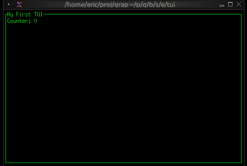
Styling and Theming
Graphix TUIs support rich styling with:
- Colors: Named colors (
Red,Green,Blue), indexed colors (Indexed(202)), and RGB (Rgb({r: 255, g: 100, b: 50})) - Text Effects: Bold, italic
- Background Colors: Set background colors for any component
- Conditional Styling: Use
selectexpressions to change styles based on state
Many widgets take optional style arguments, allowing styling to be applied at many levels.
use tui;
let is_selected = true;
style(
#fg: select is_selected { true => `Yellow, false => `White },
#bg: `DarkGray,
#add_modifier: [`Bold]
)
Layout System
The layout system provides flexible component arrangement:
- Direction:
HorizontalorVertical - Constraints:
Percentage(50),Length(20),Min(10),Max(100) - Alignment:
Left,Center,Rightfor horizontal;Top,Center,Bottomfor vertical - Focus Management: Built-in focus handling for interactive components
use tui;
use tui::layout;
use tui::text;
let selected_pane = 0;
let sidebar = text(&"Sidebar");
let main_content = text(&"Main");
layout(
#direction: &`Horizontal,
#focused: &selected_pane,
&[
child(#constraint: `Percentage(30), sidebar),
child(#constraint: `Percentage(70), main_content)
]
)
State Management
In Graphix, UI state is just regular program state. Use variables to track:
- Selection states in lists and tables
- Input field contents
- Window/pane focus
- Application modes (normal, edit, command)
State changes automatically trigger UI updates:
use tui;
use tui::list;
use tui::text;
let selected_item = 0;
let items = [line("Item 1"), line("Item 2"), line("Item 3")];
let arrow_pressed = never();
// When user presses down arrow assume the event is handled as
// shown above and arrow_pressed is set using connect
selected_item <- arrow_pressed ~ ((selected_item + 1) % array::len(items));
// UI automatically reflects the change
list(#selected: &selected_item, &items)
Real-time Data Integration
Graphix TUIs excel at displaying real-time data. Connect to data sources via netidx and the UI updates automatically:
use tui;
use tui::gauge;
use tui::text;
use core::math;
use sys;
use sys::net;
use sys::time;
// Self-contained: publish a simulated temperature reading once a
// second, then subscribe to it for display. Drop the publish to
// point the gauge at any other publisher.
//
// The gauge below renders `temperature / 100.0` as its ratio, so
// `temperature` is published in the 0–100 range (the gauge clamps
// anything outside [0, 1] and warns).
let tick = time::timer(duration:1.s, true);
let t = cast<f64>(count(tick))$;
let temp_source = 50.0;
temp_source <- tick ~ 50.0 + 25.0 * math::sin(t / 5.0);
sys::net::publish("/local/graphix/overview_realtime/temperature", temp_source);
let temperature: f64 = sys::net::subscribe("/local/graphix/overview_realtime/temperature")?;
// Will display updates automatically when data changes
gauge(
#gauge_style: &style(#fg: `Red),
#label: &span("Temperature"),
&(temperature / 100.0)
)
Style
Styles control the visual appearance of TUI widgets, including colors and text modifiers. Most widgets accept style parameters to customize their appearance.
Colors
The Color type defines available colors:
type Color = [
`Reset,
`Black,
`Red,
`Green,
`Yellow,
`Blue,
`Magenta,
`Cyan,
`Gray,
`DarkGray,
`LightRed,
`LightGreen,
`LightYellow,
`LightBlue,
`LightMagenta,
`LightCyan,
`White,
`Rgb({ r: i64, g: i64, b: i64 }),
`Indexed(i64)
];
Use Reset to return to the terminal’s default color. Use Rgb for 24-bit true
color, or Indexed for 256-color palette indices.
Modifiers
Text modifiers change the appearance of text:
type Modifier = [
`Bold,
`Italic
];
The Style Type
A Style combines foreground color, background color, underline color, and
modifiers:
type Style = {
fg: [Color, null],
bg: [Color, null],
underline_color: [Color, null],
add_modifier: [Array<Modifier>, null],
sub_modifier: [Array<Modifier>, null]
};
Creating Styles
Use the tui::style function to create styles. All parameters are optional:
val style: fn(
?#fg: [Color, null],
?#bg: [Color, null],
?#underline_color: [Color, null],
?#add_modifier: [Array<Modifier>, null],
?#sub_modifier: [Array<Modifier>, null]
) -> Style;
Examples:
// Red foreground
tui::style(#fg: `Red)
// Green text on black background
tui::style(#fg: `Green, #bg: `Black)
// Bold yellow text
tui::style(#fg: `Yellow, #add_modifier: [`Bold])
// Bold italic text with RGB color
tui::style(#fg: `Rgb({ r: 255, g: 128, b: 0 }), #add_modifier: [`Bold, `Italic])
// Default style (no customization)
tui::style()
Spans and Lines
Styles are commonly used with Span and Line types to create styled text.
Spans
A Span is a piece of text with a single style:
type Span = {
style: Style,
content: string
};
val span: fn(?#style: Style, s: string) -> Span;
Example:
// Create a red "Error:" span
tui::span(#style: tui::style(#fg: `Red), "Error:")
// Plain text span (default style)
tui::span("Hello")
Lines
A Line contains one or more spans with optional alignment:
type Alignment = [
`Left,
`Center,
`Right
];
type Line = {
style: Style,
alignment: [Alignment, null],
spans: [Array<Span>, string]
};
val line: fn(?#style: Style, ?#alignment: [Alignment, null], v: [Array<Span>, string]) -> Line;
The spans field can be either an array of spans (for mixed styling) or a
simple string (which will use the line’s style).
Examples:
// Simple centered line
tui::line(#alignment: `Center, "Centered Text")
// Line with mixed styles
tui::line([
tui::span(#style: tui::style(#fg: `Red, #add_modifier: [`Bold]), "Error: "),
tui::span("Something went wrong")
])
// Right-aligned with style
tui::line(#style: tui::style(#fg: `Gray), #alignment: `Right, "Status: OK")
Using Styles with Widgets
Most widgets accept style parameters. For example:
// Styled paragraph
tui::paragraph::paragraph(
#style: &tui::style(#fg: `White, #bg: `Blue),
&"Hello, styled world!"
)
// Styled gauge
tui::gauge::gauge(
#style: &tui::style(#fg: `Green),
&0.75
)
See individual widget documentation for specific style parameters they accept.
The Bar Chart Widget
The barchart widget displays categorical data as vertical bars, supporting grouped bars, custom styling, and dynamic updates. It’s ideal for comparing values across categories, showing rankings, or displaying resource usage.
Interface
type Bar = {
label: &[Line, null],
style: &[Style, null],
text_value: &[string, null],
value: &i64,
value_style: &[Style, null]
};
val bar: fn(
?#label: &[Line, null],
?#style: &[Style, null],
?#text_value: &[string, null],
?#value_style: &[Style, null],
n: &i64
) -> Bar;
type BarGroup = {
bars: Array<Bar>,
label: [Line, null]
};
val bar_group: fn(
?#label: [Line, null],
a: Array<Bar>
) -> BarGroup;
val bar_chart: fn(
?#bar_gap: &[i64, null],
?#bar_style: &[Style, null],
?#bar_width: &[i64, null],
?#direction: &[Direction, null],
?#group_gap: &[i64, null],
?#label_style: &[Style, null],
?#max: &[i64, null],
?#style: &[Style, null],
?#value_style: &[Style, null],
a: &Array<BarGroup>
) -> Tui;
Parameters
bar_chart
- max - Maximum value for chart scale (auto-scales if not specified)
- bar_width - Width of each bar in characters
- bar_gap - Space between bars within a group
- group_gap - Space between bar groups
- style - Base style for the chart
bar_group
- label - Line labeling the group (displayed below bars)
bar
- style - Style for the bar
- label - Line labeling the bar
- text_value - Line displayed above bar (defaults to numeric value)
Examples
Basic Usage
use tui;
use tui::barchart;
let bar1 = bar(
#style: &style(#fg: `Cyan),
#label: &line("Sales"),
&42
);
bar_chart(&[bar_group(#label: line("Q1"), [bar1])])
Grouped Bars with Dynamic Data
use tui;
use tui::barchart;
use tui::block;
use rand;
let clock = sys::time::timer(duration:0.7s, true);
let group0 = [
bar(#style: &style(#fg: `Red), #label: &line("CPU"), &rand(#start:0, #end:100, #clock)),
bar(#style: &style(#fg: `Yellow), #label: &line("Memory"), &rand(#start:25, #end:200, #clock))
];
let group1 = [
bar(#style: &style(#fg: `Cyan), #label: &line("Network"), &rand(#start:0, #end:50, #clock)),
bar(#style: &style(#fg: `Magenta), #label: &line("Disk"), &rand(#start:1, #end:25, #clock))
];
let chart = bar_chart(
#bar_gap: &2,
#bar_width: &8,
#max: &200,
&[
bar_group(#label: line("Server 1"), group0),
bar_group(#label: line("Server 2"), group1)
]
);
block(#border: &`All, #title: &line("Resource Usage"), &chart)
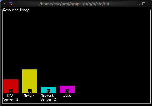
Color-coded Values
use tui;
use tui::barchart;
let make_colored_bar = |label, value| {
let color = select value {
v if v > 80 => `Red,
v if v > 50 => `Yellow,
_ => `Green
};
bar(#style: &style(#fg: color), #label: &line(label), &value)
};
let bars = [
make_colored_bar("Service A", 35),
make_colored_bar("Service B", 65),
make_colored_bar("Service C", 92)
];
bar_chart(&[bar_group(bars)])
See Also
- chart - For continuous data visualization
- sparkline - For compact trend display
- gauge - For single value display
The Block Widget
The block widget is a container that wraps other widgets with optional borders, titles, and styling. It’s one of the most commonly used widgets for creating structured layouts and visually separating different sections of your TUI.
Interface
type Border = [
`Top,
`Right,
`Bottom,
`Left
];
type BorderType = [
`Plain,
`Rounded,
`Double,
`Thick,
`QuadrantInside,
`QuadrantOutside
];
type Padding = {
bottom: i64,
left: i64,
right: i64,
top: i64
};
type Position = [
`Top,
`Bottom
];
type MergeStrategy = [
`Replace,
`Exact,
`Fuzzy
];
val block: fn(
?#border: &[Array<Border>, `All, `None, null],
?#border_type: &[BorderType, null],
?#border_style: &[Style, null],
?#merge_borders: &[MergeStrategy, null],
?#padding: &[Padding, null],
?#style: &[Style, null],
?#title: &[Line, null],
?#title_top: &[Line, null],
?#title_bottom: &[Line, null],
?#title_style: &[Style, null],
?#title_position: &[Position, null],
?#title_alignment: &[Alignment, null],
?#size: &[Size, null],
a: &Tui
) -> Tui;
Parameters
- border - Border style:
All,None,Top,Bottom,Left, orRight - border_style - Style for the border
- merge_borders - Strategy for merging borders of adjacent blocks:
Replace,Exact, orFuzzy - title - Line displayed at the top of the block
- title_bottom - Line displayed at the bottom of the block
- style - Style for the block’s interior
- size (output) - Rendered size of the block
Examples
Basic Usage
use tui;
use tui::block;
use tui::paragraph;
let content = paragraph(&"Hello, World!");
block(
#border: &`All,
#title: &line("My Block"),
&content
)
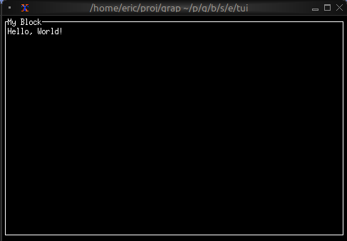
Focus Indication
Use dynamic styling to show which block has focus:
use tui;
use tui::block;
use tui::paragraph;
let focused_block = 0;
let content = paragraph(&"Content here");
block(
#border: &`All,
#border_style: &style(
#fg: select focused_block {
0 => `Red,
_ => `Yellow
}
),
#title: &line("Block 1"),
&content
)
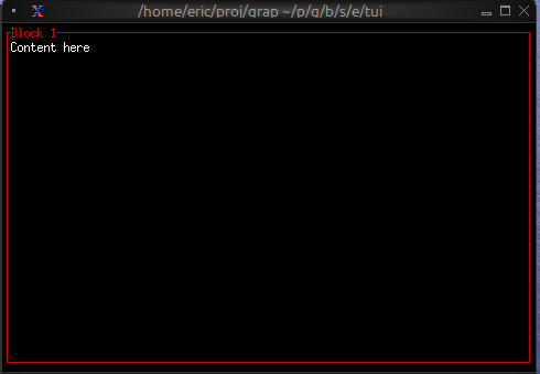
Dynamic Titles
Titles can contain reactive values that update automatically:
use tui;
use tui::block;
use tui::paragraph;
let count = count(sys::time::timer(duration:1.s, true));
let content = paragraph(&"Content here");
block(
#border: &`All,
#title: &line("Counter: [count]"),
&content
)
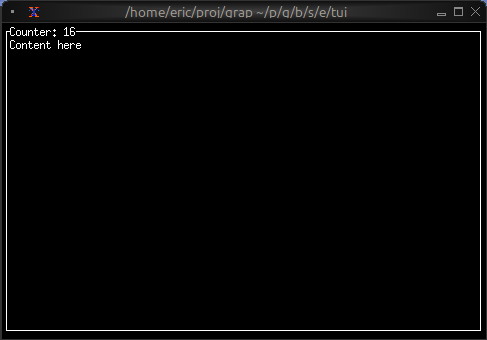
See Also
- layout - For arranging multiple blocks
- paragraph - Common content for blocks
- text - For creating styled text content
The Browser Widget
The browser widget provides a specialized interface for browsing and interacting with netidx hierarchies. It displays netidx paths in a tree structure with keyboard navigation, selection, and cursor movement support.
Interface
type MoveCursor = [
`Left(i64),
`Right(i64),
`Up(i64),
`Down(i64)
];
val browser: fn(
?#selected_style: Style,
?#header_style: Style,
?#style: Style,
?#cursor: MoveCursor,
?#selected_row: &string,
?#selected_path: &string,
?#flex: Flex,
?#rate: duration,
#size: Size,
s: string
) -> Tui;
Parameters
- cursor - Programmatic cursor movement:
Left(n),Right(n),Up(n),Down(n) - selected_row (output) - Display name of the selected row
- selected_path (output, required) - Full path of the currently selected item
- size (output) - Rendered size of the browser
Examples
Basic Usage
use tui;
use tui::browser;
let selected_path: string = never();
browser(
#size: {width: 40, height: 10},
#selected_path: &selected_path,
"/" // Start browsing from root
)
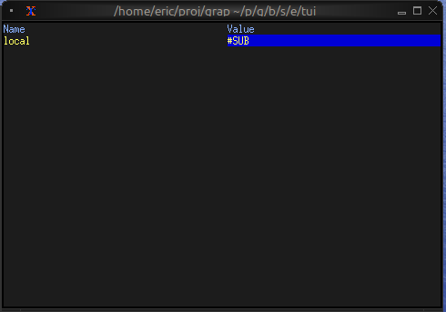
Basic Navigation
use tui;
use tui::browser;
use tui::input_handler;
let path = "/";
let selected_path: string = never();
let selected_row: string = never();
let cursor: MoveCursor = never();
let handle_event = |e: Event| -> [`Stop, `Continue] select e {
`Key(k) => select k.kind {
`Press => select k.code {
e@ `Up => { cursor <- e ~ `Up(1); `Stop },
e@ `Down => { cursor <- e ~ `Down(1); `Stop },
e@ `Left => { cursor <- e ~ `Left(1); `Stop },
e@ `Right => { cursor <- e ~ `Right(1); `Stop },
e@ `Enter => { path <- e ~ selected_row; `Stop },
_ => `Continue
},
_ => `Continue
},
_ => `Continue
};
input_handler(
#handle: &handle_event,
&browser(
#size: {width: 80, height: 24},
#cursor,
#selected_path: &selected_path,
#selected_row: &selected_row,
path
)
)
See Also
- list - For simpler selection interfaces
- table - For tabular data display
- block - For containing browsers with borders
The Calendar Widget
The calendar widget displays a monthly calendar view with support for highlighting specific dates and displaying events. It’s perfect for date pickers, event schedulers, and time-based visualizations.
Interface
type Date = {
year: i64,
month: i64,
day: i64
};
val date: fn(year: i64, month: i64, day: i64) -> Date;
type CalendarEvent = {
date: Date,
style: Style
};
val calendar_event: fn(style: Style, date: Date) -> CalendarEvent;
val calendar: fn(
?#default_style: &[Style, null],
?#show_month: &[Style, null],
?#show_surrounding: &[Style, null],
?#show_weekday: &[Style, null],
?#events: &[Array<CalendarEvent>, null],
display_date: &Date
) -> Tui;
Parameters
calendar
- show_month - Style for the month header
- show_weekday - Style for weekday headers (Mon, Tue, etc.)
- show_surrounding - Style for dates from surrounding months
- events - Array of CalendarEvent objects to highlight dates
calendar_event
Takes a style and a date to create an event marker.
date
Creates a date with year, month (1-12), and day (1-31).
Examples
Basic Usage
use tui;
use tui::calendar;
let current_date = date(2024, 5, 15);
calendar(¤t_date)
Event Calendar
use tui;
use tui::calendar;
use tui::block;
use tui::text;
let today = date(2024, 5, 15);
let events = [
calendar_event(style(#fg: `Red), date(2024, 5, 5)),
calendar_event(style(#fg: `Green), date(2024, 5, 15)),
calendar_event(style(#fg: `Yellow), date(2024, 5, 20)),
calendar_event(style(#fg: `Cyan), date(2024, 5, 28))
];
block(
#border: &`All,
#title: &line("May 2024"),
&calendar(
#show_month: &style(#fg: `Yellow, #add_modifier: [`Bold]),
#show_weekday: &style(#fg: `Cyan),
#show_surrounding: &style(#fg: `DarkGray),
#events: &events,
&today
)
)
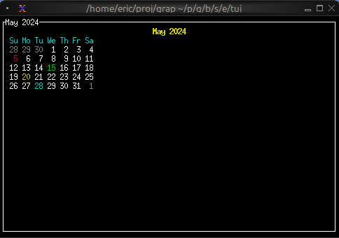
Color-coded Events by Type
use tui;
use tui::calendar;
type EventType = [`Meeting, `Deadline, `Holiday, `Birthday];
type CalendarEntry = {date: Date, event_type: EventType};
let entries = [
{date: date(2024, 5, 5), event_type: `Meeting},
{date: date(2024, 5, 10), event_type: `Deadline},
{date: date(2024, 5, 15), event_type: `Holiday},
{date: date(2024, 5, 25), event_type: `Birthday}
];
let event1 = calendar_event(style(#fg: `Blue), date(2024, 5, 5));
let event2 = calendar_event(style(#fg: `Red), date(2024, 5, 10));
let event3 = calendar_event(style(#fg: `Green), date(2024, 5, 15));
let event4 = calendar_event(style(#fg: `Magenta), date(2024, 5, 25));
let events = [event1, event2, event3, event4];
calendar(#events: &events, &date(2024, 5, 1))
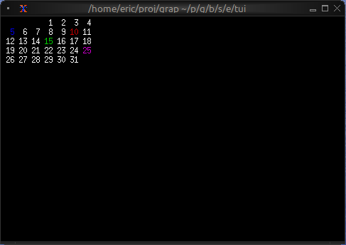
See Also
- table - For tabular date-based data
- list - For event lists
- block - For containing calendars with borders
The Canvas Widget
The canvas widget provides a low-level drawing surface for custom graphics. You can draw lines, circles, rectangles, points, and text labels at specific coordinates, making it perfect for diagrams, plots, and custom visualizations.
Interface
type CanvasLine = {
color: Color,
x1: f64,
x2: f64,
y1: f64,
y2: f64
};
type CanvasCircle = {
color: Color,
radius: f64,
x: f64,
y: f64
};
type CanvasRectangle = {
color: Color,
height: f64,
width: f64,
x: f64,
y: f64
};
type CanvasPoints = {
color: Color,
coords: Array<(f64, f64)>
};
type CanvasLabel = {
line: Line,
x: f64,
y: f64
};
type CanvasShape = [
`Line(CanvasLine),
`Circle(CanvasCircle),
`Rectangle(CanvasRectangle),
`Points(CanvasPoints),
`Label(CanvasLabel)
];
val canvas: fn(
?#background_color: &[Color, null],
?#marker: &[Marker, null],
#x_bounds: &{ max: f64, min: f64 },
#y_bounds: &{ max: f64, min: f64 },
a: &Array<&CanvasShape>
) -> Tui;
Parameters
- background_color - Background color for the canvas
- marker - Marker type:
Dot,Braille(default), orBlock - x_bounds - X-axis range with
minandmaxfields (required) - y_bounds - Y-axis range with
minandmaxfields (required)
Shape Types
Line
`Line({color: `Red, x1: 0.0, y1: 0.0, x2: 10.0, y2: 5.0})
Circle
`Circle({color: `Blue, x: 5.0, y: 5.0, radius: 2.0})
Rectangle
`Rectangle({color: `Green, x: 2.0, y: 2.0, width: 3.0, height: 4.0})
Points
`Points({color: `Yellow, coords: [(1.0, 1.0), (2.0, 3.0), (3.0, 1.5)]})
Label
`Label({line: line("Hello"), x: 5.0, y: 0.5})
Examples
Basic Usage
use tui;
use tui::canvas;
let line = `Line({color: `Red, x1: 0.0, y1: 0.0, x2: 10.0, y2: 5.0});
let circle = `Circle({color: `Blue, x: 5.0, y: 5.0, radius: 2.0});
canvas(
#x_bounds: &{min: 0.0, max: 10.0},
#y_bounds: &{min: 0.0, max: 10.0},
&[&line, &circle]
)
Function Plotting
use tui;
use tui::canvas;
let coords = [
(0.0, 0.0), (0.5, 0.48), (1.0, 0.84), (1.5, 1.0),
(2.0, 0.91), (2.5, 0.60), (3.0, 0.14), (3.5, -0.35),
(4.0, -0.76), (4.5, -0.98), (5.0, -0.96)
];
let plot = `Points({color: `Cyan, coords});
canvas(
#x_bounds: &{min: 0.0, max: 10.0},
#y_bounds: &{min: -1.0, max: 1.0},
&[&plot]
)
Network Diagram
use tui;
use tui::canvas;
use tui::text;
let circle1 = `Circle({color: `Blue, x: 2.0, y: 5.0, radius: 0.5});
let circle2 = `Circle({color: `Blue, x: 8.0, y: 5.0, radius: 0.5});
let circle3 = `Circle({color: `Blue, x: 5.0, y: 8.0, radius: 0.5});
let line1 = `Line({color: `White, x1: 2.0, y1: 5.0, x2: 8.0, y2: 5.0});
let line2 = `Line({color: `White, x1: 2.0, y1: 5.0, x2: 5.0, y2: 8.0});
let line3 = `Line({color: `White, x1: 8.0, y1: 5.0, x2: 5.0, y2: 8.0});
let all_shapes = [&line1, &line2, &line3, &circle1, &circle2, &circle3];
canvas(
#x_bounds: &{min: 0.0, max: 10.0},
#y_bounds: &{min: 0.0, max: 10.0},
&all_shapes
)
Animated Graphics
use tui;
use tui::canvas;
let x = cast<f64>(count(sys::time::timer(0.1, true)))$ * 0.1 % 10.;
let moving_circle = `Circle({color: `Red, x, y: 5.0, radius: 1.0});
canvas(
#x_bounds: &{min: 0.0, max: 10.0},
#y_bounds: &{min: 0.0, max: 10.0},
&[&moving_circle]
)
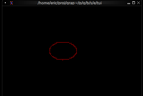
Marker Comparison
- Braille: Highest resolution, smoothest curves, best for detailed graphics
- Dot: Fast rendering, lower resolution, good for simple shapes
- Block: High contrast, blocky appearance, good for filled areas
Coordinate System
- Origin (0, 0) is at the bottom-left
- X increases to the right
- Y increases upward
- Shapes outside bounds are clipped
See Also
The Chart Widget
The chart widget renders line charts with multiple datasets, custom axes, labels, and styling. It’s ideal for visualizing time series data, trends, sensor readings, and any numeric data relationships.
Interface
type GraphType = [
`Scatter,
`Line,
`Bar
];
type LegendPosition = [
`Top,
`TopRight,
`TopLeft,
`Left,
`Right,
`Bottom,
`BottomRight,
`BottomLeft
];
type Axis = {
bounds: {min: f64, max: f64},
labels: [Array<Line>, null],
labels_alignment: [Alignment, null],
style: [Style, null],
title: [Line, null]
};
val axis: fn(
?#labels: [Array<Line>, null],
?#labels_alignment: [Alignment, null],
?#style: [Style, null],
?#title: [Line, null],
a: {min: f64, max: f64}
) -> Axis;
type Dataset = {
data: &Array<(f64, f64)>,
graph_type: &[GraphType, null],
marker: &[Marker, null],
name: &[Line, null],
style: &[Style, null]
};
val dataset: fn(
?#marker: &[Marker, null],
?#graph_type: &[GraphType, null],
?#name: &[Line, null],
?#style: &[Style, null],
a: &Array<(f64, f64)>
) -> Dataset;
type LegendConstraints = {
width: Constraint,
height: Constraint
};
val chart: fn(
?#hidden_legend_constraints: &[LegendConstraints, null],
?#legend_position: &[LegendPosition, null],
?#style: &[Style, null],
?#x_axis: &[Axis, null],
?#y_axis: &[Axis, null],
a: &Array<Dataset>
) -> Tui;
Parameters
chart
- style - Background style for the chart area
- x_axis - X-axis configuration (required)
- y_axis - Y-axis configuration (required)
axis
- title - Line for axis title
- labels - Array of lines displayed along axis
- style - Style for axis lines and ticks
dataset
- style - Style for the dataset (line and markers)
- graph_type -
LineorScatter - marker -
Dot,Braille, orBlock - name - Line naming the dataset (for legends)
Examples
Basic Usage
use tui;
use tui::chart;
let data: Array<(f64, f64)> = [(0.0, 0.0), (1.0, 1.0), (2.0, 4.0), (3.0, 9.0)];
let ds = dataset(
#style: &style(#fg: `Cyan),
#graph_type: &`Line,
#marker: &`Dot,
&data
);
chart(
#x_axis: &axis({min: 0.0, max: 3.0}),
#y_axis: &axis({min: 0.0, max: 9.0}),
&[ds]
)
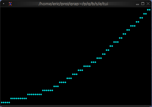
Real-time Data Visualization
use tui;
use tui::chart;
use tui::text;
let data: Array<(f64, f64)> = {
let clock = sys::time::timer(duration:0.5s, true);
let x = cast<f64>(count(clock))$;
let y = rand::rand(#clock, #start: f64:0., #end: f64:100.);
let a = [];
a <- array::window(#n: 32, clock ~ a, (x, y));
a
};
let ds = dataset(
#style: &style(#fg: `Cyan),
#graph_type: &`Line,
#marker: &`Dot,
&data
);
let label_style = style(#fg: `Yellow);
chart(
#style: &style(#bg: `Rgb({r: 20, g: 20, b: 20})),
#x_axis: &axis(
#title: line(#style: label_style, "Time (s)"),
#labels: [
line(#style: label_style, "[(data[0]$).0]"),
line(#style: label_style, "[(data[-1]$).0]")
],
{min: (data[0]$).0, max: (data[-1]$).0}
),
#y_axis: &axis(
#title: line(#style: label_style, "Value"),
#labels: [
line("0"), line("50"), line("100")
],
{min: 0.0, max: 100.0}
),
&[ds]
)
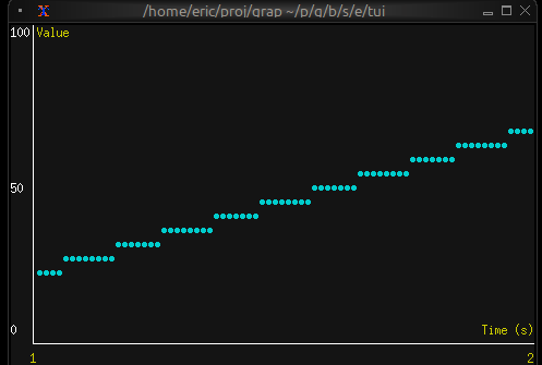
Multiple Datasets
use tui;
use tui::chart;
use tui::text;
let temp_data = [(0.0, 20.0), (1.0, 22.0), (2.0, 21.5)];
let humidity_data = [(0.0, 50.0), (1.0, 55.0), (2.0, 52.0)];
let temp_ds = dataset(
#style: &style(#fg: `Red),
#name: &line("Temperature"),
&temp_data
);
let humidity_ds = dataset(
#style: &style(#fg: `Blue),
#name: &line("Humidity"),
&humidity_data
);
let x_axis =
axis(#labels: [line("0"), line("1"), line("2")], {min: 0.0, max: 2.0});
let y_axis =
axis(#labels: [line("0"), line("50"), line("100")], {min: 0.0, max: 100.0});
chart(
#x_axis: &x_axis,
#y_axis: &y_axis,
&[temp_ds, humidity_ds]
)
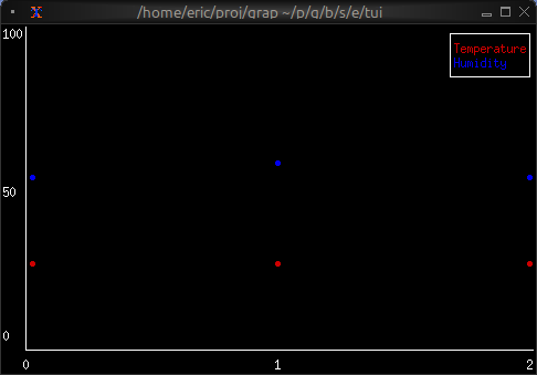
Marker Comparison
- Dot: Fastest, lowest resolution, good for dense data
- Braille: Smoothest curves, medium performance, best visual quality
- Block: High contrast, medium performance
See Also
- barchart - For categorical data visualization
- sparkline - For compact inline charts
- canvas - For custom graphics
The Text Widget
The text widget renders styled text in the terminal. It’s a fundamental building block for displaying formatted content with colors, modifiers, and multiple lines. Text is built from Line objects, which are in turn composed of Span objects.
Interface
val text: fn(
?#style: &Style,
?#alignment: &[Alignment, null],
v: &[Array<Line>, string]
) -> Tui;
The text widget uses types from the style module including Style, Line, Span, Color, Modifier, and Alignment.
Text Hierarchy
- Span: A single segment of text with a single style
- Line: A collection of spans forming one line
- Text: A collection of lines forming multi-line content
Examples
Basic Usage
use tui;
use tui::text;
text(&"Hello, World!")
Status Messages
use tui;
use tui::text;
let make_status = |level, msg| select level {
`Error => line([
span(#style: style(#fg: `Red, #add_modifier: [`Bold]), "ERROR: "),
span(msg)
]),
`Warning => line([
span(#style: style(#fg: `Yellow, #add_modifier: [`Bold]), "WARNING: "),
span(msg)
]),
`Info => line([
span(#style: style(#fg: `Cyan), "INFO: "),
span(msg)
])
};
text(&[
make_status(`Info, "Application started"),
make_status(`Warning, "Cache miss"),
make_status(`Error, "Connection failed")
])
Dynamic Colors
use tui;
use tui::text;
let count = count(sys::time::timer(duration:1.s, true));
let colors = [`Red, `Green, `Yellow, `Blue, `Magenta, `Cyan];
let color = colors[count % array::len(colors)]$;
let l = line([
span(#style: style(#fg: `White), "Count: "),
span(#style: style(#fg: color, #add_modifier: [`Bold]), "[count]")
]);
text(&[l])
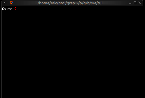
Alignment
use tui;
use tui::text;
text(&[
line(#alignment: `Left, "Left aligned"),
line(#alignment: `Center, "Centered"),
line(#alignment: `Right, "Right aligned")
])
Color Support
- Named colors:
Red,Green,Blue,Yellow,Magenta,Cyan,White,Black,Gray,DarkGray, andLight*variants - Indexed colors:
Indexed(202)for 256-color palette - RGB colors:
Rgb({r: 255, g: 100, b: 50})for true color
Text Modifiers
Bold,Italic
See Also
- paragraph - For wrapped and scrollable text
- block - For containing text with borders
- list - For selectable text items
The Paragraph Widget
The paragraph widget displays multi-line text with automatic word wrapping and scrolling support. It’s ideal for displaying long text content, logs, or any content that needs to flow across multiple lines.
Interface
val paragraph: fn(
?#style: &Style,
?#alignment: &[Alignment, null],
?#scroll: &{x: i64, y: i64},
?#trim: &bool,
v: &[Array<Line>, string]
) -> Tui;
Parameters
- scroll - Record with
xandyfields for scroll position - alignment -
Left,Center, orRight - trim - Trim leading whitespace when wrapping (default: true)
Examples
Basic Usage
use tui;
use tui::paragraph;
paragraph(&"This is a simple paragraph. It will automatically wrap to fit the available width.")
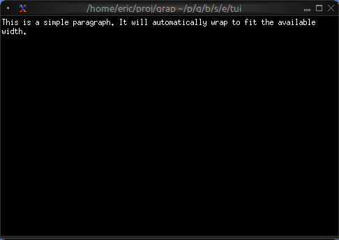
Scrollable Content
use tui;
use tui::paragraph;
use tui::block;
use tui::text;
use tui::input_handler;
let long_text = "I have got a lovely bunch of coconuts. Very long text continues here. More text. Even more text. This is a very long paragraph that will need scrolling to see all of it.";
let scroll_y = 0;
let handle_event = |e: Event| -> [`Stop, `Continue] select e {
`Key(k) => select k.kind {
`Press => select k.code {
k@`Up if scroll_y > 0 => {
scroll_y <- (k ~ scroll_y) - 1;
`Stop
},
k@`Down if scroll_y < 100 => {
scroll_y <- (k ~ scroll_y) + 1;
`Stop
},
_ => `Continue
},
_ => `Continue
},
_ => `Continue
};
input_handler(
#handle: &handle_event,
&block(
#border: &`All,
#title: &line("Scrollable Text"),
¶graph(
#scroll: &{x: 0, y: scroll_y},
&long_text
)
)
)
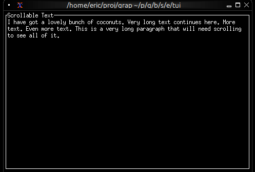
Live Log Viewer
Display real-time updating content:
use tui;
use tui::paragraph;
use tui::text;
use sys;
use sys::net;
use sys::time;
// Self-contained: publish a simulated log entry every second, then
// subscribe to display the rolling window. Drop the publish to point
// the viewer at any other string publisher.
let tick = time::timer(duration:1.s, true);
let n = count(tick);
let messages = [
"request handled",
"cache miss",
"user signed in",
"background job complete",
"config reloaded",
];
let log_source = "";
log_source <- tick ~ "[n] [rand::pick(tick ~ messages)]";
sys::net::publish("/local/graphix/paragraph_log_viewer/log", log_source);
let log_entries = [];
let new_entry: string = sys::net::subscribe("/local/graphix/paragraph_log_viewer/log")?;
log_entries <- array::window(
#n: 100,
new_entry ~ log_entries,
line(new_entry)
);
paragraph(&log_entries)
Centered Message
use tui;
use tui::paragraph;
use tui::text;
paragraph(
#alignment: &`Center,
&[
line(""),
line(#style: style(#fg: `Yellow, #add_modifier: [`Bold]), "Welcome"),
line(""),
line("Press any key to continue")
]
)
Word Wrapping
The paragraph widget automatically wraps long lines to fit the available width. Word boundaries are respected, so words won’t be split in the middle unless they’re longer than the available width.
See Also
- text - For creating styled text content
- scrollbar - For adding scrollbars
- block - For containing paragraphs with borders
- list - For line-by-line selectable content
The Gauge Widget
The gauge widget displays a single value as a filled progress indicator, perfect for showing percentages, completion status, or resource usage. It provides a clear visual representation of how full or complete something is.
Interface
val gauge: fn(
?#gauge_style: &[Style, null],
?#label: &[Span, null],
?#style: &[Style, null],
?#use_unicode: &[bool, null],
x: &f64
) -> Tui;
Parameters
- gauge_style - Style for the filled portion
- label - Line or span displayed in the center
- use_unicode - Use Unicode block characters for smoother rendering
- style - Style for the unfilled portion
Examples
Basic Usage
use tui;
use tui::gauge;
let progress = 0.75; // 75%
gauge(
#gauge_style: &style(#fg: `Green),
&progress
)
Progress with Color Thresholds
use tui;
use tui::gauge;
use tui::block;
use tui::text;
let power = min(1., cast<f64>(count(sys::time::timer(0.5, true)))$ * 0.01);
let color = select power {
x if x < 0.10 => `Red,
x if x < 0.25 => `Yellow,
x => `Green
};
let percentage = cast<i64>(power * 100.0)?;
block(
#border: &`All,
#title: &line("Power Level"),
&gauge(
#gauge_style: &style(#fg: color),
#label: &span("[percentage]%"),
&power
)
)
Resource Usage
use tui;
use tui::gauge;
use tui::text;
let used_memory = 6.5; // GB
let total_memory = 16.0; // GB
let usage_ratio = used_memory / total_memory;
let color = select usage_ratio {
x if x > 0.9 => `Red,
x if x > 0.7 => `Yellow,
_ => `Green
};
gauge(
#gauge_style: &style(#fg: color),
#label: &span("[used_memory] GB / [total_memory] GB"),
&usage_ratio
)
See Also
- linegauge - For horizontal line-based gauges
- sparkline - For historical trend display
- barchart - For comparing multiple values
The Line Gauge Widget
The line_gauge widget displays a horizontal progress indicator using line-drawing characters. It’s more compact than gauge and ideal for dashboards where vertical space is limited.
Interface
val line_gauge: fn(
?#filled_style: &[Style, null],
?#filled_symbol: &[string, null],
?#label: &[Line, null],
?#style: &[Style, null],
?#unfilled_style: &[Style, null],
?#unfilled_symbol: &[string, null],
x: &f64
) -> Tui;
Parameters
- filled_style - Style for the filled portion
- filled_symbol - Character used to draw the filled portion
- unfilled_style - Style for the unfilled portion
- unfilled_symbol - Character used to draw the unfilled portion
- label - Line or span displayed within the gauge
- style - Base style for the widget
Examples
Basic Usage
use tui;
use tui::line_gauge;
let progress = 0.75; // 75%
line_gauge(
#filled_style: &style(#fg: `Green),
&progress
)
Color-coded Status
use tui;
use tui::line_gauge;
use tui::block;
use tui::text;
let power = min(1., cast<f64>(count(sys::time::timer(0.5, true)))$ * 0.01);
let color = select power {
x if x < 0.10 => `Red,
x if x < 0.25 => `Yellow,
x => `Green
};
let percentage = cast<i64>(power * 100.0)?;
block(
#border: &`All,
#title: &line("Power"),
&line_gauge(
#filled_style: &style(#fg: color),
#label: &line("[percentage]%"),
&power
)
)
Compact Multi-metric Display
use tui;
use tui::line_gauge;
use tui::text;
use tui::layout;
layout(
#direction: &`Vertical,
&[
child(#constraint: `Percentage(5), line_gauge(
#filled_style: &style(#fg: `Red),
#label: &line("CPU 45%"),
&0.45
)),
child(#constraint: `Percentage(5), line_gauge(
#filled_style: &style(#fg: `Yellow),
#label: &line("MEM 67%"),
&0.67
)),
child(#constraint: `Percentage(5), line_gauge(
#filled_style: &style(#fg: `Green),
#label: &line("DSK 23%"),
&0.23
))
]
)
Use Cases
- System resource monitors (CPU, RAM, disk, network)
- Download/upload progress indicators
- Compact status dashboards
- Progress tracking in limited space
Comparison with gauge
Use line_gauge when:
- You need compact, single-line displays
- Vertical space is limited
- You want a more technical/modern look
Use gauge when:
- You have more vertical space available
- You want larger, more prominent indicators
See Also
- gauge - For block-style progress indicators
- sparkline - For historical trend display
- barchart - For categorical value comparison
Input Handling
The input handling system allows TUI applications to respond to keyboard, mouse, and other terminal events. Input handlers wrap widgets and intercept events before they propagate further.
The Event Type
All terminal events are represented by the Event type:
type Event = [
`FocusGained,
`FocusLost,
`Key(KeyEvent),
`Mouse(MouseEvent),
`Paste(string),
`Resize(i64, i64)
];
FocusGained/FocusLost: Terminal window focus changesKey: Keyboard inputMouse: Mouse input (requirestui::mouse <- true)Paste: Bracketed paste contentResize: Terminal was resized to (columns, rows)
Keyboard Events
Keyboard events contain detailed information about key presses:
type KeyEvent = {
code: KeyCode,
kind: KeyEventKind,
modifiers: Array<KeyModifier>,
state: Array<KeyEventState>
};
Key Codes
type KeyCode = [
`Backspace,
`Enter,
`Left,
`Right,
`Up,
`Down,
`Home,
`End,
`PageUp,
`PageDown,
`Tab,
`BackTab,
`Delete,
`Insert,
`F(i64),
`Char(string),
`Null,
`Esc,
`CapsLock,
`ScrollLock,
`NumLock,
`PrintScreen,
`Pause,
`Menu,
`KeypadBegin,
`Media(MediaKeyCode),
`Modifier(ModifierKeyCode)
];
Character keys use Char(string), e.g., Char("a") or Char("A").
Function keys use F(i64), e.g., F(1) for F1.
Key Event Kind
type KeyEventKind = [
`Press,
`Repeat,
`Release
];
Most applications only care about Press events.
Key Modifiers
type KeyModifier = [
`Shift,
`Control,
`Alt,
`Super,
`Hyper,
`Meta
];
The modifiers array contains all modifiers held during the key event.
Mouse Events
Mouse events require enabling mouse support first:
tui::mouse <- true
Mouse events contain position and action information:
type MouseEvent = {
column: i64,
kind: MouseEventKind,
modifiers: Array<KeyModifier>,
row: i64
};
type MouseEventKind = [
`Down(MouseButton),
`Up(MouseButton),
`Drag(MouseButton),
`Moved,
`ScrollDown,
`ScrollUp,
`ScrollLeft,
`ScrollRight
];
type MouseButton = [
`Left,
`Right,
`Middle
];
Creating Input Handlers
Use tui::input_handler::input_handler to wrap a widget with event handling:
val input_handler: fn(
?#enabled: &[bool, null],
#handle: &fn(a: Event) -> [`Stop, `Continue] throws 'e,
a: &Tui
) -> Tui throws 'e;
The handler function receives events and returns:
Stop: The event was handled; don’t propagate to other handlersContinue: Pass the event to the next handler
Basic Example
let count = 0;
tui::input_handler::input_handler(
#handle: &|event| select event {
`Key({ code: `Char("q"), .. }) => {
// Exit on 'q'
`Stop
},
e@ `Key({ code: `Up, .. }) => {
count <- e ~ count + 1;
`Stop
},
e@ `Key({ code: `Down, .. }) => {
count <- e ~ count - 1;
`Stop
},
_ => `Continue
},
&tui::paragraph::paragraph("[count]")
)
Conditional Handling
The #enabled parameter allows dynamically enabling/disabling a handler:
let editing = false;
tui::input_handler::input_handler(
#enabled: &editing,
#handle: &|event| select event {
`Key({ code: `Esc, .. }) => {
editing <- false;
`Stop
},
`Key({ code: `Char(c), .. }) => {
// Handle character input when editing
`Stop
},
_ => `Continue
},
&tui::paragraph::paragraph("Edit mode")
)
Event Propagation
Input handlers form a stack. Events flow from the outermost handler inward:
tui::input_handler::input_handler(
#handle: &|e| /* handler A */ `Continue,
&tui::input_handler::input_handler(
#handle: &|e| /* handler B */ `Continue,
&widget
)
)
If handler A returns Continue, the event reaches handler B. If either returns
Stop, propagation stops.
The Raw Event Stream
For advanced use cases, you can access the raw event stream directly via
tui::event:
select tui::event {
`Key(k) => dbg(k),
_ => ()
}
However, using input_handler is preferred as it integrates properly with the
widget tree and supports the enable/disable pattern.
Common Patterns
Vim-style Mode Switching
type Mode = [`Normal, `Insert];
let mode: Mode = `Normal;
tui::input_handler::input_handler(
#handle: &|event| select (mode, event) {
(`Normal, `Key({ code: `Char("i"), .. })) => {
mode <- `Insert;
`Stop
},
(`Insert, `Key({ code: `Esc, .. })) => {
mode <- `Normal;
`Stop
},
(`Insert, `Key({ code: `Char(c), .. })) => {
// Insert character
`Stop
},
_ => `Continue
},
&content
)
Focus Management
let focused = 0;
let num_widgets = 3;
tui::input_handler::input_handler(
#handle: &|event| select event {
`Key({ code: `Tab, .. }) => {
focused <- (focused + 1) % num_widgets;
`Stop
},
`Key({ code: `BackTab, .. }) => {
focused <- (focused - 1 + num_widgets) % num_widgets;
`Stop
},
_ => `Continue
},
&widgets
)
See Also
The Layout Widget
The layout widget arranges child widgets in horizontal or vertical layouts with flexible sizing constraints. It’s the primary tool for organizing complex TUI interfaces and supports focus management for interactive applications.
Interface
type Spacing = [
`Space(i64),
`Overlap(i64)
];
type Child = {
child: Tui,
constraint: Constraint,
size: &[Size, null]
};
val child: fn(
?#size: &[Size, null],
#constraint: Constraint,
a: Tui
) -> Child;
val layout: fn(
?#direction: &[Direction, null],
?#flex: &[Flex, null],
?#focused: &[i64, null],
?#horizontal_margin: &[i64, null],
?#margin: &[i64, null],
?#spacing: &[Spacing, null],
?#vertical_margin: &[i64, null],
a: &Array<Child>
) -> Tui;
Parameters
- direction -
HorizontalorVertical(default:Vertical) - focused - Index of the currently focused child (0-indexed)
- flex - Alignment when children don’t fill space:
Start,Center,End,SpaceAround,SpaceBetween
Constraint Types
- Percentage(n) - Allocates n% of available space
- Length(n) - Fixed width/height in cells
- Min(n) - At least n cells
- Max(n) - At most n cells
- Ratio(num, den) - Fractional allocation (num/den)
- Fill(n) - Takes remaining space after other constraints
Examples
Basic Layout
use tui;
use tui::layout;
use tui::block;
use tui::text;
let content1 = text(&"Sidebar content");
let content2 = text(&"Main content");
let sidebar = block(#border: &`All, #title: &line("Sidebar"), &content1);
let main = block(#border: &`All, #title: &line("Main"), &content2);
layout(
#direction: &`Horizontal,
&[
child(#constraint: `Percentage(30), sidebar),
child(#constraint: `Percentage(70), main)
]
)
Three-Pane Layout with Focus
use tui;
use tui::layout;
use tui::text;
use tui::input_handler;
use tui::block;
let focused = 0;
let handle_event = |e: Event| -> [`Stop, `Continue] select e {
`Key(k) => select k.kind {
`Press => select k.code {
k@`Tab => {
focused <- ((k ~ focused) + 1) % 3;
`Stop
},
_ => `Continue
},
_ => `Continue
},
_ => `Continue
};
let focused_border = |i| select focused { n if n == i => `All, _ => [`Top] };
let left_pane = block(#border:&focused_border(0), &text(&"Left"));
let center_pane = block(#border:&focused_border(1), &text(&"Center"));
let right_pane = block(#border:&focused_border(2), &text(&"Right"));
input_handler(
#handle: &handle_event,
&layout(
#direction: &`Horizontal,
#focused: &focused,
&[
child(#constraint: `Percentage(25), left_pane),
child(#constraint: `Percentage(50), center_pane),
child(#constraint: `Percentage(25), right_pane)
]
)
)
Nested Layouts
use tui;
use tui::layout;
use tui::text;
use tui::block;
let widget1 = block(#border:&`All, &text(&"Widget 1"));
let widget2 = block(#border:&`All, &text(&"Widget 2"));
let bottom_widget = block(#border:&`All, &text(&"Bottom"));
let top_row = layout(
#direction: &`Horizontal,
&[
child(#constraint: `Percentage(50), widget1),
child(#constraint: `Percentage(50), widget2)
]
);
layout(
#direction: &`Vertical,
&[
child(#constraint: `Percentage(50), top_row),
child(#constraint: `Percentage(50), bottom_widget)
]
)
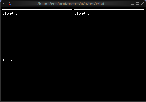
Header/Content/Footer
use tui;
use tui::layout;
use tui::text;
use tui::block;
let header = block(#border:&`All, &text(&"Header"));
let content = block(#border:&`All, &text(&"Main Content"));
let footer = block(#border:&`All, &text(&"Footer"));
layout(
#direction: &`Vertical,
&[
child(#constraint: `Percentage(20), header),
child(#constraint: `Fill(1), content),
child(#constraint: `Percentage(20), footer)
]
)
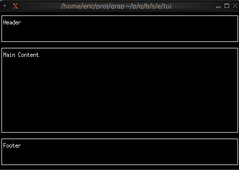
See Also
- block - Common child widget for layouts
- input_handler - For handling focus changes
The List Widget
The list widget displays a scrollable, selectable list of items with keyboard navigation support. It’s perfect for menus, file browsers, option selectors, and any interface that requires choosing from a list of items.
Interface
val list: fn(
?#highlight_spacing: &[HighlightSpacing, null],
?#highlight_style: &[Style, null],
?#highlight_symbol: &[string, null],
?#repeat_highlight_symbol: &[bool, null],
?#scroll: &[i64, null],
?#selected: &[i64, null],
?#style: &[Style, null],
a: &Array<Line>
) -> Tui;
Parameters
- selected - Index of the currently selected item (0-indexed)
- scroll - Scroll position (offset from the top)
- highlight_style - Style for the selected item
- highlight_symbol - String displayed before selected item (e.g., “▶ “)
- repeat_highlight_symbol - Whether to repeat symbol on wrapped lines
- style - Base style for all list items
Examples
Basic Usage
use tui;
use tui::list;
let items = [
line("Apple"),
line("Banana"),
line("Cherry")
];
list(
#selected: &0,
&items
)
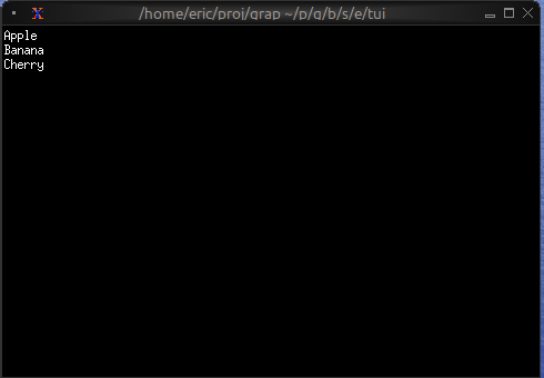
Interactive List with Navigation
use tui;
use tui::list;
use tui::block;
use tui::text;
use tui::input_handler;
let items = [
line("Apple"), line("Banana"), line("Cherry"),
line("Date"), line("Elderberry"), line("Fig"), line("Grape")
];
let last = array::len(items) - 1;
let selected = 0;
let scroll_pos = 0;
let visible = 5;
// Auto-scroll to keep selection visible
scroll_pos <- select selected {
s if s < scroll_pos => s,
s if s > (scroll_pos + visible - 1) => s - visible + 1,
_ => never()
};
let handle_event = |e: Event| -> [`Stop, `Continue] select e {
`Key(k) => select k.kind {
`Press => select k.code {
k@`Up if selected > 0 => {
selected <- (k ~ selected) - 1;
`Stop
},
k@`Down if selected < last => {
selected <- (k ~ selected) + 1;
`Stop
},
k@`Home => { selected <- k ~ 0; `Stop },
k@`End => { selected <- k ~ last; `Stop },
_ => `Continue
},
_ => `Continue
},
_ => `Continue
};
input_handler(
#handle: &handle_event,
&block(
#border: &`All,
#title: &line("Fruit Selection"),
&list(
#highlight_style: &style(#fg: `Black, #bg: `Yellow),
#highlight_symbol: &"▶ ",
#selected: &selected,
#scroll: &scroll_pos,
&items
)
)
)
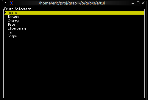
Styled Items
use tui;
use tui::list;
use tui::text;
let make_item = |text, priority| select priority {
`High => line(#style: style(#fg: `Red, #add_modifier: [`Bold]), text),
`Medium => line(#style: style(#fg: `Yellow), text),
`Low => line(#style: style(#fg: `White), text)
};
let items = [
make_item("Critical bug", `High),
make_item("Feature request", `Medium),
make_item("Documentation", `Low)
];
list(#selected: &0, &items)
See Also
- table - For multi-column structured data
- scrollbar - For adding scrollbars
- block - For containing lists with borders
- tabs - For switching between different lists
The Scrollbar Widget
The scrollbar widget adds a visual scrollbar indicator to scrollable content, making it clear when content extends beyond the visible area and showing the current scroll position.
Interface
type ScrollbarOrientation = [
`VerticalRight,
`VerticalLeft,
`HorizontalBottom,
`HorizontalTop
];
val scrollbar: fn(
?#begin_style: &[Style, null],
?#begin_symbol: &[string, null],
?#content_length: &[i64, null],
?#end_style: &[Style, null],
?#end_symbol: &[string, null],
?#orientation: &[ScrollbarOrientation, null],
?#position: &[i64, null],
?#size: &[Size, null],
?#style: &[Style, null],
?#thumb_style: &[Style, null],
?#thumb_symbol: &[string, null],
?#track_style: &[Style, null],
?#track_symbol: &[string, null],
?#viewport_length: &[i64, null],
a: &Tui
) -> Tui;
Parameters
- position (required) - Current scroll position (typically the Y offset)
- content_length - Total length of the content (auto-detected if not specified)
- size (output) - Rendered size of the scrollbar area
Examples
Basic Usage
use tui;
use tui::scrollbar;
use tui::paragraph;
let long_text = "This is a very long text that needs scrolling. More content here. Even more content. And even more. Keep going with lots of text to demonstrate scrolling.";
let position = 0;
let content = paragraph(
#scroll: &{x: 0, y: position},
&long_text
);
scrollbar(
#position: &position,
&content
)
Scrollable Paragraph
use tui;
use tui::scrollbar;
use tui::paragraph;
use tui::block;
use tui::text;
use tui::input_handler;
let long_text = "Very long text content...";
let position = 0;
let max_position = 100;
let handle_event = |e: Event| -> [`Stop, `Continue] select e {
`Key(k) => select k.kind {
`Press => select k.code {
k@`Up if position > 0 => {
position <- (k ~ position) - 1;
`Stop
},
k@`Down if position < max_position => {
position <- (k ~ position) + 1;
`Stop
},
k@`PageUp if position > 10 => {
position <- (k ~ position) - 10;
`Stop
},
k@`PageDown if position < (max_position - 10) => {
position <- (k ~ position) + 10;
`Stop
},
k@`Home => { position <- k ~ 0; `Stop },
k@`End => { position <- k ~ max_position; `Stop },
_ => `Continue
},
_ => `Continue
},
_ => `Continue
};
input_handler(
#handle: &handle_event,
&block(
#border: &`All,
#title: &line("Scrollable Content"),
&scrollbar(
#position: &position,
#content_length: &max_position,
¶graph(#scroll: &{x: 0, y: position}, &long_text)
)
)
)
Scrollable List
use tui;
use tui::scrollbar;
use tui::list;
use tui::text;
let items = [
line("Item 1"),
line("Item 2"),
line("Item 3"),
line("Item 4"),
line("Item 5")
];
let selected = 0;
let scroll_pos = 0;
let visible = 10;
// Auto-scroll to keep selection visible
scroll_pos <- select selected {
s if s < scroll_pos => s,
s if s >= (scroll_pos + visible) => s - visible + 1,
_ => never()
};
scrollbar(
#position: &scroll_pos,
&list(
#scroll: &scroll_pos,
#selected: &selected,
&items
)
)
See Also
- paragraph - For scrollable text content
- list - For scrollable lists
- table - For scrollable tables
- block - For containing scrollable content
The Sparkline Widget
The sparkline widget renders compact inline charts perfect for dashboards and status displays. It shows data trends in minimal space, with support for color-coded bars based on thresholds.
Interface
type RenderDirection = [
`LeftToRight,
`RightToLeft
];
type SparklineBar = {
style: [Style, null],
value: [f64, null]
};
val sparkline_bar: fn(
?#style: [Style, null],
v: [f64, null]
) -> SparklineBar;
val sparkline: fn(
?#absent_value_style: &[Style, null],
?#absent_value_symbol: &[string, null],
?#direction: &[RenderDirection, null],
?#max: &[i64, null],
?#style: &[Style, null],
a: &Array<[SparklineBar, f64, null]>
) -> Tui;
Parameters
sparkline
- max - Maximum value for scaling (auto-scales if not specified)
- style - Default style for bars
- direction -
LeftToRight(default) orRightToLeft
sparkline_bar
- style - Style for this specific bar
Examples
Basic Usage
use tui;
use tui::sparkline;
let data = [10.0, 25.0, 40.0, 55.0, 70.0, 85.0, 100.0];
sparkline(#max: &100, &data)
Threshold-based Coloring
use tui;
use tui::sparkline;
use tui::block;
use tui::text;
let data = {
let clock = sys::time::timer(duration:0.3s, true);
let v = rand::rand(#clock, #start:0., #end:100.);
let d = [];
let color = select v {
v if v <= 25. => `Green,
v if v <= 50. => `Yellow,
_ => `Red
};
let v = sparkline_bar(#style: style(#fg: color), v);
d <- array::window(#n:80, clock ~ d, v);
d
};
block(
#border: &`All,
#title: &line("Network Traffic Rate"),
&sparkline(
#style: &style(#fg: `Green),
#max: &100,
&data
)
)
Multi-metric Dashboard
use tui;
use tui::sparkline;
use tui::block;
use tui::text;
use tui::layout;
let cpu_data = [50., 60., 55., 70., 65.];
let mem_data = [30., 35., 40., 38., 42.];
let net_data = [10., 20., 15., 25., 30.];
layout(
#direction: &`Vertical,
&[
child(#constraint: `Percentage(33), block(
#title: &line("CPU"),
&sparkline(#style: &style(#fg: `Red), #max: &100, &cpu_data)
)),
child(#constraint: `Percentage(33), block(
#title: &line("Memory"),
&sparkline(#style: &style(#fg: `Yellow), #max: &100, &mem_data)
)),
child(#constraint: `Percentage(33), block(
#title: &line("Network"),
&sparkline(#style: &style(#fg: `Cyan), &net_data)
))
]
)
Sparkline from Netidx
This example is self-contained: it both publishes and subscribes to a
simulated CPU value over netidx, so you can run it without any
external publisher. Drop the publish call and point the subscribe at
a real path to chart live data instead — for example, the output of:
top | \
grep --line-buffered Cpu | \
awk '{ printf("/local/metrics/cpu|f64|%s\n", $6); fflush() }' | \
netidx publisher
use tui;
use tui::sparkline;
use core::math;
use sys;
use sys::net;
use sys::time;
// Self-contained: publish a simulated CPU value once a second, then
// subscribe to it for a rolling 60-sample sparkline. Drop the
// publish to point the chart at any other publisher.
let tick = time::timer(duration:1.s, true);
let t = cast<f64>(count(tick))$;
let cpu_source = 50.0;
cpu_source <- tick ~ 50.0 + 40.0 * math::sin(t / 7.0);
sys::net::publish("/local/graphix/sparkline_rolling/cpu", cpu_source);
let data: Array<f64> = [];
let new_value: f64 = sys::net::subscribe("/local/graphix/sparkline_rolling/cpu")?;
data <- array::window(
#n: 60,
new_value ~ data,
new_value
);
sparkline(#max: &100, &data)
Use Cases
Sparklines are ideal for:
- System resource monitoring (CPU, memory, network)
- Real-time metrics dashboards
- Compact data visualization in lists or tables
- Rate of change visualization
See Also
- chart - For detailed charts with axes
- gauge - For single current value display
- linegauge - For horizontal progress bars
The Table Widget
The table widget displays structured data in rows and columns with support for selection, scrolling, and custom styling. It’s ideal for data grids, process monitors, file listings, and any tabular data display.
Interface
type Cell = {
content: Line,
style: [Style, null]
};
val cell: fn(
?#style: [Style, null],
a: Line
) -> Cell;
type Row = {
bottom_margin: [i64, null],
cells: Array<Cell>,
height: [i64, null],
style: [Style, null],
top_margin: [i64, null]
};
val row: fn(
?#bottom_margin: [i64, null],
?#height: [i64, null],
?#style: [Style, null],
?#top_margin: [i64, null],
a: Array<Cell>
) -> Row;
val table: fn(
?#cell_highlight_style: &[Style, null],
?#column_highlight_style: &[Style, null],
?#column_spacing: &[i64, null],
?#flex: &[Flex, null],
?#footer: &[Row, null],
?#header: &[Row, null],
?#highlight_spacing: &[HighlightSpacing, null],
?#highlight_symbol: &[string, null],
?#row_highlight_style: &[Style, null],
?#selected: &[i64, null],
?#selected_cell: &[{x: i64, y: i64}, null],
?#selected_column: &[i64, null],
?#style: &[Style, null],
?#widths: &[Array<Constraint>, null],
a: &Array<&Row>
) -> Tui;
Parameters
- header - Row object for the table header
- selected - Index of the currently selected row
- row_highlight_style - Style for the selected row
- highlight_symbol - String before selected row
- highlight_spacing - When to show highlight symbol:
Always,WhenSelected,Never - widths - Array of column width constraints
- column_spacing - Number of spaces between columns
- style - Base style for the table
Examples
Basic Usage
use tui;
use tui::table;
let header = row([
cell(line("Name")),
cell(line("Age")),
cell(line("City"))
]);
let row1 = row([
cell(line("Alice")),
cell(line("28")),
cell(line("New York"))
]);
let row2 = row([
cell(line("Bob")),
cell(line("32")),
cell(line("San Francisco"))
]);
table(
#header: &header,
#selected: &0,
&[&row1, &row2]
)
Interactive Table
use tui;
use tui::table;
use tui::block;
use tui::text;
use tui::input_handler;
type User = {name: string, age: i64, city: string};
let users: Array<User> = [
{name: "Alice", age: 28, city: "New York"},
{name: "Bob", age: 32, city: "San Francisco"},
{name: "Charlie", age: 25, city: "Chicago"}
];
let header = row(
#style: style(#fg: `Yellow, #add_modifier: [`Bold]),
[cell(line("Name")), cell(line("Age")), cell(line("City"))]
);
let row1 = row([
cell(line("Alice")),
cell(line("28")),
cell(line("New York"))
]);
let row2 = row([
cell(line("Bob")),
cell(line("32")),
cell(line("San Francisco"))
]);
let row3 = row([
cell(line("Charlie")),
cell(line("25")),
cell(line("Chicago"))
]);
let rows = [&row1, &row2, &row3];
let selected = 0;
let handle_event = |e: Event| -> [`Stop, `Continue] select e {
`Key(k) => select k.kind {
`Press => select k.code {
k@`Up if selected > 0 => {
selected <- (k ~ selected) - 1;
`Stop
},
k@`Down if selected < 2 => {
selected <- (k ~ selected) + 1;
`Stop
},
_ => `Continue
},
_ => `Continue
},
_ => `Continue
};
input_handler(
#handle: &handle_event,
&block(
#border: &`All,
#title: &line("User Directory"),
&table(
#header: &header,
#row_highlight_style: &style(#bg: `Yellow, #fg: `Black),
#selected: &selected,
#column_spacing: &2,
#widths: &[`Percentage(30), `Percentage(20), `Percentage(50)],
&rows
)
)
)
Conditional Cell Styling
use tui;
use tui::table;
use tui::text;
let make_cpu_cell = |cpu| {
let s = select cpu {
c if c > 80 => style(#fg: `Red),
c if c > 50 => style(#fg: `Yellow),
_ => style(#fg: `Green)
};
cell(#style: s, line("[cpu]%"))
};
let row1 = row([
cell(line("process-1")),
make_cpu_cell(85) // Red
]);
let row2 = row([
cell(line("process-2")),
make_cpu_cell(60) // Yellow
]);
let row3 = row([
cell(line("process-3")),
make_cpu_cell(30) // Green
]);
let header = row([
cell(#style: style(#add_modifier: [`Bold]), line("Process")),
cell(#style: style(#add_modifier: [`Bold]), line("CPU"))
]);
table(
#header: &header,
#widths: &[`Percentage(60), `Percentage(40)],
&[&row1, &row2, &row3]
)
Real-time Updates
use tui;
use tui::table;
use tui::text;
let clock = sys::time::timer(duration:1.s, true);
let cpu_val = 5;
cpu_val <- {
let v = clock ~ cpu_val;
v + rand::rand(#clock, #start: -5, #end: 5)
};
let row1 = row([
cell(line("1")),
cell(line("init")),
cell(line("[cpu_val]%"))
]);
let row2 = row([
cell(line("2")),
cell(line("kthreadd")),
cell(line("0%"))
]);
let rows = [&row1, &row2];
let header = row([cell(line("PID")), cell(line("Name")), cell(line("CPU"))]);
table(#header: &header, &rows)
See Also
- list - For simpler single-column selection
- scrollbar - For adding scrollbars
- block - For containing tables with borders
The Tabs Widget
The tabs widget creates a tabbed interface for organizing content into multiple switchable panels. Each tab has a title displayed in the tab bar and associated content that’s shown when the tab is selected.
Interface
val tabs: fn(
?#divider: &[Span, null],
?#highlight_style: &[Style, null],
?#padding_left: &[Line, null],
?#padding_right: &[Line, null],
?#selected: &[i64, null],
?#size: &[Size, null],
?#style: &[Style, null],
a: &Array<(Line, Tui)>
) -> Tui;
Parameters
- selected - Index of the currently selected tab (0-indexed)
- highlight_style - Style for the selected tab title
- style - Base style for unselected tab titles
- divider - String or span separating tab titles
Examples
Basic Usage
use tui;
use tui::tabs;
use tui::paragraph;
let tab1 = paragraph(&"This is tab 1");
let tab2 = paragraph(&"This is tab 2");
let tab3 = paragraph(&"This is tab 3");
tabs(
#selected: &0,
&[
(line("One"), tab1),
(line("Two"), tab2),
(line("Three"), tab3)
]
)
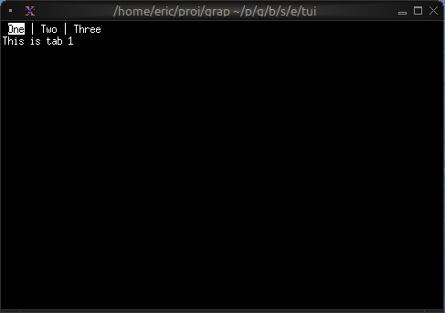
Navigation Between Tabs
use tui;
use tui::tabs;
use tui::block;
use tui::text;
use tui::input_handler;
let selected_tab = 0;
let handle_event = |e: Event| -> [`Stop, `Continue] select e {
`Key(k) => select k.kind {
`Press => select k.code {
k@`Left if selected_tab > 0 => {
selected_tab <- (k ~ selected_tab) - 1;
`Stop
},
k@`Right if selected_tab < 2 => {
selected_tab <- (k ~ selected_tab) + 1;
`Stop
},
k@`Tab => {
selected_tab <- ((k ~ selected_tab) + 1) % 3;
`Stop
},
_ => `Continue
},
_ => `Continue
},
_ => `Continue
};
let overview = text(&"Overview");
let items = text(&"Items");
let settings = text(&"Settings");
input_handler(
#handle: &handle_event,
&block(
#border: &`All,
#title: &line("Application (←/→ to navigate)"),
&tabs(
#highlight_style: &style(#fg: `Yellow, #add_modifier: [`Bold]),
#style: &style(#fg: `Gray),
#selected: &selected_tab,
&[
(line("Overview"), overview),
(line("Items"), items),
(line("Settings"), settings)
]
)
)
)
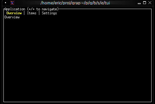
Styled Tab Titles
use tui;
use tui::tabs;
use tui::text;
let completed_content = text(&"Completed");
let progress_content = text(&"In Progress");
let failed_content = text(&"Failed");
let tab_list = [
(line([
span(#style: style(#fg: `Green), "✓ "),
span("Completed")
]), completed_content),
(line([
span(#style: style(#fg: `Yellow), "⚠ "),
span("In Progress")
]), progress_content),
(line([
span(#style: style(#fg: `Red), "✗ "),
span("Failed")
]), failed_content)
];
tabs(&tab_list)
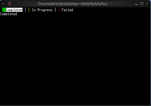
Tab with Badge
use tui;
use tui::tabs;
use tui::text;
let unread_count = 5;
let messages_tab = line([
span("Messages"),
span(#style: style(#fg: `Red, #add_modifier: [`Bold]), " ([unread_count])")
]);
let home_content = text(&"Home");
let messages_content = text(&"Messages");
let settings_content = text(&"Settings");
tabs(&[
(line("Home"), home_content),
(messages_tab, messages_content),
(line("Settings"), settings_content)
])
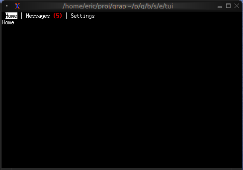
Keyboard Navigation
Common patterns:
Left/Right- Switch to previous/next tabTab- Cycle forward through tabs- Number keys - Jump directly to tab
See Also
- block - For containing tabs with borders
- list - Common content for tabs
- table - For tabular content in tabs
Graphical User Interfaces (GUIs)
Graphix includes a GUI library built on the Rust iced framework. It provides native desktop windowing with GPU-accelerated rendering via wgpu, giving you high-performance graphical applications with the same reactive programming model used throughout Graphix.
What the GUI Library Offers
- Native windowing: Real desktop windows managed by the OS, not terminal emulation
- GPU-accelerated rendering: All drawing goes through wgpu for smooth, high-performance output
- Reactive widgets: A rich set of interactive widgets (buttons, text inputs, sliders, etc.) that update automatically when their data changes
- Multi-window support: Programs can create and manage multiple windows simultaneously
- Theming: 22 built-in themes plus fully custom palettes and per-widget style overrides
- Auto-detection: The Graphix shell detects GUI mode automatically when the program’s last expression has type
Gui– no special flags needed
The Window Type
Every GUI program is built around windows. The Window type describes a window and its content:
type Window = { title: &string, size: &Size, theme: &Theme, content: &Widget };
type Gui = Array<&Window>;
val window: fn(
?#title: &string,
?#size: &Size,
?#theme: &Theme,
a: &Widget
) -> Window;
All parameters except the content widget are optional. Defaults are "Graphix" for the title, { width: 800.0, height: 600.0 } for the size, and `Dark for the theme.
The final expression of your program should be an Array<&Window> – the shell sees this type and launches the GUI runtime.
Getting Started
Here is a minimal GUI program that creates a window with text and a button:
use gui;
use gui::text;
use gui::column;
use gui::button;
mod icon;
[&window(
#icon: &icon::icon,
#title: &"Graphix Demo",
#theme: &`CatppuccinMocha,
&column(
#spacing: &20.0,
#padding: &`All(40.0),
#halign: &`Center,
#width: &`Fill,
#height: &`Fill,
&[
text(#size: &24.0, &"Hello, Graphix GUI!"),
text(&"A simple window with text and a button"),
button(
#padding: &`All(10.0),
&text(&"Click me!")
)
]
)
)]
A few things to notice:
use guibrings the top-level GUI module into scope, which gives access towindowand shared types likeLength,Padding, andTheme.- Individual widget modules (
gui::text,gui::column,gui::button) are imported separately. - Widget arguments are passed as references with
&. Even literal values like&20.0and&"Hello, Graphix GUI!"are wrapped in&. - The program’s final value is a one-element array
[&window(...)], which has typeGui.
The Reference Pattern
GUI widgets take & references so that updates propagate with fine granularity. When you write:
let name = "world"
text(&"Hello, [name]!")
The text widget holds a reference to the string expression "Hello, [name]!". When name changes, only this specific text widget re-renders – the rest of the window is untouched.
This is especially important for interactive widgets. A text input, for example, takes a &string for its current value and provides a callback to update it:
let name = ""
text_input(#on_input: |v| name <- v, #placeholder: &"Type here...", &name)
The <- connect operator schedules name to update on the next cycle, and because the text input holds a reference to name, it automatically reflects the new value.
Theming
Every window accepts a #theme parameter that controls its visual appearance. Graphix ships with 22 built-in themes plus support for fully custom palettes and stylesheets:
use gui;
use gui::text;
use gui::column;
use gui::container;
mod icon;
[&window(
#icon: &icon::icon,
#title: &"Theme Demo",
#theme: &`TokyoNight,
&container(
#width: &`Fill,
#height: &`Fill,
#halign: &`Center,
#valign: &`Center,
#padding: &`All(40.0),
&column(
#spacing: &20.0,
#halign: &`Center,
#width: &`Fill,
&[
text(#size: &28.0, #halign: &`Center, #width: &`Fill, &"Theme Demo"),
text(
#size: &16.0, #halign: &`Center, #width: &`Fill,
&"Using TokyoNight theme")
]
)
)
)]
See the theming page for the full list of built-in themes, custom palette creation, and per-widget style overrides.
Further Reading
- Types – reference for all shared types (
Widget,Length,Padding,Color,Font, etc.) - Theming – built-in themes, custom palettes, and per-widget stylesheets
Types
The GUI library defines a set of shared types used across all widgets. These types control layout, sizing, colors, fonts, and more. They are all defined in the top-level gui module and become available when you write use gui.
Layout Types
Length
Controls how a widget is sized along a single axis:
type Length = [`Fill, `FillPortion(i64), `Shrink, `Fixed(f64)];
`Fill– expand to fill all available space.`FillPortion(n)– fill proportionally. Two widgets withFillPortion(1)andFillPortion(2)split space 1:2.`Shrink– take only as much space as the content needs.`Fixed(px)– exact size in logical pixels.
Most layout widgets accept #width and #height parameters of type &Length:
column(
#width: &`Fill,
#height: &`Fixed(300.0),
&[...]
)
Padding
Controls spacing between a widget’s border and its content:
type Padding = [
`All(f64),
`Axis({x: f64, y: f64}),
`Each({top: f64, right: f64, bottom: f64, left: f64})
];
`All(px)– uniform padding on all sides.`Axis({x, y})– separate horizontal (x) and vertical (y) padding.`Each({top, right, bottom, left})– individual padding per side.
container(
#padding: &`All(20.0),
&text(&"Padded content")
)
container(
#padding: &`Each({top: 10.0, right: 20.0, bottom: 10.0, left: 20.0}),
&text(&"Different padding per side")
)
Size
A width/height pair used for window dimensions:
type Size = { width: f64, height: f64 };
window(#size: &{ width: 1024.0, height: 768.0 }, &content)
HAlign and VAlign
Horizontal and vertical alignment for positioning content within a container:
type HAlign = [`Left, `Center, `Right];
type VAlign = [`Top, `Center, `Bottom];
column(
#halign: &`Center,
#width: &`Fill,
&[text(&"Centered text")]
)
container(
#halign: &`Center,
#valign: &`Center,
#width: &`Fill,
#height: &`Fill,
&text(&"Dead center")
)
Visual Types
Color
RGBA color with floating-point components in the range 0.0 to 1.0. Color is an abstract type — use the color constructor to create values. Components default to 0.0 except alpha which defaults to 1.0. Out-of-range values return an InvalidColor error.
// Solid red ($ swallows errors with a warning)
let red = color(#r: 1.0)$
// Semi-transparent blue (? propagates errors)
let blue_50 = color(#b: 1.0, #a: 0.5)?
Colors are used in custom themes and per-widget style overrides. See the theming page for details.
Font Types
Fonts are described by family, weight, and style:
type FontFamily = [`SansSerif, `Serif, `Monospace, `Name(string)];
type FontWeight = [
`Thin, `ExtraLight, `Light, `Normal, `Medium,
`SemiBold, `Bold, `ExtraBold, `Black
];
type FontStyle = [`Normal, `Italic, `Oblique];
type Font = { family: FontFamily, weight: FontWeight, style: FontStyle };
FontFamilyselects the font.`Name(string)allows loading a specific named font.FontWeightranges from`Thin(lightest) to`Black(heaviest).FontStylecontrols italic/oblique rendering.
text(
#font: &{ family: `Monospace, weight: `Bold, style: `Normal },
&"Monospace bold text"
)
Content Types
ScrollDirection
Controls which axes a scrollable widget allows scrolling on:
type ScrollDirection = [`Vertical, `Horizontal, `Both];
scrollable(#direction: &`Both, &content)
TooltipPosition
Controls where a tooltip appears relative to its target widget:
type TooltipPosition = [`Top, `Bottom, `Left, `Right, `FollowCursor];
tooltip(
#position: &`Top,
#tip: &text(&"Tooltip text"),
&button(&text(&"Hover me"))
)
ContentFit
Controls how an image or SVG is scaled within its bounds:
type ContentFit = [`Fill, `Contain, `Cover, `None, `ScaleDown];
`Fill– stretch to fill the bounds exactly (may distort).`Contain– scale to fit within bounds, preserving aspect ratio.`Cover– scale to cover bounds, preserving aspect ratio (may crop).`None– no scaling, display at original size.`ScaleDown– like`Containbut never scales up.
The Widget Type
Widget is a union of all individual widget types. Most widget constructor functions return Widget, which means you can freely mix different widget types in arrays and containers:
type Widget = [
`Button(button::Button),
`Canvas(canvas::Canvas),
`Chart(chart::Chart),
`Checkbox(checkbox::Checkbox),
`Column(column::Column),
`ComboBox(combo_box::ComboBox),
`Container(container::Container),
`HorizontalRule(rule::HorizontalRule),
`Image(image::Image),
`KeyboardArea(keyboard_area::KeyboardArea),
`MouseArea(mouse_area::MouseArea),
`PickList(pick_list::PickList),
`ProgressBar(progress_bar::ProgressBar),
`Radio(radio::Radio),
`Row(row::Row),
`Scrollable(scrollable::Scrollable),
`Slider(slider::Slider),
`Space(space::Space),
`Stack(stack::Stack),
`Svg(svg::Svg),
`Text(text::Text),
`TextEditor(text_editor::TextEditor),
`TextInput(text_input::TextInput),
`Toggler(toggler::Toggler),
`Tooltip(tooltip::Tooltip),
`VerticalRule(rule::VerticalRule),
`VerticalSlider(vertical_slider::VerticalSlider)
];
You do not normally construct Widget variants directly. Each widget module exports a constructor function (e.g., gui::text::text(...), gui::button::button(...)) that returns Widget. This means a column’s children array has type Array<Widget> and can contain any mix of widgets:
use gui;
use gui::text;
use gui::button;
use gui::slider;
let v = 50.0
column(
#spacing: &10.0,
&[
text(&"A text widget"),
button(&text(&"A button")),
slider(#min: &0.0, #max: &100.0, &v)
]
)
Theming
Every GUI window accepts a #theme parameter that controls the visual appearance of all widgets inside it. Graphix provides 22 built-in themes, plus two mechanisms for full customization: custom palettes and custom stylesheets.
Built-in Themes
The Theme type enumerates all available themes:
type Theme = [
`Light,
`Dark,
`Dracula,
`Nord,
`SolarizedLight,
`SolarizedDark,
`GruvboxLight,
`GruvboxDark,
`CatppuccinLatte,
`CatppuccinFrappe,
`CatppuccinMacchiato,
`CatppuccinMocha,
`TokyoNight,
`TokyoNightStorm,
`TokyoNightLight,
`KanagawaWave,
`KanagawaDragon,
`KanagawaLotus,
`Moonfly,
`Nightfly,
`Oxocarbon,
`Ferra,
`Custom(StyleSheet),
`CustomPalette(Palette)
];
Apply a theme by passing it to the window function:
window(#theme: &`CatppuccinMocha, &content)
Since #theme takes a &Theme, you can change the theme reactively:
let dark = true
let theme = select dark {
true => `Dark,
false => `Light
}
window(#theme: &theme, &content)
Custom Palettes
For quick color customization without defining per-widget styles, use `CustomPalette with a Palette:
type Palette = {
background: Color,
danger: Color,
primary: Color,
success: Color,
text: Color,
warning: Color
};
The palette defines the core colors from which iced derives all widget styles automatically:
background– window and container backgrounds.text– default text color.primary– accent color for buttons, sliders, active elements.success– color for success states (e.g., toggler when enabled).danger– color for destructive actions and error states.warning– color for warning indicators.
use gui;
use gui::style;
use gui::text;
use gui::button;
use gui::toggler;
use gui::slider;
use gui::column;
mod icon;
let enabled = true;
let br = 0.0;
let cv = |base| min(1.0, base + br);
let my_palette = {
background: color(#r: cv(0.1), #g: cv(0.1), #b: cv(0.15))$,
text: color(#r: cv(0.9), #g: cv(0.9), #b: cv(0.95))$,
primary: color(#r: cv(0.4), #g: cv(0.6), #b: cv(1.0))$,
success: color(#r: cv(0.3), #g: cv(0.8), #b: cv(0.4))$,
danger: color(#r: cv(1.0), #g: cv(0.3), #b: cv(0.3))$,
warning: color(#r: cv(1.0), #g: cv(0.8), #b: cv(0.2))$
};
let col = column(
#spacing: &15.0,
#padding: &`All(30.0),
#width: &`Fill,
&[
text(#size: &24.0, &"Custom Palette"),
button(#padding: &`All(10.0), &text(&"Primary Button")),
toggler(#label: &"Enabled", #on_toggle: |v| enabled <- v, &enabled),
slider(#min: &0.0, #max: &0.5, #step: &0.05, #on_change: |v| br <- v, &br),
text(&"Brightness: [br]")
]
);
[&window(
#icon: &icon::icon,
#title: &"Custom Palette",
#theme: &`CustomPalette(my_palette),
&col
)]
Custom Stylesheets
For full control over individual widget appearances, use `Custom(StyleSheet). A stylesheet combines a palette with optional per-widget style overrides:
type StyleSheet = {
button: [ButtonStyle, null],
checkbox: [CheckboxStyle, null],
container: [ContainerStyle, null],
menu: [MenuStyle, null],
palette: Palette,
pick_list: [PickListStyle, null],
progress_bar: [ProgressBarStyle, null],
radio: [RadioStyle, null],
rule: [RuleStyle, null],
scrollable: [ScrollableStyle, null],
slider: [SliderStyle, null],
text_editor: [TextEditorStyle, null],
text_input: [TextInputStyle, null],
toggler: [TogglerStyle, null]
};
Every widget style field is optional (union with null). When null, the widget inherits its style from the palette automatically.
The stylesheet Builder
Use the stylesheet function to construct a StyleSheet without filling in every field manually. Only #palette is required; all widget style parameters default to null:
val stylesheet: fn(
#palette: Palette,
?#button: [ButtonStyle, null],
?#checkbox: [CheckboxStyle, null],
?#container: [ContainerStyle, null],
?#menu: [MenuStyle, null],
?#pick_list: [PickListStyle, null],
?#progress_bar: [ProgressBarStyle, null],
?#radio: [RadioStyle, null],
?#rule: [RuleStyle, null],
?#scrollable: [ScrollableStyle, null],
?#slider: [SliderStyle, null],
?#text_editor: [TextEditorStyle, null],
?#text_input: [TextInputStyle, null],
?#toggler: [TogglerStyle, null]
) -> StyleSheet;
Example with a custom palette and button override:
use gui;
use gui::style;
use gui::text;
use gui::button;
use gui::text_input;
use gui::slider;
use gui::toggler;
use gui::container;
use gui::column;
use gui::rule;
mod icon;
let palette = {
background: color(#r: 0.12, #g: 0.12, #b: 0.18)$,
text: color(#r: 0.85, #g: 0.85, #b: 0.9)$,
primary: color(#r: 0.55, #g: 0.35, #b: 0.95)$,
success: color(#r: 0.2, #g: 0.8, #b: 0.5)$,
danger: color(#r: 0.95, #g: 0.25, #b: 0.35)$,
warning: color(#r: 1.0, #g: 0.7, #b: 0.1)$
};
let theme = `Custom(stylesheet(
#palette: palette,
#button: button_style(
#background: color(#r: 0.55, #g: 0.35, #b: 0.95)$,
#text_color: color(#r: 1.0, #g: 1.0, #b: 1.0)$,
#border_radius: 12.0
),
#text_input: text_input_style(
#background: color(#r: 0.16, #g: 0.16, #b: 0.24)$,
#border_color: color(#r: 0.55, #g: 0.35, #b: 0.95, #a: 0.5)$,
#border_radius: 8.0,
#border_width: 2.0,
#value_color: color(#r: 0.9, #g: 0.9, #b: 0.95)$,
#placeholder_color: color(#r: 0.5, #g: 0.5, #b: 0.6)$
),
#slider: slider_style(
#rail_color: color(#r: 0.3, #g: 0.3, #b: 0.4)$,
#rail_fill_color: color(#r: 0.55, #g: 0.35, #b: 0.95)$,
#handle_color: color(#r: 0.7, #g: 0.55, #b: 1.0)$,
#handle_radius: 8.0
),
#toggler: toggler_style(
#background: color(#r: 0.3, #g: 0.3, #b: 0.4)$,
#foreground: color(#r: 0.85, #g: 0.85, #b: 0.9)$
),
#container: container_style(
#background: color(#r: 0.15, #g: 0.15, #b: 0.22)$,
#border_color: color(#r: 0.55, #g: 0.35, #b: 0.95, #a: 0.3)$,
#border_width: 1.0,
#border_radius: 10.0
)
));
let name = "";
let volume = 50.0;
let dark_mode = true;
[&window(
#icon: &icon::icon,
#title: &"Custom Styles",
#theme: &theme,
&container(
#padding: &`All(30.0),
#width: &`Fill,
#height: &`Fill,
&column(
#spacing: &15.0,
#width: &`Fill,
&[
text(#size: &24.0, &"Custom Stylesheet Demo"),
horizontal_rule(),
text_input(
#placeholder: &"Type something...",
#on_input: |v| name <- v,
&name
),
slider(
#min: &0.0, #max: &100.0,
#on_change: |v| volume <- v,
&volume
),
text(&"Volume: [volume]"),
toggler(
#label: &"Dark mode",
#on_toggle: |v| dark_mode <- v,
&dark_mode
),
button(#padding: &`All(12.0), &text(&"Styled Button"))
]
)
)
)]
Per-Widget Style Types
Each widget style type is a struct where every field is optional ([T, null]). A null field means “inherit from the theme palette.” The GUI module provides both the types and corresponding builder functions.
ButtonStyle
type ButtonStyle = {
background: [Color, null],
border_color: [Color, null],
border_radius: [f64, null],
border_width: [f64, null],
text_color: [Color, null]
};
val button_style: fn(
?#background: [Color, null],
?#border_color: [Color, null],
?#border_radius: [f64, null],
?#border_width: [f64, null],
?#text_color: [Color, null]
) -> ButtonStyle;
TextInputStyle
type TextInputStyle = {
background: [Color, null],
border_color: [Color, null],
border_radius: [f64, null],
border_width: [f64, null],
icon_color: [Color, null],
placeholder_color: [Color, null],
selection_color: [Color, null],
value_color: [Color, null]
};
val text_input_style: fn(
?#background: [Color, null],
?#border_color: [Color, null],
?#border_radius: [f64, null],
?#border_width: [f64, null],
?#icon_color: [Color, null],
?#placeholder_color: [Color, null],
?#selection_color: [Color, null],
?#value_color: [Color, null]
) -> TextInputStyle;
SliderStyle
type SliderStyle = {
handle_border_color: [Color, null],
handle_border_width: [f64, null],
handle_color: [Color, null],
handle_radius: [f64, null],
rail_color: [Color, null],
rail_fill_color: [Color, null],
rail_width: [f64, null]
};
val slider_style: fn(
?#handle_border_color: [Color, null],
?#handle_border_width: [f64, null],
?#handle_color: [Color, null],
?#handle_radius: [f64, null],
?#rail_color: [Color, null],
?#rail_fill_color: [Color, null],
?#rail_width: [f64, null]
) -> SliderStyle;
Other Widget Styles
The remaining widget style types follow the same pattern – a struct of optional fields with a corresponding builder function:
| Type | Builder | Key Fields |
|---|---|---|
CheckboxStyle | checkbox_style | accent, background, border_color, border_radius, border_width, icon_color, text_color |
ContainerStyle | container_style | background, border_color, border_radius, border_width, text_color |
MenuStyle | menu_style | background, border_color, border_radius, border_width, selected_background, selected_text_color, text_color |
PickListStyle | pick_list_style | background, border_color, border_radius, border_width, handle_color, placeholder_color, text_color |
ProgressBarStyle | progress_bar_style | background, bar_color, border_radius |
RadioStyle | radio_style | background, border_color, border_width, dot_color, text_color |
RuleStyle | rule_style | color, radius, width |
ScrollableStyle | scrollable_style | background, border_color, border_radius, border_width, scroller_color |
TextEditorStyle | text_editor_style | background, border_color, border_radius, border_width, placeholder_color, selection_color, value_color |
TogglerStyle | toggler_style | background, background_border_color, border_radius, foreground, foreground_border_color, text_color |
All builder functions accept the same labeled arguments as the corresponding struct fields, all optional, all defaulting to null.
The Text Widget
The text widget displays a string with optional styling. It is the most basic display widget and the foundation for showing any textual content in a GUI application. Font size, color, font family, weight, style, sizing, and alignment are all configurable through labeled arguments.
Interface
val text: fn(
?#size: &[f64, null],
?#color: &[Color, null],
?#font: &[Font, null],
?#width: &Length,
?#height: &Length,
?#halign: &HAlign,
?#valign: &VAlign,
s: &string
) -> Widget
Parameters
- size - Font size in pixels. Defaults to the theme’s standard text size when null.
- color - Text color as a
Colorstruct withr,g,b,afields, each a float from 0.0 to 1.0. Defaults to the theme’s text color when null. - font - A
Fontstruct controlling the typeface:family: One of`SansSerif,`Serif,`Monospace, or`Name(string)for a specific font name.weight: One of`Thin,`ExtraLight,`Light,`Normal,`Medium,`SemiBold,`Bold,`ExtraBold,`Black.style: One of`Normal,`Italic,`Oblique.
- width - Horizontal sizing as a
Length:`Fill,`Shrink,`Fixed(f64), or`FillPortion(i64). Defaults to`Shrink. - height - Vertical sizing as a
Length. Defaults to`Shrink. - halign - Horizontal text alignment:
`Left,`Center, or`Right. Defaults to`Left. Only visible when the widget is wider than the text (e.g. with#width: &Fill``). - valign - Vertical text alignment:
`Top,`Center, or`Bottom. Defaults to`Top.
The positional argument is a reference to the string to display. Because it is a reference, the text updates reactively when the underlying value changes.
Examples
Styling and Alignment
use gui;
use gui::text;
use gui::column;
mod icon;
[&window(
#icon: &icon::icon,
#title: &"Text Widget",
&column(
#spacing: &15.0,
#padding: &`All(30.0),
#width: &`Fill,
&[
text(&"Default text"),
text(#size: &32.0, &"Large text"),
text(#color: &color(#r: 1.0, #g: 0.2, #b: 0.2)$, &"Red text"),
text(
#font: &{ family: `Monospace, weight: `Bold, style: `Normal },
&"Bold monospace"),
text(#halign: &`Center, #width: &`Fill, &"Centered"),
text(#halign: &`Right, #width: &`Fill, &"Right-aligned")
]
)
)]
See Also
- button - Clickable button that wraps a widget (often text)
- text_input - Editable single-line text field
- text_editor - Multi-line text editing
The Button Widget
A clickable button that wraps a child widget (typically text). Buttons trigger a callback when pressed and can be styled with custom width, height, and padding.
Interface
val button: fn(
?#on_press: fn(a: null) -> Any,
?#width: &Length,
?#height: &Length,
?#padding: &Padding,
?#disabled: &bool,
a: &Widget
) -> Widget
Parameters
#on_press– Callback invoked when the button is clicked. Receivesnullas its argument. Use the sample operator~inside the callback to capture current state at click time:|c| counter <- c ~ counter + 1. If omitted, the button renders but does nothing when clicked.#width– Width of the button. AcceptsLengthvalues:`Fill,`Shrink, or`Fixed(f64). Defaults to`Shrink.#height– Height of the button. SameLengthvalues as width. Defaults to`Shrink.#padding– Interior padding around the child widget. AcceptsPaddingvalues:`All(f64),`Axis({x: f64, y: f64}), or`Each({top: f64, right: f64, bottom: f64, left: f64}).#disabled– Whentrue, the button is grayed out and#on_pressis not triggered. Defaults tofalse.- positional
&Widget– The child widget displayed inside the button. Usually atextwidget.
Examples
Basic Buttons
use gui;
use gui::text;
use gui::column;
use gui::button;
mod icon;
let b0 = button(
#on_press: |c| println(c ~ "normal button clicked"),
#padding: &`All(10.0),
&text(&"Click me!")
);
let b1 = button(
#on_press: |c| println(c ~ "wide button clicked"),
#padding: &`All(8.0),
#width: &`Fixed(200.0),
&text(#halign:&`Center, &"Wide button")
);
let col = column(
#spacing: &20.0,
#padding: &`All(30.0),
#halign: &`Center,
#width: &`Fill,
&[
text(#size: &24.0, &"Button Demo"),
b0,
b1
]
);
[&window(#icon: &icon::icon, #title: &"Button Widget", &col)]
See Also
- text – the most common child widget for buttons
- mouse_area – for click detection on arbitrary widgets
The Text Input Widget
A single-line text field for user input. The widget displays the current value via a reference and reports changes through callbacks. Supports placeholder text, password masking, and custom sizing.
Interface
val text_input: fn(
?#placeholder: &string,
?#on_input: fn(s: string) -> Any,
?#on_submit: fn(a: null) -> Any,
?#is_secure: &bool,
?#width: &Length,
?#padding: &Padding,
?#size: &[f64, null],
?#font: &[Font, null],
?#disabled: &bool,
s: &string
) -> Widget
Parameters
#placeholder– Hint text displayed when the field is empty. Shown in a lighter style and disappears once the user begins typing.#on_input– Callback invoked on every keystroke. Receives the full current text as astring. Typically used with<-to update state:#on_input: |v| name <- v.#on_submit– Callback invoked when the user presses Enter. Receivesnull. Useful for form submission or triggering a search.#is_secure– Whentrue, the input is masked (password mode). Characters are replaced with dots. Defaults tofalse.#width– Width of the input field. AcceptsLengthvalues. Defaults to`Fill.#padding– Interior padding around the text content. AcceptsPaddingvalues.#size– Font size in pixels, ornullfor the default size.#font– Font to use for the text, ornullfor the default font.#disabled– Whentrue, the input cannot be focused or edited. Defaults tofalse.- positional
&string– Reference to the current text value. The widget reads from this reference to display the text, and you update it from the#on_inputcallback.
Examples
Basic Text Input
use gui;
use gui::text;
use gui::text_input;
use gui::column;
mod icon;
let name = "";
let col = column(
#spacing: &15.0,
#padding: &`All(30.0),
#halign: &`Center,
#width: &`Fill,
&[
text(#size: &24.0, &"Text Input Demo"),
text_input(#placeholder: &"Enter your name...", #on_input: |v| name <- v, &name),
text(&name)
]
);
[&window(#icon: &icon::icon, #title: &"Text Input", &col)]
See Also
- text_editor – multi-line text editing
- text – displaying static or reactive text
The Text Editor Widget
A multi-line text editing area for longer-form content. Unlike text_input, which handles a single line, text_editor supports multiple lines of text with scrolling. It reports the full content string on every edit.
Interface
val text_editor: fn(
?#placeholder: &string,
?#on_edit: fn(s: string) -> Any,
?#width: &[f64, null],
?#height: &[f64, null],
?#padding: &Padding,
?#font: &[Font, null],
?#size: &[f64, null],
?#disabled: &bool,
s: &string
) -> Widget
Parameters
#placeholder– Hint text displayed when the editor is empty.#on_edit– Callback invoked on every edit. Receives the full content as astring. Use with<-to keep state in sync:#on_edit: |v| content <- v.#width– Width in pixels asf64, ornullfor automatic sizing. Note: this is&[f64, null], not&Length– the text editor uses fixed pixel dimensions rather than the layout-basedLengthtype.#height– Height in pixels asf64, ornullfor automatic sizing. Same&[f64, null]type as width.#padding– Interior padding around the text content. AcceptsPaddingvalues.#font– Font to use, ornullfor the default font.#size– Font size in pixels, ornullfor the default size.#disabled– Whentrue, the editor cannot be focused or edited. Defaults tofalse.- positional
&string– Reference to the current content. The editor displays this text and you update it from the#on_editcallback.
Examples
Basic Text Editor
use gui;
use gui::text;
use gui::text_editor;
use gui::column;
mod icon;
let content = "";
let col = column(
#spacing: &15.0,
#padding: &`All(30.0),
#width: &`Fill,
#height: &`Fill,
&[
text(#size: &24.0, &"Text Editor Demo"),
text_editor(
#placeholder: &"Start typing here...",
#on_edit: |v| content <- v,
#height: &300.0,
&content
),
text(&"Length: [str::len(content)] characters")
]
);
[&window(#icon: &icon::icon, #title: &"Text Editor", &col)]
See Also
- text_input – single-line text input
- text – read-only text display
The Checkbox Widget
A checkbox with an optional text label. Displays a checked or unchecked box and reports toggles through a callback. Useful for boolean settings and multi-select scenarios.
Interface
val checkbox: fn(
?#label: &string,
?#on_toggle: fn(flag: bool) -> Any,
?#width: &Length,
?#size: &[f64, null],
?#spacing: &[f64, null],
?#disabled: &bool,
flag: &bool
) -> Widget
Parameters
#label– Text displayed next to the checkbox. If omitted, the checkbox renders without a label.#on_toggle– Callback invoked when the checkbox is clicked. Receives the new boolean state (trueif now checked,falseif unchecked). Typically:#on_toggle: |v| checked <- v.#width– Width of the widget (checkbox plus label). AcceptsLengthvalues.#size– Size of the checkbox square in pixels, ornullfor the default size.#spacing– Gap in pixels between the checkbox and the label text, ornullfor the default spacing.#disabled– Whentrue, the checkbox is grayed out and cannot be toggled. Defaults tofalse.- positional
&bool– Reference to the checked state.truerenders a checked box,falserenders unchecked.
Examples
Checkbox Group
use gui;
use gui::text;
use gui::checkbox;
use gui::column;
mod icon;
let dark_mode = true;
let notifications = false;
let auto_save = true;
let col = column(
#spacing: &15.0,
#padding: &`All(30.0),
#width: &`Fill,
&[
text(#size: &24.0, &"Checkbox Demo"),
checkbox(#label: &"Dark mode", #on_toggle: |v| dark_mode <- v, &dark_mode),
checkbox(#label: &"Enable notifications", #on_toggle: |v| notifications <- v, ¬ifications),
checkbox(#label: &"Auto-save", #on_toggle: |v| auto_save <- v, &auto_save)
]
);
[&window(#icon: &icon::icon, #title: &"Checkbox", &col)]
See Also
The Toggler Widget
A toggle switch with an optional text label. Functionally identical to a checkbox but rendered as a sliding toggle, which is often a better visual fit for on/off settings like enabling features or connectivity options.
Interface
val toggler: fn(
?#label: &string,
?#on_toggle: fn(flag: bool) -> Any,
?#width: &Length,
?#size: &[f64, null],
?#spacing: &[f64, null],
?#disabled: &bool,
flag: &bool
) -> Widget
Parameters
#label– Text displayed next to the toggle switch. If omitted, the toggler renders without a label.#on_toggle– Callback invoked when the toggle is flipped. Receives the new boolean state. Typically:#on_toggle: |v| enabled <- v.#width– Width of the widget (toggle plus label). AcceptsLengthvalues.#size– Size of the toggle switch in pixels, ornullfor the default size.#spacing– Gap in pixels between the toggle and the label text, ornullfor the default spacing.#disabled– Whentrue, the toggle is grayed out and cannot be flipped. Defaults tofalse.- positional
&bool– Reference to the toggled state.truerenders the toggle in the “on” position,falsein the “off” position.
Examples
Toggle Switches
use gui;
use gui::text;
use gui::toggler;
use gui::column;
mod icon;
let wifi = true;
let bluetooth = false;
let col = column(
#spacing: &15.0,
#padding: &`All(30.0),
#width: &`Fill,
&[
text(#size: &24.0, &"Toggler Demo"),
toggler(#label: &"WiFi", #on_toggle: |v| wifi <- v, &wifi),
toggler(#label: &"Bluetooth", #on_toggle: |v| bluetooth <- v, &bluetooth)
]
);
[&window(#icon: &icon::icon, #title: &"Toggler", &col)]
See Also
The Radio Widget
A radio button for single-select choices within a group. Each radio widget represents one option. When the currently selected value matches this radio’s value, the button is filled. Clicking an unselected radio triggers the #on_select callback.
Interface
val radio: fn(
#label: &string,
?#selected: &'a,
?#on_select: fn(x: 'a) -> Any,
?#width: &Length,
?#size: &[f64, null],
?#spacing: &[f64, null],
?#disabled: &bool,
x: &'a
) -> Widget
Parameters
#label(required) – Text displayed next to the radio button. Unlike most labeled arguments in GUI widgets, this one is not optional – every radio button must have a label.#selected– Reference to the currently selected value. When this value equals the positional value, the radio button appears filled. Pass the same reference to every radio in the group so they stay in sync.#on_select– Callback invoked when this radio is clicked. Receives this radio’s value (the positional argument). Typically:#on_select: |v| selection <- v.#width– Width of the widget (radio button plus label). AcceptsLengthvalues.#size– Size of the radio circle in pixels, ornullfor the default size.#spacing– Gap in pixels between the radio circle and the label text, ornullfor the default spacing.#disabled– Whentrue, the radio button is grayed out and cannot be selected. Defaults tofalse.- positional
&Any– The value this radio button represents. When the user clicks this radio,#on_selectreceives this value. The radio appears selected when#selectedequals this value.
Examples
Radio Group
use gui;
use gui::text;
use gui::radio;
use gui::column;
mod icon;
let size: [`Small, `Medium, `Large] = `Medium;
let dir: [`Vertical, `Horizontal] = `Vertical;
let col = column(
#spacing: &15.0,
#padding: &`All(30.0),
#width: &`Fill,
&[
text(#size: &24.0, &"Radio Button Demo"),
text(&"Choose a size: [size]"),
radio(#label: &"Small", #selected: &size, #on_select: |v| size <- v, &`Small),
radio(#label: &"Medium", #selected: &size, #on_select: |v| size <- v, &`Medium),
radio(#label: &"Large", #selected: &size, #on_select: |v| size <- v, &`Large),
text(&"Choose a direction: [dir]"),
radio(#label: &"Vertical", #selected: &dir, #on_select: |v| dir <- v, &`Vertical),
radio(#label: &"Horizontal", #selected: &dir, #on_select: |v| dir <- v, &`Horizontal),
]
);
[&window(#icon: &icon::icon, #title: &"Radio Buttons", &col)]
Note: the selected variable is typed as Any so it can hold any value used for comparison. In the example above, string values are used as the radio values.
See Also
- checkbox – for multi-select boolean toggles
- toggler – for on/off switches
- pick_list – for dropdown-based selection
The Slider Widgets
Graphix provides three related widgets for numeric values within a range: slider (horizontal), vertical_slider, and progress_bar (display-only).
Slider
A horizontal slider that lets the user select a floating-point value by dragging a handle along a track.
Interface
val slider: fn(
?#min: &f64,
?#max: &f64,
?#step: &[f64, null],
?#on_change: fn(x: f64) -> Any,
?#on_release: fn(a: null) -> Any,
?#width: &Length,
?#height: &[f64, null],
?#disabled: &bool,
x: &f64
) -> Widget
Parameters
#min– Minimum value of the range. Defaults to0.0.#max– Maximum value of the range. Defaults to100.0.#step– Snap increment. When set, the slider snaps to multiples of this value.nullmeans continuous (no snapping).#on_change– Callback invoked as the handle is dragged. Receives the currentf64value. Typically:#on_change: |v| volume <- v.#on_release– Callback invoked when the user releases the handle. Receivesnull. Useful for committing a value only after the user finishes adjusting.#width– Width of the slider track. AcceptsLengthvalues. Defaults to`Fill.#height– Height of the slider track in pixels, ornullfor the default height.#disabled– Whentrue, the slider cannot be dragged. Defaults tofalse.- positional
&f64– Reference to the current value. Must be within the#min..#maxrange.
Vertical Slider
A vertical slider – identical to slider but oriented top-to-bottom. Note the width and height types are swapped: #width is &[f64, null] (fixed pixels) and #height is &Length (layout-based).
Interface
val vertical_slider: fn(
?#min: &f64,
?#max: &f64,
?#step: &[f64, null],
?#on_change: fn(x: f64) -> Any,
?#on_release: fn(a: null) -> Any,
?#width: &[f64, null],
?#height: &Length,
?#disabled: &bool,
x: &f64
) -> Widget
Parameters
Same as slider except:
#width– Width of the slider track in pixels, ornullfor the default width. This is&[f64, null], not&Length.#height– Height of the slider track. AcceptsLengthvalues (`Fill,`Shrink,`Fixed(f64)). This is&Length, not&[f64, null].
Progress Bar
A non-interactive horizontal bar that fills proportionally to a value within a range. Use it to display progress, levels, or any metric that the user should see but not control.
Interface
val progress_bar: fn(
?#min: &f64,
?#max: &f64,
?#width: &Length,
?#height: &[f64, null],
x: &f64
) -> Widget
Parameters
#min– Minimum value of the range. Defaults to0.0.#max– Maximum value of the range. Defaults to100.0.#width– Width of the bar. AcceptsLengthvalues. Defaults to`Fill.#height– Height of the bar in pixels, ornullfor the default height.- positional
&f64– Reference to the current value. The bar fills proportionally between#minand#max.
Examples
Slider & Progress Bar
use gui;
use gui::text;
use gui::slider;
use gui::progress_bar;
use gui::column;
mod icon;
let volume = 50.0;
let col = column(
#spacing: &15.0,
#padding: &`All(30.0),
#width: &`Fill,
&[
text(#size: &24.0, &"Slider & Progress Bar"),
text(&"Drag the slider:"),
slider(#min: &0.0, #max: &100.0, #on_change: |v| volume <- v, &volume),
text(&"Progress bar mirrors the slider:"),
progress_bar(#min: &0.0, #max: &100.0, &volume)
]
);
[&window(#icon: &icon::icon, #title: &"Slider & ProgressBar", &col)]
Vertical Slider
use gui;
use gui::text;
use gui::vertical_slider;
use gui::column;
use gui::row;
mod icon;
let value = 50.0;
[&window(
#icon: &icon::icon,
#title: &"Vertical Slider",
&row(
#spacing: &30.0,
#padding: &`All(30.0),
#height: &`Fill,
#valign: &`Center,
&[
column(
#spacing: &10.0,
&[
text(#size: &24.0, &"Vertical Slider"),
text(&"Value: [value]")
]
),
vertical_slider(
#min: &0.0,
#max: &100.0,
#on_change: |v| value <- v,
#height: &`Fixed(200.0),
&value
)
]
)
)]
See Also
- text_input – for entering numeric values as text
- types – for
Lengthand other shared types
The Pick List Widget
A dropdown menu that lets the user select one option from a list of strings. Clicking the widget opens a dropdown; selecting an item closes it and triggers the callback.
Interface
val pick_list: fn(
?#selected: &[string, null],
?#on_select: fn(s: string) -> Any,
?#placeholder: &string,
?#width: &Length,
?#padding: &Padding,
?#disabled: &bool,
a: &Array<string>
) -> Widget
Parameters
#selected– Reference to the currently selected value, ornullif nothing is selected. Whennull, the placeholder text is shown instead.#on_select– Callback invoked when the user picks an item. Receives the selected string. Typically:#on_select: |v| choice <- v.#placeholder– Text displayed when#selectedisnull. Gives the user a hint about what to choose.#width– Width of the dropdown. AcceptsLengthvalues.#padding– Interior padding around the displayed text. AcceptsPaddingvalues.#disabled– Whentrue, the dropdown cannot be opened. Defaults tofalse.- positional
&Array<string>– Reference to the list of available options.
Examples
use gui;
use gui::text;
use gui::pick_list;
use gui::column;
mod icon;
let language: [string, null] = null;
let col = column(
#spacing: &15.0,
#padding: &`All(30.0),
#width: &`Fill,
&[
text(#size: &24.0, &"Pick List Demo"),
text(&"Selected: [language]"),
pick_list(
#selected: &language,
#on_select: |v| language <- v,
#placeholder: &"Choose a language...",
&["English", "Spanish", "French", "Japanese"]
)
]
);
[&window(#icon: &icon::icon, #title: &"Pick List", &col)]
See Also
- Combo Box — searchable dropdown with type-to-filter
- Radio — inline single-select when there are few options
The Combo Box Widget
A searchable dropdown that combines a text input with a dropdown list. As the user types, the options are filtered to match. This is useful when the list of options is long and the user needs to find a specific item quickly.
Interface
val combo_box: fn(
?#selected: &[string, null],
?#on_select: fn(s: string) -> Any,
?#placeholder: &string,
?#width: &Length,
?#disabled: &bool,
a: &Array<string>
) -> Widget
Parameters
#selected– Reference to the currently selected value, ornullif nothing is selected.#on_select– Callback invoked when the user selects an item from the filtered list. Receives the selected string.#placeholder– Placeholder text shown in the input field when nothing is selected. Defaults to"Type to search...".#width– Width of the widget. AcceptsLengthvalues.#disabled– Whentrue, the combo box cannot be interacted with. Defaults tofalse.- positional
&Array<string>– Reference to the full list of options. The combo box filters this list as the user types.
Examples
use gui;
use gui::text;
use gui::combo_box;
use gui::column;
mod icon;
let selected: [string, null] = null;
let col = column(
#spacing: &15.0,
#padding: &`All(30.0),
#width: &`Fill,
&[
text(#size: &24.0, &"Combo Box Demo"),
combo_box(
#selected: &selected,
#on_select: |v| selected <- v,
#placeholder: &"Type or select a fruit...",
&["Apple", "Banana", "Cherry", "Date", "Elderberry", "Fig", "Grape"]
),
text(&"Selected: [selected]")
]
);
[&window(#icon: &icon::icon, #title: &"Combo Box", &col)]
See Also
- Pick List — standard dropdown without search
- Radio — inline single-select when there are few options
The Column Widget
The column widget arranges child widgets vertically from top to bottom. It is one of the primary layout containers, along with row.
Interface
val column: fn(
?#spacing: &f64,
?#padding: &Padding,
?#width: &Length,
?#height: &Length,
?#halign: &HAlign,
a: &Array<Widget>
) -> Widget
Parameters
- spacing — vertical space between child widgets in pixels
- padding — space around the column’s edges (see Types for
Paddingvariants) - width — column width (
Fill,Shrink,Fixed(px), orFillPortion(n)) - height — column height
- halign — horizontal alignment of children within the column (
Left,Center,Right)
The positional argument is a reference to an array of child widgets.
Examples
use gui;
use gui::text;
use gui::column;
mod icon;
[&window(
#icon: &icon::icon,
#title: &"Column Widget",
&column(
#spacing: &15.0,
#padding: &`All(30.0),
#halign: &`Center,
#width: &`Fill,
&[
text(#size: &24.0, &"Column Layout"),
text(&"Items are stacked vertically"),
text(&"With configurable spacing"),
text(&"And padding around the edges"),
text(
#halign: &`Center, #width: &`Fill,
&"This column is centered and fills the width")
]
)
)]
See Also
- Row — horizontal layout
- Container — single-child alignment and padding
- Stack — overlapping layout
- Space & Rules — spacing and dividers within layouts
The Row Widget
The row widget arranges child widgets horizontally from left to right. It is one of the primary layout containers, along with column.
Interface
val row: fn(
?#spacing: &f64,
?#padding: &Padding,
?#width: &Length,
?#height: &Length,
?#valign: &VAlign,
a: &Array<Widget>
) -> Widget
Parameters
- spacing — horizontal space between child widgets in pixels
- padding — space around the row’s edges
- width — row width (
Fill,Shrink,Fixed(px), orFillPortion(n)) - height — row height
- valign — vertical alignment of children within the row (
Top,Center,Bottom)
The positional argument is a reference to an array of child widgets.
Examples
use gui;
use gui::text;
use gui::column;
use gui::row;
use gui::button;
mod icon;
[&window(
#icon: &icon::icon,
#title: &"Row Widget",
&column(
#spacing: &20.0,
#padding: &`All(30.0),
#width: &`Fill,
&[
text(#size: &24.0, &"Row Layout"),
row(
#spacing: &30.0,
&[
text(&"Left"),
text(&"Center"),
text(&"Right")
]
),
row(
#spacing: &10.0,
#valign: &`Center,
&[
button(#padding: &`All(10.0), &text(&"One")),
button(#padding: &`All(10.0), &text(&"Two")),
button(#padding: &`All(10.0), &text(&"Three"))
]
)
]
)
)]
See Also
- Column — vertical layout
- Container — single-child alignment and padding
- Space & Rules — spacing and dividers within layouts
The Container Widget
The container widget wraps a single child widget, providing padding and alignment control. Use it to position content within a fixed or flexible region.
Interface
val container: fn(
?#padding: &Padding,
?#width: &Length,
?#height: &Length,
?#halign: &HAlign,
?#valign: &VAlign,
a: &Widget
) -> Widget
Parameters
- padding — space between the container’s edges and its child
- width — container width (
Fill,Shrink,Fixed(px), orFillPortion(n)) - height — container height
- halign — horizontal alignment of the child (
Left,Center,Right) - valign — vertical alignment of the child (
Top,Center,Bottom)
The positional argument is a reference to the child widget.
Examples
use gui;
use gui::text;
use gui::column;
use gui::container;
mod icon;
[&window(
#icon: &icon::icon,
#title: &"Container Widget",
&column(
#spacing: &15.0,
#padding: &`All(30.0),
#width: &`Fill,
&[
text(#size: &24.0, &"Container Widget"),
container(
#width: &`Fill,
#height: &`Fixed(100.0),
#halign: &`Center,
#valign: &`Center,
&text(&"Centered in a fill container")
),
container(
#padding: &`All(20.0),
&text(&"Padded content")
),
container(
#width: &`Fill,
#height: &`Fixed(80.0),
#halign: &`Right,
#valign: &`Bottom,
&text(&"Bottom-right aligned")
)
]
)
)]
See Also
The Scrollable Widget
The scrollable widget wraps content that may exceed the available space, providing scroll bars to navigate. It supports vertical, horizontal, or bidirectional scrolling.
Interface
val scrollable: fn(
?#direction: &ScrollDirection,
?#on_scroll: fn(a: {x: f64, y: f64}) -> Any,
?#width: &Length,
?#height: &Length,
a: &Widget
) -> Widget
Parameters
- direction — scroll direction:
Vertical(default),Horizontal, orBoth - on_scroll — callback receiving the scroll offset as
{x, y}when the user scrolls - width — widget width
- height — widget height
The positional argument is a reference to the child widget to scroll.
Examples
use gui;
use gui::text;
use gui::scrollable;
use gui::column;
use gui::rule;
mod icon;
let col = column(
#spacing: &10.0,
#padding: &`All(20.0),
#width: &`Fill,
&[
text(&"Item 1"), horizontal_rule(),
text(&"Item 2"), horizontal_rule(),
text(&"Item 3"), horizontal_rule(),
text(&"Item 4"), horizontal_rule(),
text(&"Item 5"), horizontal_rule(),
text(&"Item 6"), horizontal_rule(),
text(&"Item 7"), horizontal_rule(),
text(&"Item 8"), horizontal_rule(),
text(&"Item 9"), horizontal_rule(),
text(&"Item 10"), horizontal_rule(),
text(&"Item 11"), horizontal_rule(),
text(&"Item 12"), horizontal_rule(),
text(&"Item 13"), horizontal_rule(),
text(&"Item 14"), horizontal_rule(),
text(&"Item 15")
]
);
[&window(
#icon: &icon::icon,
#title: &"Scrollable",
#size: &{ width: 400.0, height: 300.0 },
&scrollable(
#height: &`Fill,
#width: &`Fill,
&col
)
)]
See Also
- Column — commonly used inside scrollable for vertical lists
- Space & Rules — dividers between scrollable items
The Stack Widget
The stack widget layers children on top of each other. The first child is drawn at the bottom, and each subsequent child is drawn on top. This is useful for overlays, watermarks, or layered visual effects.
Interface
val stack: fn(
?#width: &Length,
?#height: &Length,
a: &Array<Widget>
) -> Widget
Parameters
- width — stack width
- height — stack height
The positional argument is a reference to an array of child widgets. Children are drawn in order, with later children appearing on top of earlier ones.
Examples
use gui;
use gui::text;
use gui::stack;
use gui::container;
use gui::column;
mod icon;
[&window(
#icon: &icon::icon,
#title: &"Stack Widget",
&column(
#spacing: &15.0,
#padding: &`All(30.0),
#width: &`Fill,
#height: &`Fill,
&[
text(#size: &24.0, &"Stack Demo"),
stack(
#width: &`Fill,
#height: &`Fill,
&[
container(
#width: &`Fill,
#height: &`Fill,
#halign: &`Center,
#valign: &`Center,
&text(#size: &64.0, #color: &color(#r: 0.3, #g: 0.3, #b: 0.3)$, &"Background")
),
container(
#width: &`Fill,
#height: &`Fill,
#halign: &`Center,
#valign: &`Center,
&text(#size: &32.0, &"Foreground")
)
]
)
]
)
)]
See Also
- Container — for positioning content within stack layers
- Column — for non-overlapping vertical layout
Space & Rules
Space and rules are layout utilities for controlling whitespace and adding visual dividers between widgets.
Space
The space widget creates empty space with configurable dimensions. Use it to push widgets apart within a row or column.
Interface
val space: fn(
?#width: &Length,
?#height: &Length
) -> Widget
Parameters
- width — horizontal size of the space
- height — vertical size of the space
A common pattern is space(#width: &Fill)` to push items to opposite ends of a row.
Example
use gui;
use gui::text;
use gui::column;
use gui::row;
use gui::space;
mod icon;
[&window(
#icon: &icon::icon,
#title: &"Space Widget",
&column(
#spacing: &10.0,
#padding: &`All(30.0),
#width: &`Fill,
&[
text(#size: &24.0, &"Space Widget"),
text(&"Space pushes items apart:"),
row(
#width: &`Fill,
&[
text(&"Left"),
space(#width: &`Fill),
text(&"Right")
]
),
text(&"Vertical space below:"),
space(#height: &`Fixed(50.0)),
text(&"...and above this line")
]
)
)]
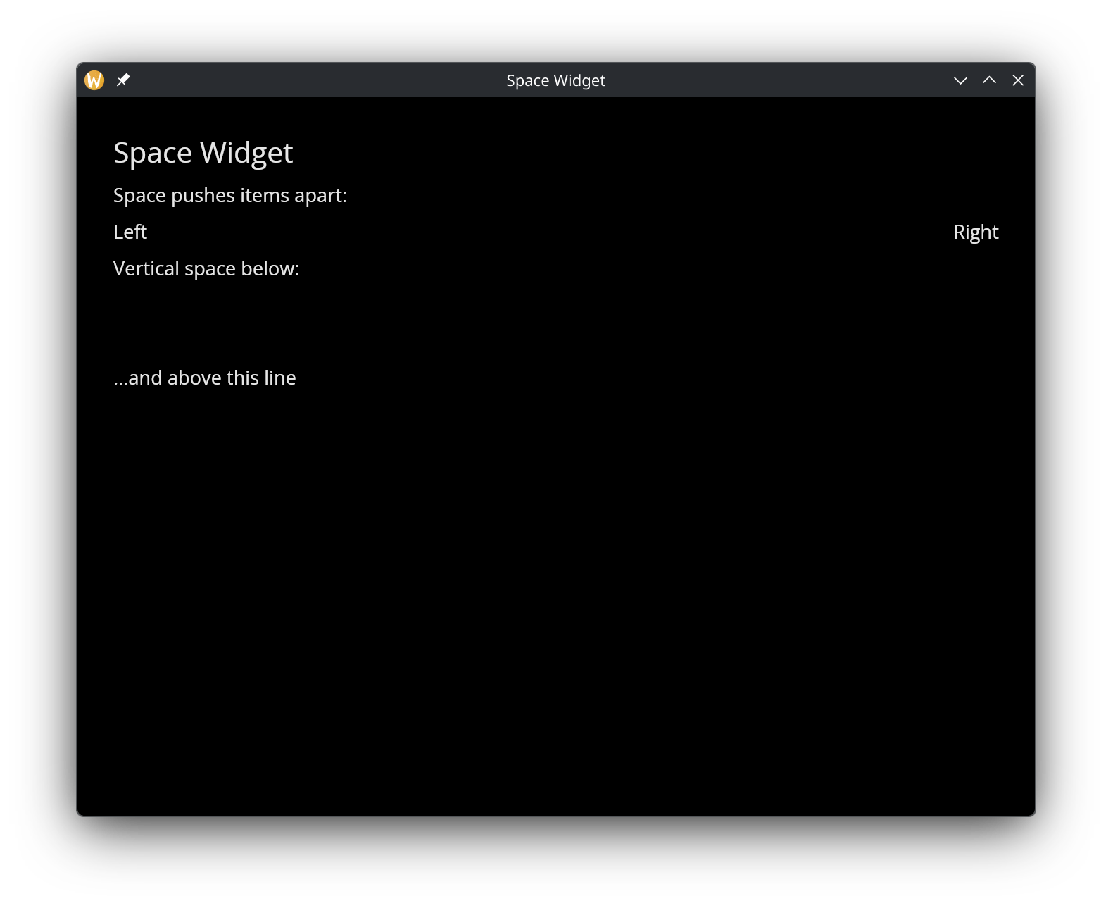
Rules
Rules draw horizontal or vertical lines to visually separate content.
Interface
val horizontal_rule: fn(?#height: &f64) -> Widget;
val vertical_rule: fn(?#width: &f64) -> Widget;
Parameters
- height (horizontal_rule) — thickness of the horizontal line in pixels
- width (vertical_rule) — thickness of the vertical line in pixels
Example
use gui;
use gui::text;
use gui::column;
use gui::row;
use gui::rule;
mod icon;
[&window(
#icon: &icon::icon,
#title: &"Rules",
&row(
#spacing: &20.0,
#padding: &`All(30.0),
#width: &`Fill,
#height: &`Fill,
&[
column(
#spacing: &10.0,
#width: &`Fill,
&[
text(#size: &24.0, &"Horizontal Rules"),
text(&"Section One"),
horizontal_rule(),
text(&"Section Two"),
horizontal_rule(#height: &4.0),
text(&"Section Three")
]
),
vertical_rule(),
column(
#spacing: &10.0,
#width: &`Fill,
&[
text(#size: &24.0, &"Right Panel"),
text(&"Separated by a vertical rule")
]
)
]
)
)]
See Also
- Column — vertical layout where rules serve as dividers
- Row — horizontal layout where vertical rules separate sections
- Scrollable — rules work well between scrollable list items
The Canvas Widget
The canvas widget provides a low-level 2D drawing surface for custom graphics. You supply an array of shapes – lines, circles, rectangles, arcs, curves, text labels, and arbitrary paths – and the canvas renders them in order. This makes it suitable for diagrams, visualizations, procedural art, and anything that doesn’t fit into the standard widget set.
Interface
type PathSegment = [
`MoveTo({x: f64, y: f64}),
`LineTo({x: f64, y: f64}),
`BezierTo({
control_a: {x: f64, y: f64},
control_b: {x: f64, y: f64},
to: {x: f64, y: f64}
}),
`QuadraticTo({
control: {x: f64, y: f64},
to: {x: f64, y: f64}
}),
`ArcTo({
a: {x: f64, y: f64},
b: {x: f64, y: f64},
radius: f64
}),
`Close(null)
];
type CanvasShape = [
`Line({
from: {x: f64, y: f64}, to: {x: f64, y: f64},
color: Color, width: f64
}),
`Circle({
center: {x: f64, y: f64}, radius: f64,
fill: [Color, null], stroke: [{color: Color, width: f64}, null]
}),
`Rect({
top_left: {x: f64, y: f64}, size: {width: f64, height: f64},
fill: [Color, null], stroke: [{color: Color, width: f64}, null]
}),
`RoundedRect({
top_left: {x: f64, y: f64}, size: {width: f64, height: f64},
radius: f64,
fill: [Color, null], stroke: [{color: Color, width: f64}, null]
}),
`Arc({
center: {x: f64, y: f64}, radius: f64,
start_angle: f64, end_angle: f64,
stroke: {color: Color, width: f64}
}),
`Ellipse({
center: {x: f64, y: f64}, radii: {x: f64, y: f64},
rotation: f64, start_angle: f64, end_angle: f64,
fill: [Color, null], stroke: [{color: Color, width: f64}, null]
}),
`BezierCurve({
from: {x: f64, y: f64},
control_a: {x: f64, y: f64}, control_b: {x: f64, y: f64},
to: {x: f64, y: f64},
color: Color, width: f64
}),
`QuadraticCurve({
from: {x: f64, y: f64}, control: {x: f64, y: f64},
to: {x: f64, y: f64},
color: Color, width: f64
}),
`Text({
content: string, position: {x: f64, y: f64},
color: Color, size: f64
}),
`Path({
segments: Array<PathSegment>,
fill: [Color, null], stroke: [{color: Color, width: f64}, null]
})
];
val canvas: fn(
?#width: &Length,
?#height: &Length,
?#background: &[Color, null],
a: &Array<CanvasShape>
) -> Widget
Parameters
- width - Horizontal sizing as a
Length. Defaults to`Shrink. - height - Vertical sizing as a
Length. Defaults to`Shrink. - background - Background color for the canvas area. Null means transparent.
The positional argument is a reference to an array of CanvasShape values. Shapes are drawn in array order, so later shapes paint over earlier ones.
Shapes
Line
A straight line between two points with a given color and stroke width.
`Line({ from: {x: 0.0, y: 0.0}, to: {x: 100.0, y: 50.0},
color: color(#r: 1.0)$, width: 2.0 })
Circle
A circle defined by center and radius. Either or both of fill and stroke can be provided; set the other to null.
`Circle({ center: {x: 100.0, y: 100.0}, radius: 40.0,
fill: color(#r: 0.2, #g: 0.6, #b: 1.0)$, stroke: null })
Rect
An axis-aligned rectangle defined by its top-left corner and size.
`Rect({ top_left: {x: 10.0, y: 10.0}, size: {width: 80.0, height: 60.0},
fill: color(#g: 0.8, #b: 0.4)$, stroke: null })
RoundedRect
Like Rect but with rounded corners. The radius field controls the corner rounding.
`RoundedRect({ top_left: {x: 10.0, y: 10.0}, size: {width: 80.0, height: 60.0},
radius: 8.0,
fill: null, stroke: {color: color(#r: 1.0, #g: 1.0, #b: 1.0)$, width: 2.0} })
Arc
A circular arc defined by center, radius, and start/end angles in radians. Arcs only have a stroke (no fill).
`Arc({ center: {x: 100.0, y: 100.0}, radius: 50.0,
start_angle: 0.0, end_angle: 3.14159,
stroke: {color: color(#r: 1.0, #g: 0.5)$, width: 2.0} })
Ellipse
An ellipse with independent x and y radii, a rotation angle, and start/end angles (all in radians). Supports both fill and stroke.
`Ellipse({ center: {x: 150.0, y: 100.0}, radii: {x: 60.0, y: 30.0},
rotation: 0.5, start_angle: 0.0, end_angle: 6.283,
fill: color(#r: 0.8, #g: 0.2, #b: 0.8, #a: 0.5)$, stroke: null })
BezierCurve
A cubic Bezier curve defined by start, two control points, and end. Drawn as a stroked line.
`BezierCurve({ from: {x: 0.0, y: 100.0},
control_a: {x: 50.0, y: 0.0}, control_b: {x: 150.0, y: 200.0},
to: {x: 200.0, y: 100.0},
color: color(#g: 1.0, #b: 1.0)$, width: 2.0 })
QuadraticCurve
A quadratic Bezier curve with one control point. Drawn as a stroked line.
`QuadraticCurve({ from: {x: 0.0, y: 100.0},
control: {x: 100.0, y: 0.0},
to: {x: 200.0, y: 100.0},
color: color(#r: 1.0, #g: 1.0)$, width: 2.0 })
Text
A text label placed at a specific position on the canvas.
`Text({ content: "Hello", position: {x: 50.0, y: 50.0},
color: color(#r: 1.0, #g: 1.0, #b: 1.0)$, size: 16.0 })
Path
An arbitrary path built from PathSegment values. Supports fill, stroke, or both. Path segments are:
`MoveTo({x, y})– move the pen without drawing`LineTo({x, y})– draw a straight line to the point`BezierTo({control_a, control_b, to})– cubic Bezier segment`QuadraticTo({control, to})– quadratic Bezier segment`ArcTo({a, b, radius})– arc through two tangent points`Close(null)– close the path back to its start
`Path({
segments: [
`MoveTo({x: 0.0, y: 0.0}),
`LineTo({x: 50.0, y: 100.0}),
`LineTo({x: 100.0, y: 0.0}),
`Close(null)
],
fill: color(#r: 0.5, #b: 0.5, #a: 0.8)$,
stroke: null
})
Examples
Basic Shapes
use gui;
use gui::text;
use gui::canvas;
use gui::column;
mod icon;
let shapes = &[
`Rect({
top_left: { x: 50.0, y: 50.0 },
size: { width: 200.0, height: 150.0 },
fill: color(#r: 0.2, #g: 0.4, #b: 0.8)$,
stroke: null
}),
`Circle({
center: { x: 350.0, y: 125.0 },
radius: 60.0,
fill: color(#r: 0.8, #g: 0.2, #b: 0.3)$,
stroke: null
}),
`Line({
from: { x: 50.0, y: 250.0 },
to: { x: 450.0, y: 250.0 },
color: color(#g: 0.8, #b: 0.4)$,
width: 3.0
}),
`Text({
content: "Hello Canvas!",
position: { x: 150.0, y: 280.0 },
color: color(#r: 1.0, #g: 1.0, #b: 1.0)$,
size: 24.0
})
];
let col = column(
#spacing: &15.0,
#padding: &`All(20.0),
#width: &`Fill,
#height: &`Fill,
&[
text(#size: &24.0, #halign: &`Center, #width: &`Fill, &"Canvas Demo"),
canvas(
#width: &`Fill,
#height: &`Fill,
#background: &color(#r: 0.1, #g: 0.1, #b: 0.15)$,
shapes
)
]
);
[&window(#icon: &icon::icon, #title: &"Canvas", #size: &{ width: 600.0, height: 450.0 }, &col)]
See Also
The Chart Widget
The chart widget renders data visualizations with multiple datasets, axis labels, and automatic or manual axis scaling. It supports line charts, scatter plots, bar charts, area charts, dashed lines, candlestick charts, error bars, pie charts, and 3D plots (scatter, line, surface). Multiple series types can be mixed on the same chart (within the same mode — you cannot mix e.g. bar and pie).
Interface
type SeriesStyle = {
color: [Color, null],
label: [string, null],
stroke_width: [f64, null],
point_size: [f64, null]
};
type BarStyle = {
color: [Color, null],
label: [string, null],
margin: [f64, null]
};
type CandlestickStyle = {
gain_color: [Color, null],
loss_color: [Color, null],
bar_width: [f64, null],
label: [string, null]
};
type PieStyle = {
colors: [Array<Color>, null],
donut: [f64, null],
label_offset: [f64, null],
show_percentages: [bool, null],
start_angle: [f64, null]
};
type SurfaceStyle = {
color: [Color, null],
color_by_z: [bool, null],
label: [string, null]
};
type Projection3D = {
pitch: [f64, null],
scale: [f64, null],
yaw: [f64, null]
};
type OhlcPoint<'a: [f64, datetime]> = {x: 'a, open: f64, high: f64, low: f64, close: f64};
type ErrorBarPoint<'a: [f64, datetime]> = {x: 'a, min: f64, avg: f64, max: f64};
type MeshStyle = {
show_x_grid: [bool, null],
show_y_grid: [bool, null],
grid_color: [Color, null],
axis_color: [Color, null],
label_color: [Color, null],
label_size: [f64, null],
x_label_area_size: [f64, null],
x_labels: [i64, null],
y_label_area_size: [f64, null],
y_labels: [i64, null]
};
type LegendStyle = {
background: [Color, null],
border: [Color, null],
label_color: [Color, null],
label_size: [f64, null]
};
type LegendPosition = [
`UpperLeft, `UpperRight, `LowerLeft, `LowerRight,
`MiddleLeft, `MiddleRight, `UpperMiddle, `LowerMiddle
];
type Dataset = [
`Line({data: &[Array<(f64, f64)>, Array<(datetime, f64)>], style: SeriesStyle}),
`Scatter({data: &[Array<(f64, f64)>, Array<(datetime, f64)>], style: SeriesStyle}),
`Bar({data: &Array<(string, f64)>, style: BarStyle}),
`Area({data: &[Array<(f64, f64)>, Array<(datetime, f64)>], style: SeriesStyle}),
`DashedLine({data: &[Array<(f64, f64)>, Array<(datetime, f64)>], dash: f64, gap: f64, style: SeriesStyle}),
`Candlestick({data: &[Array<OhlcPoint<f64>>, Array<OhlcPoint<datetime>>], style: CandlestickStyle}),
`ErrorBar({data: &[Array<ErrorBarPoint<f64>>, Array<ErrorBarPoint<datetime>>], style: SeriesStyle}),
`Pie({data: &Array<(string, f64)>, style: PieStyle}),
`Scatter3D({data: &Array<(f64, f64, f64)>, style: SeriesStyle}),
`Line3D({data: &Array<(f64, f64, f64)>, style: SeriesStyle}),
`Surface({data: &Array<Array<(f64, f64, f64)>>, style: SurfaceStyle})
];
val chart: fn(
?#title: &[string, null],
?#title_color: &[Color, null],
?#x_label: &[string, null],
?#y_label: &[string, null],
?#x_range: &[{min: f64, max: f64}, {min: datetime, max: datetime}, null],
?#y_range: &[{min: f64, max: f64}, null],
?#z_label: &[string, null],
?#z_range: &[{min: f64, max: f64}, null],
?#projection: &[Projection3D, null],
?#width: &Length,
?#height: &Length,
?#background: &[Color, null],
?#margin: &[f64, null],
?#title_size: &[f64, null],
?#legend_position: &[LegendPosition, null],
?#legend_style: &[LegendStyle, null],
?#mesh: &[MeshStyle, null],
a: &Array<Dataset>
) -> Widget
Chart Parameters
- title — Chart title displayed above the plot area. Null for no title.
- title_color — Color of the chart title text. Defaults to black when null.
- x_label — Label for the x-axis. Null for no label.
- y_label — Label for the y-axis. Null for no label.
- x_range — Manual x-axis range as
{min: f64, max: f64}or{min: datetime, max: datetime}. When null, the range is computed automatically from the data. - y_range — Manual y-axis range as
{min: f64, max: f64}. When null, auto-computed. - z_label — Label for the z-axis (3D charts only). Null for no label.
- z_range — Manual z-axis range as
{min: f64, max: f64}(3D charts only). When null, auto-computed. - projection — 3D projection parameters as a
Projection3Dstruct. Controls pitch, yaw, and scale of the 3D view. When null, plotters defaults are used. - width — Horizontal sizing as a
Length. Defaults to`Fill. - height — Vertical sizing as a
Length. Defaults to`Fill. - background — Background color as a
Colorstruct. Defaults to white when null. - margin — Margin in pixels around the plot area. Defaults to 10.
- title_size — Font size for the chart title. Defaults to 16.
- legend_position — Position of the series legend. Defaults to
`UpperLeftwhen null. - legend_style — Legend appearance via a
LegendStylestruct. Controls background, border, text color, and label size. When null, defaults to white background with black border. - mesh — Grid and axis styling via a
MeshStylestruct. When null, plotters defaults are used.
The positional argument is a reference to an array of Dataset values. Multiple datasets can be plotted on the same axes.
Series Constructors
Rather than constructing Dataset variants directly, use these convenience functions. All style parameters are optional and default to null.
chart::line
chart::line(#label: "Price", #color: color(#r: 1.0)$, &data)
Points connected by straight line segments. Data is &[Array<(f64, f64)>, Array<(datetime, f64)>] — either numeric or time-series x values.
chart::scatter
chart::scatter(#label: "Points", #point_size: 5.0, &data)
Individual points without connecting lines. Same data type as line.
chart::bar
chart::bar(#label: "Counts", &data)
Vertical bars from the x-axis. Data is &Array<(string, f64)> — category labels paired with values. Uses BarStyle (which has margin instead of stroke_width/point_size).
chart::area
chart::area(#label: "Volume", &data)
Like line but with the region between the line and the x-axis filled with 30% opacity. Same data type as line.
chart::dashed_line
chart::dashed_line(#label: "Projection", #dash: 10.0, #gap: 5.0, &data)
A dashed line series. dash and gap control the dash and gap lengths in pixels. Defaults to 5.0 each.
chart::candlestick
chart::candlestick(#label: "OHLC", &ohlc_data)
Financial candlestick chart. Data is &[Array<OhlcPoint<f64>>, Array<OhlcPoint<datetime>>] where each point has {x, open, high, low, close} fields. Gain candles (close > open) are green by default; loss candles are red. Override with #gain_color and #loss_color.
chart::error_bar
chart::error_bar(#label: "Confidence", &error_data)
Vertical error bars. Data is &[Array<ErrorBarPoint<f64>>, Array<ErrorBarPoint<datetime>>] where each point has {x, min, avg, max} fields. A circle is drawn at the average value with whiskers extending to min and max.
chart::pie
chart::pie(#show_percentages: true, #start_angle: -90.0, &data)
Pie chart. Data is &Array<(string, f64)> — category labels paired with values. Uses PieStyle which controls colors, donut hole size, label offset, percentage display, and start angle.
chart::scatter3d
chart::scatter3d(#label: "3D Points", #point_size: 4.0, &data)
3D scatter plot. Data is &Array<(f64, f64, f64)>. Use the chart #projection parameter to control the 3D viewing angle.
chart::line3d
chart::line3d(#label: "3D Line", &data)
3D line plot. Data is &Array<(f64, f64, f64)>. Points connected by line segments in 3D space.
chart::surface
chart::surface(#color_by_z: true, #label: "surface", &grid_data)
3D surface plot. Data is &Array<Array<(f64, f64, f64)>> — a grid of rows where each point is (x, y, z). Set #color_by_z: true for automatic heat-map coloring based on z values.
chart::mesh_style
chart::mesh_style(#label_color: color(#r: 1.0, #g: 1.0, #b: 1.0)$, #x_labels: 5)
Constructs a MeshStyle value for use with the chart’s #mesh parameter.
chart::legend_style
chart::legend_style(#background: color(#r: 0.1, #g: 0.1, #b: 0.1)$, #label_color: color(#r: 1.0, #g: 1.0, #b: 1.0)$)
Constructs a LegendStyle value for use with the chart’s #legend_style parameter.
Style Fields
SeriesStyle
Used by line, scatter, area, dashed_line, error_bar, scatter3d, and line3d:
- color — Series color. When null, a color is assigned from a default palette.
- label — Display name shown in the legend. When null, no legend entry is created.
- stroke_width — Line/stroke width in pixels. Defaults to 2.
- point_size — Point radius for scatter plots. Defaults to 3.
BarStyle
Used by bar:
- color — Bar fill color. When null, assigned from palette.
- label — Display name shown in the legend.
- margin — Margin between bars in pixels.
CandlestickStyle
Used by candlestick:
- gain_color — Color for gain candles (close > open). Defaults to green.
- loss_color — Color for loss candles (close <= open). Defaults to red.
- bar_width — Width of candlestick bodies in pixels. Defaults to 5.
- label — Display name shown in the legend.
PieStyle
Used by pie:
- colors — Array of colors for pie slices. When null, default palette is used.
- donut — Inner radius as a fraction of the outer radius (0.0–1.0). When null or 0, draws a full pie.
- label_offset — Distance of labels from the pie center as a percentage. Defaults to plotters default.
- show_percentages — Whether to display percentage values on labels. Defaults to false.
- start_angle — Starting angle in degrees. Defaults to 0 (3 o’clock position). Use -90.0 to start at 12 o’clock.
SurfaceStyle
Used by surface:
- color — Surface fill color. When null, assigned from palette.
- color_by_z — When true, colors the surface with a heat map based on z values. Defaults to false.
- label — Display name shown in the legend.
Projection3D
Used with the chart #projection parameter for 3D charts:
- pitch — Vertical rotation angle in radians.
- scale — Scale factor for the 3D projection.
- yaw — Horizontal rotation angle in radians.
MeshStyle Fields
- show_x_grid — Show vertical grid lines. Defaults to true when null.
- show_y_grid — Show horizontal grid lines. Defaults to true when null.
- grid_color — Color of grid lines.
- axis_color — Color of axis lines.
- label_color — Color of tick labels and axis descriptions. Essential for dark backgrounds where the default black text is invisible.
- label_size — Font size for axis labels.
- x_label_area_size — Width of the x-axis label area in pixels. Increase to prevent label clipping.
- x_labels — Number of x-axis tick labels.
- y_label_area_size — Width of the y-axis label area in pixels. Increase to prevent label clipping.
- y_labels — Number of y-axis tick labels.
LegendStyle Fields
- background — Legend background color. Defaults to white when null.
- border — Legend border color. Defaults to black when null.
- label_color — Color of legend text labels. Defaults to plotters default (black) when null.
- label_size — Font size for legend labels. When null, plotters default is used.
Examples
Multiple Datasets
use gui;
use gui::text;
use gui::chart;
use gui::column;
use gui::row;
use gui::slider;
mod icon;
let rate = 0.;
let clock = sys::time::timer(1. - rate, true);
let x = cast<f64>(count(clock))$;
let series = |start: f64, end: f64| -> Array<(f64, f64)> {
let d = [];
let y = rand::rand(#start, #end, #clock);
d <- array::window(#n:20, clock ~ d, (x, y));
d
};
let adjust_speed = row(
#spacing:&15.0,
&[
text(#size: &14.0, &"Adjust Speed"),
slider(#min:&0., #max:&0.9, #step:&0.1, #on_change:|v| rate <- v, &rate)
]
);
let col = column(
#spacing: &15.0,
#padding: &`All(20.0),
#width: &`Fill,
#height: &`Fill,
&[
text(#size: &24.0, #halign: &`Center, #width: &`Fill, &"Chart Demo"),
adjust_speed,
chart::chart(
#title: &"Sample Data",
#x_label: &"x",
#y_label: &"y",
&[
chart::line(#label: "Series A", &series(0., 50.)),
chart::scatter(#label: "Series B", &series(0., 5.))
]
)
]
);
[&window(#icon: &icon::icon, #title: &"Chart", #size: &{ width: 900.0, height: 700.0 }, &col)]
Bar Chart
use gui;
use gui::text;
use gui::chart;
use gui::column;
mod icon;
let data = [
("Jan", 42.),
("Feb", 67.),
("Mar", 35.),
("Apr", 89.),
("May", 54.),
("Jun", 73.),
("Jul", 28.),
("Aug", 61.)
];
let col = column(
#spacing: &15.0,
#padding: &`All(20.0),
#width: &`Fill,
#height: &`Fill,
&[
text(#size: &24.0, #halign: &`Center, #width: &`Fill, &"Bar Chart"),
chart::chart(
#title: &"Monthly Sales",
#x_label: &"Month",
#y_label: &"Units Sold",
&[
chart::bar(
#label: "Product A",
#color: color(#r: 0.2, #g: 0.5, #b: 0.8)$,
&data
)
]
)
]
);
[&window(#icon: &icon::icon, #title: &"Bar Chart", #size: &{width: 800.0, height: 600.0}, &col)]
Candlestick
use gui;
use gui::text;
use gui::chart;
use gui::column;
mod icon;
let dark_bg = color(#r: 0.1, #g: 0.1, #b: 0.15)$;
let ohlc_data = [
{x: datetime:"2024-01-01T00:00:00Z", open: 100., high: 108., low: 97., close: 105.},
{x: datetime:"2024-01-02T00:00:00Z", open: 105., high: 112., low: 103., close: 110.},
{x: datetime:"2024-01-03T00:00:00Z", open: 110., high: 115., low: 106., close: 107.},
{x: datetime:"2024-01-04T00:00:00Z", open: 107., high: 111., low: 101., close: 103.},
{x: datetime:"2024-01-05T00:00:00Z", open: 103., high: 109., low: 100., close: 108.},
{x: datetime:"2024-01-08T00:00:00Z", open: 108., high: 116., low: 107., close: 114.},
{x: datetime:"2024-01-09T00:00:00Z", open: 114., high: 118., low: 110., close: 112.},
{x: datetime:"2024-01-10T00:00:00Z", open: 112., high: 117., low: 108., close: 116.},
{x: datetime:"2024-01-11T00:00:00Z", open: 116., high: 120., low: 113., close: 115.},
{x: datetime:"2024-01-12T00:00:00Z", open: 115., high: 119., low: 109., close: 110.},
{x: datetime:"2024-01-15T00:00:00Z", open: 110., high: 114., low: 105., close: 106.},
{x: datetime:"2024-01-16T00:00:00Z", open: 106., high: 112., low: 104., close: 111.},
{x: datetime:"2024-01-17T00:00:00Z", open: 111., high: 117., low: 109., close: 115.},
{x: datetime:"2024-01-18T00:00:00Z", open: 115., high: 121., low: 114., close: 120.},
{x: datetime:"2024-01-19T00:00:00Z", open: 120., high: 125., low: 118., close: 119.},
{x: datetime:"2024-01-22T00:00:00Z", open: 119., high: 122., low: 112., close: 113.},
{x: datetime:"2024-01-23T00:00:00Z", open: 113., high: 118., low: 110., close: 117.},
{x: datetime:"2024-01-24T00:00:00Z", open: 117., high: 123., low: 115., close: 122.},
{x: datetime:"2024-01-25T00:00:00Z", open: 122., high: 126., low: 118., close: 119.},
{x: datetime:"2024-01-26T00:00:00Z", open: 119., high: 124., low: 116., close: 123.}
];
let col = column(
#spacing: &15.0,
#padding: &`All(20.0),
#width: &`Fill,
#height: &`Fill,
&[
text(#size: &24.0, #halign: &`Center, #width: &`Fill, &"Candlestick Chart"),
chart::chart(
#title: &"ACME Corp",
#title_color: &color(#r: 0.9, #g: 0.9, #b: 0.95)$,
#x_label: &"Date",
#y_label: &"Price",
#background: &dark_bg,
#title_size: &20.0,
#legend_style: &chart::legend_style(
#background: color(#r: 0.15, #g: 0.15, #b: 0.2)$,
#border: color(#r: 0.4, #g: 0.4, #b: 0.45)$,
#label_color: color(#r: 0.85, #g: 0.85, #b: 0.9)$
),
#mesh: &chart::mesh_style(
#show_x_grid: false,
#grid_color: color(#r: 0.3, #g: 0.3, #b: 0.35)$,
#axis_color: color(#r: 0.6, #g: 0.6, #b: 0.65)$,
#label_color: color(#r: 0.75, #g: 0.75, #b: 0.8)$,
#x_label_area_size: 60.0
),
&[
chart::candlestick(
#label: "ACME",
#gain_color: color(#g: 0.8, #b: 0.4)$,
#loss_color: color(#r: 0.9, #g: 0.2, #b: 0.2)$,
#bar_width: 6.0,
&ohlc_data
)
]
)
]
);
[&window(
#icon: &icon::icon,
#title: &"Candlestick",
#size: &{width: 900.0, height: 650.0},
#theme: &`CatppuccinMocha,
&col
)]
Error Bars
use gui;
use gui::text;
use gui::chart;
use gui::column;
mod icon;
let clock = sys::time::timer(duration:1.s, true);
let x = cast<f64>(count(clock))$;
let avg_data = [];
let err_data = [];
let avg = rand::rand(#start: 20., #end: 80., #clock);
let noise = rand::rand(#start: 3., #end: 15., #clock);
avg_data <- array::window(#n: 25, clock ~ avg_data, (x, avg));
err_data <- array::window(#n: 25, clock ~ err_data, {
x, min: avg - noise, avg, max: avg + noise
});
let col = column(
#spacing: &15.0,
#padding: &`All(20.0),
#width: &`Fill,
#height: &`Fill,
&[
text(#size: &24.0, #halign: &`Center, #width: &`Fill, &"Error Bar Chart"),
chart::chart(
#title: &"Measurements with Confidence Bands",
#x_label: &"Sample",
#y_label: &"Value",
&[
chart::error_bar(
#label: "Confidence",
#color: color(#r: 0.8, #g: 0.4, #b: 0.4)$,
&err_data
),
chart::line(
#label: "Average",
#color: color(#r: 0.2, #g: 0.4, #b: 0.8)$,
#stroke_width: 2.0,
&avg_data
)
]
)
]
);
[&window(#icon: &icon::icon, #title: &"Error Bars", #size: &{width: 900.0, height: 650.0}, &col)]
Pie Chart
use gui;
use gui::text;
use gui::chart;
use gui::column;
mod icon;
let data = [
("Rust", 35.),
("Python", 25.),
("JavaScript", 20.),
("Go", 12.),
("Other", 8.)
];
let col = column(
#spacing: &15.0,
#padding: &`All(20.0),
#width: &`Fill,
#height: &`Fill,
&[
text(#size: &24.0, #halign: &`Center, #width: &`Fill, &"Language Popularity"),
chart::chart(
#title: &"Programming Languages",
&[
chart::pie(
#show_percentages: true,
#start_angle: -90.0,
&data
)
]
)
]
);
[&window(#icon: &icon::icon, #title: &"Pie Chart", #size: &{width: 800.0, height: 600.0}, &col)]
3D Surface
use gui;
use gui::text;
use gui::chart;
use gui::column;
mod icon;
let surface_data = [
[(-4., -4., 32.), (-4., -2., 20.), (-4., 0., 16.), (-4., 2., 20.), (-4., 4., 32.)],
[(-2., -4., 20.), (-2., -2., 8.), (-2., 0., 4.), (-2., 2., 8.), (-2., 4., 20.)],
[(0., -4., 16.), (0., -2., 4.), (0., 0., 0.), (0., 2., 4.), (0., 4., 16.)],
[(2., -4., 20.), (2., -2., 8.), (2., 0., 4.), (2., 2., 8.), (2., 4., 20.)],
[(4., -4., 32.), (4., -2., 20.), (4., 0., 16.), (4., 2., 20.), (4., 4., 32.)]
];
let col = column(
#spacing: &15.0,
#padding: &`All(20.0),
#width: &`Fill,
#height: &`Fill,
&[
text(#size: &24.0, #halign: &`Center, #width: &`Fill, &"3D Surface Plot"),
chart::chart(
#title: &"Paraboloid",
#x_label: &"X",
#y_label: &"Y",
#z_label: &"Z",
#projection: &{yaw: 0.5, pitch: 0.15, scale: 0.9},
&[
chart::surface(
#color_by_z: true,
#label: "surface",
&surface_data
)
]
)
]
);
[&window(#icon: &icon::icon, #title: &"3D Chart", #size: &{width: 800.0, height: 600.0}, &col)]
Styling
use gui;
use gui::text;
use gui::chart;
use gui::column;
mod icon;
let clock = sys::time::timer(duration:0.5s, true);
let x = cast<f64>(count(clock))$;
let series = |offset, scale| {
let d = [];
let y = rand::rand(#start: 0., #end: scale, #clock) + offset;
d <- array::window(#n: 30, clock ~ d, (x, y));
d
};
let line_data = series(50., 20.);
let area_data = series(20., 15.);
let dash_data = series(70., 10.);
let col = column(
#spacing: &15.0,
#padding: &`All(20.0),
#width: &`Fill,
#height: &`Fill,
&[
text(#size: &24.0, #halign: &`Center, #width: &`Fill, &"Chart Styling"),
chart::chart(
#title: &"Styled Chart",
#title_color: &color(#r: 0.9, #g: 0.9, #b: 0.95)$,
#x_label: &"Time",
#y_label: &"Value",
#background: &color(#r: 0.12, #g: 0.12, #b: 0.18)$,
#margin: &20.0,
#title_size: &22.0,
#legend_position: &`UpperRight,
#legend_style: &chart::legend_style(
#background: color(#r: 0.18, #g: 0.18, #b: 0.24)$,
#border: color(#r: 0.4, #g: 0.4, #b: 0.45)$,
#label_color: color(#r: 0.85, #g: 0.85, #b: 0.9)$
),
#mesh: &chart::mesh_style(
#show_x_grid: true,
#show_y_grid: false,
#grid_color: color(#r: 0.25, #g: 0.25, #b: 0.3)$,
#axis_color: color(#r: 0.5, #g: 0.5, #b: 0.55)$,
#label_color: color(#r: 0.75, #g: 0.75, #b: 0.8)$,
#label_size: 14.0
),
&[
chart::line(
#label: "Signal",
#color: color(#r: 0.3, #g: 0.7, #b: 1.0)$,
#stroke_width: 3.0,
&line_data
),
chart::area(
#label: "Baseline",
#color: color(#r: 0.4, #g: 0.8, #b: 0.4)$,
&area_data
),
chart::dashed_line(
#label: "Projection",
#color: color(#r: 1.0, #g: 0.6, #b: 0.2)$,
#dash: 12.0,
#gap: 6.0,
#stroke_width: 2.0,
&dash_data
)
]
)
]
);
[&window(
#icon: &icon::icon,
#title: &"Chart Styles",
#size: &{width: 900.0, height: 700.0},
#theme: &`CatppuccinMocha,
&col
)]
See Also
- canvas — Low-level drawing for custom visualizations
The Image & SVG Widgets
The image widget displays raster images from files, raw bytes, or pixel buffers. The svg widget renders Scalable Vector Graphics from files or inline XML. Both support sizing and content fitting controls.
Interface
image
type ImageSource = [
string,
`Bytes(bytes),
`Rgba({width: u32, height: u32, pixels: bytes})
];
val image: fn(
?#width: &Length,
?#height: &Length,
?#content_fit: &ContentFit,
a: &ImageSource
) -> Widget
svg
val svg: fn(
?#width: &Length,
?#height: &Length,
?#content_fit: &ContentFit,
s: &string
) -> Widget
Parameters
Both widgets share the same labeled arguments:
- width - Horizontal sizing as a
Length. Defaults to`Shrink. - height - Vertical sizing as a
Length. Defaults to`Shrink. - content_fit - Controls how the content is scaled to fill the available space:
`Fill– Stretch to fill the entire area, ignoring aspect ratio.`Contain– Scale uniformly to fit within the area, preserving aspect ratio. May leave empty space.`Cover– Scale uniformly to cover the entire area, preserving aspect ratio. May crop content.`None– Display at the original size with no scaling.`ScaleDown– Like`Containbut only scales down, never up.
Image Sources
The image widget accepts an ImageSource union with three variants:
- string – A file path to a PNG, JPEG, BMP, GIF, or other supported image format. The path is relative to the working directory.
`Bytes(bytes)– Raw image file bytes (e.g. the contents of a PNG file loaded withsys::fs::read_all_bin). Useful when image data comes from a network source or is embedded in the program. Bytes literals use thebytes:<base64>syntax.`Rgba({width, height, pixels})– A raw RGBA pixel buffer. Thewidthandheightfields specify the image dimensions, andpixelsis abytesvalue containingwidth * height * 4bytes (one byte each for red, green, blue, and alpha per pixel, in row-major order).
The svg widget accepts a string that is either a file path to an .svg file or inline SVG XML content.
Examples
Image
use gui;
use gui::text;
use gui::image;
use gui::column;
mod icon;
let pixels = bytes:/wAA/wD/AP8AAP////8A/wD/////AP///4AA/4AA//8AgAD/gICA//////8AAAD//8DL/6UqKv8AgID//9cA/w==;
[&window(
#icon: &icon::icon,
#title: &"Image Widget",
&column(
#spacing: &15.0,
#padding: &`All(30.0),
#halign: &`Center,
#width: &`Fill,
#height: &`Fill,
&[
text(#size: &24.0, &"Image Demo"),
text(&"A 4x4 pixel image scaled up:"),
image(
#width: &`Fixed(200.0),
#height: &`Fixed(200.0),
&`Rgba({ width: cast<u32>(4)$, height: cast<u32>(4)$, pixels: pixels })
)
]
)
)]
SVG
use gui;
use gui::text;
use gui::image;
use gui::column;
mod icon;
let svg_content = r'<svg xmlns="http://www.w3.org/2000/svg" viewBox="0 0 200 200">
<circle cx="100" cy="100" r="80" fill="#4a9eff" opacity="0.8"/>
<circle cx="100" cy="100" r="50" fill="#ff6b6b" opacity="0.8"/>
<circle cx="100" cy="100" r="25" fill="#ffd93d" opacity="0.9"/>
</svg>';
[&window(
#icon: &icon::icon,
#title: &"SVG Widget",
&column(
#spacing: &15.0,
#padding: &`All(30.0),
#halign: &`Center,
#width: &`Fill,
#height: &`Fill,
&[
text(#size: &24.0, &"SVG Demo"),
image(
#width: &`Fixed(300.0),
#height: &`Fixed(300.0),
#content_fit: &`Contain,
&`Svg(svg_content)
)
]
)
)]
See Also
The Tooltip Widget
The tooltip widget displays a popup hint when the user hovers over a child widget. The tooltip content is itself a widget, allowing rich formatted tips.
Interface
val tooltip: fn(
#tip: &Widget,
?#position: &TooltipPosition,
?#gap: &[f64, null],
a: &Widget
) -> Widget
Parameters
- tip — (required) the tooltip content widget, typically
text(...). This is a required labeled argument. - position — where the tooltip appears relative to the child:
Top,Bottom,Left,Right, orFollowCursor - gap — space in pixels between the child and the tooltip
The positional argument is a reference to the child widget that triggers the tooltip on hover.
Examples
use gui;
use gui::text;
use gui::tooltip;
use gui::button;
use gui::column;
mod icon;
let col = column(
#spacing: &20.0,
#padding: &`All(30.0),
#halign: &`Center,
#width: &`Fill,
&[
text(#size: &24.0, &"Tooltip Demo"),
text(&"Hover over the buttons below:"),
tooltip(
#tip: &text(&"Save your work"),
#position: &`Bottom,
#gap: &5.0,
&button(#padding: &`All(10.0), &text(&"Save"))
),
tooltip(
#tip: &text(&"Delete permanently"),
#position: &`Right,
#gap: &5.0,
&button(#padding: &`All(10.0), &text(&"Delete"))
)
]
);
[&window(#icon: &icon::icon, #title: &"Tooltip", &col)]
See Also
- Button — commonly wrapped with tooltips
- Mouse Area — lower-level mouse interaction
The Mouse Area Widget
The mouse_area widget wraps a child and captures mouse events within its bounds. Use it to add click, hover, and movement tracking to any widget.
Interface
type MouseButton = [`Left, `Right, `Middle];
val mouse_area: fn(
?#on_press: fn(a: MouseButton) -> Any,
?#on_release: fn(a: MouseButton) -> Any,
?#on_enter: fn(a: null) -> Any,
?#on_exit: fn(a: null) -> Any,
?#on_move: fn(a: {x: f64, y: f64}) -> Any,
a: &Widget
) -> Widget
Parameters
- on_press — called when a mouse button is pressed inside the area. Receives a
MouseButtonvariant (`Left,`Right, or`Middle). - on_release — called when a mouse button is released inside the area. Receives a
MouseButtonvariant. - on_enter — called when the mouse cursor enters the area
- on_exit — called when the mouse cursor leaves the area
- on_move — called with
{x, y}coordinates as the mouse moves within the area
The positional argument is a reference to the child widget.
Examples
use gui;
use gui::text;
use gui::mouse_area;
use gui::container;
use gui::column;
mod icon;
let status = "Move the mouse over the box";
let position = "---";
[&window(
#icon: &icon::icon,
#title: &"Mouse Area",
&column(
#spacing: &15.0,
#padding: &`All(30.0),
#width: &`Fill,
&[
text(#size: &24.0, &"Mouse Area Demo"),
text(&status),
text(&"Position: [position]"),
mouse_area(
#on_press: |btn| status <- btn ~ select btn {
`Left => "Left pressed",
`Right => "Right pressed",
`Middle => "Middle pressed"
},
#on_release: |btn| status <- btn ~ select btn {
`Left => "Left released",
`Right => "Right released",
`Middle => "Middle released"
},
#on_enter: |e| status <- e ~ "Mouse entered",
#on_exit: |e| status <- e ~ "Mouse exited",
#on_move: |pos| position <- pos ~ "[pos.x], [pos.y]",
&container(
#width: &`Fixed(300.0),
#height: &`Fixed(200.0),
#halign: &`Center,
#valign: &`Center,
&text(&"Interact here")
)
)
]
)
)]
See Also
- Keyboard Area — keyboard event capture
- Button — simpler click handling
- Tooltip — hover-triggered popups
The Keyboard Area Widget
The keyboard_area widget wraps a child and captures keyboard events. Use it to build keyboard-driven interactions like shortcuts, navigation, or text handling.
Interface
type KeyEvent = {
key: string,
modifiers: { shift: bool, ctrl: bool, alt: bool, logo: bool },
text: string,
repeat: bool
};
val keyboard_area: fn(
?#on_key_press: fn(a: KeyEvent) -> Any,
?#on_key_release: fn(a: KeyEvent) -> Any,
a: &Widget
) -> Widget
The KeyEvent Type
- key — the key name (e.g.
"a","Enter","ArrowUp") - modifiers — which modifier keys were held:
shift,ctrl,alt,logo(super/command) - text — the text produced by the key press (empty for non-character keys)
- repeat —
trueif this is an auto-repeat event from holding the key
Parameters
- on_key_press — called with a
KeyEventwhen a key is pressed - on_key_release — called with a
KeyEventwhen a key is released
The positional argument is a reference to the child widget.
Examples
use gui;
use gui::text;
use gui::keyboard_area;
use gui::container;
use gui::column;
mod icon;
let last_key = "None";
let mod_name = "None";
[&window(
#icon: &icon::icon,
#title: &"Keyboard Area",
&keyboard_area(
#on_key_press: |e| {
last_key <- e ~ e.key;
mod_name <- e ~ select e.modifiers {
{ ctrl: true, shift: _, alt: _, logo: _ } => "Ctrl",
{ ctrl: _, shift: true, alt: _, logo: _ } => "Shift",
{ ctrl: _, shift: _, alt: true, logo: _ } => "Alt",
{ ctrl: _, shift: _, alt: _, logo: true } => "Logo",
_ => "None"
}
},
&container(
#width: &`Fill,
#height: &`Fill,
#halign: &`Center,
#valign: &`Center,
&column(
#spacing: &15.0,
#halign: &`Center,
&[
text(#size: &24.0, &"Keyboard Area Demo"),
text(&"Press any key..."),
text(#size: &32.0, &last_key),
text(&"Modifier: [mod_name]")
]
)
)
)
)]
See Also
- Mouse Area — mouse event capture
- Text Input — built-in text input handling
The Clipboard Module
The clipboard module provides functions for reading from and writing to the system clipboard. Unlike other GUI components, clipboard is a plain module of functions, not a widget constructor.
Interface
type ClipboardImage = { height: u32, pixels: bytes, width: u32 };
type HtmlContent = { alt_text: string, html: string };
val read_text: fn(v: Any) -> Result<string, `ClipboardError(string)>;
val write_text: fn(s: string) -> Result<null, `ClipboardError(string)>;
val read_image: fn(v: Any) -> Result<ClipboardImage, `ClipboardError(string)>;
val write_image: fn(a: ClipboardImage) -> Result<null, `ClipboardError(string)>;
val read_html: fn(v: Any) -> Result<string, `ClipboardError(string)>;
val write_html: fn(a: HtmlContent) -> Result<null, `ClipboardError(string)>;
val read_files: fn(v: Any) -> Result<Array<string>, `ClipboardError(string)>;
val write_files: fn(a: Array<string>) -> Result<null, `ClipboardError(string)>;
val clear: fn(v: Any) -> Result<null, `ClipboardError(string)>;
Functions
Text
- read_text — reads text from the clipboard. Takes an event trigger (
Any) to control when the read happens. - write_text — writes a string to the clipboard.
Images
- read_image — reads an image from the clipboard as a
ClipboardImagecontaining raw pixel data. - write_image — writes a
ClipboardImageto the clipboard.
HTML
- read_html — reads HTML content from the clipboard.
- write_html — writes HTML content with alt text to the clipboard.
Files
- read_files — reads file paths from the clipboard (e.g. from a file manager copy).
- write_files — writes file paths to the clipboard.
Utility
- clear — clears all clipboard contents.
All read functions take an Any argument as an event trigger — they execute when the trigger fires. All functions return Result types that may contain a ClipboardError.
Examples
use gui;
use gui::text;
use gui::text_input;
use gui::button;
use gui::column;
use gui::clipboard;
mod icon;
let content = "Hello, clipboard!";
let pasted = "";
let col = column(
#spacing: &15.0,
#padding: &`All(30.0),
#width: &`Fill,
&[
text(#size: &24.0, &"Clipboard Demo"),
text_input(#placeholder: &"Text to copy...", #on_input: |v| content <- v, &content),
button(
#on_press: |c| clipboard::write_text(c ~ content)$,
#padding: &`All(10.0),
&text(&"Copy to clipboard")
),
button(
#on_press: |c| pasted <- c ~ clipboard::read_text(c)$,
#padding: &`All(10.0),
&text(&"Paste from clipboard")
),
text(&"Pasted: [pasted]")
]
);
[&window(#icon: &icon::icon, #title: &"Clipboard", &col)]
See Also
- Button — commonly used to trigger clipboard operations
- Text Input — text entry for clipboard content
The Grid Widget
A layout container that arranges child widgets in a grid with a fixed number of columns. Items wrap to the next row automatically.
Interface
type GridColumns = [`Fixed(i64), `Fluid(f64)];
type GridHeight = [`AspectRatio(f64), `EvenlyDistribute(Length)];
val grid: fn(
?#spacing: &f64,
?#columns: &GridColumns,
?#width: &[f64, null],
?#height: &GridHeight,
a: &Array<Widget>
) -> Widget
Parameters
#spacing– Space in pixels between grid cells, applied both horizontally and vertically. Defaults to0.0.#columns– How columns are determined.`Fixed(n)uses exactlyncolumns.`Fluid(min_width)calculates the column count so each column is at leastmin_widthpixels wide. Defaults to`Fixed(3).#width– Total width of the grid in pixels, ornullto use the available space. Defaults tonull.#height– How row heights are determined.`AspectRatio(ratio)sets each cell’s height relative to its width (e.g.1.0for square cells).`EvenlyDistribute(len)divides the givenLengthevenly among all rows. Defaults to`AspectRatio(1.0).- positional
&Array<Widget>– The child widgets to arrange in the grid. They fill left-to-right, top-to-bottom.
Examples
Colored Grid Items
use gui;
use gui::text;
use gui::grid;
use gui::container;
use gui::column;
mod icon;
let item = |label| container(
#width: &`Fill,
#halign: &`Center,
#valign: &`Center,
#padding: &`All(20.0),
&text(#size: &16.0, &label)
);
let col = column(
#spacing: &20.0,
#padding: &`All(30.0),
#width: &`Fill,
&[
text(#size: &24.0, &"Grid Demo"),
grid(
#columns: &`Fixed(3),
#spacing: &10.0,
#width: &800.0,
&[
item("One"),
item("Two"),
item("Three"),
item("Four"),
item("Five"),
item("Six")
]
)
]
);
[&window(#icon: &icon::icon, #title: &"Grid Widget", &col)]
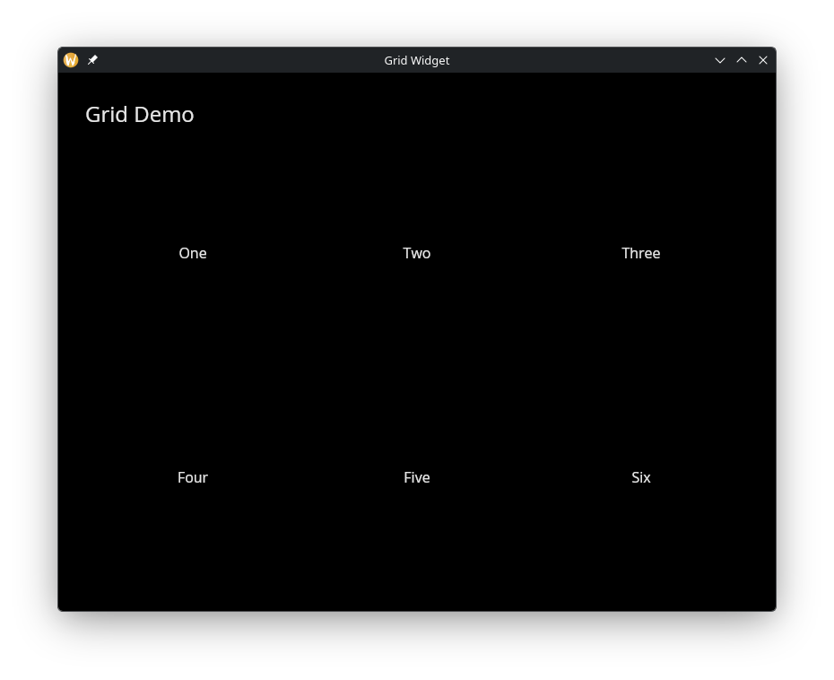
See Also
- column – single-column vertical layout
- row – single-row horizontal layout
- types – for
Lengthand other shared types
The QR Code Widget
Encodes a string as a QR code image. The QR code updates reactively when the input string changes.
Interface
val qr_code: fn(
?#cell_size: &[f64, null],
s: &string
) -> Widget
Parameters
#cell_size– Size in pixels of each cell in the QR code matrix, ornullfor the default size. Larger values produce a bigger QR code image.- positional
&string– The data to encode. Any valid string will be encoded into the QR code.
Examples
QR Code from Text Input
use gui;
use gui::text;
use gui::text_input;
use gui::qr_code;
use gui::column;
mod icon;
let url = "https://graphix-lang.github.io/graphix";
let col = column(
#spacing: &20.0,
#padding: &`All(30.0),
#halign: &`Center,
#width: &`Fill,
&[
text(#size: &24.0, &"QR Code Demo"),
text_input(
#placeholder: &"Enter text...",
#on_input: |v| url <- v,
&url
),
qr_code(#cell_size: &4.0, &url)
]
);
[&window(#icon: &icon::icon, #title: &"QR Code", &col)]
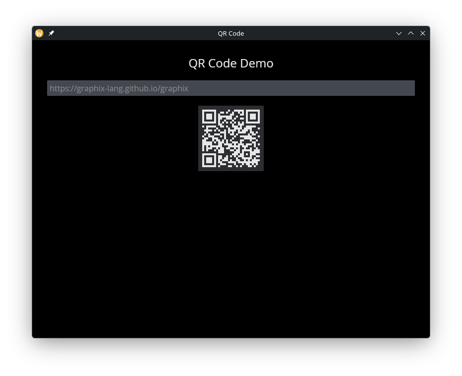
See Also
The Markdown Widget
Renders a markdown string as rich text with support for headings, bold, italic, lists, code blocks, and clickable links.
Interface
val markdown: fn(
?#on_link: fn(s: string) -> Any,
?#spacing: &[f64, null],
?#text_size: &[f64, null],
?#width: &Length,
s: &string
) -> Widget
Parameters
#on_link– Callback invoked when the user clicks a link in the rendered markdown. Receives the URL as astring. If omitted, links are displayed but not interactive.#spacing– Vertical space in pixels between markdown elements (paragraphs, headings, lists), ornullfor the default spacing.#text_size– Base text size in pixels, ornullfor the default. Headings scale relative to this size.#width– Width of the markdown content area. AcceptsLengthvalues. Defaults to`Fill.- positional
&string– The markdown source text to render.
Examples
Rendered Markdown with Link Callback
use gui;
use gui::text;
use gui::text_editor;
use gui::markdown;
use gui::column;
mod icon;
let content = r'# Markdown Demo
This is **bold** and this is *italic*.
- First item
- Second item
- Fifth item
Here is a [link](https://graphix.dev) you can click.
';
let col = column(
#spacing: &20.0,
#padding: &`All(30.0),
#width: &`Fill,
&[
text(#size: &24.0, &"Markdown Widget"),
markdown(
#on_link: |url| println("Clicked: [url]"),
#text_size: &16.0,
&content
),
text_editor(
#on_edit: |v| content <- v,
#height: &200.0,
&content
)
]
);
[&window(#icon: &icon::icon, #title: &"Markdown", &col)]
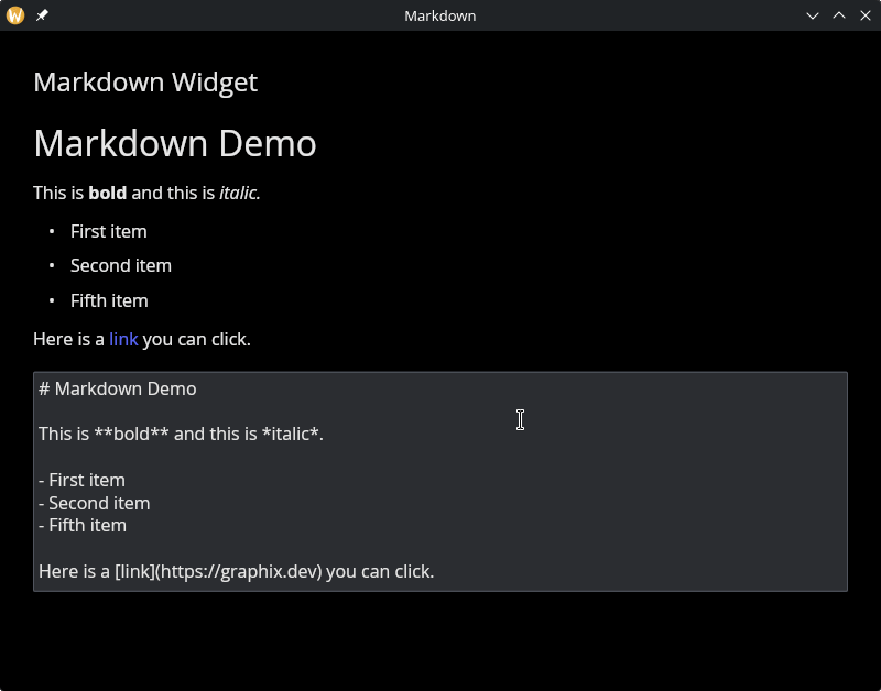
See Also
- text – for plain text display
- text_editor – for editing text content
The Table Widget
Displays data in rows and columns with configurable headers, alignment, and separators. Tables are built from TableColumn definitions and a 2D array of row widgets.
Interface
type TableColumn = {
header: &Widget,
width: &Length,
halign: &HAlign,
valign: &VAlign
};
val table_column: fn(
?#width: &Length,
?#halign: &HAlign,
?#valign: &VAlign,
a: &Widget
) -> TableColumn;
val table: fn(
?#width: &Length,
?#padding: &[f64, null],
?#separator: &[f64, null],
a: &Array<TableColumn>,
a2: &Array<Array<Widget>>
) -> Widget
table_column Parameters
#width– Width of this column. AcceptsLengthvalues:`Fill,`Shrink, or`Fixed(f64). Defaults to`Shrink.#halign– Horizontal alignment of content within this column:`Left,`Center, or`Right. Defaults to`Left.#valign– Vertical alignment of content within this column:`Top,`Center, or`Bottom. Defaults to`Top.- positional
&Widget– The header widget for this column, typically a styledtextwidget.
table Parameters
#width– Total width of the table. AcceptsLengthvalues. Defaults to`Shrink.#padding– Padding in pixels around each cell, ornullfor no padding.#separator– Thickness in pixels of the line between rows, ornullfor no separators.- positional
&Array<TableColumn>– Column definitions created withtable_column. - positional
&Array<Array<Widget>>– Row data. Each inner array has one widget per column.
Examples
Product Table
use gui;
use gui::text;
use gui::table;
use gui::column;
mod icon;
let cols = &[
table_column(#width: &`Fixed(200.0), &text(&"Name")),
table_column(#width: &`Fixed(100.0), #halign: &`Right, &text(&"Price")),
table_column(#width: &`Fixed(80.0), #halign: &`Center, &text(&"Qty"))
];
let rows = &[
[text(&"Apples"), text(&"$1.20"), text(&"5")],
[text(&"Bananas"), text(&"$0.50"), text(&"12")],
[text(&"Cherries"), text(&"$3.00"), text(&"2")]
];
let layout = column(
#spacing: &20.0,
#padding: &`All(30.0),
#width: &`Fill,
&[
text(#size: &24.0, &"Table Demo"),
table(#padding: &8.0, #separator: &1.0, cols, rows)
]
);
[&window(#icon: &icon::icon, #title: &"Table Widget", &layout)]
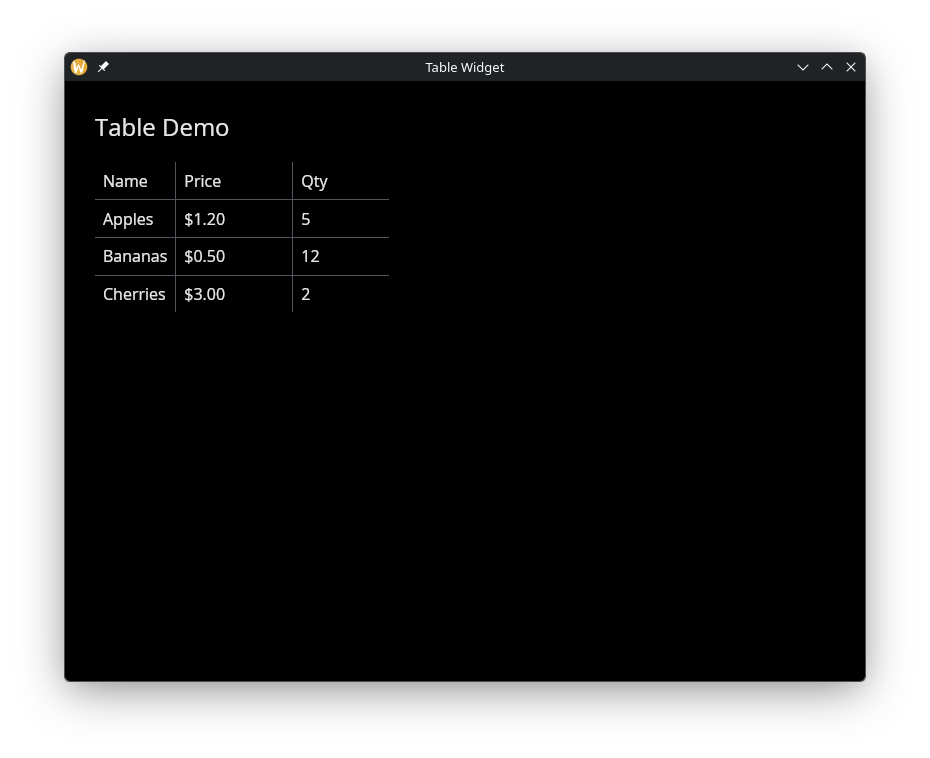
See Also
- column – for simple vertical layouts
- grid – for uniform grid layouts
- types – for
Length,HAlign,VAlign
The Data Table Widget
A spreadsheet-style widget that renders a Table value as a grid of
live-subscribed cells. Columns are typed: each one picks the editor
(text, toggle, pick-list, spinner), visualization (progress bar,
sparkline), or action (button) that cells should use. Row sort, row
filter, column widths, and the selection set are all controlled from
graphix — the widget is the rendering surface and the subscription
manager, nothing more.
The Table value is the single source of truth for what columns
exist, in what order, and how each one is sourced. Columns are
declared as either bare strings (shorthand for a default Text column
with `Netidx source named after the string) or full
ColumnSpec structs. Bare strings let the output of
sys::net::list_table (which has columns: Array<string>) flow
straight through; mixed arrays are fine.
Rows that are absolute netidx paths trigger live subscriptions for
every column whose source is `Netidx. Non-absolute row names
render as virtual rows. Columns whose source is a string or
Map<string, Any> skip subscription entirely and read their values
from the source ref.
Interface
type SortDirection = [`Ascending, `Descending];
type SortBy = { column: string, direction: SortDirection };
type ColumnType = [
`Text({ on_edit: [fn(#path: string, #value: Any) -> Any, null] }),
`Toggle({ on_edit: [fn(#path: string, #value: bool) -> Any, null] }),
`Combo({
choices: Array<{ id: string, label: string }>,
on_edit: [fn(#path: string, #value: string) -> Any, null]
}),
`Spin({
min: f64,
max: f64,
increment: f64,
on_edit: [fn(#path: string, #value: f64) -> Any, null]
}),
`Progress,
`Button({
on_click: [fn(#path: string, #value: Any) -> Any, null]
}),
`Sparkline({
history_seconds: f64,
min: [f64, null],
max: [f64, null]
})
];
type Source = [`Netidx([null, string]), string, Map<string, Any>];
type ColumnSpec = {
name: string,
typ: ColumnType,
display_name: [string, null],
source: &Source,
on_resize: &[fn(x: f64) -> Any, null],
width: &[f64, null]
};
type Table = {
rows: Array<string>,
columns: Array<[string, ColumnSpec]>
};
val data_table: fn(
?#sort_by: &Array<SortBy>,
?#selection: &Array<string>,
?#show_row_name: &bool,
?#on_select: [fn(#path: string) -> Any, null],
?#on_activate: [fn(#path: string) -> Any, null],
?#on_header_click: [fn(#column: string) -> Any, null],
?#on_update: [fn(#path: string, #value: Primitive) -> Any, null],
#table: &Table
) -> Widget;
val text_column: fn(
#name: string,
?#on_edit: [fn(#path: string, #value: Any) -> Any, null],
?#display_name: [string, null],
?#source: &Source,
?#on_resize: &[fn(x: f64) -> Any, null],
?#width: &[f64, null]
) -> ColumnSpec;
// (toggle_column, combo_column, spin_column, progress_column,
// button_column, sparkline_column have the same shape — each takes
// #name plus its kind-specific args, and accepts the same source /
// width / on_resize options.)
data_table Parameters
-
#table– The table shape:{ rows: Array<string>, columns: Array<[string, ColumnSpec]> }.sys::net::list_table(path)produces a value whosecolumns: Array<string>unifies with this type via the union element. The caller owns the shape: to filter, sort, hide, or reorder rows and columns — or to attach customColumnSpecs to specific columns — build theTablerecord in graphix and hand the result todata_table. Every change to this ref is reconciled against the current subscription set. -
#sort_by– Array of sort keys applied in order. The first is the primary sort; later keys break ties. Empty list (the default) preserves theTable’s row order. Sort values come from the column’s source — a live subscription when source is`Netidx, or the source’s stored value otherwise. -
#selection– Controlled set of selected cell paths. For cells in the row-name column this is just"row_path"; for every other cell it is"row_path/col_name". The widget’s own click / keyboard handlers never mutate this ref directly — they fire#on_selectand#on_activatecallbacks that the caller uses to drive the ref however they want (single-select, multi-select, toggle, etc.). -
#show_row_name– Whentrue(the default) a synthesized leftmost column shows each row’s basename (Path::basename(row)). Setfalsefor tables where the row identity is already carried by a regular column. -
#on_select– Fired whenever a cell is clicked or keyboard navigation lands on a cell. The callback receives the full cell path ("row_path/col_name"for data cells,"row_path"for the row-name column). -
#on_activate– Fired when the user clicks a row-name cell or presses Enter while a row is selected. Receives the row path. -
#on_header_click– Fired when the user clicks a data column’s header label. Receives the column name. -
#on_update– Fired once per subscription update on every cell — useful when you want to mirror live values into graphix state (e.g. re-derive an aggregate) without subscribing separately. Receives the cell path and new value.
Column Types
Each ColumnSpec carries a typ: ColumnType picked with one of the
helper constructors. All constructors take #name: string plus
their kind-specific args (#on_edit / #on_click / #choices /
etc.) and the common appearance options (#display_name, #source,
#width, #on_resize).
-
text_column– Plain text. Withon_editthe cell becomes editable: clicking a selected cell opens a text field;Entercommits the typed value viaon_edit,Escapecancels. The widget attempts to parse the buffer as a typed graphix value; if parsing fails the raw string is sent instead, so users can enterhellowithout quotes. -
toggle_column– Renders a toggler. Cell values"true"or"1"turn it on. Withon_editthe user can flip the toggle. -
combo_column– Drop-down with a fixed set ofchoices. Each choice has anid(the raw value published / sent back throughon_edit) and alabel(what the user sees). -
spin_column– Numeric spinner withmin,max, andincrementbounds;on_editreceives the clamped new value. -
progress_column– Read-only progress bar. Cell values are clamped to[0, 1]. -
button_column– Each cell renders as a button labelled with the cell’s current value.on_clickfires with the cell path and current value. -
sparkline_column– Rolling-line visualization accumulating published values overhistory_seconds. By default the y-axis is shared across every cell in the column (auto-scaled to the union of all rows’ values) so cells are visually comparable. Pass#min/#maxto fix the axis instead.
Column Widths and Resizing
Widths are controlled by two refs per column:
-
width: &[f64, null]– WhenSome(f64)the column is pinned to that width (and the resize handle at the column header vanishes unless anon_resizecallback is also set). Whennullthe column auto-sizes to its content, with a per-column cap (default 300px). -
on_resize: &[fn(x: f64) -> Any, null]– Fired while the user drags a column header’s right edge. The callable receives the new pixel width. The reference is a&field so the callable can be swapped, nulled, or initialized reactively.
Double-clicking any column’s resize handle auto-fits every column to the widest cell in the entire table (not just the visible window).
Source: Where Cell Values Come From
Each ColumnSpec.source is a &Source ref that decides where the
column’s per-cell values originate:
`Netidx(placeholder)– The column subscribes to<row_path>/<column_name>for every row whose path is absolute. Cell values come from the subscription. Theplaceholderpayload (nullor a string) is the text rendered before the subscription resolves and any time it goesUnsubscribedafterward — useful for distinguishing “not yet subscribed” / “lost” from a real blank value.`Netidx(null)is the default for the column-builder helpers and the implicit behavior for bare-string entries inTable.columns.string– A uniform value: every cell in the column renders this text. No subscription. Useful for static fields and computed columns where one value applies to all rows.Map<string, Any>– Per-row values keyed by the row’s basename. No subscription. Rows without a matching key render blank. Useful for “calculated” columns whose values are derived in graphix.
When the source ref updates reactively (e.g. the map changes), the widget re-reads it and refreshes the affected cells. Sparkline columns additionally push each new numeric source value into the rolling history, so a virtual-column sparkline fed from graphix state accumulates points the same way a subscribed one does.
Keyboard Navigation
The widget is focusable: clicking into it grants keyboard focus.
Arrow keys move the selection (the currently-rendered selected cell
scrolls into view as needed). Enter on a row-name cell fires
on_activate; Space on an editable cell opens its editor;
Escape cancels an in-progress edit.
Examples
Basic
Minimal usage: publish three hosts and hand the
sys::net::list_table output to data_table with no column
configuration. Bare-string columns become default Text columns with
`Netidx source.
use gui;
use gui::data_table;
use gui::column;
use gui::text;
use sys;
use sys::net;
mod icon;
let publish_host = |#name: string, #status: [`Up, `Degraded], #cpu: f64, #mem: f64| {
sys::net::publish("/local/graphix/data_table_basic/[name]/status", status);
sys::net::publish("/local/graphix/data_table_basic/[name]/cpu", cpu);
sys::net::publish("/local/graphix/data_table_basic/[name]/memory", mem);
};
publish_host(#name: "host-01", #status: `Up, #cpu: 12.4, #mem: 37.1);
publish_host(#name: "host-02", #status: `Up, #cpu: 88.2, #mem: 62.0);
publish_host(#name: "host-03", #status: `Degraded, #cpu: 4.1, #mem: 19.8);
// list_table inspects the resolver to discover children of this path.
let tbl = sys::net::list_table("/local/graphix/data_table_basic")$;
let layout = column(
#spacing: &12.0,
#padding: &`All(20.0),
#width: &`Fill,
#height: &`Fill,
&[
text(#size: &20.0, &"Fleet health"),
data_table(#table: &tbl)
]
);
[&window(
#icon: &icon::icon,
#title: &"Data Table — Basic",
#theme: &`CatppuccinMocha,
&layout
)]
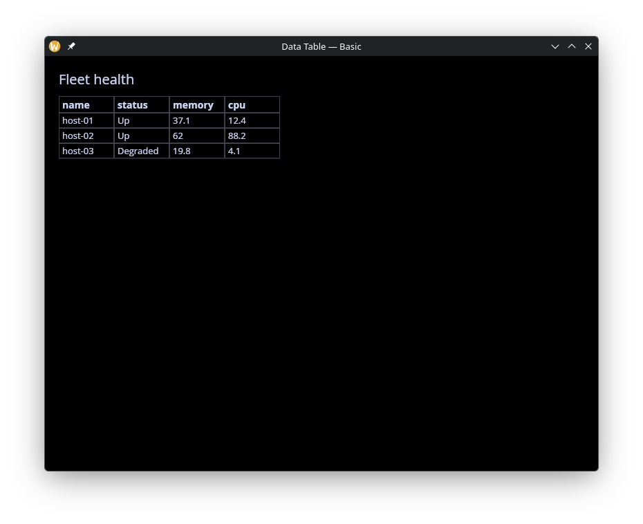
Filter and Sort
Row filtering (a regex over basenames) and sort configuration done
in graphix before the Table is handed to the widget. Shows how the
caller owns the data pipeline end to end.
use gui;
use gui::data_table;
use gui::row;
use gui::column;
use gui::text;
use gui::text_input;
use gui::pick_list;
use array;
use opt;
use re;
use str;
use sys;
use sys::net;
mod icon;
// Publish 6 sensors across three environments; the sidebar controls
// let the user pick a row filter mode. Sorting is driven entirely
// from the table itself — click a header to cycle its sort order.
sys::net::publish("/local/graphix/data_table_filter/sensor-01/name", "auth-requests");
sys::net::publish("/local/graphix/data_table_filter/sensor-01/env", "prod");
sys::net::publish("/local/graphix/data_table_filter/sensor-02/name", "auth-errors");
sys::net::publish("/local/graphix/data_table_filter/sensor-02/env", "prod");
sys::net::publish("/local/graphix/data_table_filter/sensor-03/name", "db-latency");
sys::net::publish("/local/graphix/data_table_filter/sensor-03/env", "prod");
sys::net::publish("/local/graphix/data_table_filter/sensor-04/name", "cache-hits");
sys::net::publish("/local/graphix/data_table_filter/sensor-04/env", "stage");
sys::net::publish("/local/graphix/data_table_filter/sensor-05/name", "cache-misses");
sys::net::publish("/local/graphix/data_table_filter/sensor-05/env", "stage");
sys::net::publish("/local/graphix/data_table_filter/sensor-06/name", "api-latency");
sys::net::publish("/local/graphix/data_table_filter/sensor-06/env", "dev");
let raw_tbl = sys::net::list_table("/local/graphix/data_table_filter")$;
// Filter controls: a regex pattern and whether it includes or excludes.
// The caller reshapes the Table in graphix before passing it in.
let pattern = "";
let mode: [`Include, `Exclude] = `Include;
let tbl: Table = raw_tbl;
tbl <- select str::len(pattern) {
n if n == 0 => raw_tbl,
_ => {
let name_of = |r: string| opt::or_default(str::basename(r), r);
let matches = |r: string| opt::or_default(
re::is_match(#pat: pattern, name_of(r))$, false);
let keep = |r: string| select mode {
`Include => matches(r),
`Exclude => !matches(r)
};
{ raw_tbl with rows: array::filter(raw_tbl.rows, keep) }
}
};
// Sort state: an array of (column, direction) pairs applied in order.
// The first entry is the primary sort, subsequent entries break ties.
// `cycle_sort` rotates a column through the three states a spreadsheet
// user expects: absent → ascending → descending → absent.
//
// Clicking a column that isn't in `sort_by` appends it as ascending,
// so sort_by grows as the user clicks new columns — that's how multi-
// column sort is demonstrated. The first click on a column that is
// already sorted flips its direction; a second click removes it.
let sort_by: Array<SortBy> = [];
// CR claude for estokes: the `column ~ { ... }` sampling and the
// `matches[0]$` + separate `let dir = m0.direction` split are both
// workarounds for sharp edges in graphix reactivity / parsing:
//
// 1. Without `column ~` on the RHS of `sort_by <-`, the compiled
// dataflow evaluates `array::filter(sort_by, ...)` at its
// initial empty sort_by value and never re-fires on callback
// invocation — so the callback appears to do nothing.
// The lang reference already documents that `~` is required in
// callbacks to sample current state at event time; this example
// makes that concrete.
//
// 2. `array::find` hits a MapQ fast-path in graphix-package-core
// (`MapQ::update`, around lib.rs:679) that returns the empty
// input array for an empty collection instead of calling
// `finish()`. For HOFs whose element-returning `finish()` would
// produce a different type than the collection (find → Option,
// find_map → Option), the fast-path returns the wrong type —
// so `array::find(<empty>, pred)` emits `[]` instead of `null`
// and the null arm of the outer select never fires. The
// `array::filter` + `array::len` pair below sidesteps this
// because filter's natural "empty → empty" happens to match
// its output type.
//
// 3. `matches[0]$.direction` fails to parse — the `$` error-drop
// postfix followed immediately by `.field` confuses the parser
// into reporting the outer callsite as unexpected, which is a
// red herring. Binding `matches[0]$` to a local first parses
// cleanly.
//
// Also, every lambda needs `|sb: SortBy|` annotations (and the `map`
// callback needs `-> SortBy`) because graphix narrows sort_by's
// element type based on the `direction: `Ascending` literal in the
// push arm and then rejects `sb.direction` elsewhere as non-matching.
let cycle_sort = |#column: string|
sort_by <- column ~ {
let matches = array::filter(sort_by, |sb: SortBy| sb.column == column);
let n = array::len(matches);
let m0 = matches[0]$;
let dir: SortDirection = m0.direction;
select n {
0 => array::push(sort_by, { column: column, direction: `Ascending }),
_ => select dir {
`Ascending => array::map(sort_by, |s: SortBy| -> SortBy
select s.column == column {
true => { s with direction: `Descending },
false => s
}),
`Descending => array::filter(sort_by, |s: SortBy| s.column != column)
}
}
};
let controls = row(
#spacing: &10.0,
#padding: &`All(10.0),
&[
text(&"Pattern:"),
text_input(
#on_input: |v: string| pattern <- v,
#placeholder: &"regex or empty",
#width: &`Fill,
&pattern
),
pick_list(
#on_select: |choice: string| mode <- select choice {
"Include matches" => `Include,
_ => `Exclude
},
#selected: &select mode {
`Include => "Include matches",
`Exclude => "Exclude matches"
},
&["Include matches", "Exclude matches"]
)
]
);
let layout = column(
#spacing: &10.0,
#padding: &`All(20.0),
#width: &`Fill,
#height: &`Fill,
&[
text(#size: &20.0, &"Interactive filter + sort"),
text(#size: &12.0, &"Click a column header to cycle its sort; click more than one for tie-broken multi-column sort."),
controls,
data_table(
#sort_by: &sort_by,
#on_header_click: |#column: string| cycle_sort(#column: column),
#table: &tbl
)
]
);
[&window(
#icon: &icon::icon,
#title: &"Data Table — Filter & Sort",
#theme: &`CatppuccinMocha,
&layout
)]
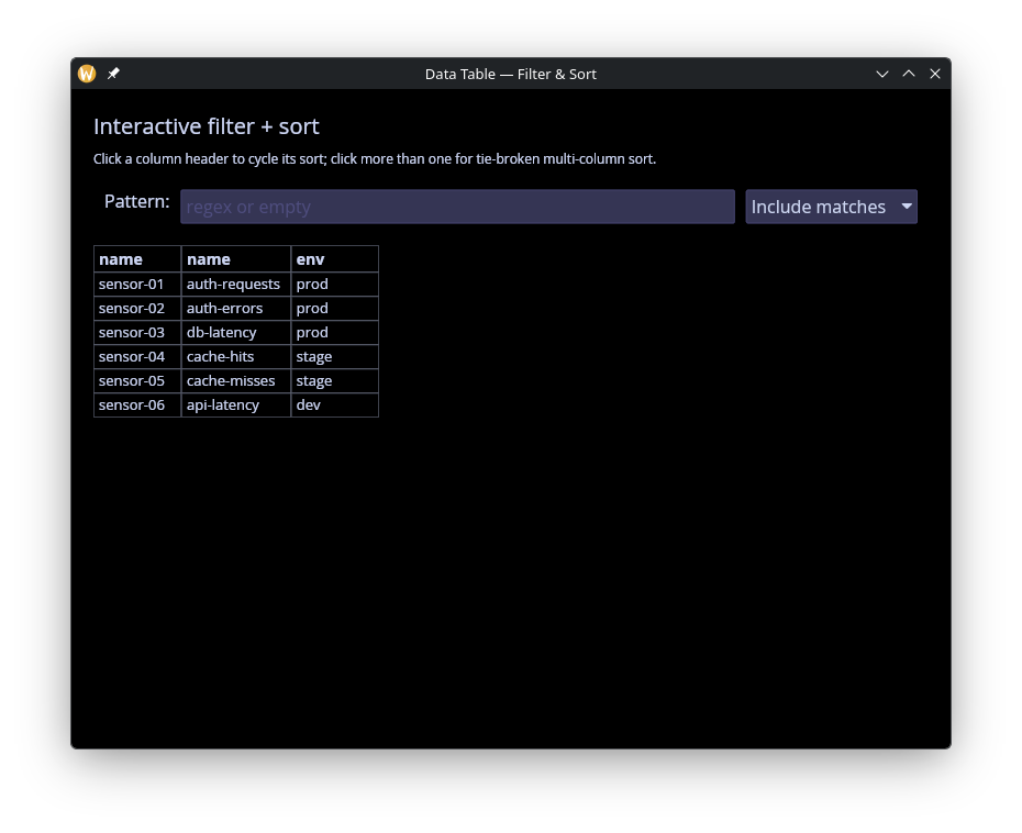
Editable
Every editable column type in one place: Text, Toggle, Combo,
Spin. Each cell is published with an on_write handler so edits
round-trip through netidx. The example shows the
array::map(raw_columns, …) pattern for attaching custom
ColumnSpecs to specific column names while leaving everything else
as bare-string Netidx-sourced columns.
use gui;
use gui::data_table;
use gui::column;
use gui::text;
use sys;
use sys::net;
mod icon;
// Four editable columns demonstrating every ColumnType that takes
// user input: Text, Toggle, Combo, Spin. Each cell is published with
// an #on_write handler so edits round-trip through netidx.
let host_01_name = "alpha";
let host_01_enabled = true;
let host_01_zone = "us-east-1";
let host_01_cpu = f64:4.0;
sys::net::publish(
#on_write: |v: string| host_01_name <- v,
"/local/graphix/data_table_editable/host-01/name",
host_01_name
);
sys::net::publish(
#on_write: |v: bool| host_01_enabled <- v,
"/local/graphix/data_table_editable/host-01/enabled",
host_01_enabled
);
sys::net::publish(
#on_write: |v: string| host_01_zone <- v,
"/local/graphix/data_table_editable/host-01/zone",
host_01_zone
);
sys::net::publish(
#on_write: |v: f64| host_01_cpu <- v,
"/local/graphix/data_table_editable/host-01/cpu",
host_01_cpu
);
let host_02_name = "bravo";
let host_02_enabled = false;
let host_02_zone = "eu-west-1";
let host_02_cpu = f64:8.0;
sys::net::publish(
#on_write: |v: string| host_02_name <- v,
"/local/graphix/data_table_editable/host-02/name",
host_02_name
);
sys::net::publish(
#on_write: |v: bool| host_02_enabled <- v,
"/local/graphix/data_table_editable/host-02/enabled",
host_02_enabled
);
sys::net::publish(
#on_write: |v: string| host_02_zone <- v,
"/local/graphix/data_table_editable/host-02/zone",
host_02_zone
);
sys::net::publish(
#on_write: |v: f64| host_02_cpu <- v,
"/local/graphix/data_table_editable/host-02/cpu",
host_02_cpu
);
// Map the resolver-derived columns array. Each editable column gets
// an explicit ColumnSpec; anything else (none expected here) passes
// through as a default Text/Netidx column.
let make_columns = |raw: Array<string>| array::map(raw, |name| select name {
"name" => text_column(
#name: "name",
#on_edit: |#path: string, #value: Any|
sys::net::write(path, value)$,
#display_name: "Name"
),
"enabled" => toggle_column(
#name: "enabled",
#on_edit: |#path: string, #value: bool|
sys::net::write(path, value)$,
#display_name: "Enabled"
),
"zone" => combo_column(
#name: "zone",
#choices: [
{ id: "us-east-1", label: "US East" },
{ id: "us-west-2", label: "US West" },
{ id: "eu-west-1", label: "EU West" },
{ id: "ap-south-1", label: "Asia Pacific" }
],
#on_edit: |#path: string, #value: string|
sys::net::write(path, value)$,
#display_name: "Zone"
),
"cpu" => spin_column(
#name: "cpu",
#min: f64:1.0,
#max: f64:64.0,
#increment: f64:1.0,
#on_edit: |#path: string, #value: f64|
sys::net::write(path, value)$,
#display_name: "CPU cores"
),
other => other
});
let raw_tbl = sys::net::list_table("/local/graphix/data_table_editable")$;
let tbl = { rows: raw_tbl.rows, columns: make_columns(raw_tbl.columns) };
let selection: Array<string> = [];
let layout = column(
#spacing: &12.0,
#padding: &`All(20.0),
#width: &`Fill,
#height: &`Fill,
&[
text(#size: &20.0, &"Editable hosts"),
text(&"Edits are written back through netidx and reflected in the same cell."),
data_table(
#selection: &selection,
#on_select: |#path| selection <- [path],
#table: &tbl
)
]
);
[&window(
#icon: &icon::icon,
#title: &"Data Table — Editable",
#theme: &`CatppuccinMocha,
&layout
)]
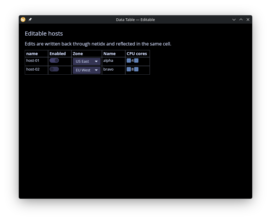
Calculated Columns
A virtual column whose source is a reactive Map<string, Any>,
rebuilt whenever any subscribed cell updates. Demonstrates deriving
per-row aggregates (here, sums) without touching netidx.
use gui;
use gui::data_table;
use gui::column;
use gui::text;
use str;
use sys;
use sys::net;
mod icon;
// Two published columns A and B. A virtual "sum" column has its
// per-cell value set from a let-bound Map; the `on_update` callback
// watches every subscribed cell update and pushes the new (a+b)
// total into the sum entry.
let rv = {
let clock = time::timer(5, true);
|| any(1, rand::rand(#start:0, #end:10, #clock))
};
publish("/local/graphix/data_table_calculated/r0/A", rv());
publish("/local/graphix/data_table_calculated/r1/A", rv());
publish("/local/graphix/data_table_calculated/r2/A", rv());
publish("/local/graphix/data_table_calculated/r0/B", rv());
publish("/local/graphix/data_table_calculated/r1/B", rv());
publish("/local/graphix/data_table_calculated/r2/B", rv());
let raw_tbl = sys::net::list_table("/local/graphix/data_table_calculated")$;
let data: Map<string, Map<string, i64>> = {};
// Append a virtual `sum` column to the resolver-derived table. The
// bare strings from `sys::net::list_table` continue to mean "Netidx-
// sourced Text columns"; the new entry pulls its values from a let-
// bound Map updated by the on_update callback below.
//
// `array::map` with an explicit `-> [string, ColumnSpec]` return type
// widens each bare-string entry into the union element type before
// concat. Without the explicit return type, inference leaves the
// resulting array as `Array<string>` and fails to fit ColumnSpec.
let widened: Array<[string, ColumnSpec]> =
array::map(raw_tbl.columns, |n: string| -> [string, ColumnSpec] n);
let tbl: Table = {
rows: raw_tbl.rows,
columns: array::push(widened, text_column(
#name: "sum",
#display_name: "A + B",
#source: &opt::or_default(map::get(data, "sum"), {})
))
};
// on_update is called on updates to netidx subscriptions by the table.
let on_update = |#path: string, #value: Primitive| {
let v = cast<i64>(value)$;
let d = v ~ data; // run only when v updates
let (row, col) = opt::or_never(str::row_col(path));
let d = map::change(d, col, {}, |rows| map::insert(rows, row, v));
let sum = map::fold(d, 0, |sum, (col, rows)| select col {
"sum" => sum,
col => sum + map::get_or(rows, row, 0)
});
data <- map::change(d, "sum", {}, |sums| map::insert(sums, row, sum))
};
let layout = column(
#spacing: &12.0,
#padding: &`All(20.0),
#width: &`Fill,
#height: &`Fill,
&[
text(#size: &20.0, &"Calculated column"),
text(&"on_update fires on every cell update; the virtual sum column reflects A + B."),
data_table(#on_update, #table: &tbl)
]
);
[&window(
#icon: &icon::icon,
#title: &"Data Table — Calculated",
#theme: &`CatppuccinMocha,
&layout
)]
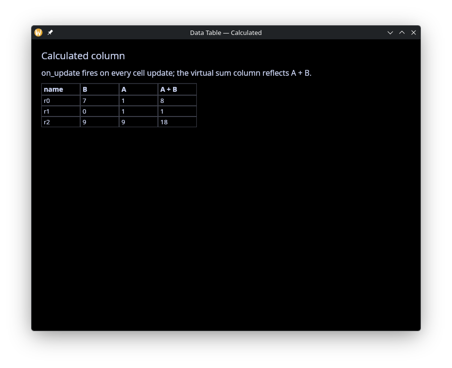
Sparkline
Live rolling charts per row with automatic column-wide y-axis sharing, so cells are visually comparable without the caller picking bounds.
use gui;
use gui::data_table;
use gui::column;
use gui::text;
use core::math;
use sys;
use sys::net;
use sys::time;
mod icon;
// Four rows, each publishing a cpu value that updates once a second
// on a sine-wave pattern staggered per row. The Sparkline column
// accumulates the history and draws a rolling chart.
let tick = time::timer(duration:1.s, true);
let t = cast<f64>(count(tick))$;
let cpu_1 = 0.0;
cpu_1 <- tick ~ 50.0 + 40.0 * math::sin(t / 4.0);
let cpu_2 = 0.0;
cpu_2 <- tick ~ 50.0 + 30.0 * math::sin((t + 10.) / 5.0);
let cpu_3 = 0.0;
cpu_3 <- tick ~ 40.0 + 20.0 * math::sin((t + 20.) / 6.0);
let cpu_4 = 0.0;
cpu_4 <- tick ~ 70.0 + 10.0 * math::sin((t + 30.) / 3.0);
sys::net::publish("/local/graphix/data_table_sparkline/web-01/cpu", cpu_1);
sys::net::publish("/local/graphix/data_table_sparkline/web-02/cpu", cpu_2);
sys::net::publish("/local/graphix/data_table_sparkline/db-01/cpu", cpu_3);
sys::net::publish("/local/graphix/data_table_sparkline/db-02/cpu", cpu_4);
let make_columns = |raw: Array<string>| array::map(raw, |name| select name {
"cpu" => sparkline_column(
#name: "cpu",
#history_seconds: 30.0,
#display_name: "CPU (last 30s)",
#width: &260.0
),
other => other
});
let raw_tbl = sys::net::list_table("/local/graphix/data_table_sparkline")$;
let tbl = { rows: raw_tbl.rows, columns: make_columns(raw_tbl.columns) };
let layout = column(
#spacing: &12.0,
#padding: &`All(20.0),
#width: &`Fill,
#height: &`Fill,
&[
text(#size: &20.0, &"CPU over time"),
text(&"Sparkline column accumulates values from its cell subscription."),
data_table(#table: &tbl)
]
);
[&window(
#icon: &icon::icon,
#title: &"Data Table — Sparkline",
#theme: &`CatppuccinMocha,
&layout
)]
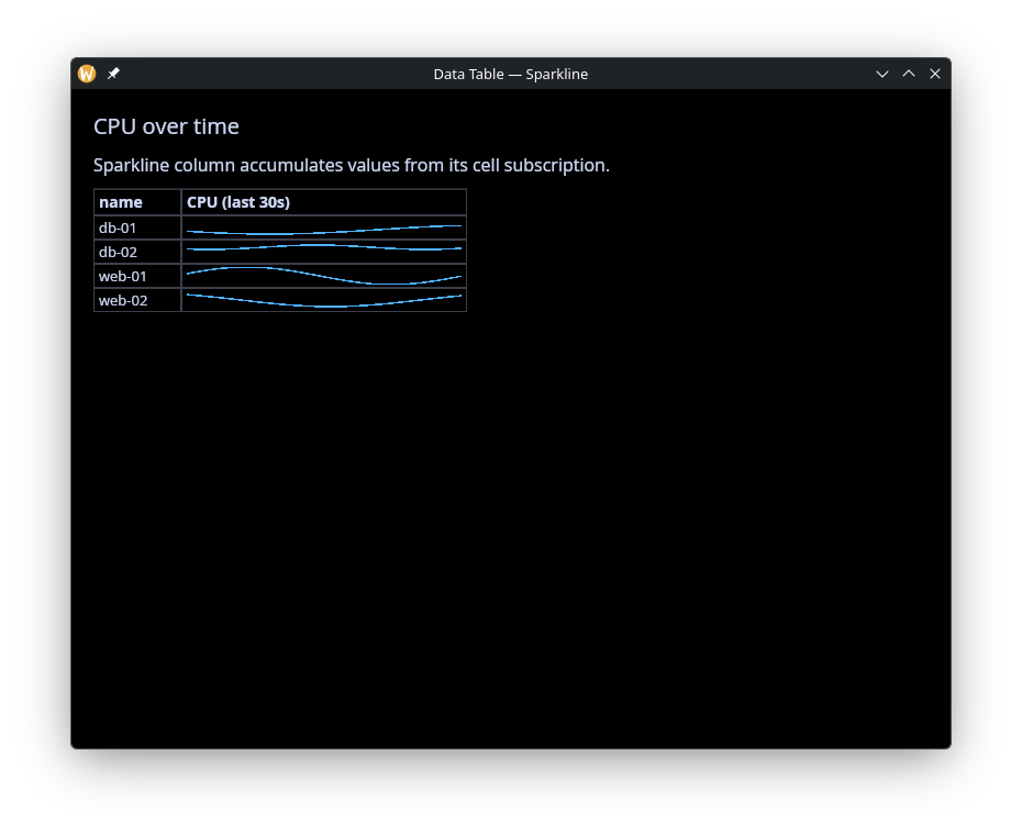
Virtual Rows and Columns
Mix live subscribed rows with virtual rows whose cells come from non-Netidx sources. Virtual-column-plus-virtual-row combinations give you fully client-side cells.
use gui;
use gui::data_table;
use gui::slider;
use gui::column;
use gui::text;
use sys;
mod icon;
let rv = {
let clock = time::timer(5, true);
|| any(0.5, rand::rand(#start:0., #end:1., #clock))
};
net::publish("/local/graphix/data_table_virtual/nr0/score", rv());
net::publish("/local/graphix/data_table_virtual/nr1/score", rv());
net::publish("/local/graphix/data_table_virtual/nr2/score", rv());
let score: Map<string, f64> = {};
let tbl = {
let raw = net::list_table("/local/graphix/data_table_virtual")$;
let columns = array::map(raw.columns, |n| select n {
"score" => progress_column(
#name: "score",
#display_name: "Score",
#source: &`Netidx(score),
#width: &f64:180.0
),
n => n
});
let columns = array::push_front(columns, text_column(
#name: "region",
#display_name: "Region",
#source: &"production"
));
// rows that aren't absolute paths won't attempt to subscribe
// but will be looked up in the score map for a default value.
// that lets us add virtual rows that don't exist in netidx
let rows = array::concat(raw.rows, ["vr0", "vr1", "vr2"]);
uniq({ rows, columns })
};
let layout = column(
#spacing: &14.0,
#padding: &`All(20.0),
#width: &`Fill,
#height: &`Fill,
&[
text(#size: &20.0, &"Virtual rows and columns"),
text(&"Move the sliders to change the score in the three virtual rows."),
slider(
#on_change: |v: f64| score <- v ~ map::insert(score, "vr0", v),
#min: &f64:0.0, #max: &f64:1.0, #step: &f64:0.01,
&map::get_or(score, "vr0", 0.)
),
slider(
#on_change: |v: f64| score <- v ~ map::insert(score, "vr1", v),
#min: &f64:0.0, #max: &f64:1.0, #step: &f64:0.01,
&map::get_or(score, "vr1", 0.)
),
slider(
#on_change: |v: f64| score <- v ~ map::insert(score, "vr2", v),
#min: &f64:0.0, #max: &f64:1.0, #step: &f64:0.01,
&map::get_or(score, "vr2", 0.)
),
data_table(#table: &tbl)
]
);
[&window(
#icon: &icon::icon,
#title: &"Data Table — Virtual",
#theme: &`CatppuccinMocha,
&layout
)]
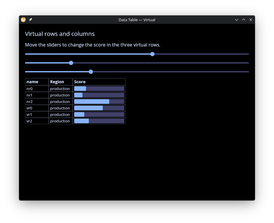
Dashboard
Kitchen-sink example combining Combo state pickers, Sparkline
CPU metrics, Progress uptime, a Button action column, a regex
row filter in a text input, sort controlled by pick-lists, and
selection echoed in the footer.
use gui;
use gui::data_table;
use gui::row;
use gui::column;
use gui::text;
use gui::text_input;
use gui::pick_list;
use core::math;
use array;
use opt;
use re;
use str;
use sys;
use sys::net;
use sys::time;
mod icon;
// Kitchen-sink example combining the main data_table features:
// * Combo column for state picklists
// * Sparkline column for rolling cpu metrics
// * Progress column for uptime %
// * Button column that fires an action callback
// * Regex row filter wired to a text input
// * Column sort driven by pick_list widgets in the sidebar
// * Selection echoed in the footer
let t = cast<f64>(count(time::timer(duration:1.s, true)))$;
type State = [`Healthy, `Degraded, `Down];
// Publish a tiny fleet of services. state is writable (Combo).
let svc = |#state:State, #cpu:f64, #uptime:f64, #name:string| {
sys::net::publish(
#on_write: |v: State| state <- v,
"/local/graphix/data_table_dashboard/[name]/state",
state
);
sys::net::publish("/local/graphix/data_table_dashboard/[name]/cpu", cpu);
sys::net::publish("/local/graphix/data_table_dashboard/[name]/uptime", uptime);
sys::net::publish("/local/graphix/data_table_dashboard/[name]/action", "Restart");
};
// single random number
let rn = |start: f64, end: f64| -> f64 rand::rand(#start, #end, #clock:1);
let published = array::init(1024, |i| svc(
#name:"svc-[i]",
#state:select rand::rand(#clock:1) {
n if n <= 0.8 => `Healthy,
n if n <= 0.9 => `Degraded,
_ => `Down
},
#uptime:rn(0., 1.),
#cpu:rn(0., 30.) + rn(1., 5.) * math::sin((t + rn(0., 5.)) / rn(1., 5.))
));
let last_action = "";
// Map the resolver-derived columns array. Bare-string entries
// (anything we don't recognize) pass through as default Text columns;
// the four named columns get their custom ColumnSpec.
let make_columns = |raw: Array<string>| array::map(raw, |name| select name {
"state" => combo_column(
#name: "state",
#choices: [
{ id: "Healthy", label: "Healthy" },
{ id: "Degraded", label: "Degraded" },
{ id: "Down", label: "Down" }
],
#on_edit: |#path: string, #value: string|
sys::net::write(path, value)$,
#display_name: "State",
#width: &110.
),
"cpu" => sparkline_column(
#name: "cpu",
#history_seconds: f64:30.0,
#display_name: "CPU",
#width: &220.0,
#min:0.,
#max:100.
),
"uptime" => progress_column(
#name: "uptime",
#display_name: "Uptime",
#width: &180.0
),
"action" => button_column(
#name: "action",
#on_click: |#path: string, #value: Any|
last_action <- "[path]",
#display_name: "Action"
),
other => other
});
// Caller-side filter: apply the regex to the Table's rows, then
// rewrap with the column specs.
let pattern = "";
let tbl: Table = {
let raw = sys::net::list_table("/local/graphix/data_table_dashboard")$;
let rows = select str::len(pattern) {
n if n == 0 => raw.rows,
_ => array::filter(raw.rows, |r| {
let row = opt::or_default(str::basename(r), r);
select re::is_match(#pat: pattern, row) {
error as _ => false,
b => b
}
})
};
{ rows, columns: make_columns(raw.columns) }
};
let sort_col = "state";
let sort_dir: SortDirection = `Ascending;
let sort_by: Array<SortBy> = [{ column: sort_col, direction: sort_dir }];
// Selection + footer
let selection: Array<string> = [];
let controls = row(
#spacing: &10.0,
&[
text(&"Filter:"),
text_input(
#on_input: |v| pattern <- v,
#placeholder: &"regex or blank",
#width: &`Fill,
&pattern
),
text(&"Sort:"),
pick_list(
#on_select: |v| sort_col <- v,
#selected: &sort_col,
&["state", "cpu", "uptime"]
),
pick_list(
#on_select: |v| sort_dir <- cast<SortDirection>(v)$,
#selected: &cast<string>(sort_dir)$,
&["Ascending", "Descending"]
)
]
);
let footer = row(
#spacing: &10.0,
&[
text(&"Selected:"),
text(&"[selection[0]$]"),
text(&" Last action:"),
text(&"[last_action]")
]
);
let layout = column(
#spacing: &10.0,
#padding: &`All(20.0),
#width: &`Fill,
#height: &`Fill,
&[
text(#size: &20.0, &"Service dashboard"),
controls,
data_table(
#sort_by: &sort_by,
#selection: &selection,
#on_select: |#path: string| selection <- [path],
#table: &tbl
),
footer
]
);
[&window(
#icon: &icon::icon,
#title: &"Data Table — Dashboard",
#theme: &`CatppuccinMocha,
&layout
)]
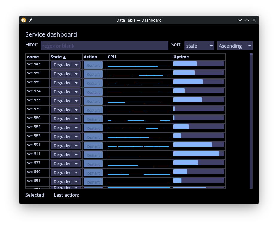
See Also
- Table – static row/column layout from graphix widgets, no netidx subscriptions.
- Chart – larger-scale line / area / scatter plots.
sys::net– theTablerecord andlist_tablehelper consumed by#table.
Menus
The menu module provides menu bars and context menus. Both are built from the same MenuItem building blocks — actions (clickable items with optional keyboard shortcuts) and dividers.
Interface
type Shortcut;
val shortcut: fn(
?#ctrl: bool,
?#shift: bool,
?#alt: bool,
?#logo: bool,
s: string
) -> [Shortcut, Error<`InvalidKey(string)>];
type MenuAction = {
label: &string,
shortcut: &[Shortcut, null],
on_click: &fn(a: null) -> Any,
disabled: &bool
};
type MenuItem = [`Action(MenuAction), `Divider];
type MenuGroup = {
label: &string,
items: &Array<MenuItem>
};
type ContextMenu = { child: &Widget, items: &Array<MenuItem> };
val action: fn(
?#on_click: fn(a: null) -> Any,
?#shortcut: &[Shortcut, null],
?#disabled: &bool,
s: &string
) -> MenuItem;
val divider: fn() -> MenuItem;
val menu: fn(s: &string, a: &Array<MenuItem>) -> MenuGroup;
val bar: fn(?#width: &Length, a: &Array<MenuGroup>) -> Widget;
val context_menu: fn(a: &Array<MenuItem>, a2: &Widget) -> Widget
menu::shortcut
Creates a keyboard shortcut from modifier flags and a single character key.
#ctrl– Hold Ctrl. Defaults tofalse.#shift– Hold Shift. Defaults tofalse.#alt– Hold Alt. Defaults tofalse.#logo– Hold the logo/super key. Defaults tofalse.- positional
string– A single character (e.g."N","Z"). Returns an error if the key is not exactly one character.
The shortcut text (e.g. “Ctrl+N”) is displayed right-aligned in dimmed text next to the menu item label. Pressing the key combination triggers the action globally within the window.
menu::action Parameters
#on_click– Callback invoked when the action is clicked. Receivesnull. If omitted, the action is displayed but does nothing.#shortcut– AShortcutvalue created bymenu::shortcut(...). The shortcut text is shown right-aligned in the menu and the key combination triggers the action.nullfor no shortcut.#disabled– Whentrue, the action is grayed out and#on_clickis not triggered. Defaults tofalse.- positional
&string– The label text for this menu action.
menu::divider
Takes no arguments. Returns a horizontal separator line between menu items.
menu::menu
Groups a list of menu items under a label that appears in the menu bar.
- positional
&string– The label shown in the menu bar (e.g."File","Edit"). - positional
&Array<MenuItem>– The items in this dropdown menu.
menu::bar Parameters
#width– Width of the menu bar. AcceptsLengthvalues. Defaults to`Shrink.- positional
&Array<MenuGroup>– The menu groups to display in the bar.
menu::context_menu
Wraps any widget and shows a dropdown menu on right-click. Reuses the same MenuItem type as the menu bar.
- positional
&Array<MenuItem>– The items to display in the context menu. - positional
&Widget– The child widget. Right-clicking anywhere on this widget opens the menu at the cursor position.
The menu closes when an item is clicked, when the user clicks outside it, or when Escape is pressed.
Examples
Menu Bar
use gui;
use gui::text;
use gui::menu;
use gui::column;
mod icon;
let file_menu = menu::menu(
&"File",
&[
menu::action(
#on_click: |v| println(v ~ "New file"),
#shortcut: &menu::shortcut(#ctrl: true, "N")$,
&"New"
),
menu::action(
#on_click: |v| println(v ~ "Open file"),
#shortcut: &menu::shortcut(#ctrl: true, "O")$,
&"Open"
),
menu::divider(),
menu::action(
#on_click: |v| println(v ~ "Quit"),
#shortcut: &menu::shortcut(#ctrl: true, "Q")$,
&"Quit"
)
]
);
let edit_menu = menu::menu(
&"Edit",
&[
menu::action(
#on_click: |v| println(v ~ "Undo"),
#shortcut: &menu::shortcut(#ctrl: true, "Z")$,
&"Undo"
),
menu::action(
#on_click: |v| println(v ~ "Redo"),
#shortcut: &menu::shortcut(#ctrl: true, #shift: true, "Z")$,
&"Redo"
),
menu::divider(),
menu::action(
#on_click: |v| println(v ~ "Copy"),
#shortcut: &menu::shortcut(#ctrl: true, "C")$,
&"Copy"
),
menu::action(
#on_click: |v| println(v ~ "Paste"),
#shortcut: &menu::shortcut(#ctrl: true, "V")$,
&"Paste"
)
]
);
let layout = column(
#width: &`Fill,
&[
menu::bar(#width: &`Fill, &[file_menu, edit_menu]),
text(#size: &18.0, &"Application content goes here")
]
);
[&window(#icon: &icon::icon, #title: &"Menu Bar", &layout)]
Context Menu
use gui;
use gui::text;
use gui::column;
use gui::container;
use gui::menu;
mod icon;
let status = "Right-click anywhere";
let items = [
menu::action(
#on_click: |v| status <- v ~ "Copied!",
#shortcut: &menu::shortcut(#ctrl: true, "C")$,
&"Copy"
),
menu::action(
#on_click: |v| status <- v ~ "Pasted!",
#shortcut: &menu::shortcut(#ctrl: true, "V")$,
&"Paste"
),
menu::divider(),
menu::action(
#on_click: |v| status <- v ~ "Deleted!",
&"Delete"
)
];
let content = container(
#halign: &`Center,
#valign: &`Center,
#width: &`Fill,
#height: &`Fill,
&column(
#halign: &`Center,
#spacing: &10.0,
&[
text(#size: &24.0, &"Context Menu Demo"),
text(&status)
]
)
);
[&window(
#icon: &icon::icon,
#title: &"Context Menu",
&menu::context_menu(&items, &content)
)]
See Also
- button – for standalone clickable actions
- keyboard_area – for capturing keyboard shortcuts
- mouse_area – for general mouse event handling
Packages
Graphix has a package system that lets you extend the language with new built-in functions written in Rust and new modules written in Graphix. Packages are the primary mechanism for adding functionality beyond what the standard library provides.
How Packages Work
Each package is a Rust crate named graphix-package-<name>. A package can
contain:
- Rust built-in functions that are callable from Graphix
- Graphix source modules (
.gxand.gxifiles) that provide a Graphix-level API - Dependencies on other packages via Cargo
When you install or remove a package, the graphix binary is rebuilt with the
new set of packages compiled in. This means packages run at native speed with no
FFI or serialization overhead.
Packages can depend on other packages through normal Cargo dependencies. For
example, the net package depends on time. If you remove time from your
installed packages but still have net installed, time remains available
because it’s a transitive dependency. Cargo handles the dependency graph
automatically.
The Standard Library as Packages
The standard library is itself implemented as a set of packages: core, str,
array, map, time, net, re, rand, fs, and tui. These ship with
the default graphix binary. The same defpackage! macro and Package trait
that power the standard library are available for third-party packages.
Getting Started
- Using Packages covers installing, removing, and managing packages
- Creating Packages covers building your own packages
- Standalone Binaries covers building self-contained binaries from packages
Using Packages
The graphix package command manages your installed packages. All package
operations rebuild the graphix binary to include the new set of packages.
Using an Installed Package
Once installed, a package is available as a Graphix module with the same name
as the package. For example, the sys package provides netidx networking
functions under sys::net:
use sys::net;
subscribe("/some/netidx/path")
Or access it without use:
sys::net::subscribe("/some/netidx/path")
The standard library packages (core, str, array, map, re, rand,
sys, http, json, toml, pack, xls, sqlite, db, list, args,
hbs, tui, gui) are pre-installed and available by default.
Searching for Packages
Search crates.io for packages matching a query:
graphix package search http
This searches for crates matching graphix-package-*http*. Results show the
package name, version, and description.
Installing Packages
Install a package from crates.io:
graphix package add mypackage
Install a specific version:
graphix package add mypackage@1.2.0
Install from a local path (useful during development):
graphix package add mypackage --path /home/user/mypackage
Alternative Registries
If your organization uses a private Cargo registry instead of crates.io, use
the --skip-crates-io-check flag to bypass the crates.io validation:
graphix package add mypackage@1.0.0 --skip-crates-io-check
Configure your alternative registry in ~/.cargo/config.toml using Cargo’s
standard source replacement
mechanism.
Removing Packages
graphix package remove mypackage
If other installed packages depend on the removed package via Cargo, the removed package’s modules will still be available (since it remains a transitive dependency). This is by design – Cargo manages the dependency graph.
Listing Installed Packages
graphix package list
Shows all explicitly installed packages with their versions.
Rebuilding
If you manually edit the packages file, you can trigger a rebuild:
graphix package rebuild
A rebuild also picks up minor and patch version updates of third-party
packages automatically, since no Cargo.lock is generated – Cargo resolves
the latest compatible version within each package’s semver range.
Updating
To update graphix itself (and the standard library) to the latest version:
graphix package update
This queries crates.io for the latest graphix-shell version and the latest
version of each standard library package, updates packages.toml accordingly,
and triggers a full rebuild. Your third-party packages are left untouched.
If you’re already on the latest version, the command prints a message and exits without rebuilding.
To update a third-party package to a new major version, edit the version
in packages.toml directly and run graphix package rebuild.
Package Storage
The package list is stored in packages.toml in your platform’s data
directory:
| Platform | Location |
|---|---|
| Linux | ~/.local/share/graphix/packages.toml |
| macOS | ~/Library/Application Support/graphix/packages.toml |
| Windows | %APPDATA%\graphix\packages.toml |
The file is a simple TOML map of package names to versions:
[packages]
mypackage = "1.2.0"
another = "0.5.0"
Path dependencies use an inline table:
[packages]
mypackage = { path = "/home/user/mypackage" }
How the Rebuild Works
When you add or remove a package, the package manager:
- Unpacks the
graphix-shellsource from the Cargo cache - Updates its
Cargo.tomlto include your packages as dependencies - Generates a
deps.rsthat registers all packages - Runs
cargo install --forceto build and install the new binary - Backs up the previous binary with a timestamp
This means you need a working Rust toolchain installed. The rebuild takes roughly the same time as compiling any Rust project of similar size.
Creating Packages
Scaffolding a New Package
Create a new package with:
graphix package create mylib
Or specify a directory:
graphix package create mylib --dir ~/projects
This creates a graphix-package-mylib directory with the following structure:
graphix-package-mylib/
Cargo.toml
README.md
src/
lib.rs
graphix/
mod.gx
mod.gxi
Package Structure
src/lib.rs – The Rust Entry Point
The heart of a package is src/lib.rs, which uses the defpackage! macro to
declare the package:
#![allow(unused)]
fn main() {
use graphix_derive::defpackage;
use graphix_package_core::{CachedArgs, CachedVals, EvalCached};
// ... builtin implementations (types are declared in .gx files) ...
defpackage! {
builtins => [
MyBuiltin,
MyCachedBuiltin,
]
}
}The defpackage! macro generates:
- A
pub struct Pthat implements thePackagetrait - Registration code for all listed builtins
- Automatic inclusion of all
.gxand.gxifiles fromsrc/graphix/ - Test infrastructure (
TEST_REGISTER) for the test harness
src/graphix/ – Graphix Source Modules
Graphix source files in src/graphix/ are automatically included in the
package. These files provide the Graphix-level API for your package. The
directory structure maps to the module hierarchy: src/graphix/foo.gx becomes
the module mylib::foo (note you still need mod foo in mod.gx).
The top-level module file is src/graphix/mod.gx. This is where you typically
bind your builtins to Graphix names and re-export them. Builtin lambdas must
have full type annotations on all arguments and the return type:
let my_builtin = |arg: Any| -> bool 'mylib_my_builtin;
let my_cached = |@args: bool| -> bool 'mylib_my_cached;
src/graphix/mod.gxi – Interface File
The interface file declares the public API of your package:
/// Check if a value is an error
val my_builtin: fn(v: Any) -> bool;
/// Logical OR of all arguments
val my_cached: fn(@args: bool) -> bool;
See Interface Files for the full interface syntax.
Writing Built-in Functions
There are two ways to write builtins: the simplified CachedArgs interface for
pure functions, and the full BuiltIn + Apply traits for functions that need
fine-grained control over the update cycle.
Naming Convention
All builtin names must start with your package name. For a package named
mylib, builtins must be named mylib_something. The defpackage! macro
enforces this at compile time.
The Simple Path: EvalCached / CachedArgs
For pure functions that just compute a result from their arguments, use
EvalCached:
#![allow(unused)]
fn main() {
use graphix_package_core::{CachedArgs, CachedVals, EvalCached};
use netidx_value::Value;
#[derive(Debug, Default)]
struct MyMinEv;
impl EvalCached for MyMinEv {
const NAME: &str = "mylib_min";
fn eval(&mut self, from: &CachedVals) -> Option<Value> {
let mut res = None;
for v in from.flat_iter() {
match (res, v) {
(None, None) | (Some(_), None) => return None,
(None, Some(v)) => res = Some(v),
(Some(v0), Some(v)) => {
res = if v < v0 { Some(v) } else { Some(v0) };
}
}
}
res
}
}
type MyMin = CachedArgs<MyMinEv>;
}Then list MyMin in your defpackage! builtins. CachedArgs handles all the
details of caching argument values, calling eval when arguments change, and
implementing the Apply trait.
The Full-Control Path: BuiltIn + Apply
For builtins that need to interact with the execution context, manage internal
state across cycles, or work with higher-order functions, implement the
BuiltIn and Apply traits directly. See
Writing Built in Functions for a deep dive.
Here is a minimal example – once passes through exactly one update:
#![allow(unused)]
fn main() {
use anyhow::Result;
use graphix_compiler::{
expr::ExprId, typ::FnType, Apply, BuiltIn, Event, ExecCtx, Node, Rt, Scope, UserEvent,
};
use netidx_value::Value;
#[derive(Debug)]
struct MyOnce {
val: bool,
}
impl<R: Rt, E: UserEvent> BuiltIn<R, E> for MyOnce {
const NAME: &str = "mylib_once";
fn init<'a, 'b, 'c>(
_ctx: &'a mut ExecCtx<R, E>,
_typ: &'a FnType,
_resolved_typ: Option<&'a FnType>,
_scope: &'b Scope,
_from: &'c [Node<R, E>],
_top_id: ExprId,
) -> Result<Box<dyn Apply<R, E>>> {
Ok(Box::new(MyOnce { val: false }))
}
}
impl<R: Rt, E: UserEvent> Apply<R, E> for MyOnce {
fn update(
&mut self,
ctx: &mut ExecCtx<R, E>,
from: &mut [Node<R, E>],
event: &mut Event<E>,
) -> Option<Value> {
match from {
[s] => s.update(ctx, event).and_then(|v| {
if self.val {
None
} else {
self.val = true;
Some(v)
}
}),
_ => None,
}
}
fn sleep(&mut self, _ctx: &mut ExecCtx<R, E>) {
self.val = false
}
}
}Generic Builtins
If your builtin’s type is parameterized over the runtime types R and E, use
the as syntax in the builtins list:
#![allow(unused)]
fn main() {
defpackage! {
builtins => [
MyGeneric as MyGeneric<GXRt<X>, X::UserEvent>,
]
}
}Custom Displays
Packages can provide custom display implementations. Custom displays allow you to do something special with a value returned to the shell by a script or in the REPL. For example the TUI package uses a custom display to take control of the terminal and render a terminal UI from the returned value.
The CustomDisplay Trait
A custom display implements CustomDisplay<X>:
#![allow(unused)]
fn main() {
#[async_trait]
pub trait CustomDisplay<X: GXExt>: Any {
/// Called when the shell wants to return to normal display mode,
/// or when the custom display signals stop. Free any resources here.
async fn clear(&mut self);
/// Called on every update from the Graphix runtime.
/// This includes all updates, not just ones related to the custom
/// display. The future returned must resolve promptly or the shell
/// will hang.
async fn process_update(&mut self, env: &Env, id: ExprId, v: Value);
}
}Registering a Custom Display
To hook a custom display into the shell, provide is_custom and init_custom
closures in defpackage!:
is_customreceives each compiled expression and returnstrueif your package should handle its display. The shell calls this to decide whether to use the default display or delegate to your package.init_customconstructs yourCustomDisplay. It receives astopchannel — send on it when the display wants to exit (e.g. the user closed a window), and the shell will callclear()before dropping the display.
Here is a minimal example that prints every update to stderr:
#![allow(unused)]
fn main() {
use async_trait::async_trait;
use graphix_compiler::{env::Env, expr::ExprId};
use graphix_package::CustomDisplay;
use graphix_rt::GXExt;
use netidx_value::Value;
struct DebugDisplay;
#[async_trait]
impl<X: GXExt> CustomDisplay<X> for DebugDisplay {
async fn clear(&mut self) {
eprintln!("[debug display] cleared");
}
async fn process_update(&mut self, _env: &Env, id: ExprId, v: Value) {
eprintln!("[debug display] {id:?} = {v}");
}
}
defpackage! {
builtins => [...],
is_custom => |_gx, _env, e| {
// claim all expressions whose result type is an array
e.typ.with_deref(|t| {
matches!(t, Some(graphix_compiler::typ::Type::Array(_)))
})
},
init_custom => |_gx, _env, _stop, _e| {
Ok(Box::new(DebugDisplay))
}
}
}The e parameter is a CompExp which has a typ field (the inferred result
type) and an id field (the expression ID). Typically is_custom checks
whether the result type matches something your display knows how to render, as
the TUI package does with its widget types. The custom display is responsible
for keeping the CompExp alive (if that is necessary), if it is dropped the
expression will be removed from the runtime (just like any other dropped
CompExp).
Dependencies Between Packages
Packages can depend on other packages via Cargo. Add the dependency to your
Cargo.toml:
[dependencies]
graphix-package-core = "0.3"
graphix-package-time = "0.3"
Your package’s register() function (generated by defpackage!) automatically
calls register() on all its graphix-package-* dependencies before
registering itself. This ensures transitive dependencies are always available.
Testing
The defpackage! macro generates a TEST_REGISTER constant that includes
register functions for all package dependencies. Use the test macros from
graphix-package-core:
#![allow(unused)]
fn main() {
#[cfg(test)]
mod test {
use graphix_package_core::run;
run!(my_test, "mylib::my_builtin(true)", |r| {
matches!(r, Ok(netidx::subscriber::Value::Bool(true)))
});
}
}The run! macro sets up a full Graphix runtime with your package registered,
compiles the expression, and checks the result against your predicate.
Publishing
Packages are published to crates.io like any other Rust crate:
cd graphix-package-mylib
cargo publish
Once published, anyone can install it with graphix package add mylib.
Standalone Binaries
If you want to build a self-contained graphix binary with your package
and all it’s dependencies baked in (for deployment, distribution, or
use as a custom application), you can create a main.gx program in
your packages’ src/graphix directory, which will enable the package to
be built as a standalone binary.
Adding a Main Program
Create src/graphix/main.gx in your package with the program to run at startup:
"Hello from my standalone app!"
During normal library use (e.g. when loaded via graphix package add), main.gx is excluded from the virtual filesystem and has no
effect. It only activates the package is building as standalone
binary. This is very similar to Python’s
if __name__ == '__main__':
mechanism, except it is … somewhat less ugly to look at.
Building
From your package directory:
cd graphix-package-mylib
graphix package build-standalone
This builds a release-optimized graphix binary in the current
directory that includes your local package and all it’s
dependencies. The build enables the standalone cargo feature on your
package, which causes the contents of main.gx to be appended to the
root module as the entry point program.
Scaffolded packages already include [features] standalone = [] in their
Cargo.toml. If you created your package before this feature existed, add it
manually:
[features]
standalone = []
The resulting binary is fully standalone — it doesn’t require graphix package add or any runtime .gx files in order to run.
Embedding and Extending Graphix
There are multiple ways you can embed Graphix in your application and extend it with Rust code.
Packages
The recommended way to extend Graphix is by creating a
package. Packages let you bundle Rust built-in
functions and Graphix modules into a crate that can be installed with graphix package add. The standard library itself is built as a set of packages using the
same tools available to third-party developers.
See Packages for details.
Writing Built-in Functions in Rust
For a simple pure function you can use the CachedArgs interface which takes
care of most of the details for you. You only need to implement one method to
evaluate changes to your arguments. For example, a function that finds the
minimum value of all its arguments:
#![allow(unused)]
fn main() {
use graphix_package_core::{CachedArgs, CachedVals, EvalCached};
use netidx_value::Value;
#[derive(Debug, Default)]
struct MinEv;
impl EvalCached for MinEv {
const NAME: &str = "core_min";
fn eval(&mut self, from: &CachedVals) -> Option<Value> {
let mut res = None;
for v in from.flat_iter() {
match (res, v) {
(None, None) | (Some(_), None) => return None,
(None, Some(v)) => res = Some(v),
(Some(v0), Some(v)) => {
res = if v < v0 { Some(v) } else { Some(v0) };
}
}
}
res
}
}
type Min = CachedArgs<MinEv>;
}Then register this built-in by listing it in your package’s defpackage! macro,
and bind it in your Graphix module:
let min = |a: 'a, @args: 'a| -> 'a 'core_min
The special form function body 'core_min references a built-in Rust
function. Builtin lambdas must have full type annotations on all
arguments and the return type — this is how the compiler knows the
function’s signature.
See Writing Built in Functions for the full API details.
Custom Embedded Applications
For most standalone binaries, the simplest approach is graphix package build-standalone — see Standalone Binaries.
If you need more control (custom module resolvers, embedded REPLs, compiler
flags, or integration with your own Rust application), you can use the
graphix-shell crate directly to build a custom application. See Custom
Embedded Applications for details.
Embedding Graphix in Your Application
Using the graphix-rt crate you can embed the Graphix compiler and runtime in
your application. Then you can:
- compile and run Graphix code
- receive events from Graphix expressions
- inject events into Graphix pipelines
- call Graphix functions
The runtime uses tokio and runs in a background task so it integrates well into a normal async workflow.
See Using Graphix as Embedded Scripting for details.
Writing Built in Functions
As mentioned in the introduction you can extend Graphix by writing built in functions in Rust. This chapter will deep dive into the full API. If you just want to write a pure function see the Overview, or better yet the Creating Packages guide.
Most users should create a package rather
than using these traits directly. The defpackage! macro handles
registration and module setup automatically. This chapter is for
understanding the internals.
In order to implement a built-in Graphix function you must implement
two traits,
graphix_compiler::BuiltIn
and
graphix_compiler::Apply.
See the rustdoc for details. These two traits give you more control
than the CachedArgs method we covered in the overview. Lets look at
the simplest possible example.
Understanding The Once Function
The once function evaluates its argument every cycle and passes
through one and only one update. The update method is the most
important method of Apply, it is called every cycle and returns
something only when the node being updated has “updated”. The meaning
of that is specific to what the node does, but in the case of once
it means that the argument to once updated, and once has not
already seen an update. Consider the example program,
let clock = sys::time::timer(1, true);
println(once(clock))
We expect this example to print the datetime exactly one time. Lets
dig in to how that actually works. The clock created by sys::time::timer
will tick once per second forever. The sys::time::timer built-in will
call set_timer in the
Rt,
which is part of the
ExecCtx. This
will schedule a cycle to happen 1 second from now, and will also
register that this toplevel node (let clock = ...) depends on the
timer event. When the timer event happens the approximate sequence of
events is,
- let clock = sys::time::timer(1, true), update called on toplevel node (Bind)
- sys::time::timer(1, true), bind calls update on its rhs
- sys::time::timer checks events to see if it should update, returns Some(DateTime(..))
- bind sets the id of clock in events to Value::DateTime(..)
- Rt checks for nodes that depend on
clockschedules println(..)
- println(once(clock)), update called on toplevel node (CallSite)
- once(clock), println calls update on its argument, once(clock)
- once::update calls update on clock
- ref clock checks events to see if it updated, returns Some(Value::DateTime(..))
- once::update checks if it’s the first time its argument has updated, it is
- once::update returns Some(Value::DateTime(..))
- println prints the datetime
Implementing Once
#![allow(unused)]
fn main() {
use anyhow::Result;
use graphix_compiler::{
expr::ExprId, typ::FnType, Apply, BuiltIn, Event, ExecCtx, Node, Rt, Scope, UserEvent,
};
use netidx_value::Value;
#[derive(Debug)]
struct Once {
val: bool,
}
impl<R: Rt, E: UserEvent> BuiltIn<R, E> for Once {
const NAME: &str = "core_once";
fn init<'a, 'b, 'c>(
_ctx: &'a mut ExecCtx<R, E>,
_typ: &'a FnType,
_resolved_typ: Option<&'a FnType>,
_scope: &'b Scope,
_from: &'c [Node<R, E>],
_top_id: ExprId,
) -> Result<Box<dyn Apply<R, E>>> {
Ok(Box::new(Once { val: false }))
}
}
impl<R: Rt, E: UserEvent> Apply<R, E> for Once {
fn update(
&mut self,
ctx: &mut ExecCtx<R, E>,
from: &mut [Node<R, E>],
event: &mut Event<E>,
) -> Option<Value> {
match from {
[s] => s.update(ctx, event).and_then(|v| {
if self.val {
None
} else {
self.val = true;
Some(v)
}
}),
_ => None,
}
}
fn sleep(&mut self, _ctx: &mut ExecCtx<R, E>) {
self.val = false
}
}
}The BuiltIn trait is for construction. It declares the built-in’s
name. The function’s type is declared in the .gx file where the
builtin is bound — all arguments and the return type must be
annotated. For example, once would be bound as:
let once = |v: 'a| -> 'a 'core_once
The init method is called when the built-in is instantiated at a
call site. It receives the execution context, the concrete function
type, the lexical scope, the argument nodes, and the top-level
expression id. In this case we don’t care about any of that
information, but it will be useful later.
The most important method of Apply is update. sleep is expected to
reset all the internal state and unregister anything registered with
the context.
Higher Order Functions
Right, now that the easy stuff is out of the way, lets see how we can
implement a built-in that takes another Graphix function as an
argument. This gets compiler guts all over the place, sorry about
that. Again lets look at the simplest example from the standard
library, which is array::group.
#![allow(unused)]
fn main() {
use anyhow::bail;
use compact_str::format_compact;
use graphix_compiler::{
expr::ExprId,
genn,
node::Node,
typ::{FnType, Typ, Type},
Apply, BindId, BuiltIn, Event, ExecCtx, LambdaId, Refs, Rt, Scope, UserEvent,
};
use netidx_value::Value;
use smallvec::{smallvec, SmallVec};
use std::collections::VecDeque;
#[derive(Debug)]
pub(super) struct Group<R: Rt, E: UserEvent> {
queue: VecDeque<Value>,
buf: SmallVec<[Value; 16]>,
pred: Node<R, E>,
ready: bool,
pid: BindId,
nid: BindId,
xid: BindId,
}
impl<R: Rt, E: UserEvent> BuiltIn<R, E> for Group<R, E> {
const NAME: &str = "array_group";
fn init<'a, 'b, 'c>(
ctx: &'a mut ExecCtx<R, E>,
typ: &'a FnType,
_resolved_typ: Option<&'a FnType>,
scope: &'b Scope,
from: &'c [Node<R, E>],
top_id: ExprId,
) -> Result<Box<dyn Apply<R, E>>> {
match from {
[_, _] => {
let scope =
scope.append(&format_compact!("fn{}", LambdaId::new().inner()));
let n_typ = Type::Primitive(Typ::I64.into());
let etyp = typ.args[0].typ.clone();
let mftyp = match &typ.args[1].typ {
Type::Fn(ft) => ft.clone(),
t => bail!("expected function not {t}"),
};
let (nid, n) =
genn::bind(ctx, &scope.lexical, "n", n_typ.clone(), top_id);
let (xid, x) =
genn::bind(ctx, &scope.lexical, "x", etyp.clone(), top_id);
let pid = BindId::new();
let fnode =
genn::reference(ctx, pid, Type::Fn(mftyp.clone()), top_id);
let pred = genn::apply(fnode, scope, vec![n, x], &mftyp, top_id);
Ok(Box::new(Self {
queue: VecDeque::new(),
buf: smallvec![],
pred,
ready: true,
pid,
nid,
xid,
}))
}
_ => bail!("expected two arguments"),
}
}
}
impl<R: Rt, E: UserEvent> Apply<R, E> for Group<R, E> {
fn update(
&mut self,
ctx: &mut ExecCtx<R, E>,
from: &mut [Node<R, E>],
event: &mut Event<E>,
) -> Option<Value> {
macro_rules! set {
($v:expr) => {{
self.ready = false;
self.buf.push($v.clone());
let len = Value::I64(self.buf.len() as i64);
ctx.cached.insert(self.nid, len.clone());
event.variables.insert(self.nid, len);
ctx.cached.insert(self.xid, $v.clone());
event.variables.insert(self.xid, $v);
}};
}
if let Some(v) = from[0].update(ctx, event) {
self.queue.push_back(v);
}
if let Some(v) = from[1].update(ctx, event) {
ctx.cached.insert(self.pid, v.clone());
event.variables.insert(self.pid, v);
}
if self.ready && self.queue.len() > 0 {
let v = self.queue.pop_front().unwrap();
set!(v);
}
loop {
match self.pred.update(ctx, event) {
None => break None,
Some(v) => {
self.ready = true;
match v {
Value::Bool(true) => {
break Some(Value::Array(
netidx_value::ValArray::from_iter_exact(
self.buf.drain(..),
),
))
}
_ => match self.queue.pop_front() {
None => break None,
Some(v) => set!(v),
},
}
}
}
}
}
fn typecheck(
&mut self,
ctx: &mut ExecCtx<R, E>,
_from: &mut [Node<R, E>],
) -> anyhow::Result<()> {
self.pred.typecheck(ctx)
}
fn refs(&self, refs: &mut Refs) {
self.pred.refs(refs)
}
fn delete(&mut self, ctx: &mut ExecCtx<R, E>) {
ctx.cached.remove(&self.nid);
ctx.cached.remove(&self.pid);
ctx.cached.remove(&self.xid);
self.pred.delete(ctx);
}
fn sleep(&mut self, ctx: &mut ExecCtx<R, E>) {
self.pred.sleep(ctx);
}
}
}This implements array::group, which given an argument, stores that
argument’s updates internally, and creates an array out of them when
the predicate returns true. Its type is
fn(v: 'a, f: fn(len: i64, x: 'a) -> bool) -> Array<'a>
For example,
let n = seq(0, 100);
array::group(n, |_, n| (n == 50) || (n == 99))
seq(0, 100) updates 100 times from 0 to 99. The array::group will
create two arrays, one containing [0, .. 50] and the other
containing [51, .. 99].
The implementation needs to build a Node representing the
predicate. Node is the fundamental type of everything in the graph.
Ultimately the entire program compiles to a node. The kind of node we
need to create here is a function call site, that will handle all the
details of late binding, optional arguments, default args, etc. The
genn module is specifically for generating nodes.
Typecheck
Because we generated code, we have to hook into the typecheck
compiler phase and make sure the type checker runs on it. This
requires that we implement the typecheck method. In our case all we
have to do is typecheck our generated call site.
Two-Phase Typecheck for Higher-Order Functions
Higher-order builtins must return TypecheckResult::NeedsCallSite
and handle the TypecheckPhase::CallSite(resolved) phase. This is
required so that type information from the call site propagates
through to the inner predicate function. Without this, if the user
passes a builtin like json::read that requires a concrete return
type, the type checker won’t be able to verify or initialize it.
The pattern is:
#![allow(unused)]
fn main() {
fn typecheck(
&mut self,
ctx: &mut ExecCtx<R, E>,
_from: &mut [Node<R, E>],
phase: TypecheckPhase<'_>,
) -> anyhow::Result<TypecheckResult> {
// During CallSite phase, update stored types from the resolved FnType
if let TypecheckPhase::CallSite(resolved) = phase {
self.mftyp = match &resolved.args[PRED_INDEX].typ {
Type::Fn(ft) => ft.clone(),
t => bail!("expected a function not {t}"),
};
// Update any other stored types (element type, etc.)
}
// Create and typecheck the inner CallSite — this is critical
// because it pushes deferred checks that cascade type information
// to inner builtins (e.g. json::read getting its cast_typ set)
let (_, node) = genn::bind(ctx, &self.scope.lexical, "x", self.etyp.clone(), self.top_id);
let ft = self.mftyp.clone();
let fnode = genn::reference(ctx, self.predid, Type::Fn(ft.clone()), self.top_id);
let mut node = genn::apply(fnode, self.scope.clone(), vec![node], &ft, self.top_id);
node.typecheck(ctx)?;
node.delete(ctx);
Ok(TypecheckResult::NeedsCallSite)
}
}The NeedsCallSite return value tells the compiler to store this
builtin for deferred type checking. When the outer call site’s
deferred check runs, it calls typecheck(CallSite(resolved)) with
the fully resolved function type. The builtin updates its stored
predicate type (mftyp) from the resolved type, then creates and
typechecks an inner CallSite node. This inner typecheck pushes its
own deferred checks, cascading type information to any inner builtins
that need it.
For builtins that store a persistent predicate node (like filter or
group), the CallSite phase should rebuild the predicate node with
the resolved types, since the original was built with unresolved type
variables.
BindIds and Refs
BindId is a very fundamental type in compiler guts. The
Event
struct contains two tables indexed by it. The most important is variables.
Every bound variable has a BindId. If a variable has updated this cycle, then
its updated value will be in the variables table indexed by its BindId. In
order to call this predicate function we actually create three different
variables and store their BindIds as xid, nid, and pid.
genn::reference returns a reference Node and the BindId of the variable it
is referencing. Since those ref nodes become the arguments to the predicate call
site we create, xid and nid allow us to control the arguments passed into
the function. We just have to set xid and nid in Event::variables before
we update the predicate in order to call the function. This may cause it to
update immediately, or, it may depend on something else that needs to update
before it will update. Either way, once we’ve set xid and nid once and
called update on the predicate we’ve done our duty (it may never update, and
that’s ok). That just leaves pid, what is it for? Well, earlier it was
mentioned that functions are always late bound. This is how that works. The
lambda argument we were passed from[1], whatever kind of node it is, will
ultimately update and return a Lambda, which a compiled function. So every
cycle we need to call update on this node just like any other node, because the
Lambda we are calling might change, and if that happens the call site we
created with genn::apply needs to know about it. Luckily we don’t have to
handle any of the wonderful details of late binding beyond this simple passing
through of updates, the call site will take care of that.
ExecCtx::cached, refs, delete
What is all this ctx.cached stuff? Well, when call sites get
initialized for the first time, or when a branch of select wakes from
sleep, it turns out we need to know what the current value of every
variable they depend on is. Which means we need to cache globally the
current value of every variable. So if you’re setting variables, 90%
chance you need to update cached.
And this also explains another function that you have to implement
when you’re generating nodes, which is refs. Turns out we need to know
all the variables a node depends on, so we can set them when it’s
being woken up from sleep, or stood up at a call site for the first
time.
That just leaves delete. The structure of the graph changes at
runtime, and we need to keep everything straight. It would be nice if
we could do this with Drop, but that would require holding a
reference to the ExecCtx at every Node. I’d really rather not pay
to wrap every access to the context in a mutex, so we’re doing it the
hard way (for now).
Custom Embedded Applications
For most standalone binaries, graphix package build-standalone is the simplest
approach — see Standalone Binaries. This section
covers the more advanced case where you need full control: custom module
resolvers, embedded REPLs, compiler flags, or integration with your own Rust
application.
Using the graphix-shell crate you can build a custom Graphix application. All installed packages are automatically registered, so your application gets the full standard library and any additional packages out of the box.
Basic Application
The shell needs a MainThreadHandle so widgets that must run on the
main thread (notably the GUI backend) can dispatch work back from the
tokio runtime. The standard pattern is to spawn tokio on its own thread
and pump the main-thread queue from main:
use anyhow::Result;
use graphix_compiler::expr::Source;
use graphix_rt::NoExt;
use graphix_shell::{MainThreadHandle, Mode, ShellBuilder};
use netidx::{
publisher::{DesiredAuth, PublisherBuilder},
subscriber::Subscriber,
};
async fn tokio_main(
cfg: netidx::config::Config,
auth: DesiredAuth,
run_on_main: MainThreadHandle,
) -> Result<()> {
let publisher = PublisherBuilder::new(cfg.clone())
.desired_auth(auth.clone())
.build()
.await?;
let subscriber = Subscriber::new(cfg, auth)?;
ShellBuilder::<NoExt>::default()
.mode(Mode::Script(Source::from("main.gx")))
.publisher(publisher)
.subscriber(subscriber)
.no_init(true)
.build()?
.run(run_on_main)
.await
}
fn main() -> Result<()> {
let cfg = netidx::config::Config::load_default()?;
let auth = DesiredAuth::Anonymous;
let (handle, main_rx) = MainThreadHandle::new();
let tokio_thread = std::thread::Builder::new()
.name("tokio".into())
.spawn(move || {
tokio::runtime::Builder::new_multi_thread()
.enable_all()
.build()?
.block_on(tokio_main(cfg, auth, handle))
})
.expect("spawn tokio thread");
while let Ok(f) = main_rx.recv() {
f();
}
tokio_thread.join().expect("tokio thread panicked")
}MainThreadHandle::new() returns the handle you pass to .run() and a
receiver you drive on the main thread. The receiver yields closures the
shell wants executed there; calling each in turn is enough.
Module Resolvers
If you want to bundle additional Graphix source files into your binary (beyond what packages provide), you can add module resolvers. A VFS resolver maps virtual paths to source code:
#![allow(unused)]
fn main() {
use arcstr::literal;
use graphix_compiler::expr::ModuleResolver;
use fxhash::FxHashMap;
use netidx_core::path::Path;
fn my_modules() -> ModuleResolver {
ModuleResolver::VFS(FxHashMap::from_iter([
(Path::from("/myapp"), literal!(include_str!("myapp/mod.gx"))),
(Path::from("/myapp/util"), literal!(include_str!("myapp/util.gx"))),
]))
}
ShellBuilder::<NoExt>::default()
.module_resolvers(vec![my_modules()])
.mode(Mode::Script(Source::from("main.gx")))
.publisher(publisher)
.subscriber(subscriber)
.build()?
.run(run_on_main)
.await
}You can have as many module resolvers as you like. When loading modules they are checked in order, so earlier ones shadow later ones.
Note that for most cases, creating a package is
preferable to manually constructing VFS resolvers. Packages handle module
registration automatically through the defpackage! macro.
Custom REPL
You can build a REPL with pre-loaded modules by setting the mode to
Mode::Repl:
#![allow(unused)]
fn main() {
ShellBuilder::<NoExt>::default()
.module_resolvers(vec![my_modules()])
.mode(Mode::Repl)
.publisher(publisher)
.subscriber(subscriber)
.build()?
.run(run_on_main)
.await
}This gives you a REPL with the standard library, all installed packages, and your additional modules available.
Compiler Flags
You can enable or disable compiler flags:
#![allow(unused)]
fn main() {
use graphix_compiler::CFlag;
ShellBuilder::<NoExt>::default()
.enable_flags(CFlag::WarnUnused | CFlag::WarnUnhandled)
.mode(Mode::Repl)
// ...
}Embedded Scripting Systems
You can use Graphix as an embedded scripting engine in your application. For
this application we leave the shell behind and move to the
graphix-rt crate. This is a
lower level crate that gives you a lot more control over the compiler and
runtime.
Tokio
graphix-rt uses tokio internally. It will run the compiler and run loop in
its own tokio task. You interface with this task via a
GXHandle.
As a result, all operations on Graphix objects are async, and the compiler/run
loop will run in parallel with your application.
Setting it up
The shell itself is the best example of using the graphix-rt crate. As we get
further into internals, the details can change more often, but in general
getting a Graphix runtime going involves the following:
#![allow(unused)]
fn main() {
use graphix_compiler::ExecCtx;
use graphix_rt::{GXConfig, GXRt, NoExt};
use tokio::sync::mpsc;
// set up an execution context using the generic runtime with no customization
let mut ctx = ExecCtx::new(GXRt::<NoExt>::new(publisher, subscriber))?;
// ... use the context to register all your built-ins, etc
// set up a channel to receive events from the RT
let (tx, rx) = mpsc::channel(100);
// build the config and start the runtime
let handle = GXConfig::builder(ctx, tx)
// set up a root module. Note if you want the standard library you must
// register packages or load modules manually. Otherwise you will get
// the bare compiler with no standard library.
.root(arcstr::literal!("mod mymod"))
.build()?
.start().await?;
}Once that all succeeds you have a running compiler/run loop, and a handle that
can interact with it. You are expected to read the rx portion of the mpsc
channel. If you do not, the run loop will block waiting for you to read once the
mpsc channel fills up.
Compiling Code, Getting Results
Once setup is complete, lets compile some code and get some results! To compile
code we call
compile
on the handle. This results in one or more toplevel expressions and a copy of
the environment (or a compile error).
#![allow(unused)]
fn main() {
let cres = handle.compile(arcstr::literal!("2 + 2")).await?;
// in this case we know there is just one top level expression
let e = &cres.exprs[0];
// the actual result will come to us on the channel. If the expression kept
// producing results, we'd keep seeing updates for its id on the channel.
// This is a batch of GXEvents
let mut batch = rx.recv().await.ok_or_else(|| anyhow::anyhow!("the runtime is dead"))?;
let mut env = handle.get_env().await?;
for ev in batch.drain(..) {
match ev {
graphix_rt::GXEvent::Updated(id, v) if id == e.id => println!("2 + 2 = {v}"),
graphix_rt::GXEvent::Env(e) => env = e,
_ => ()
}
}
}Refs and TRefs, Depending on Graphix Variables
If you want to be notified when a variable in Graphix updates you can register a
Ref, or a
TRef if you
have a corresponding Rust type that implements
FromValue.
There are two ways to get a ref, by id and by name. By id is probably the most
common, because
BindId
will appear in any data structure that has a value passed by ref (e.g. &v),
which should be common for large structures that don’t change often.
#![allow(unused)]
fn main() {
// assume we got id from a data structure and its type is &i64
let mut r = handle.compile_ref(id);
// if the variable r is bound to has a value right now it will be in last
if let Some(v) = &r.last {
println!("current value: {v}")
}
// now we will get an update whenever the variable updates
let mut batch = rx.recv().await.ok_or_else(|| anyhow::anyhow!("the runtime is dead"))?;
for ev in batch.drain(..) {
match ev {
graphix_rt::GXEvent::Updated(id, v) => {
if let Some(v) = r.update(id, &v) {
println!("current value {v}")
}
},
graphix_rt::GXEvent::Env(_) => ()
}
}
}You can also set refs, which is exactly the same thing as the connect operator
<-, and does what you expect it should do.
Ref By Name
We can also reference a variable by name:
#![allow(unused)]
fn main() {
let mut r = handle.compile_ref_by_name(
&env,
&graphix_compiler::Scope::root(),
&graphix_compiler::ModPath::from(["foo"]),
).await?;
// the rest of the code is exactly the same
}Calling Graphix Functions
Now lets register a call site, call a Graphix function, and get its result. We
do this by calling
compile_callable_by_name
on the handle.
#![allow(unused)]
fn main() {
let mut f = handle.compile_callable_by_name(
&env,
&graphix_compiler::Scope::root(),
&graphix_compiler::ModPath::from(["sum"]),
).await?;
f.call(netidx_value::ValArray::from_iter_exact(
[Value::from(1), Value::from(2), Value::from(3)]
)).await?;
// now we must update f to drive both late binding, and get our return value
// we need a loop this time because there will be multiple updates
loop {
let mut batch = rx.recv().await.ok_or_else(|| anyhow::anyhow!("the runtime is dead"))?;
for ev in batch.drain(..) {
match ev {
graphix_rt::GXEvent::Updated(id, v) => {
if let Some(v) = f.update(&v).await {
println!("sum returned {v}")
}
}
graphix_rt::GXEvent::Env(e) => env = e,
_ => ()
}
}
}
}Calling Functions by LambdaId
The above case applies when we only know the name of the function we want to
call, which is less common than you might imagine. If the function was passed in
to us, for example we evaluated an expression that returned a function, then
it’s actually easier to deal with because we don’t have to handle late binding.
In this case we can call
compile_callable
on the handle.
#![allow(unused)]
fn main() {
// id is the LambdaId of the function as a Value. Lets assume it's sum
let f = handle.compile_callable(id).await?;
f.call(netidx_value::ValArray::from_iter_exact(
[Value::from(1), Value::from(41)]
)).await?;
// now wait for the value
let mut batch = rx.recv().await.ok_or_else(|| anyhow::anyhow!("the runtime is dead"))?;
for ev in batch.drain(..) {
match ev {
graphix_rt::GXEvent::Updated(id, v) => {
if let Some(v) = f.update(&v) {
println!("sum returned {v}")
}
}
graphix_rt::GXEvent::Env(e) => env = e,
_ => ()
}
}
}