Graphical User Interfaces (GUIs)
Graphix includes a GUI library built on the Rust iced framework. It provides native desktop windowing with GPU-accelerated rendering via wgpu, giving you high-performance graphical applications with the same reactive programming model used throughout Graphix.
What the GUI Library Offers
- Native windowing: Real desktop windows managed by the OS, not terminal emulation
- GPU-accelerated rendering: All drawing goes through wgpu for smooth, high-performance output
- Reactive widgets: A rich set of interactive widgets (buttons, text inputs, sliders, etc.) that update automatically when their data changes
- Multi-window support: Programs can create and manage multiple windows simultaneously
- Theming: 22 built-in themes plus fully custom palettes and per-widget style overrides
- Auto-detection: The Graphix shell detects GUI mode automatically when the program’s last expression has type
Gui– no special flags needed
The Window Type
Every GUI program is built around windows. The Window type describes a window and its content:
type Window = { title: &string, size: &Size, theme: &Theme, content: &Widget };
type Gui = Array<&Window>;

val window: fn(
  ?#title: &string,
  ?#size: &Size,
  ?#theme: &Theme,
  a: &Widget
) -> Window;
All parameters except the content widget are optional. Defaults are "Graphix" for the title, { width: 800.0, height: 600.0 } for the size, and `Dark for the theme.
The final expression of your program should be an Array<&Window> – the shell sees this type and launches the GUI runtime.
Getting Started
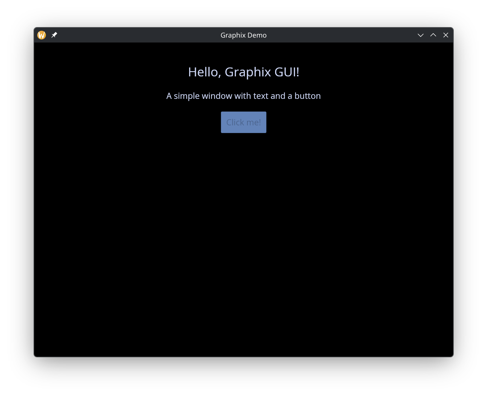
Here is a minimal GUI program that creates a window with text and a button:
use gui;
use gui::text;
use gui::column;
use gui::button;
mod icon;

[&window(
  #icon: &icon::icon,
  #title: &"Graphix Demo",
  #theme: &`CatppuccinMocha,
  &column(
    #spacing: &20.0,
    #padding: &`All(40.0),
    #halign: &`Center,
    #width: &`Fill,
    #height: &`Fill,
    &[
      text(#size: &24.0, &"Hello, Graphix GUI!"),
      text(&"A simple window with text and a button"),
      button(
        #padding: &`All(10.0),
        &text(&"Click me!")
      )
    ]
  )
)]
A few things to notice:
use guibrings the top-level GUI module into scope, which gives access towindowand shared types likeLength,Padding, andTheme.- Individual widget modules (
gui::text,gui::column,gui::button) are imported separately. - Widget arguments are passed as references with
&. Even literal values like&20.0and&"Hello, Graphix GUI!"are wrapped in&. - The program’s final value is a one-element array
[&window(...)], which has typeGui.
The Reference Pattern
GUI widgets take & references so that updates propagate with fine granularity. When you write:
let name = "world"
text(&"Hello, [name]!")
The text widget holds a reference to the string expression "Hello, [name]!". When name changes, only this specific text widget re-renders – the rest of the window is untouched.
This is especially important for interactive widgets. A text input, for example, takes a &string for its current value and provides a callback to update it:
let name = ""
text_input(#on_input: |v| name <- v, #placeholder: &"Type here...", &name)
The <- connect operator schedules name to update on the next cycle, and because the text input holds a reference to name, it automatically reflects the new value.
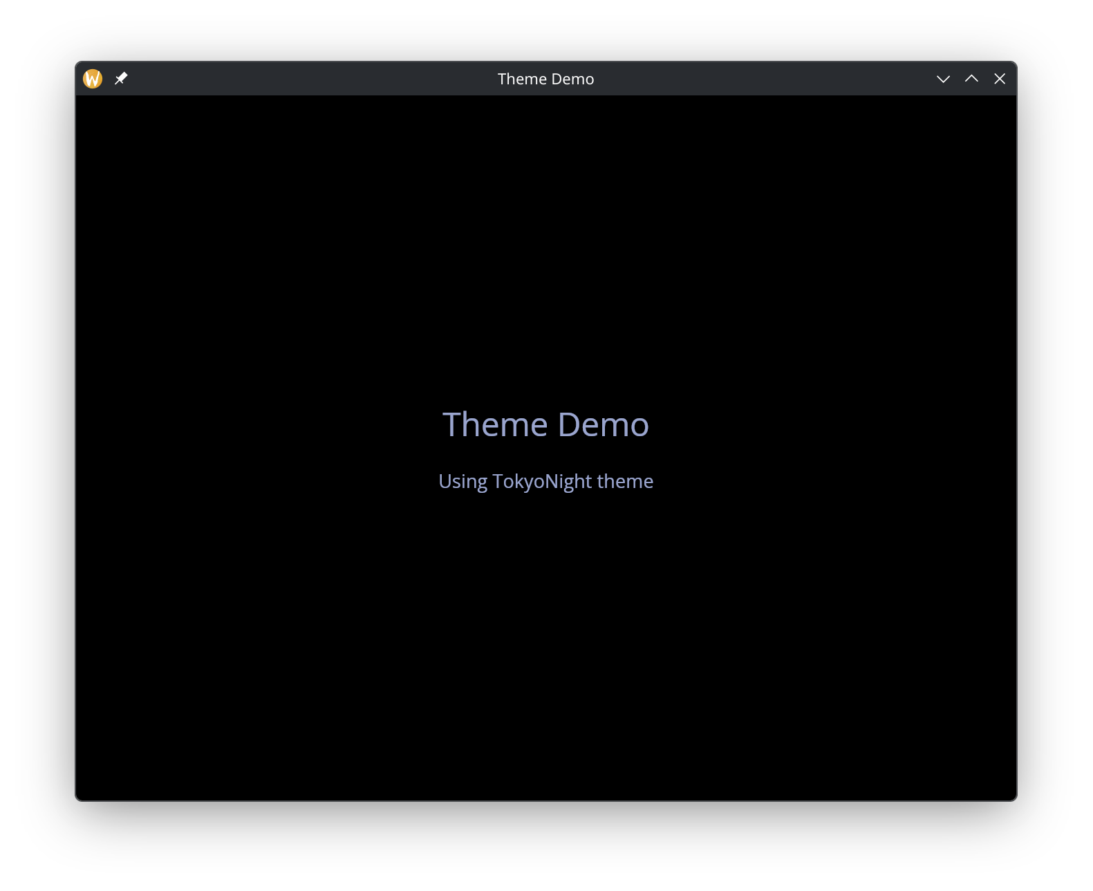
Theming
Every window accepts a #theme parameter that controls its visual appearance. Graphix ships with 22 built-in themes plus support for fully custom palettes and stylesheets:
use gui;
use gui::text;
use gui::column;
use gui::container;
mod icon;

[&window(
  #icon: &icon::icon,
  #title: &"Theme Demo",
  #theme: &`TokyoNight,
  &container(
    #width: &`Fill,
    #height: &`Fill,
    #halign: &`Center,
    #valign: &`Center,
    #padding: &`All(40.0),
    &column(
      #spacing: &20.0,
      #halign: &`Center,
      #width: &`Fill,
      &[
        text(#size: &28.0, #halign: &`Center, #width: &`Fill, &"Theme Demo"),
        text(
          #size: &16.0, #halign: &`Center, #width: &`Fill,
          &"Using TokyoNight theme")
      ]
    )
  )
)]
See the theming page for the full list of built-in themes, custom palette creation, and per-widget style overrides.