Theming
Every GUI window accepts a #theme parameter that controls the visual appearance of all widgets inside it. Graphix provides 22 built-in themes, plus two mechanisms for full customization: custom palettes and custom stylesheets.
Built-in Themes
The Theme type enumerates all available themes:
type Theme = [
  `Light,
  `Dark,
  `Dracula,
  `Nord,
  `SolarizedLight,
  `SolarizedDark,
  `GruvboxLight,
  `GruvboxDark,
  `CatppuccinLatte,
  `CatppuccinFrappe,
  `CatppuccinMacchiato,
  `CatppuccinMocha,
  `TokyoNight,
  `TokyoNightStorm,
  `TokyoNightLight,
  `KanagawaWave,
  `KanagawaDragon,
  `KanagawaLotus,
  `Moonfly,
  `Nightfly,
  `Oxocarbon,
  `Ferra,
  `Custom(StyleSheet),
  `CustomPalette(Palette)
];
Apply a theme by passing it to the window function:
window(#theme: &`CatppuccinMocha, &content)
Since #theme takes a &Theme, you can change the theme reactively:
let dark = true
let theme = select dark {
  true => `Dark,
  false => `Light
}

window(#theme: &theme, &content)
Custom Palettes
For quick color customization without defining per-widget styles, use `CustomPalette with a Palette:
type Palette = {
  background: Color,
  danger: Color,
  primary: Color,
  success: Color,
  text: Color,
  warning: Color
};
The palette defines the core colors from which iced derives all widget styles automatically:
background– window and container backgrounds.text– default text color.primary– accent color for buttons, sliders, active elements.success– color for success states (e.g., toggler when enabled).danger– color for destructive actions and error states.warning– color for warning indicators.
use gui;
use gui::style;
use gui::text;
use gui::button;
use gui::toggler;
use gui::slider;
use gui::column;
mod icon;
let enabled = true;
let br = 0.0;
let cv = |base| min(1.0, base + br);
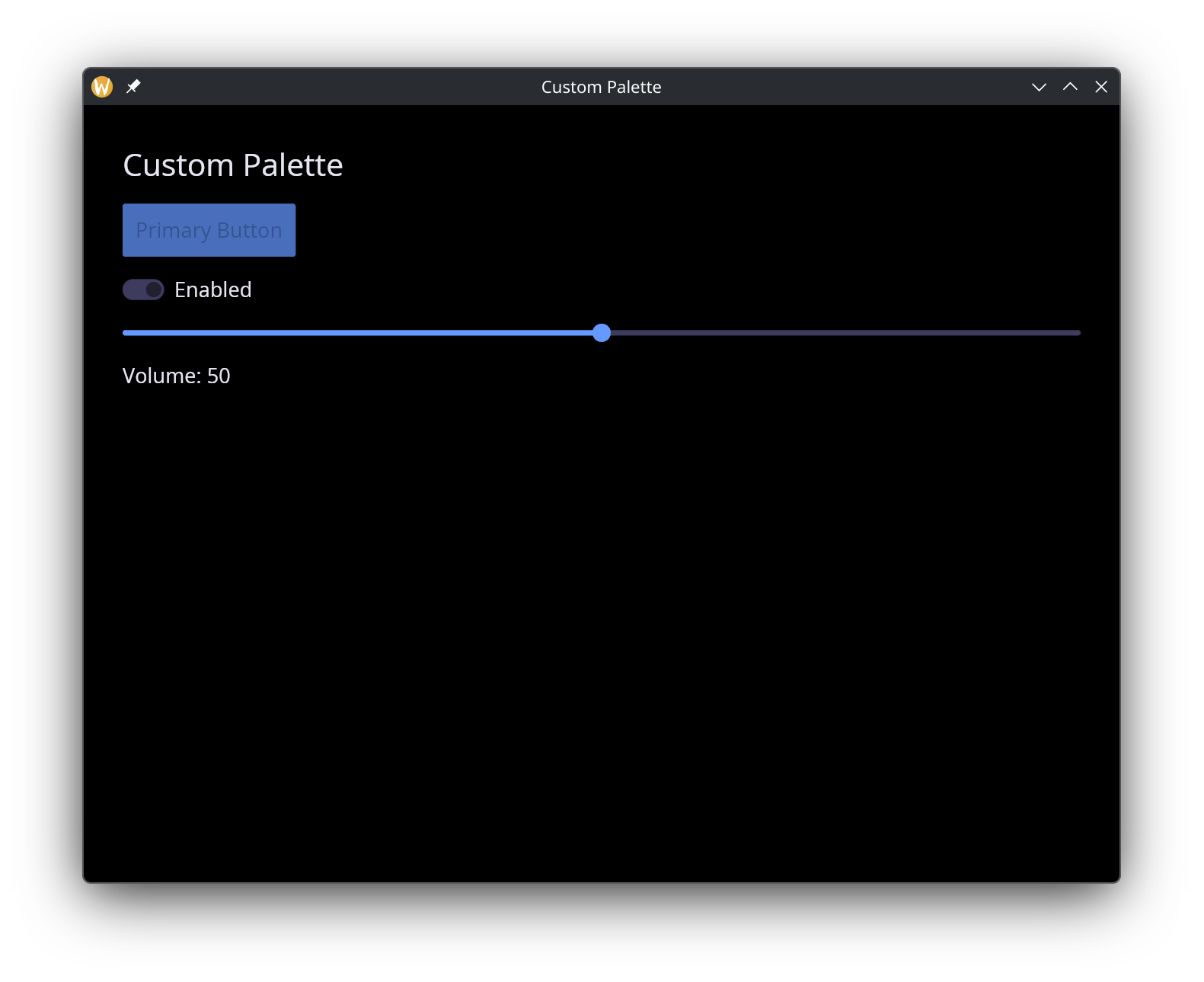
let my_palette = {
background: color(#r: cv(0.1), #g: cv(0.1), #b: cv(0.15))$,
text: color(#r: cv(0.9), #g: cv(0.9), #b: cv(0.95))$,
primary: color(#r: cv(0.4), #g: cv(0.6), #b: cv(1.0))$,
success: color(#r: cv(0.3), #g: cv(0.8), #b: cv(0.4))$,
danger: color(#r: cv(1.0), #g: cv(0.3), #b: cv(0.3))$,
warning: color(#r: cv(1.0), #g: cv(0.8), #b: cv(0.2))$
};
let col = column(
#spacing: &15.0,
#padding: &`All(30.0),
#width: &`Fill,
&[
text(#size: &24.0, &"Custom Palette"),
button(#padding: &`All(10.0), &text(&"Primary Button")),
toggler(#label: &"Enabled", #on_toggle: |v| enabled <- v, &enabled),
slider(#min: &0.0, #max: &0.5, #step: &0.05, #on_change: |v| br <- v, &br),
text(&"Brightness: [br]")
]
);
[&window(
#icon: &icon::icon,
#title: &"Custom Palette",
#theme: &`CustomPalette(my_palette),
&col
)]
Custom Stylesheets
For full control over individual widget appearances, use `Custom(StyleSheet). A stylesheet combines a palette with optional per-widget style overrides:
type StyleSheet = {
  button: [ButtonStyle, null],
  checkbox: [CheckboxStyle, null],
  container: [ContainerStyle, null],
  menu: [MenuStyle, null],
  palette: Palette,
  pick_list: [PickListStyle, null],
  progress_bar: [ProgressBarStyle, null],
  radio: [RadioStyle, null],
  rule: [RuleStyle, null],
  scrollable: [ScrollableStyle, null],
  slider: [SliderStyle, null],
  text_editor: [TextEditorStyle, null],
  text_input: [TextInputStyle, null],
  toggler: [TogglerStyle, null]
};
Every widget style field is optional (union with null). When null, the widget inherits its style from the palette automatically.
The stylesheet Builder
Use the stylesheet function to construct a StyleSheet without filling in every field manually. Only #palette is required; all widget style parameters default to null:
val stylesheet: fn(
  #palette: Palette,
  ?#button: [ButtonStyle, null],
  ?#checkbox: [CheckboxStyle, null],
  ?#container: [ContainerStyle, null],
  ?#menu: [MenuStyle, null],
  ?#pick_list: [PickListStyle, null],
  ?#progress_bar: [ProgressBarStyle, null],
  ?#radio: [RadioStyle, null],
  ?#rule: [RuleStyle, null],
  ?#scrollable: [ScrollableStyle, null],
  ?#slider: [SliderStyle, null],
  ?#text_editor: [TextEditorStyle, null],
  ?#text_input: [TextInputStyle, null],
  ?#toggler: [TogglerStyle, null]
) -> StyleSheet;
Example with a custom palette and button override:
use gui;
use gui::style;
use gui::text;
use gui::button;
use gui::text_input;
use gui::slider;
use gui::toggler;
use gui::container;
use gui::column;
use gui::rule;
mod icon;
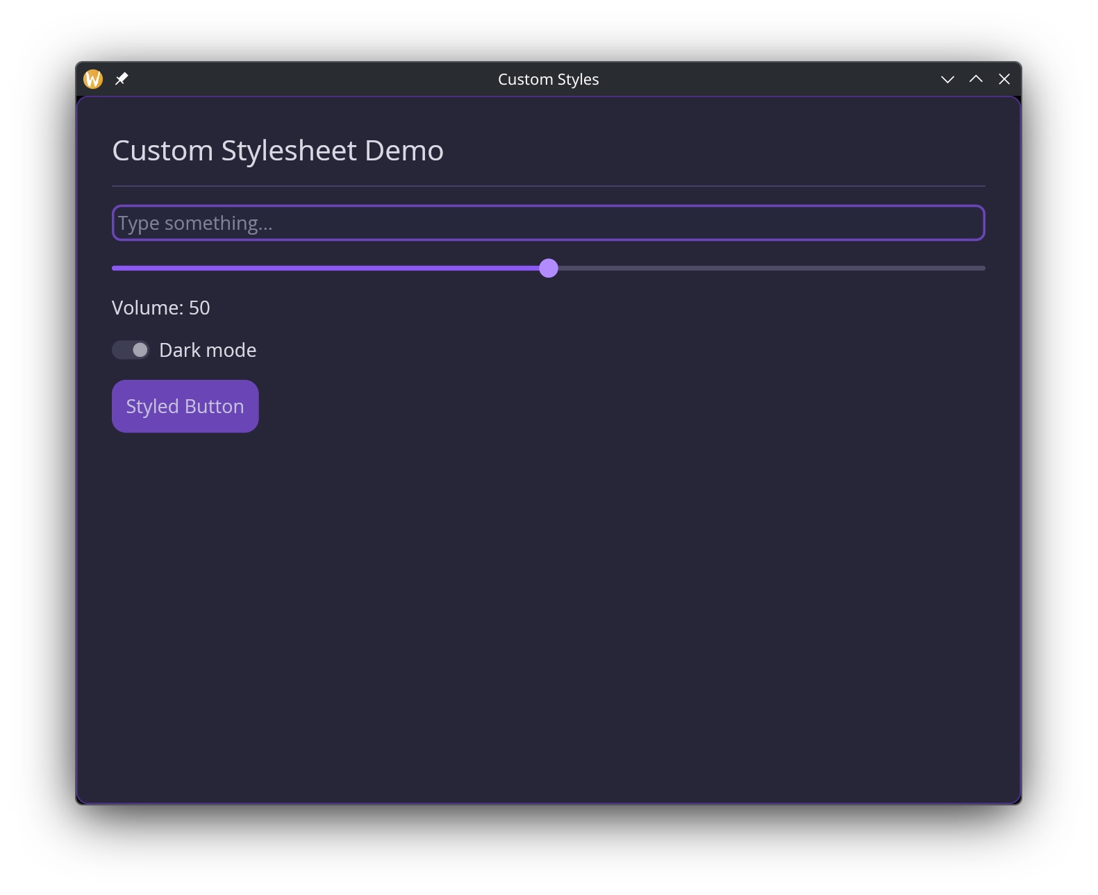
let palette = {
background: color(#r: 0.12, #g: 0.12, #b: 0.18)$,
text: color(#r: 0.85, #g: 0.85, #b: 0.9)$,
primary: color(#r: 0.55, #g: 0.35, #b: 0.95)$,
success: color(#r: 0.2, #g: 0.8, #b: 0.5)$,
danger: color(#r: 0.95, #g: 0.25, #b: 0.35)$,
warning: color(#r: 1.0, #g: 0.7, #b: 0.1)$
};
let theme = `Custom(stylesheet(
#palette: palette,
#button: button_style(
#background: color(#r: 0.55, #g: 0.35, #b: 0.95)$,
#text_color: color(#r: 1.0, #g: 1.0, #b: 1.0)$,
#border_radius: 12.0
),
#text_input: text_input_style(
#background: color(#r: 0.16, #g: 0.16, #b: 0.24)$,
#border_color: color(#r: 0.55, #g: 0.35, #b: 0.95, #a: 0.5)$,
#border_radius: 8.0,
#border_width: 2.0,
#value_color: color(#r: 0.9, #g: 0.9, #b: 0.95)$,
#placeholder_color: color(#r: 0.5, #g: 0.5, #b: 0.6)$
),
#slider: slider_style(
#rail_color: color(#r: 0.3, #g: 0.3, #b: 0.4)$,
#rail_fill_color: color(#r: 0.55, #g: 0.35, #b: 0.95)$,
#handle_color: color(#r: 0.7, #g: 0.55, #b: 1.0)$,
#handle_radius: 8.0
),
#toggler: toggler_style(
#background: color(#r: 0.3, #g: 0.3, #b: 0.4)$,
#foreground: color(#r: 0.85, #g: 0.85, #b: 0.9)$
),
#container: container_style(
#background: color(#r: 0.15, #g: 0.15, #b: 0.22)$,
#border_color: color(#r: 0.55, #g: 0.35, #b: 0.95, #a: 0.3)$,
#border_width: 1.0,
#border_radius: 10.0
)
));
let name = "";
let volume = 50.0;
let dark_mode = true;
[&window(
#icon: &icon::icon,
#title: &"Custom Styles",
#theme: &theme,
&container(
#padding: &`All(30.0),
#width: &`Fill,
#height: &`Fill,
&column(
#spacing: &15.0,
#width: &`Fill,
&[
text(#size: &24.0, &"Custom Stylesheet Demo"),
horizontal_rule(),
text_input(
#placeholder: &"Type something...",
#on_input: |v| name <- v,
&name
),
slider(
#min: &0.0, #max: &100.0,
#on_change: |v| volume <- v,
&volume
),
text(&"Volume: [volume]"),
toggler(
#label: &"Dark mode",
#on_toggle: |v| dark_mode <- v,
&dark_mode
),
button(#padding: &`All(12.0), &text(&"Styled Button"))
]
)
)
)]
Per-Widget Style Types
Each widget style type is a struct where every field is optional ([T, null]). A null field means “inherit from the theme palette.” The GUI module provides both the types and corresponding builder functions.
ButtonStyle
type ButtonStyle = {
  background: [Color, null],
  border_color: [Color, null],
  border_radius: [f64, null],
  border_width: [f64, null],
  text_color: [Color, null]
};

val button_style: fn(
  ?#background: [Color, null],
  ?#border_color: [Color, null],
  ?#border_radius: [f64, null],
  ?#border_width: [f64, null],
  ?#text_color: [Color, null]
) -> ButtonStyle;
TextInputStyle
type TextInputStyle = {
  background: [Color, null],
  border_color: [Color, null],
  border_radius: [f64, null],
  border_width: [f64, null],
  icon_color: [Color, null],
  placeholder_color: [Color, null],
  selection_color: [Color, null],
  value_color: [Color, null]
};

val text_input_style: fn(
  ?#background: [Color, null],
  ?#border_color: [Color, null],
  ?#border_radius: [f64, null],
  ?#border_width: [f64, null],
  ?#icon_color: [Color, null],
  ?#placeholder_color: [Color, null],
  ?#selection_color: [Color, null],
  ?#value_color: [Color, null]
) -> TextInputStyle;
SliderStyle
type SliderStyle = {
  handle_border_color: [Color, null],
  handle_border_width: [f64, null],
  handle_color: [Color, null],
  handle_radius: [f64, null],
  rail_color: [Color, null],
  rail_fill_color: [Color, null],
  rail_width: [f64, null]
};

val slider_style: fn(
  ?#handle_border_color: [Color, null],
  ?#handle_border_width: [f64, null],
  ?#handle_color: [Color, null],
  ?#handle_radius: [f64, null],
  ?#rail_color: [Color, null],
  ?#rail_fill_color: [Color, null],
  ?#rail_width: [f64, null]
) -> SliderStyle;
Other Widget Styles
The remaining widget style types follow the same pattern – a struct of optional fields with a corresponding builder function:
| Type | Builder | Key Fields |
|---|---|---|
CheckboxStyle | checkbox_style | accent, background, border_color, border_radius, border_width, icon_color, text_color |
ContainerStyle | container_style | background, border_color, border_radius, border_width, text_color |
MenuStyle | menu_style | background, border_color, border_radius, border_width, selected_background, selected_text_color, text_color |
PickListStyle | pick_list_style | background, border_color, border_radius, border_width, handle_color, placeholder_color, text_color |
ProgressBarStyle | progress_bar_style | background, bar_color, border_radius |
RadioStyle | radio_style | background, border_color, border_width, dot_color, text_color |
RuleStyle | rule_style | color, radius, width |
ScrollableStyle | scrollable_style | background, border_color, border_radius, border_width, scroller_color |
TextEditorStyle | text_editor_style | background, border_color, border_radius, border_width, placeholder_color, selection_color, value_color |
TogglerStyle | toggler_style | background, background_border_color, border_radius, foreground, foreground_border_color, text_color |
All builder functions accept the same labeled arguments as the corresponding struct fields, all optional, all defaulting to null.