The Text Widget
The text widget displays a string with optional styling. It is the most basic display widget and the foundation for showing any textual content in a GUI application. Font size, color, font family, weight, style, sizing, and alignment are all configurable through labeled arguments.
Interface
val text: fn(
  ?#size: &[f64, null],
  ?#color: &[Color, null],
  ?#font: &[Font, null],
  ?#width: &Length,
  ?#height: &Length,
  ?#halign: &HAlign,
  ?#valign: &VAlign,
  s: &string
) -> Widget
Parameters
- size - Font size in pixels. Defaults to the theme’s standard text size when null.
- color - Text color as a
Colorstruct withr,g,b,afields, each a float from 0.0 to 1.0. Defaults to the theme’s text color when null. - font - A
Fontstruct controlling the typeface:family: One of`SansSerif,`Serif,`Monospace, or`Name(string)for a specific font name.weight: One of`Thin,`ExtraLight,`Light,`Normal,`Medium,`SemiBold,`Bold,`ExtraBold,`Black.style: One of`Normal,`Italic,`Oblique.
- width - Horizontal sizing as a
Length:`Fill,`Shrink,`Fixed(f64), or`FillPortion(i64). Defaults to`Shrink. - height - Vertical sizing as a
Length. Defaults to`Shrink. - halign - Horizontal text alignment:
`Left,`Center, or`Right. Defaults to`Left. Only visible when the widget is wider than the text (e.g. with#width: &Fill``). - valign - Vertical text alignment:
`Top,`Center, or`Bottom. Defaults to`Top.
The positional argument is a reference to the string to display. Because it is a reference, the text updates reactively when the underlying value changes.
Examples
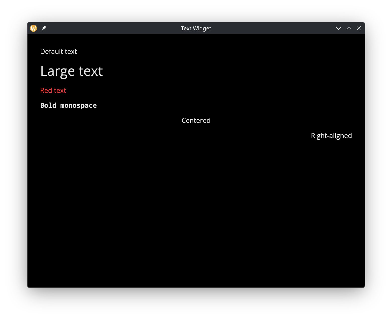
Styling and Alignment
use gui;
use gui::text;
use gui::column;
mod icon;

[&window(
  #icon: &icon::icon,
  #title: &"Text Widget",
  &column(
    #spacing: &15.0,
    #padding: &`All(30.0),
    #width: &`Fill,
    &[
      text(&"Default text"),
      text(#size: &32.0, &"Large text"),
      text(#color: &color(#r: 1.0, #g: 0.2, #b: 0.2)$, &"Red text"),
      text(
        #font: &{ family: `Monospace, weight: `Bold, style: `Normal },
        &"Bold monospace"),
      text(#halign: &`Center, #width: &`Fill, &"Centered"),
      text(#halign: &`Right, #width: &`Fill, &"Right-aligned")
    ]
  )
)]
See Also
- button - Clickable button that wraps a widget (often text)
- text_input - Editable single-line text field
- text_editor - Multi-line text editing