The Chart Widget
The chart widget renders data visualizations with multiple datasets, axis labels, and automatic or manual axis scaling. It supports line charts, scatter plots, bar charts, area charts, dashed lines, candlestick charts, error bars, pie charts, and 3D plots (scatter, line, surface). Multiple series types can be mixed on the same chart (within the same mode — you cannot mix e.g. bar and pie).
Interface
type SeriesStyle = {
  color: [Color, null],
  label: [string, null],
  stroke_width: [f64, null],
  point_size: [f64, null]
};

type BarStyle = {
  color: [Color, null],
  label: [string, null],
  margin: [f64, null]
};

type CandlestickStyle = {
  gain_color: [Color, null],
  loss_color: [Color, null],
  bar_width: [f64, null],
  label: [string, null]
};

type PieStyle = {
  colors: [Array<Color>, null],
  donut: [f64, null],
  label_offset: [f64, null],
  show_percentages: [bool, null],
  start_angle: [f64, null]
};

type SurfaceStyle = {
  color: [Color, null],
  color_by_z: [bool, null],
  label: [string, null]
};

type Projection3D = {
  pitch: [f64, null],
  scale: [f64, null],
  yaw: [f64, null]
};

type OhlcPoint<'a: [f64, datetime]> = {x: 'a, open: f64, high: f64, low: f64, close: f64};
type ErrorBarPoint<'a: [f64, datetime]> = {x: 'a, min: f64, avg: f64, max: f64};

type MeshStyle = {
  show_x_grid: [bool, null],
  show_y_grid: [bool, null],
  grid_color: [Color, null],
  axis_color: [Color, null],
  label_color: [Color, null],
  label_size: [f64, null],
  x_label_area_size: [f64, null],
  x_labels: [i64, null],
  y_label_area_size: [f64, null],
  y_labels: [i64, null]
};

type LegendStyle = {
  background: [Color, null],
  border: [Color, null],
  label_color: [Color, null],
  label_size: [f64, null]
};

type LegendPosition = [
  `UpperLeft, `UpperRight, `LowerLeft, `LowerRight,
  `MiddleLeft, `MiddleRight, `UpperMiddle, `LowerMiddle
];

type Dataset = [
  `Line({data: &[Array<(f64, f64)>, Array<(datetime, f64)>], style: SeriesStyle}),
  `Scatter({data: &[Array<(f64, f64)>, Array<(datetime, f64)>], style: SeriesStyle}),
  `Bar({data: &Array<(string, f64)>, style: BarStyle}),
  `Area({data: &[Array<(f64, f64)>, Array<(datetime, f64)>], style: SeriesStyle}),
  `DashedLine({data: &[Array<(f64, f64)>, Array<(datetime, f64)>], dash: f64, gap: f64, style: SeriesStyle}),
  `Candlestick({data: &[Array<OhlcPoint<f64>>, Array<OhlcPoint<datetime>>], style: CandlestickStyle}),
  `ErrorBar({data: &[Array<ErrorBarPoint<f64>>, Array<ErrorBarPoint<datetime>>], style: SeriesStyle}),
  `Pie({data: &Array<(string, f64)>, style: PieStyle}),
  `Scatter3D({data: &Array<(f64, f64, f64)>, style: SeriesStyle}),
  `Line3D({data: &Array<(f64, f64, f64)>, style: SeriesStyle}),
  `Surface({data: &Array<Array<(f64, f64, f64)>>, style: SurfaceStyle})
];

val chart: fn(
  ?#title: &[string, null],
  ?#title_color: &[Color, null],
  ?#x_label: &[string, null],
  ?#y_label: &[string, null],
  ?#x_range: &[{min: f64, max: f64}, {min: datetime, max: datetime}, null],
  ?#y_range: &[{min: f64, max: f64}, null],
  ?#z_label: &[string, null],
  ?#z_range: &[{min: f64, max: f64}, null],
  ?#projection: &[Projection3D, null],
  ?#width: &Length,
  ?#height: &Length,
  ?#background: &[Color, null],
  ?#margin: &[f64, null],
  ?#title_size: &[f64, null],
  ?#legend_position: &[LegendPosition, null],
  ?#legend_style: &[LegendStyle, null],
  ?#mesh: &[MeshStyle, null],
  a: &Array<Dataset>
) -> Widget
Chart Parameters
- title — Chart title displayed above the plot area. Null for no title.
- title_color — Color of the chart title text. Defaults to black when null.
- x_label — Label for the x-axis. Null for no label.
- y_label — Label for the y-axis. Null for no label.
- x_range — Manual x-axis range as
{min: f64, max: f64}or{min: datetime, max: datetime}. When null, the range is computed automatically from the data. - y_range — Manual y-axis range as
{min: f64, max: f64}. When null, auto-computed. - z_label — Label for the z-axis (3D charts only). Null for no label.
- z_range — Manual z-axis range as
{min: f64, max: f64}(3D charts only). When null, auto-computed. - projection — 3D projection parameters as a
Projection3Dstruct. Controls pitch, yaw, and scale of the 3D view. When null, plotters defaults are used. - width — Horizontal sizing as a
Length. Defaults to`Fill. - height — Vertical sizing as a
Length. Defaults to`Fill. - background — Background color as a
Colorstruct. Defaults to white when null. - margin — Margin in pixels around the plot area. Defaults to 10.
- title_size — Font size for the chart title. Defaults to 16.
- legend_position — Position of the series legend. Defaults to
`UpperLeftwhen null. - legend_style — Legend appearance via a
LegendStylestruct. Controls background, border, text color, and label size. When null, defaults to white background with black border. - mesh — Grid and axis styling via a
MeshStylestruct. When null, plotters defaults are used.
The positional argument is a reference to an array of Dataset values. Multiple datasets can be plotted on the same axes.
Series Constructors
Rather than constructing Dataset variants directly, use these convenience functions. All style parameters are optional and default to null.
chart::line
chart::line(#label: "Price", #color: color(#r: 1.0)$, &data)
Points connected by straight line segments. Data is &[Array<(f64, f64)>, Array<(datetime, f64)>] — either numeric or time-series x values.
chart::scatter
chart::scatter(#label: "Points", #point_size: 5.0, &data)
Individual points without connecting lines. Same data type as line.
chart::bar
chart::bar(#label: "Counts", &data)
Vertical bars from the x-axis. Data is &Array<(string, f64)> — category labels paired with values. Uses BarStyle (which has margin instead of stroke_width/point_size).
chart::area
chart::area(#label: "Volume", &data)
Like line but with the region between the line and the x-axis filled with 30% opacity. Same data type as line.
chart::dashed_line
chart::dashed_line(#label: "Projection", #dash: 10.0, #gap: 5.0, &data)
A dashed line series. dash and gap control the dash and gap lengths in pixels. Defaults to 5.0 each.
chart::candlestick
chart::candlestick(#label: "OHLC", &ohlc_data)
Financial candlestick chart. Data is &[Array<OhlcPoint<f64>>, Array<OhlcPoint<datetime>>] where each point has {x, open, high, low, close} fields. Gain candles (close > open) are green by default; loss candles are red. Override with #gain_color and #loss_color.
chart::error_bar
chart::error_bar(#label: "Confidence", &error_data)
Vertical error bars. Data is &[Array<ErrorBarPoint<f64>>, Array<ErrorBarPoint<datetime>>] where each point has {x, min, avg, max} fields. A circle is drawn at the average value with whiskers extending to min and max.
chart::pie
chart::pie(#show_percentages: true, #start_angle: -90.0, &data)
Pie chart. Data is &Array<(string, f64)> — category labels paired with values. Uses PieStyle which controls colors, donut hole size, label offset, percentage display, and start angle.
chart::scatter3d
chart::scatter3d(#label: "3D Points", #point_size: 4.0, &data)
3D scatter plot. Data is &Array<(f64, f64, f64)>. Use the chart #projection parameter to control the 3D viewing angle.
chart::line3d
chart::line3d(#label: "3D Line", &data)
3D line plot. Data is &Array<(f64, f64, f64)>. Points connected by line segments in 3D space.
chart::surface
chart::surface(#color_by_z: true, #label: "surface", &grid_data)
3D surface plot. Data is &Array<Array<(f64, f64, f64)>> — a grid of rows where each point is (x, y, z). Set #color_by_z: true for automatic heat-map coloring based on z values.
chart::mesh_style
chart::mesh_style(#label_color: color(#r: 1.0, #g: 1.0, #b: 1.0)$, #x_labels: 5)
Constructs a MeshStyle value for use with the chart’s #mesh parameter.
chart::legend_style
chart::legend_style(#background: color(#r: 0.1, #g: 0.1, #b: 0.1)$, #label_color: color(#r: 1.0, #g: 1.0, #b: 1.0)$)
Constructs a LegendStyle value for use with the chart’s #legend_style parameter.
Style Fields
SeriesStyle
Used by line, scatter, area, dashed_line, error_bar, scatter3d, and line3d:
- color — Series color. When null, a color is assigned from a default palette.
- label — Display name shown in the legend. When null, no legend entry is created.
- stroke_width — Line/stroke width in pixels. Defaults to 2.
- point_size — Point radius for scatter plots. Defaults to 3.
BarStyle
Used by bar:
- color — Bar fill color. When null, assigned from palette.
- label — Display name shown in the legend.
- margin — Margin between bars in pixels.
CandlestickStyle
Used by candlestick:
- gain_color — Color for gain candles (close > open). Defaults to green.
- loss_color — Color for loss candles (close <= open). Defaults to red.
- bar_width — Width of candlestick bodies in pixels. Defaults to 5.
- label — Display name shown in the legend.
PieStyle
Used by pie:
- colors — Array of colors for pie slices. When null, default palette is used.
- donut — Inner radius as a fraction of the outer radius (0.0–1.0). When null or 0, draws a full pie.
- label_offset — Distance of labels from the pie center as a percentage. Defaults to plotters default.
- show_percentages — Whether to display percentage values on labels. Defaults to false.
- start_angle — Starting angle in degrees. Defaults to 0 (3 o’clock position). Use -90.0 to start at 12 o’clock.
SurfaceStyle
Used by surface:
- color — Surface fill color. When null, assigned from palette.
- color_by_z — When true, colors the surface with a heat map based on z values. Defaults to false.
- label — Display name shown in the legend.
Projection3D
Used with the chart #projection parameter for 3D charts:
- pitch — Vertical rotation angle in radians.
- scale — Scale factor for the 3D projection.
- yaw — Horizontal rotation angle in radians.
MeshStyle Fields
- show_x_grid — Show vertical grid lines. Defaults to true when null.
- show_y_grid — Show horizontal grid lines. Defaults to true when null.
- grid_color — Color of grid lines.
- axis_color — Color of axis lines.
- label_color — Color of tick labels and axis descriptions. Essential for dark backgrounds where the default black text is invisible.
- label_size — Font size for axis labels.
- x_label_area_size — Width of the x-axis label area in pixels. Increase to prevent label clipping.
- x_labels — Number of x-axis tick labels.
- y_label_area_size — Width of the y-axis label area in pixels. Increase to prevent label clipping.
- y_labels — Number of y-axis tick labels.
LegendStyle Fields
- background — Legend background color. Defaults to white when null.
- border — Legend border color. Defaults to black when null.
- label_color — Color of legend text labels. Defaults to plotters default (black) when null.
- label_size — Font size for legend labels. When null, plotters default is used.
Examples
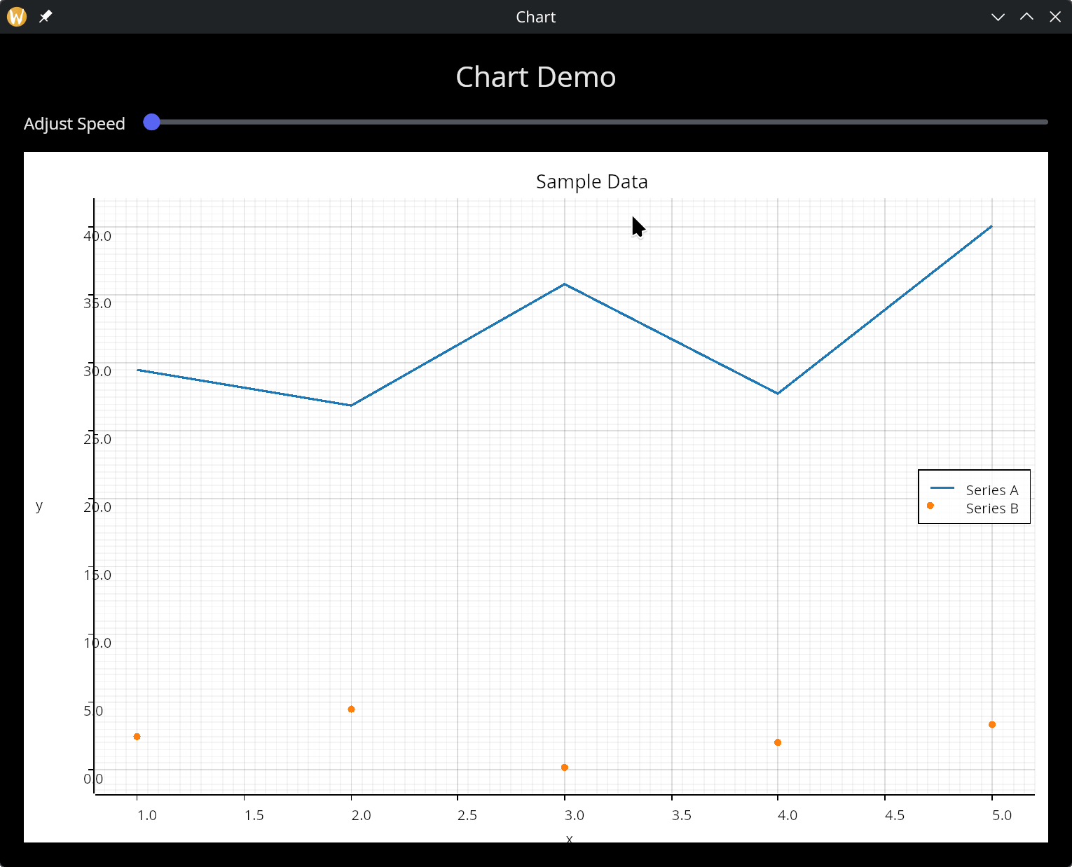
Multiple Datasets
use gui;
use gui::text;
use gui::chart;
use gui::column;
use gui::row;
use gui::slider;
mod icon;

let rate = 0.;
let clock = sys::time::timer(1. - rate, true);
let x = cast<f64>(count(clock))$;

let series = |start: f64, end: f64| -> Array<(f64, f64)> {
    let d = [];
    let y = rand::rand(#start, #end, #clock);
    d <- array::window(#n:20, clock ~ d, (x, y));
    d
};

let adjust_speed = row(
    #spacing:&15.0,
    &[
        text(#size: &14.0, &"Adjust Speed"),
        slider(#min:&0., #max:&0.9, #step:&0.1, #on_change:|v| rate <- v, &rate)
     ]
);

let col = column(
    #spacing: &15.0,
    #padding: &`All(20.0),
    #width: &`Fill,
    #height: &`Fill,
    &[
        text(#size: &24.0, #halign: &`Center, #width: &`Fill, &"Chart Demo"),
        adjust_speed,
        chart::chart(
            #title: &"Sample Data",
            #x_label: &"x",
            #y_label: &"y",
            &[
                chart::line(#label: "Series A", &series(0., 50.)),
                chart::scatter(#label: "Series B", &series(0., 5.))
            ]
        )
    ]
);

[&window(#icon: &icon::icon, #title: &"Chart", #size: &{ width: 900.0, height: 700.0 }, &col)]
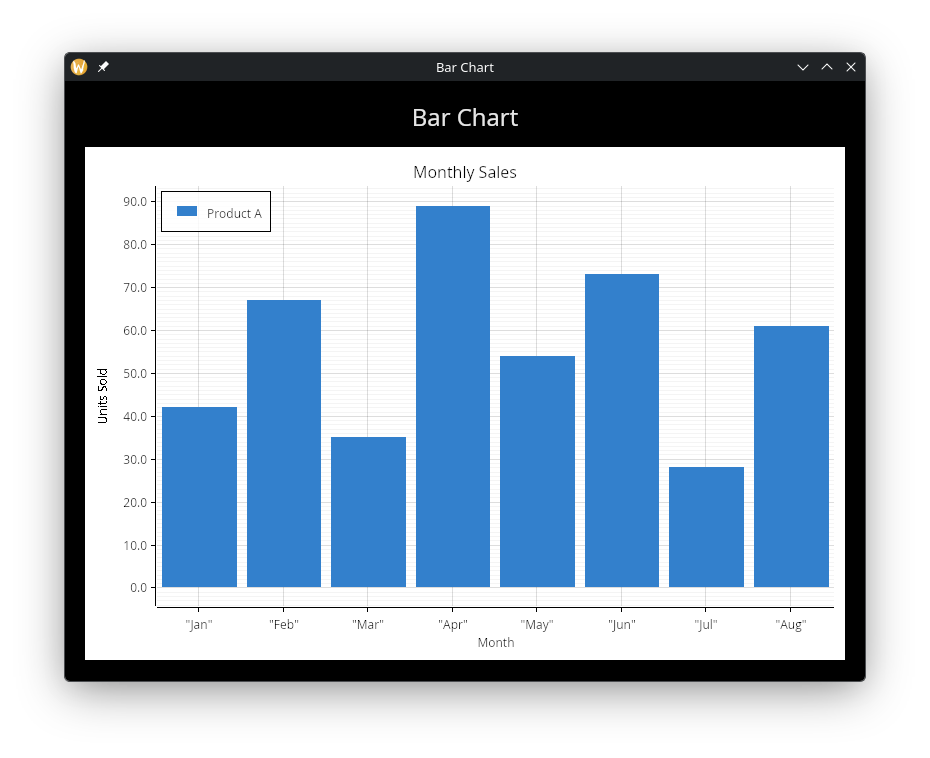
Bar Chart
use gui;
use gui::text;
use gui::chart;
use gui::column;
mod icon;

let data = [
    ("Jan", 42.),
    ("Feb", 67.),
    ("Mar", 35.),
    ("Apr", 89.),
    ("May", 54.),
    ("Jun", 73.),
    ("Jul", 28.),
    ("Aug", 61.)
];

let col = column(
    #spacing: &15.0,
    #padding: &`All(20.0),
    #width: &`Fill,
    #height: &`Fill,
    &[
        text(#size: &24.0, #halign: &`Center, #width: &`Fill, &"Bar Chart"),
        chart::chart(
            #title: &"Monthly Sales",
            #x_label: &"Month",
            #y_label: &"Units Sold",
            &[
                chart::bar(
                    #label: "Product A",
                    #color: color(#r: 0.2, #g: 0.5, #b: 0.8)$,
                    &data
                )
            ]
        )
    ]
);

[&window(#icon: &icon::icon, #title: &"Bar Chart", #size: &{width: 800.0, height: 600.0}, &col)]
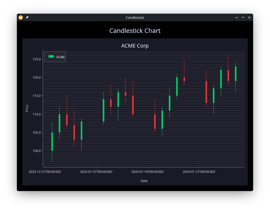
Candlestick
use gui;
use gui::text;
use gui::chart;
use gui::column;
mod icon;

let dark_bg = color(#r: 0.1, #g: 0.1, #b: 0.15)$;

let ohlc_data = [
    {x: datetime:"2024-01-01T00:00:00Z", open: 100., high: 108., low: 97.,  close: 105.},
    {x: datetime:"2024-01-02T00:00:00Z", open: 105., high: 112., low: 103., close: 110.},
    {x: datetime:"2024-01-03T00:00:00Z", open: 110., high: 115., low: 106., close: 107.},
    {x: datetime:"2024-01-04T00:00:00Z", open: 107., high: 111., low: 101., close: 103.},
    {x: datetime:"2024-01-05T00:00:00Z", open: 103., high: 109., low: 100., close: 108.},
    {x: datetime:"2024-01-08T00:00:00Z", open: 108., high: 116., low: 107., close: 114.},
    {x: datetime:"2024-01-09T00:00:00Z", open: 114., high: 118., low: 110., close: 112.},
    {x: datetime:"2024-01-10T00:00:00Z", open: 112., high: 117., low: 108., close: 116.},
    {x: datetime:"2024-01-11T00:00:00Z", open: 116., high: 120., low: 113., close: 115.},
    {x: datetime:"2024-01-12T00:00:00Z", open: 115., high: 119., low: 109., close: 110.},
    {x: datetime:"2024-01-15T00:00:00Z", open: 110., high: 114., low: 105., close: 106.},
    {x: datetime:"2024-01-16T00:00:00Z", open: 106., high: 112., low: 104., close: 111.},
    {x: datetime:"2024-01-17T00:00:00Z", open: 111., high: 117., low: 109., close: 115.},
    {x: datetime:"2024-01-18T00:00:00Z", open: 115., high: 121., low: 114., close: 120.},
    {x: datetime:"2024-01-19T00:00:00Z", open: 120., high: 125., low: 118., close: 119.},
    {x: datetime:"2024-01-22T00:00:00Z", open: 119., high: 122., low: 112., close: 113.},
    {x: datetime:"2024-01-23T00:00:00Z", open: 113., high: 118., low: 110., close: 117.},
    {x: datetime:"2024-01-24T00:00:00Z", open: 117., high: 123., low: 115., close: 122.},
    {x: datetime:"2024-01-25T00:00:00Z", open: 122., high: 126., low: 118., close: 119.},
    {x: datetime:"2024-01-26T00:00:00Z", open: 119., high: 124., low: 116., close: 123.}
];

let col = column(
    #spacing: &15.0,
    #padding: &`All(20.0),
    #width: &`Fill,
    #height: &`Fill,
    &[
        text(#size: &24.0, #halign: &`Center, #width: &`Fill, &"Candlestick Chart"),
        chart::chart(
            #title: &"ACME Corp",
            #title_color: &color(#r: 0.9, #g: 0.9, #b: 0.95)$,
            #x_label: &"Date",
            #y_label: &"Price",
            #background: &dark_bg,
            #title_size: &20.0,
            #legend_style: &chart::legend_style(
                #background: color(#r: 0.15, #g: 0.15, #b: 0.2)$,
                #border: color(#r: 0.4, #g: 0.4, #b: 0.45)$,
                #label_color: color(#r: 0.85, #g: 0.85, #b: 0.9)$
            ),
            #mesh: &chart::mesh_style(
                #show_x_grid: false,
                #grid_color: color(#r: 0.3, #g: 0.3, #b: 0.35)$,
                #axis_color: color(#r: 0.6, #g: 0.6, #b: 0.65)$,
                #label_color: color(#r: 0.75, #g: 0.75, #b: 0.8)$,
                #x_label_area_size: 60.0
            ),
            &[
                chart::candlestick(
                    #label: "ACME",
                    #gain_color: color(#g: 0.8, #b: 0.4)$,
                    #loss_color: color(#r: 0.9, #g: 0.2, #b: 0.2)$,
                    #bar_width: 6.0,
                    &ohlc_data
                )
            ]
        )
    ]
);

[&window(
    #icon: &icon::icon,
    #title: &"Candlestick",
    #size: &{width: 900.0, height: 650.0},
    #theme: &`CatppuccinMocha,
    &col
)]
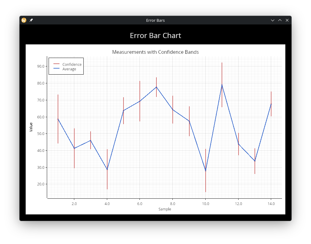
Error Bars
use gui;
use gui::text;
use gui::chart;
use gui::column;
mod icon;

let clock = sys::time::timer(duration:1.s, true);
let x = cast<f64>(count(clock))$;

let avg_data = [];
let err_data = [];

let avg = rand::rand(#start: 20., #end: 80., #clock);
let noise = rand::rand(#start: 3., #end: 15., #clock);

avg_data <- array::window(#n: 25, clock ~ avg_data, (x, avg));
err_data <- array::window(#n: 25, clock ~ err_data, {
    x, min: avg - noise, avg, max: avg + noise
});

let col = column(
    #spacing: &15.0,
    #padding: &`All(20.0),
    #width: &`Fill,
    #height: &`Fill,
    &[
        text(#size: &24.0, #halign: &`Center, #width: &`Fill, &"Error Bar Chart"),
        chart::chart(
            #title: &"Measurements with Confidence Bands",
            #x_label: &"Sample",
            #y_label: &"Value",
            &[
                chart::error_bar(
                    #label: "Confidence",
                    #color: color(#r: 0.8, #g: 0.4, #b: 0.4)$,
                    &err_data
                ),
                chart::line(
                    #label: "Average",
                    #color: color(#r: 0.2, #g: 0.4, #b: 0.8)$,
                    #stroke_width: 2.0,
                    &avg_data
                )
            ]
        )
    ]
);

[&window(#icon: &icon::icon, #title: &"Error Bars", #size: &{width: 900.0, height: 650.0}, &col)]
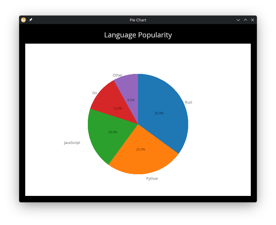
Pie Chart
use gui;
use gui::text;
use gui::chart;
use gui::column;
mod icon;

let data = [
    ("Rust", 35.),
    ("Python", 25.),
    ("JavaScript", 20.),
    ("Go", 12.),
    ("Other", 8.)
];

let col = column(
    #spacing: &15.0,
    #padding: &`All(20.0),
    #width: &`Fill,
    #height: &`Fill,
    &[
        text(#size: &24.0, #halign: &`Center, #width: &`Fill, &"Language Popularity"),
        chart::chart(
            #title: &"Programming Languages",
            &[
                chart::pie(
                    #show_percentages: true,
                    #start_angle: -90.0,
                    &data
                )
            ]
        )
    ]
);

[&window(#icon: &icon::icon, #title: &"Pie Chart", #size: &{width: 800.0, height: 600.0}, &col)]
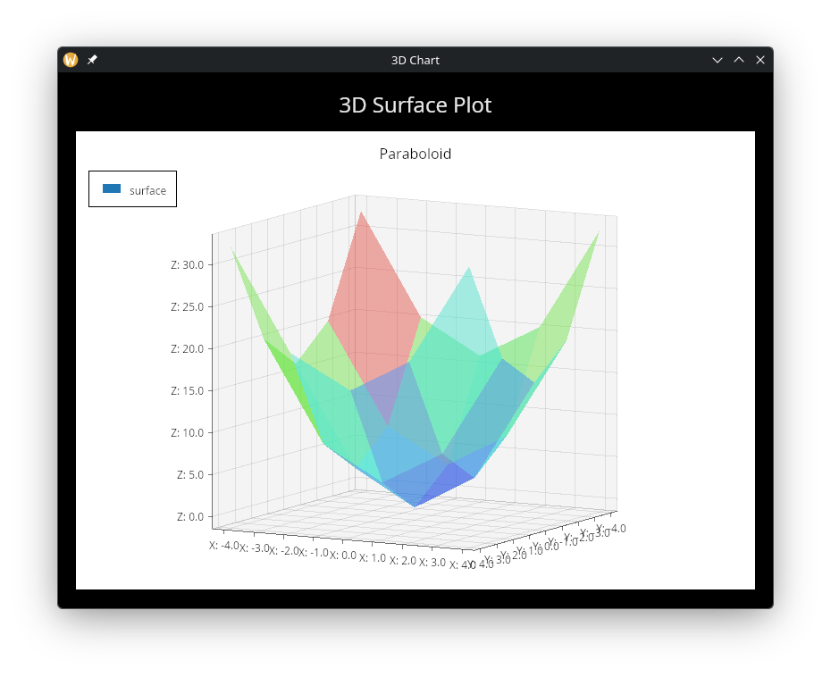
3D Surface
use gui;
use gui::text;
use gui::chart;
use gui::column;
mod icon;

let surface_data = [
    [(-4., -4., 32.), (-4., -2., 20.), (-4., 0., 16.), (-4., 2., 20.), (-4., 4., 32.)],
    [(-2., -4., 20.), (-2., -2., 8.),  (-2., 0., 4.),  (-2., 2., 8.),  (-2., 4., 20.)],
    [(0.,  -4., 16.), (0.,  -2., 4.),  (0.,  0., 0.),  (0.,  2., 4.),  (0.,  4., 16.)],
    [(2.,  -4., 20.), (2.,  -2., 8.),  (2.,  0., 4.),  (2.,  2., 8.),  (2.,  4., 20.)],
    [(4.,  -4., 32.), (4.,  -2., 20.), (4.,  0., 16.), (4.,  2., 20.), (4.,  4., 32.)]
];

let col = column(
    #spacing: &15.0,
    #padding: &`All(20.0),
    #width: &`Fill,
    #height: &`Fill,
    &[
        text(#size: &24.0, #halign: &`Center, #width: &`Fill, &"3D Surface Plot"),
        chart::chart(
            #title: &"Paraboloid",
            #x_label: &"X",
            #y_label: &"Y",
            #z_label: &"Z",
            #projection: &{yaw: 0.5, pitch: 0.15, scale: 0.9},
            &[
                chart::surface(
                    #color_by_z: true,
                    #label: "surface",
                    &surface_data
                )
            ]
        )
    ]
);

[&window(#icon: &icon::icon, #title: &"3D Chart", #size: &{width: 800.0, height: 600.0}, &col)]
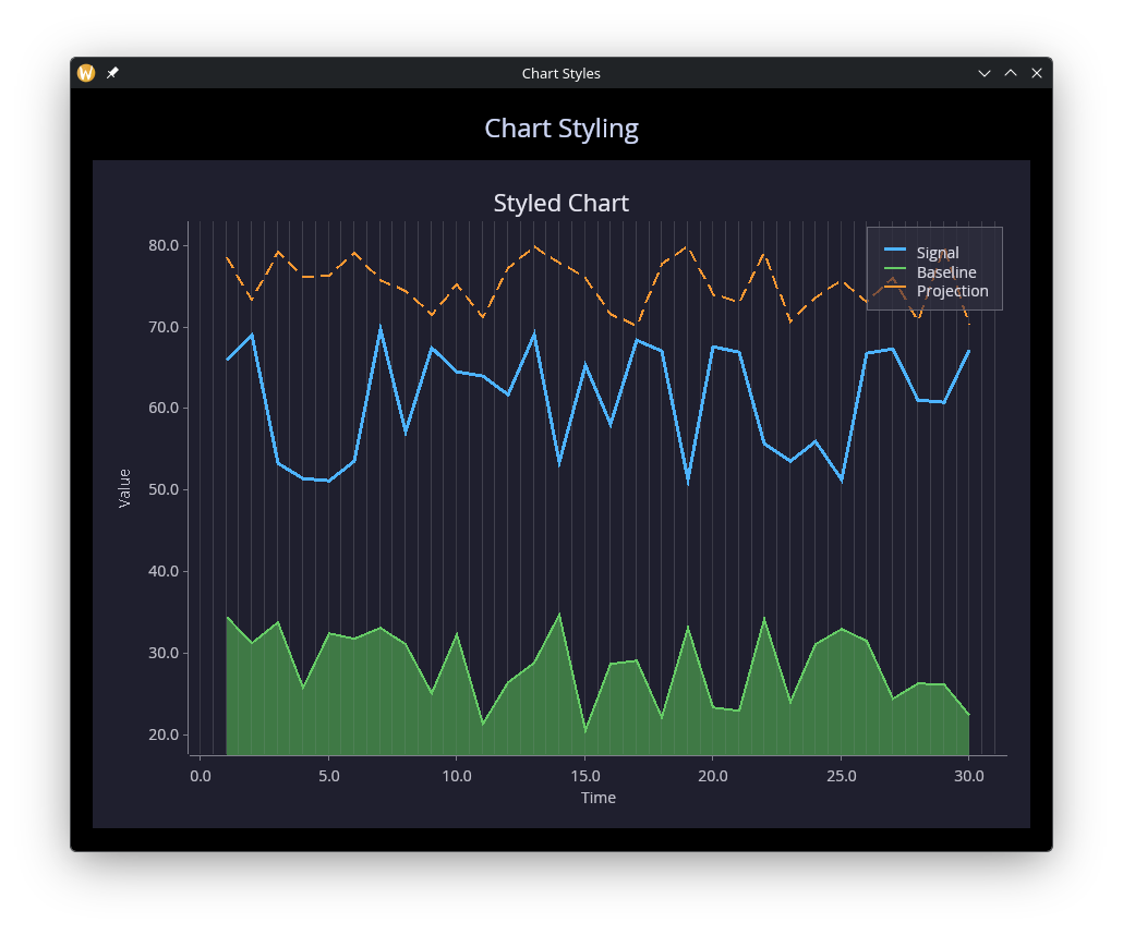
Styling
use gui;
use gui::text;
use gui::chart;
use gui::column;
mod icon;

let clock = sys::time::timer(duration:0.5s, true);
let x = cast<f64>(count(clock))$;

let series = |offset, scale| {
    let d = [];
    let y = rand::rand(#start: 0., #end: scale, #clock) + offset;
    d <- array::window(#n: 30, clock ~ d, (x, y));
    d
};

let line_data = series(50., 20.);
let area_data = series(20., 15.);
let dash_data = series(70., 10.);

let col = column(
    #spacing: &15.0,
    #padding: &`All(20.0),
    #width: &`Fill,
    #height: &`Fill,
    &[
        text(#size: &24.0, #halign: &`Center, #width: &`Fill, &"Chart Styling"),
        chart::chart(
            #title: &"Styled Chart",
            #title_color: &color(#r: 0.9, #g: 0.9, #b: 0.95)$,
            #x_label: &"Time",
            #y_label: &"Value",
            #background: &color(#r: 0.12, #g: 0.12, #b: 0.18)$,
            #margin: &20.0,
            #title_size: &22.0,
            #legend_position: &`UpperRight,
            #legend_style: &chart::legend_style(
                #background: color(#r: 0.18, #g: 0.18, #b: 0.24)$,
                #border: color(#r: 0.4, #g: 0.4, #b: 0.45)$,
                #label_color: color(#r: 0.85, #g: 0.85, #b: 0.9)$
            ),
            #mesh: &chart::mesh_style(
                #show_x_grid: true,
                #show_y_grid: false,
                #grid_color: color(#r: 0.25, #g: 0.25, #b: 0.3)$,
                #axis_color: color(#r: 0.5, #g: 0.5, #b: 0.55)$,
                #label_color: color(#r: 0.75, #g: 0.75, #b: 0.8)$,
                #label_size: 14.0
            ),
            &[
                chart::line(
                    #label: "Signal",
                    #color: color(#r: 0.3, #g: 0.7, #b: 1.0)$,
                    #stroke_width: 3.0,
                    &line_data
                ),
                chart::area(
                    #label: "Baseline",
                    #color: color(#r: 0.4, #g: 0.8, #b: 0.4)$,
                    &area_data
                ),
                chart::dashed_line(
                    #label: "Projection",
                    #color: color(#r: 1.0, #g: 0.6, #b: 0.2)$,
                    #dash: 12.0,
                    #gap: 6.0,
                    #stroke_width: 2.0,
                    &dash_data
                )
            ]
        )
    ]
);

[&window(
    #icon: &icon::icon,
    #title: &"Chart Styles",
    #size: &{width: 900.0, height: 700.0},
    #theme: &`CatppuccinMocha,
    &col
)]
See Also
- canvas — Low-level drawing for custom visualizations