The Canvas Widget
The canvas widget provides a low-level 2D drawing surface for custom graphics. You supply an array of shapes – lines, circles, rectangles, arcs, curves, text labels, and arbitrary paths – and the canvas renders them in order. This makes it suitable for diagrams, visualizations, procedural art, and anything that doesn’t fit into the standard widget set.
Interface
type PathSegment = [
  `MoveTo({x: f64, y: f64}),
  `LineTo({x: f64, y: f64}),
  `BezierTo({
    control_a: {x: f64, y: f64},
    control_b: {x: f64, y: f64},
    to: {x: f64, y: f64}
  }),
  `QuadraticTo({
    control: {x: f64, y: f64},
    to: {x: f64, y: f64}
  }),
  `ArcTo({
    a: {x: f64, y: f64},
    b: {x: f64, y: f64},
    radius: f64
  }),
  `Close(null)
];

type CanvasShape = [
  `Line({
    from: {x: f64, y: f64}, to: {x: f64, y: f64},
    color: Color, width: f64
  }),
  `Circle({
    center: {x: f64, y: f64}, radius: f64,
    fill: [Color, null], stroke: [{color: Color, width: f64}, null]
  }),
  `Rect({
    top_left: {x: f64, y: f64}, size: {width: f64, height: f64},
    fill: [Color, null], stroke: [{color: Color, width: f64}, null]
  }),
  `RoundedRect({
    top_left: {x: f64, y: f64}, size: {width: f64, height: f64},
    radius: f64,
    fill: [Color, null], stroke: [{color: Color, width: f64}, null]
  }),
  `Arc({
    center: {x: f64, y: f64}, radius: f64,
    start_angle: f64, end_angle: f64,
    stroke: {color: Color, width: f64}
  }),
  `Ellipse({
    center: {x: f64, y: f64}, radii: {x: f64, y: f64},
    rotation: f64, start_angle: f64, end_angle: f64,
    fill: [Color, null], stroke: [{color: Color, width: f64}, null]
  }),
  `BezierCurve({
    from: {x: f64, y: f64},
    control_a: {x: f64, y: f64}, control_b: {x: f64, y: f64},
    to: {x: f64, y: f64},
    color: Color, width: f64
  }),
  `QuadraticCurve({
    from: {x: f64, y: f64}, control: {x: f64, y: f64},
    to: {x: f64, y: f64},
    color: Color, width: f64
  }),
  `Text({
    content: string, position: {x: f64, y: f64},
    color: Color, size: f64
  }),
  `Path({
    segments: Array<PathSegment>,
    fill: [Color, null], stroke: [{color: Color, width: f64}, null]
  })
];

val canvas: fn(
  ?#width: &Length,
  ?#height: &Length,
  ?#background: &[Color, null],
  a: &Array<CanvasShape>
) -> Widget
Parameters
- width - Horizontal sizing as a
Length. Defaults to`Shrink. - height - Vertical sizing as a
Length. Defaults to`Shrink. - background - Background color for the canvas area. Null means transparent.
The positional argument is a reference to an array of CanvasShape values. Shapes are drawn in array order, so later shapes paint over earlier ones.
Shapes
Line
A straight line between two points with a given color and stroke width.
`Line({ from: {x: 0.0, y: 0.0}, to: {x: 100.0, y: 50.0},
        color: color(#r: 1.0)$, width: 2.0 })
Circle
A circle defined by center and radius. Either or both of fill and stroke can be provided; set the other to null.
`Circle({ center: {x: 100.0, y: 100.0}, radius: 40.0,
          fill: color(#r: 0.2, #g: 0.6, #b: 1.0)$, stroke: null })
Rect
An axis-aligned rectangle defined by its top-left corner and size.
`Rect({ top_left: {x: 10.0, y: 10.0}, size: {width: 80.0, height: 60.0},
        fill: color(#g: 0.8, #b: 0.4)$, stroke: null })
RoundedRect
Like Rect but with rounded corners. The radius field controls the corner rounding.
`RoundedRect({ top_left: {x: 10.0, y: 10.0}, size: {width: 80.0, height: 60.0},
               radius: 8.0,
               fill: null, stroke: {color: color(#r: 1.0, #g: 1.0, #b: 1.0)$, width: 2.0} })
Arc
A circular arc defined by center, radius, and start/end angles in radians. Arcs only have a stroke (no fill).
`Arc({ center: {x: 100.0, y: 100.0}, radius: 50.0,
       start_angle: 0.0, end_angle: 3.14159,
       stroke: {color: color(#r: 1.0, #g: 0.5)$, width: 2.0} })
Ellipse
An ellipse with independent x and y radii, a rotation angle, and start/end angles (all in radians). Supports both fill and stroke.
`Ellipse({ center: {x: 150.0, y: 100.0}, radii: {x: 60.0, y: 30.0},
           rotation: 0.5, start_angle: 0.0, end_angle: 6.283,
           fill: color(#r: 0.8, #g: 0.2, #b: 0.8, #a: 0.5)$, stroke: null })
BezierCurve
A cubic Bezier curve defined by start, two control points, and end. Drawn as a stroked line.
`BezierCurve({ from: {x: 0.0, y: 100.0},
               control_a: {x: 50.0, y: 0.0}, control_b: {x: 150.0, y: 200.0},
               to: {x: 200.0, y: 100.0},
               color: color(#g: 1.0, #b: 1.0)$, width: 2.0 })
QuadraticCurve
A quadratic Bezier curve with one control point. Drawn as a stroked line.
`QuadraticCurve({ from: {x: 0.0, y: 100.0},
                  control: {x: 100.0, y: 0.0},
                  to: {x: 200.0, y: 100.0},
                  color: color(#r: 1.0, #g: 1.0)$, width: 2.0 })
Text
A text label placed at a specific position on the canvas.
`Text({ content: "Hello", position: {x: 50.0, y: 50.0},
        color: color(#r: 1.0, #g: 1.0, #b: 1.0)$, size: 16.0 })
Path
An arbitrary path built from PathSegment values. Supports fill, stroke, or both. Path segments are:
`MoveTo({x, y})– move the pen without drawing`LineTo({x, y})– draw a straight line to the point`BezierTo({control_a, control_b, to})– cubic Bezier segment`QuadraticTo({control, to})– quadratic Bezier segment`ArcTo({a, b, radius})– arc through two tangent points`Close(null)– close the path back to its start
`Path({
  segments: [
    `MoveTo({x: 0.0, y: 0.0}),
    `LineTo({x: 50.0, y: 100.0}),
    `LineTo({x: 100.0, y: 0.0}),
    `Close(null)
  ],
  fill: color(#r: 0.5, #b: 0.5, #a: 0.8)$,
  stroke: null
})
Examples
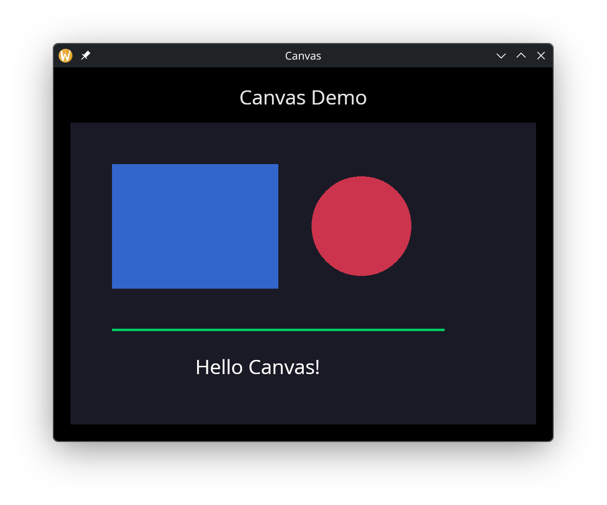
Basic Shapes
use gui;
use gui::text;
use gui::canvas;
use gui::column;
mod icon;

let shapes = &[
    `Rect({
        top_left: { x: 50.0, y: 50.0 },
        size: { width: 200.0, height: 150.0 },
        fill: color(#r: 0.2, #g: 0.4, #b: 0.8)$,
        stroke: null
    }),
    `Circle({
        center: { x: 350.0, y: 125.0 },
        radius: 60.0,
        fill: color(#r: 0.8, #g: 0.2, #b: 0.3)$,
        stroke: null
    }),
    `Line({
        from: { x: 50.0, y: 250.0 },
        to: { x: 450.0, y: 250.0 },
        color: color(#g: 0.8, #b: 0.4)$,
        width: 3.0
    }),
    `Text({
        content: "Hello Canvas!",
        position: { x: 150.0, y: 280.0 },
        color: color(#r: 1.0, #g: 1.0, #b: 1.0)$,
        size: 24.0
    })
];

let col = column(
    #spacing: &15.0,
    #padding: &`All(20.0),
    #width: &`Fill,
    #height: &`Fill,
    &[
        text(#size: &24.0, #halign: &`Center, #width: &`Fill, &"Canvas Demo"),
        canvas(
            #width: &`Fill,
            #height: &`Fill,
            #background: &color(#r: 0.1, #g: 0.1, #b: 0.15)$,
            shapes
        )
    ]
);

[&window(#icon: &icon::icon, #title: &"Canvas", #size: &{ width: 600.0, height: 450.0 }, &col)]