The Toggler Widget
A toggle switch with an optional text label. Functionally identical to a checkbox but rendered as a sliding toggle, which is often a better visual fit for on/off settings like enabling features or connectivity options.
Interface
val toggler: fn(
  ?#label: &string,
  ?#on_toggle: fn(flag: bool) -> Any,
  ?#width: &Length,
  ?#size: &[f64, null],
  ?#spacing: &[f64, null],
  ?#disabled: &bool,
  flag: &bool
) -> Widget
Parameters
#label– Text displayed next to the toggle switch. If omitted, the toggler renders without a label.#on_toggle– Callback invoked when the toggle is flipped. Receives the new boolean state. Typically:#on_toggle: |v| enabled <- v.#width– Width of the widget (toggle plus label). AcceptsLengthvalues.#size– Size of the toggle switch in pixels, ornullfor the default size.#spacing– Gap in pixels between the toggle and the label text, ornullfor the default spacing.#disabled– Whentrue, the toggle is grayed out and cannot be flipped. Defaults tofalse.- positional
&bool– Reference to the toggled state.truerenders the toggle in the “on” position,falsein the “off” position.
Examples
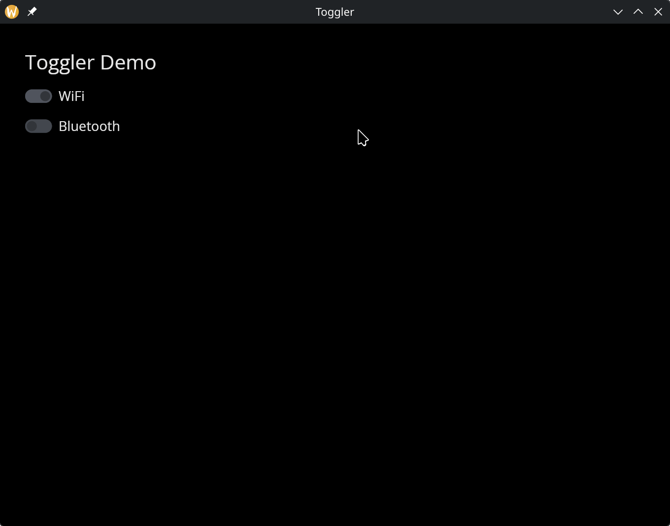
Toggle Switches
use gui;
use gui::text;
use gui::toggler;
use gui::column;
mod icon;

let wifi = true;
let bluetooth = false;

let col = column(
    #spacing: &15.0,
    #padding: &`All(30.0),
    #width: &`Fill,
    &[
        text(#size: &24.0, &"Toggler Demo"),
        toggler(#label: &"WiFi", #on_toggle: |v| wifi <- v, &wifi),
        toggler(#label: &"Bluetooth", #on_toggle: |v| bluetooth <- v, &bluetooth)
    ]
);

[&window(#icon: &icon::icon, #title: &"Toggler", &col)]