The Checkbox Widget
A checkbox with an optional text label. Displays a checked or unchecked box and reports toggles through a callback. Useful for boolean settings and multi-select scenarios.
Interface
val checkbox: fn(
  ?#label: &string,
  ?#on_toggle: fn(flag: bool) -> Any,
  ?#width: &Length,
  ?#size: &[f64, null],
  ?#spacing: &[f64, null],
  ?#disabled: &bool,
  flag: &bool
) -> Widget
Parameters
#label– Text displayed next to the checkbox. If omitted, the checkbox renders without a label.#on_toggle– Callback invoked when the checkbox is clicked. Receives the new boolean state (trueif now checked,falseif unchecked). Typically:#on_toggle: |v| checked <- v.#width– Width of the widget (checkbox plus label). AcceptsLengthvalues.#size– Size of the checkbox square in pixels, ornullfor the default size.#spacing– Gap in pixels between the checkbox and the label text, ornullfor the default spacing.#disabled– Whentrue, the checkbox is grayed out and cannot be toggled. Defaults tofalse.- positional
&bool– Reference to the checked state.truerenders a checked box,falserenders unchecked.
Examples
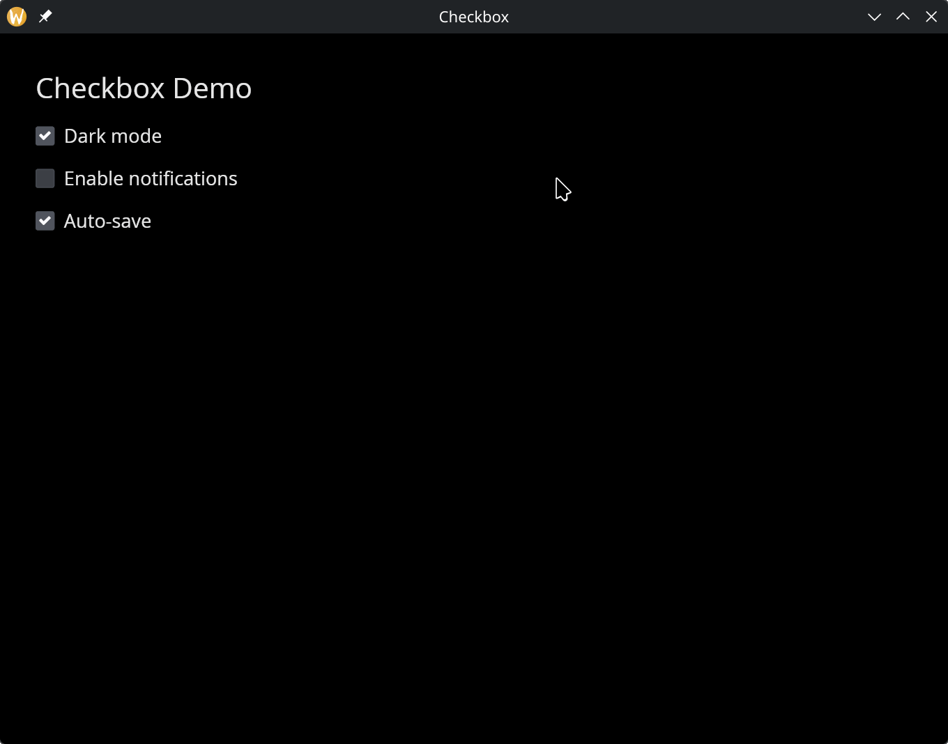
Checkbox Group
use gui;
use gui::text;
use gui::checkbox;
use gui::column;
mod icon;
let dark_mode = true;
let notifications = false;
let auto_save = true;
let col = column(
#spacing: &15.0,
#padding: &`All(30.0),
#width: &`Fill,
&[
text(#size: &24.0, &"Checkbox Demo"),
checkbox(#label: &"Dark mode", #on_toggle: |v| dark_mode <- v, &dark_mode),
checkbox(#label: &"Enable notifications", #on_toggle: |v| notifications <- v, ¬ifications),
checkbox(#label: &"Auto-save", #on_toggle: |v| auto_save <- v, &auto_save)
]
);
[&window(#icon: &icon::icon, #title: &"Checkbox", &col)]