The Line Gauge Widget
The line_gauge widget displays a horizontal progress indicator using line-drawing characters. It’s more compact than gauge and ideal for dashboards where vertical space is limited.
Interface
type LineSet = [
  `Normal,
  `Rounded,
  `Double,
  `Thick
];

val line_gauge: fn(
  ?#filled_style: &[Style, null],
  ?#label: &[Line, null],
  ?#line_set: &[LineSet, null],
  ?#style: &[Style, null],
  ?#unfilled_style: &[Style, null],
  &f64
) -> Tui;
Parameters
- filled_style - Style for the filled portion
- unfilled_style - Style for the unfilled portion
- line_set - Character set:
Thin,Thick(default), orDouble - label - Line or span displayed within the gauge
- style - Base style for the widget
Examples
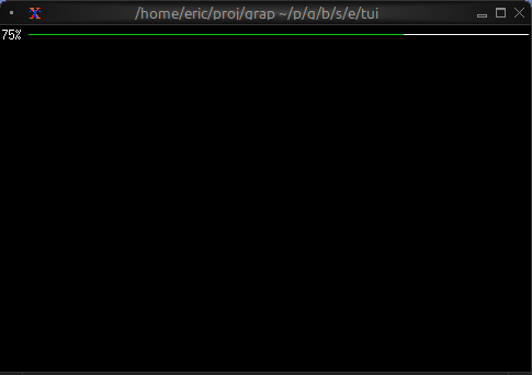
Basic Usage
use tui;
use tui::line_gauge;

let progress = 0.75;  // 75%

line_gauge(
    #filled_style: &style(#fg: `Green),
    &progress
)
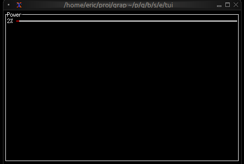
Color-coded Status
use tui;
use tui::line_gauge;
use tui::block;
use tui::text;

{
    let clock = time::timer(duration:0.5s, true);
    let power = 0.0;
    power <- min(1.0, (clock ~ power) + 0.01);

    let color = select power {
        x if x < 0.10 => `Red,
        x if x < 0.25 => `Yellow,
        x => `Green
    };

    let percentage = cast<i64>(power * 100.0)?;

    block(
        #border: &`All,
        #title: &line("Power"),
        &line_gauge(
            #filled_style: &style(#fg: color),
            #line_set: &`Thick,
            #label: &line("[percentage]%"),
            &power
        )
    )
}
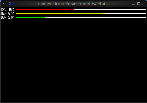
Compact Multi-metric Display
use tui;
use tui::line_gauge;
use tui::text;
use tui::layout;

layout(
    #direction: &`Vertical,
    &[
        child(#constraint: `Percentage(5), line_gauge(
            #line_set:&`Thick,
            #filled_style: &style(#fg: `Red),
            #label: &line("CPU 45%"),
            &0.45
        )),
        child(#constraint: `Percentage(5), line_gauge(
            #line_set:&`Thick,
            #filled_style: &style(#fg: `Yellow),
            #label: &line("MEM 67%"),
            &0.67
        )),
        child(#constraint: `Percentage(5), line_gauge(
            #line_set:&`Thick,
            #filled_style: &style(#fg: `Green),
            #label: &line("DSK 23%"),
            &0.23
        ))
    ]
)
Use Cases
- System resource monitors (CPU, RAM, disk, network)
- Download/upload progress indicators
- Compact status dashboards
- Progress tracking in limited space
Comparison with gauge
Use line_gauge when:
- You need compact, single-line displays
- Vertical space is limited
- You want a more technical/modern look
Use gauge when:
- You have more vertical space available
- You want larger, more prominent indicators