The Gauge Widget
The gauge widget displays a single value as a filled progress indicator, perfect for showing percentages, completion status, or resource usage. It provides a clear visual representation of how full or complete something is.
Interface
val gauge: fn(
  ?#gauge_style: &[Style, null],
  ?#label: &[Span, null],
  ?#style: &[Style, null],
  ?#use_unicode: &[bool, null],
  &f64
) -> Tui;
Parameters
- gauge_style - Style for the filled portion
- label - Line or span displayed in the center
- use_unicode - Use Unicode block characters for smoother rendering
- style - Style for the unfilled portion
Examples
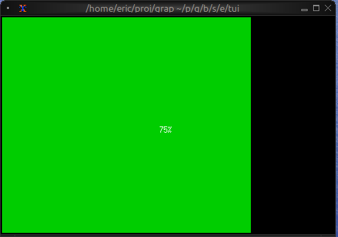
Basic Usage
use tui;
use tui::gauge;

let progress = 0.75;  // 75%

gauge(
    #gauge_style: &style(#fg: `Green),
    &progress
)
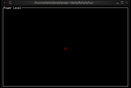
Progress with Color Thresholds
use tui;
use tui::gauge;
use tui::block;
use tui::text;

let clock = time::timer(duration:0.5s, true);
let power = 0.0;
power <- min(1.0, (clock ~ power) + 0.01);

let color = select power {
    x if x < 0.10 => `Red,
    x if x < 0.25 => `Yellow,
    x => `Green
};

let percentage = cast<i64>(power * 100.0)?;

block(
    #border: &`All,
    #title: &line("Power Level"),
    &gauge(
        #gauge_style: &style(#fg: color),
        #label: &span("[percentage]%"),
        &power
    )
)
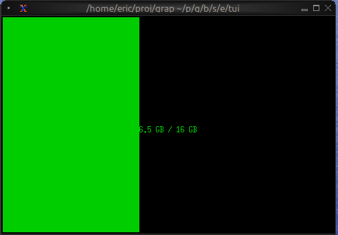
Resource Usage
use tui;
use tui::gauge;
use tui::text;

let used_memory = 6.5;  // GB
let total_memory = 16.0;  // GB
let usage_ratio = used_memory / total_memory;

let color = select usage_ratio {
    x if x > 0.9 => `Red,
    x if x > 0.7 => `Yellow,
    _ => `Green
};

gauge(
    #gauge_style: &style(#fg: color),
    #label: &span("[used_memory] GB / [total_memory] GB"),
    &usage_ratio
)