The Button Widget
A clickable button that wraps a child widget (typically text). Buttons trigger a callback when pressed and can be styled with custom width, height, and padding.
Interface
val button: fn(
  ?#on_press: fn(a: null) -> Any,
  ?#width: &Length,
  ?#height: &Length,
  ?#padding: &Padding,
  ?#disabled: &bool,
  a: &Widget
) -> Widget
Parameters
#on_press– Callback invoked when the button is clicked. Receivesnullas its argument. Use the sample operator~inside the callback to capture current state at click time:|c| counter <- c ~ counter + 1. If omitted, the button renders but does nothing when clicked.#width– Width of the button. AcceptsLengthvalues:`Fill,`Shrink, or`Fixed(f64). Defaults to`Shrink.#height– Height of the button. SameLengthvalues as width. Defaults to`Shrink.#padding– Interior padding around the child widget. AcceptsPaddingvalues:`All(f64),`Axis({x: f64, y: f64}), or`Each({top: f64, right: f64, bottom: f64, left: f64}).#disabled– Whentrue, the button is grayed out and#on_pressis not triggered. Defaults tofalse.- positional
&Widget– The child widget displayed inside the button. Usually atextwidget.
Examples
Basic Buttons
use gui;
use gui::text;
use gui::column;
use gui::button;
mod icon;
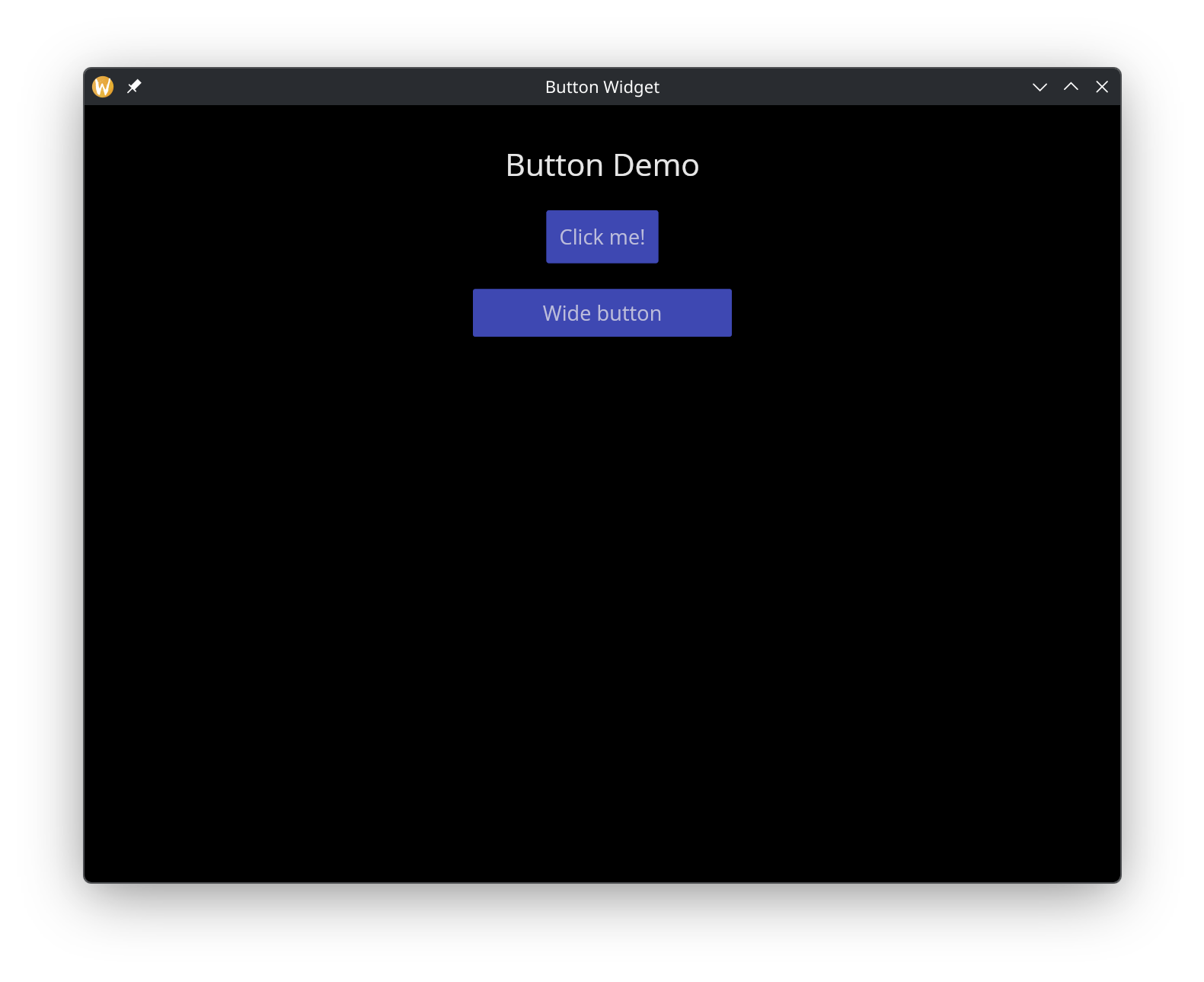
let b0 = button(
#on_press: |c| println(c ~ "normal button clicked"),
#padding: &`All(10.0),
&text(&"Click me!")
);
let b1 = button(
#on_press: |c| println(c ~ "wide button clicked"),
#padding: &`All(8.0),
#width: &`Fixed(200.0),
&text(#halign:&`Center, &"Wide button")
);
let col = column(
#spacing: &20.0,
#padding: &`All(30.0),
#halign: &`Center,
#width: &`Fill,
&[
text(#size: &24.0, &"Button Demo"),
b0,
b1
]
);
[&window(#icon: &icon::icon, #title: &"Button Widget", &col)]
See Also
- text – the most common child widget for buttons
- mouse_area – for click detection on arbitrary widgets