The Text Input Widget
A single-line text field for user input. The widget displays the current value via a reference and reports changes through callbacks. Supports placeholder text, password masking, and custom sizing.
Interface
val text_input: fn(
  ?#placeholder: &string,
  ?#on_input: fn(s: string) -> Any,
  ?#on_submit: fn(a: null) -> Any,
  ?#is_secure: &bool,
  ?#width: &Length,
  ?#padding: &Padding,
  ?#size: &[f64, null],
  ?#font: &[Font, null],
  ?#disabled: &bool,
  s: &string
) -> Widget
Parameters
#placeholder– Hint text displayed when the field is empty. Shown in a lighter style and disappears once the user begins typing.#on_input– Callback invoked on every keystroke. Receives the full current text as astring. Typically used with<-to update state:#on_input: |v| name <- v.#on_submit– Callback invoked when the user presses Enter. Receivesnull. Useful for form submission or triggering a search.#is_secure– Whentrue, the input is masked (password mode). Characters are replaced with dots. Defaults tofalse.#width– Width of the input field. AcceptsLengthvalues. Defaults to`Fill.#padding– Interior padding around the text content. AcceptsPaddingvalues.#size– Font size in pixels, ornullfor the default size.#font– Font to use for the text, ornullfor the default font.#disabled– Whentrue, the input cannot be focused or edited. Defaults tofalse.- positional
&string– Reference to the current text value. The widget reads from this reference to display the text, and you update it from the#on_inputcallback.
Examples
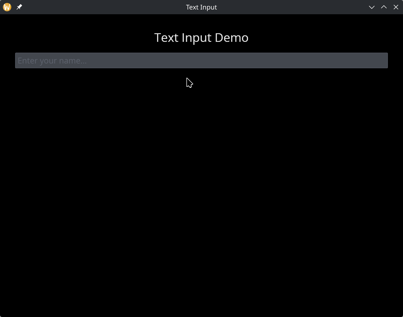
Basic Text Input
use gui;
use gui::text;
use gui::text_input;
use gui::column;
mod icon;

let name = "";

let col = column(
    #spacing: &15.0,
    #padding: &`All(30.0),
    #halign: &`Center,
    #width: &`Fill,
    &[
        text(#size: &24.0, &"Text Input Demo"),
        text_input(#placeholder: &"Enter your name...", #on_input: |v| name <- v, &name),
        text(&name)
    ]
);

[&window(#icon: &icon::icon, #title: &"Text Input", &col)]
See Also
- text_editor – multi-line text editing
- text – displaying static or reactive text