The Combo Box Widget
A searchable dropdown that combines a text input with a dropdown list. As the user types, the options are filtered to match. This is useful when the list of options is long and the user needs to find a specific item quickly.
Interface
val combo_box: fn(
  ?#selected: &[string, null],
  ?#on_select: fn(s: string) -> Any,
  ?#placeholder: &string,
  ?#width: &Length,
  ?#disabled: &bool,
  a: &Array<string>
) -> Widget
Parameters
#selected– Reference to the currently selected value, ornullif nothing is selected.#on_select– Callback invoked when the user selects an item from the filtered list. Receives the selected string.#placeholder– Placeholder text shown in the input field when nothing is selected. Defaults to"Type to search...".#width– Width of the widget. AcceptsLengthvalues.#disabled– Whentrue, the combo box cannot be interacted with. Defaults tofalse.- positional
&Array<string>– Reference to the full list of options. The combo box filters this list as the user types.
Examples
use gui;
use gui::text;
use gui::combo_box;
use gui::column;
mod icon;
let selected: [string, null] = null;
let col = column(
#spacing: &15.0,
#padding: &`All(30.0),
#width: &`Fill,
&[
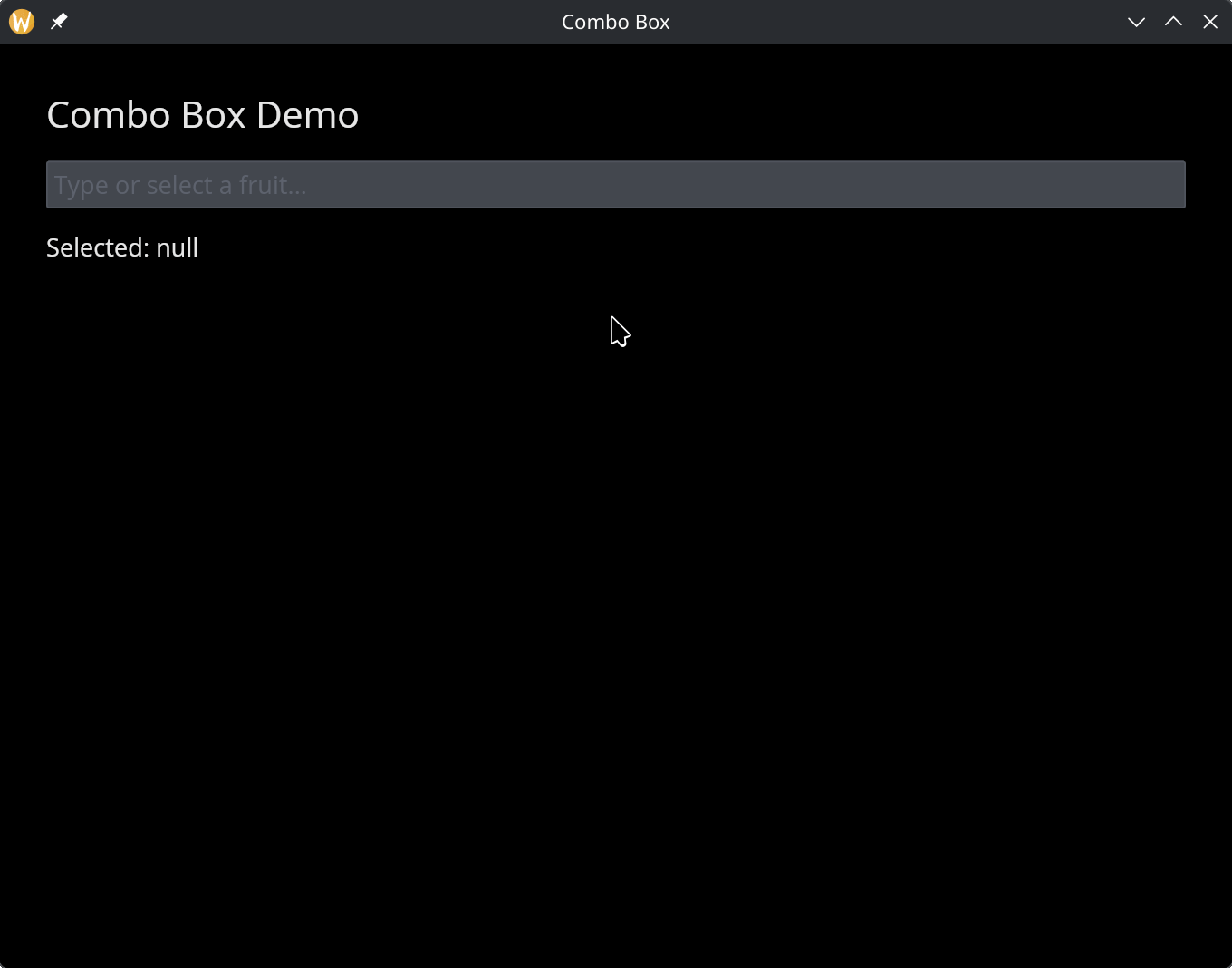
text(#size: &24.0, &"Combo Box Demo"),
combo_box(
#selected: &selected,
#on_select: |v| selected <- v,
#placeholder: &"Type or select a fruit...",
&["Apple", "Banana", "Cherry", "Date", "Elderberry", "Fig", "Grape"]
),
text(&"Selected: [selected]")
]
);
[&window(#icon: &icon::icon, #title: &"Combo Box", &col)]