The Column Widget
The column widget arranges child widgets vertically from top to bottom. It is one of the primary layout containers, along with row.
Interface
val column: fn(
  ?#spacing: &f64,
  ?#padding: &Padding,
  ?#width: &Length,
  ?#height: &Length,
  ?#halign: &HAlign,
  a: &Array<Widget>
) -> Widget
Parameters
- spacing — vertical space between child widgets in pixels
- padding — space around the column’s edges (see Types for
Paddingvariants) - width — column width (
Fill,Shrink,Fixed(px), orFillPortion(n)) - height — column height
- halign — horizontal alignment of children within the column (
Left,Center,Right)
The positional argument is a reference to an array of child widgets.
Examples
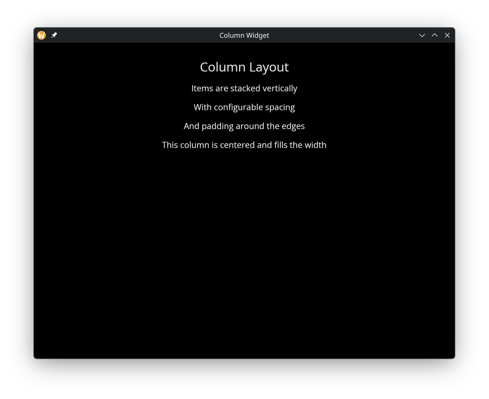
use gui;
use gui::text;
use gui::column;
mod icon;

[&window(
  #icon: &icon::icon,
  #title: &"Column Widget",
  &column(
    #spacing: &15.0,
    #padding: &`All(30.0),
    #halign: &`Center,
    #width: &`Fill,
    &[
      text(#size: &24.0, &"Column Layout"),
      text(&"Items are stacked vertically"),
      text(&"With configurable spacing"),
      text(&"And padding around the edges"),
      text(
        #halign: &`Center, #width: &`Fill,
        &"This column is centered and fills the width")
    ]
  )
)]
See Also
- Row — horizontal layout
- Container — single-child alignment and padding
- Stack — overlapping layout
- Space & Rules — spacing and dividers within layouts