The Pick List Widget
A dropdown menu that lets the user select one option from a list of strings. Clicking the widget opens a dropdown; selecting an item closes it and triggers the callback.
Interface
val pick_list: fn(
  ?#selected: &[string, null],
  ?#on_select: fn(s: string) -> Any,
  ?#placeholder: &string,
  ?#width: &Length,
  ?#padding: &Padding,
  ?#disabled: &bool,
  a: &Array<string>
) -> Widget
Parameters
#selected– Reference to the currently selected value, ornullif nothing is selected. Whennull, the placeholder text is shown instead.#on_select– Callback invoked when the user picks an item. Receives the selected string. Typically:#on_select: |v| choice <- v.#placeholder– Text displayed when#selectedisnull. Gives the user a hint about what to choose.#width– Width of the dropdown. AcceptsLengthvalues.#padding– Interior padding around the displayed text. AcceptsPaddingvalues.#disabled– Whentrue, the dropdown cannot be opened. Defaults tofalse.- positional
&Array<string>– Reference to the list of available options.
Examples
use gui;
use gui::text;
use gui::pick_list;
use gui::column;
mod icon;
let language: [string, null] = null;
let col = column(
#spacing: &15.0,
#padding: &`All(30.0),
#width: &`Fill,
&[
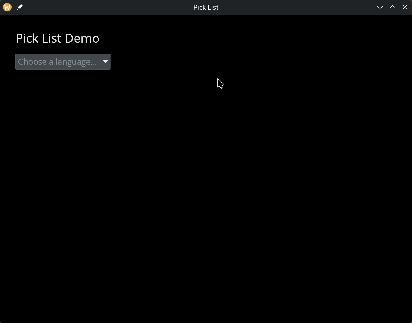
text(#size: &24.0, &"Pick List Demo"),
text(&"Selected: [language]"),
pick_list(
#selected: &language,
#on_select: |v| language <- v,
#placeholder: &"Choose a language...",
&["English", "Spanish", "French", "Japanese"]
)
]
);
[&window(#icon: &icon::icon, #title: &"Pick List", &col)]