The Slider Widgets
Graphix provides three related widgets for numeric values within a range: slider (horizontal), vertical_slider, and progress_bar (display-only).
Slider
A horizontal slider that lets the user select a floating-point value by dragging a handle along a track.
Interface
val slider: fn(
  ?#min: &f64,
  ?#max: &f64,
  ?#step: &[f64, null],
  ?#on_change: fn(x: f64) -> Any,
  ?#on_release: fn(a: null) -> Any,
  ?#width: &Length,
  ?#height: &[f64, null],
  ?#disabled: &bool,
  x: &f64
) -> Widget
Parameters
#min– Minimum value of the range. Defaults to0.0.#max– Maximum value of the range. Defaults to100.0.#step– Snap increment. When set, the slider snaps to multiples of this value.nullmeans continuous (no snapping).#on_change– Callback invoked as the handle is dragged. Receives the currentf64value. Typically:#on_change: |v| volume <- v.#on_release– Callback invoked when the user releases the handle. Receivesnull. Useful for committing a value only after the user finishes adjusting.#width– Width of the slider track. AcceptsLengthvalues. Defaults to`Fill.#height– Height of the slider track in pixels, ornullfor the default height.#disabled– Whentrue, the slider cannot be dragged. Defaults tofalse.- positional
&f64– Reference to the current value. Must be within the#min..#maxrange.
Vertical Slider
A vertical slider – identical to slider but oriented top-to-bottom. Note the width and height types are swapped: #width is &[f64, null] (fixed pixels) and #height is &Length (layout-based).
Interface
val vertical_slider: fn(
  ?#min: &f64,
  ?#max: &f64,
  ?#step: &[f64, null],
  ?#on_change: fn(x: f64) -> Any,
  ?#on_release: fn(a: null) -> Any,
  ?#width: &[f64, null],
  ?#height: &Length,
  ?#disabled: &bool,
  x: &f64
) -> Widget
Parameters
Same as slider except:
#width– Width of the slider track in pixels, ornullfor the default width. This is&[f64, null], not&Length.#height– Height of the slider track. AcceptsLengthvalues (`Fill,`Shrink,`Fixed(f64)). This is&Length, not&[f64, null].
Progress Bar
A non-interactive horizontal bar that fills proportionally to a value within a range. Use it to display progress, levels, or any metric that the user should see but not control.
Interface
val progress_bar: fn(
  ?#min: &f64,
  ?#max: &f64,
  ?#width: &Length,
  ?#height: &[f64, null],
  x: &f64
) -> Widget
Parameters
#min– Minimum value of the range. Defaults to0.0.#max– Maximum value of the range. Defaults to100.0.#width– Width of the bar. AcceptsLengthvalues. Defaults to`Fill.#height– Height of the bar in pixels, ornullfor the default height.- positional
&f64– Reference to the current value. The bar fills proportionally between#minand#max.
Examples
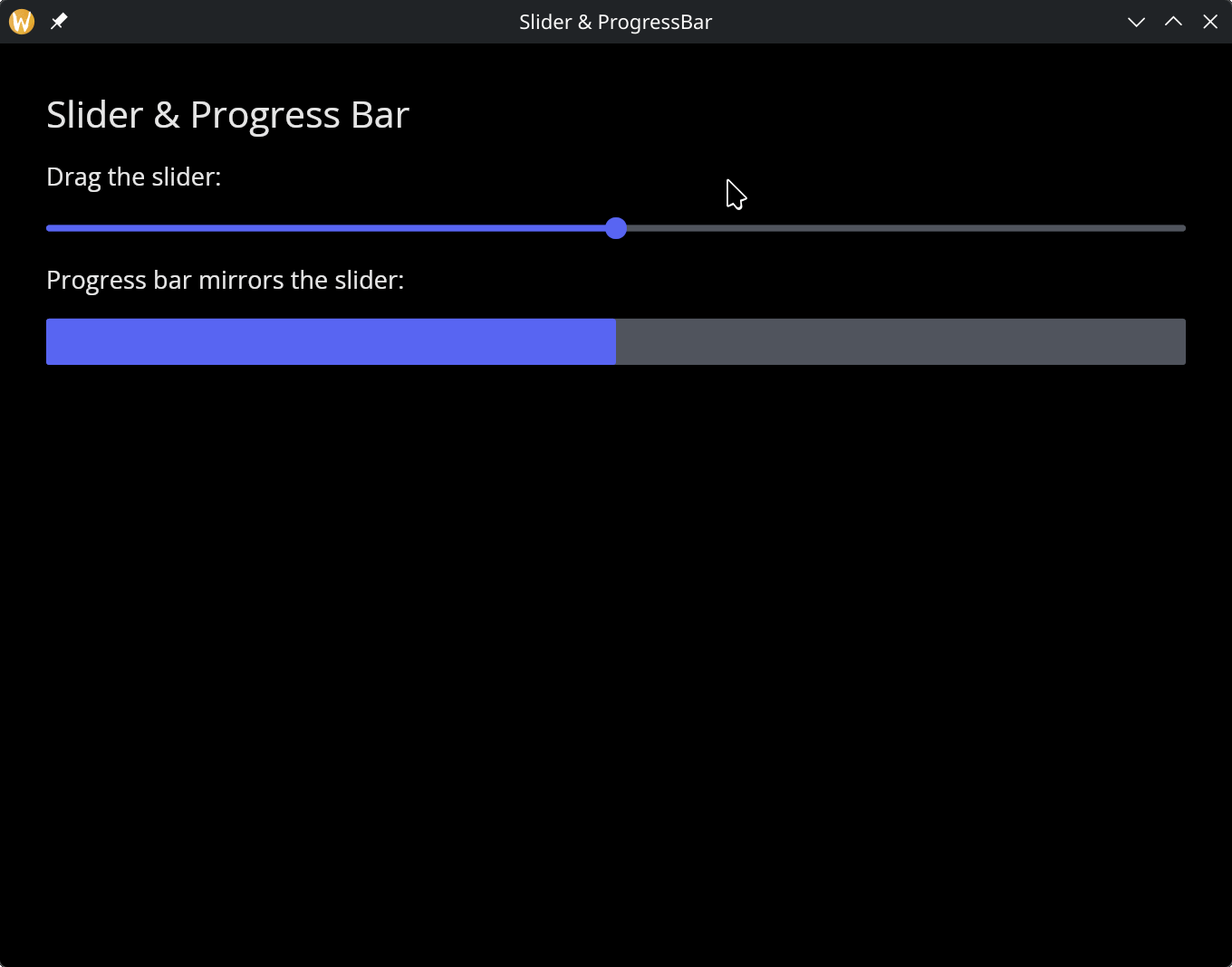
Slider & Progress Bar
use gui;
use gui::text;
use gui::slider;
use gui::progress_bar;
use gui::column;
mod icon;

let volume = 50.0;

let col = column(
    #spacing: &15.0,
    #padding: &`All(30.0),
    #width: &`Fill,
    &[
        text(#size: &24.0, &"Slider & Progress Bar"),
        text(&"Drag the slider:"),
        slider(#min: &0.0, #max: &100.0, #on_change: |v| volume <- v, &volume),
        text(&"Progress bar mirrors the slider:"),
        progress_bar(#min: &0.0, #max: &100.0, &volume)
    ]
);

[&window(#icon: &icon::icon, #title: &"Slider & ProgressBar", &col)]
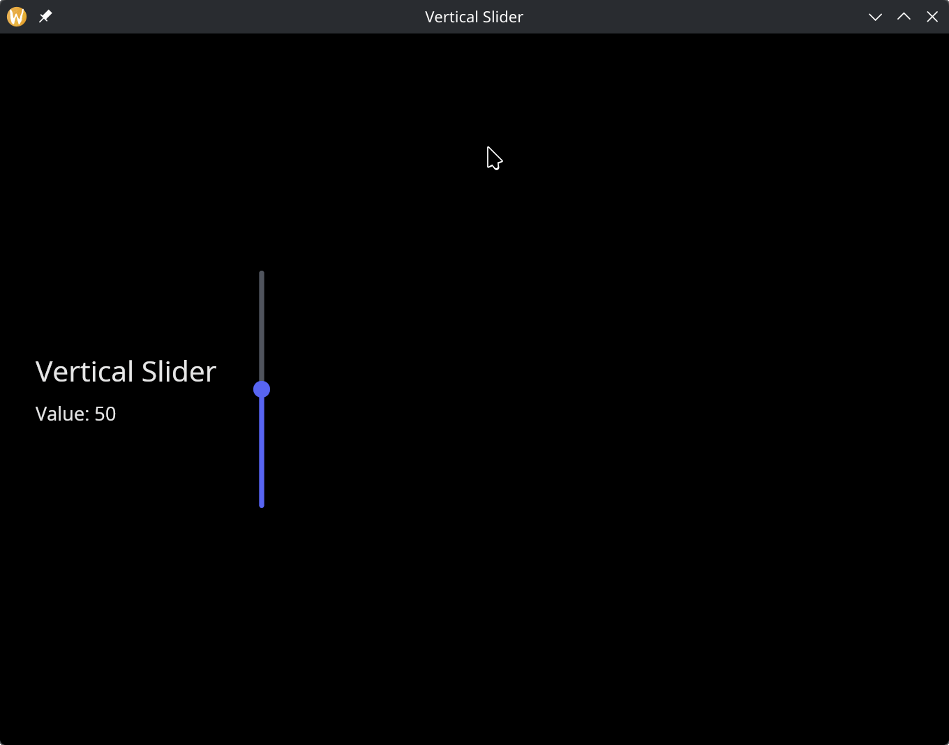
Vertical Slider
use gui;
use gui::text;
use gui::vertical_slider;
use gui::column;
use gui::row;
mod icon;

let value = 50.0;

[&window(
    #icon: &icon::icon,
    #title: &"Vertical Slider",
    &row(
        #spacing: &30.0,
        #padding: &`All(30.0),
        #height: &`Fill,
        #valign: &`Center,
        &[
            column(
                #spacing: &10.0,
                &[
                    text(#size: &24.0, &"Vertical Slider"),
                    text(&"Value: [value]")
                ]
            ),
            vertical_slider(
                #min: &0.0,
                #max: &100.0,
                #on_change: |v| value <- v,
                #height: &`Fixed(200.0),
                &value
            )
        ]
    )
)]
See Also
- text_input – for entering numeric values as text
- types – for
Lengthand other shared types