The Tooltip Widget
The tooltip widget displays a popup hint when the user hovers over a child widget. The tooltip content is itself a widget, allowing rich formatted tips.
Interface
val tooltip: fn(
  #tip: &Widget,
  ?#position: &TooltipPosition,
  ?#gap: &[f64, null],
  a: &Widget
) -> Widget
Parameters
- tip — (required) the tooltip content widget, typically
text(...). This is a required labeled argument. - position — where the tooltip appears relative to the child:
Top,Bottom,Left,Right, orFollowCursor - gap — space in pixels between the child and the tooltip
The positional argument is a reference to the child widget that triggers the tooltip on hover.
Examples
use gui;
use gui::text;
use gui::tooltip;
use gui::button;
use gui::column;
mod icon;
let col = column(
#spacing: &20.0,
#padding: &`All(30.0),
#halign: &`Center,
#width: &`Fill,
&[
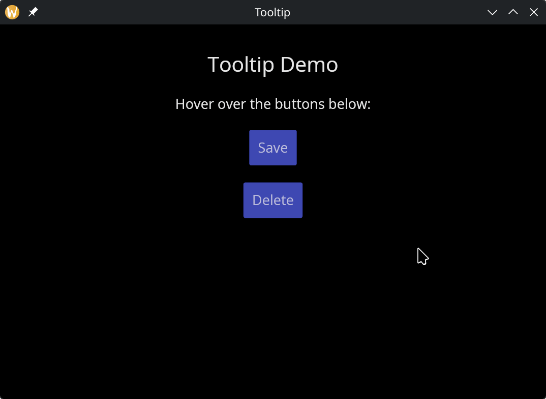
text(#size: &24.0, &"Tooltip Demo"),
text(&"Hover over the buttons below:"),
tooltip(
#tip: &text(&"Save your work"),
#position: &`Bottom,
#gap: &5.0,
&button(#padding: &`All(10.0), &text(&"Save"))
),
tooltip(
#tip: &text(&"Delete permanently"),
#position: &`Right,
#gap: &5.0,
&button(#padding: &`All(10.0), &text(&"Delete"))
)
]
);
[&window(#icon: &icon::icon, #title: &"Tooltip", &col)]
See Also
- Button — commonly wrapped with tooltips
- Mouse Area — lower-level mouse interaction