The Chart Widget
The chart widget renders line charts with multiple datasets, custom axes, labels, and styling. It’s ideal for visualizing time series data, trends, sensor readings, and any numeric data relationships.
Interface
type GraphType = [
  `Scatter,
  `Line,
  `Bar
];

type LegendPosition = [
  `Top,
  `TopRight,
  `TopLeft,
  `Left,
  `Right,
  `Bottom,
  `BottomRight,
  `BottomLeft
];

type Axis = {
  bounds: {min: f64, max: f64},
  labels: [Array<Line>, null],
  labels_alignment: [Alignment, null],
  style: [Style, null],
  title: [Line, null]
};

val axis: fn(
  ?#labels: [Array<Line>, null],
  ?#labels_alignment: [Alignment, null],
  ?#style: [Style, null],
  ?#title: [Line, null],
  {min: f64, max: f64}
) -> Axis;

type Dataset = {
  data: &Array<(f64, f64)>,
  graph_type: &[GraphType, null],
  marker: &[Marker, null],
  name: &[Line, null],
  style: &[Style, null]
};

val dataset: fn(
  ?#marker: &[Marker, null],
  ?#graph_type: &[GraphType, null],
  ?#name: &[Line, null],
  ?#style: &[Style, null],
  &Array<(f64, f64)>
) -> Dataset;

val chart: fn(
  ?#hidden_legend_constraints: &[LegendConstraints, null],
  ?#legend_position: &[LegendPosition, null],
  ?#style: &[Style, null],
  ?#x_axis: &[Axis, null],
  ?#y_axis: &[Axis, null],
  &Array<Dataset>
) -> Tui;
Parameters
chart
- style - Background style for the chart area
- x_axis - X-axis configuration (required)
- y_axis - Y-axis configuration (required)
axis
- title - Line for axis title
- labels - Array of lines displayed along axis
- style - Style for axis lines and ticks
dataset
- style - Style for the dataset (line and markers)
- graph_type -
LineorScatter - marker -
Dot,Braille, orBlock - name - Line naming the dataset (for legends)
Examples
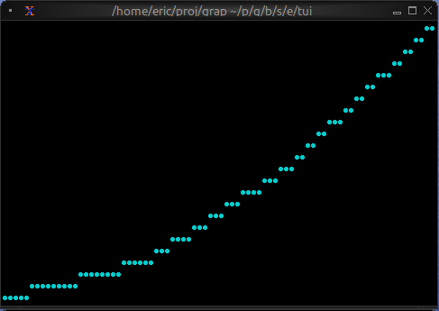
Basic Usage
use tui;
use tui::chart;

let data: Array<(f64, f64)> = [(0.0, 0.0), (1.0, 1.0), (2.0, 4.0), (3.0, 9.0)];

let ds = dataset(
    #style: &style(#fg: `Cyan),
    #graph_type: &`Line,
    #marker: &`Dot,
    &data
);

chart(
    #x_axis: &axis({min: 0.0, max: 3.0}),
    #y_axis: &axis({min: 0.0, max: 9.0}),
    &[ds]
)
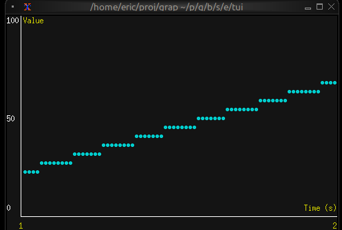
Real-time Data Visualization
use tui;
use tui::chart;
use tui::text;

let data: Array<(f64, f64)> = {
    let clock = time::timer(duration:0.5s, true);
    let x = 0.0;
    x <- (clock ~ x) + 1.0;
    let y = rand::rand(#clock, #start: f64:0., #end: f64:100.);
    let a = [];
    a <- array::window(#n: 32, clock ~ a, (x, y));
    a
};

let ds = dataset(
    #style: &style(#fg: `Cyan),
    #graph_type: &`Line,
    #marker: &`Dot,
    &data
);

let label_style = style(#fg: `Yellow);

chart(
    #style: &style(#bg: `Rgb({r: 20, g: 20, b: 20})),
    #x_axis: &axis(
        #title: line(#style: label_style, "Time (s)"),
        #labels: [
            line(#style: label_style, "[(data[0]$).0]"),
            line(#style: label_style, "[(data[-1]$).0]")
        ],
        {min: (data[0]$).0, max: (data[-1]$).0}
    ),
    #y_axis: &axis(
        #title: line(#style: label_style, "Value"),
        #labels: [
            line("0"), line("50"), line("100")
        ],
        {min: 0.0, max: 100.0}
    ),
    &[ds]
)
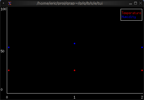
Multiple Datasets
use tui;
use tui::chart;
use tui::text;

let temp_data = [(0.0, 20.0), (1.0, 22.0), (2.0, 21.5)];
let humidity_data = [(0.0, 50.0), (1.0, 55.0), (2.0, 52.0)];

let temp_ds = dataset(
    #style: &style(#fg: `Red),
    #name: &line("Temperature"),
    &temp_data
);

let humidity_ds = dataset(
    #style: &style(#fg: `Blue),
    #name: &line("Humidity"),
    &humidity_data
);

let x_axis =
    axis(#labels: [line("0"), line("1"), line("2")], {min: 0.0, max: 2.0});
let y_axis =
    axis(#labels: [line("0"), line("50"), line("100")], {min: 0.0, max: 100.0});

chart(
    #x_axis: &x_axis,
    #y_axis: &y_axis,
    &[temp_ds, humidity_ds]
)
Marker Comparison
- Dot: Fastest, lowest resolution, good for dense data
- Braille: Smoothest curves, medium performance, best visual quality
- Block: High contrast, medium performance