The Tabs Widget
The tabs widget creates a tabbed interface for organizing content into multiple switchable panels. Each tab has a title displayed in the tab bar and associated content that’s shown when the tab is selected.
Interface
val tabs: fn(
  ?#divider: &[Span, null],
  ?#highlight_style: &[Style, null],
  ?#padding_left: &[Line, null],
  ?#padding_right: &[Line, null],
  ?#selected: &[i64, null],
  ?#size: &[Size, null],
  ?#style: &[Style, null],
  &Array<(Line, Tui)>
) -> Tui;
Parameters
- selected - Index of the currently selected tab (0-indexed)
- highlight_style - Style for the selected tab title
- style - Base style for unselected tab titles
- divider - String or span separating tab titles
Examples
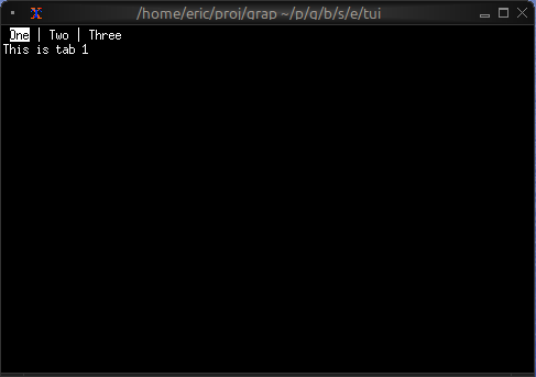
Basic Usage
use tui;
use tui::tabs;
use tui::paragraph;

let tab1 = paragraph(&"This is tab 1");
let tab2 = paragraph(&"This is tab 2");
let tab3 = paragraph(&"This is tab 3");

tabs(
    #selected: &0,
    &[
        (line("One"), tab1),
        (line("Two"), tab2),
        (line("Three"), tab3)
    ]
)
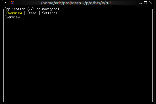
Navigation Between Tabs
use tui;
use tui::tabs;
use tui::block;
use tui::text;
use tui::input_handler;

let selected_tab = 0;

let handle_event = |e: Event| -> [`Stop, `Continue] select e {
    `Key(k) => select k.kind {
        `Press => select k.code {
            k@`Left if selected_tab > 0 => {
                selected_tab <- (k ~ selected_tab) - 1;
                `Stop
            },
            k@`Right if selected_tab < 2 => {
                selected_tab <- (k ~ selected_tab) + 1;
                `Stop
            },
            k@`Tab => {
                selected_tab <- ((k ~ selected_tab) + 1) % 3;
                `Stop
            },
            _ => `Continue
        },
        _ => `Continue
    },
    _ => `Continue
};

let overview = text(&"Overview");
let items = text(&"Items");
let settings = text(&"Settings");

input_handler(
    #handle: &handle_event,
    &block(
        #border: &`All,
        #title: &line("Application (←/→ to navigate)"),
        &tabs(
            #highlight_style: &style(#fg: `Yellow, #add_modifier: [`Bold]),
            #style: &style(#fg: `Gray),
            #selected: &selected_tab,
            &[
                (line("Overview"), overview),
                (line("Items"), items),
                (line("Settings"), settings)
             ]
        )
    )
)
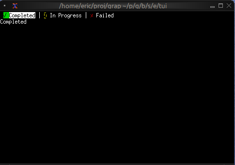
Styled Tab Titles
use tui;
use tui::tabs;
use tui::text;

let completed_content = text(&"Completed");
let progress_content = text(&"In Progress");
let failed_content = text(&"Failed");

let tab_list = [
    (line([
        span(#style: style(#fg: `Green), "✓ "),
        span("Completed")
    ]), completed_content),
    (line([
        span(#style: style(#fg: `Yellow), "⚠ "),
        span("In Progress")
    ]), progress_content),
    (line([
        span(#style: style(#fg: `Red), "✗ "),
        span("Failed")
    ]), failed_content)
];

tabs(&tab_list)
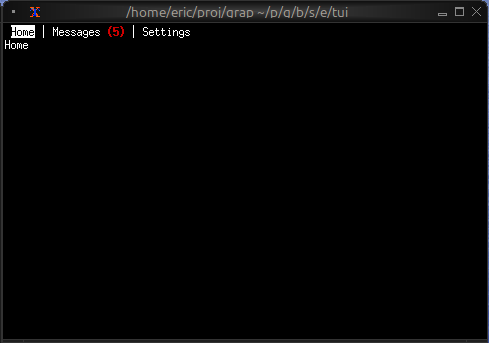
Tab with Badge
use tui;
use tui::tabs;
use tui::text;

let unread_count = 5;

let messages_tab = line([
    span("Messages"),
    span(#style: style(#fg: `Red, #add_modifier: [`Bold]), " ([unread_count])")
]);

let home_content = text(&"Home");
let messages_content = text(&"Messages");
let settings_content = text(&"Settings");

tabs(&[
    (line("Home"), home_content),
    (messages_tab, messages_content),
    (line("Settings"), settings_content)
])
Keyboard Navigation
Common patterns:
Left/Right- Switch to previous/next tabTab- Cycle forward through tabs- Number keys - Jump directly to tab