The List Widget
The list widget displays a scrollable, selectable list of items with keyboard navigation support. It’s perfect for menus, file browsers, option selectors, and any interface that requires choosing from a list of items.
Interface
val list: fn(
  ?#highlight_spacing: &[HighlightSpacing, null],
  ?#highlight_style: &[Style, null],
  ?#highlight_symbol: &[string, null],
  ?#repeat_highlight_symbol: &[bool, null],
  ?#scroll: &[i64, null],
  ?#selected: &[i64, null],
  ?#style: &[Style, null],
  &Array<Line>
) -> Tui;
Parameters
- selected - Index of the currently selected item (0-indexed)
- scroll - Scroll position (offset from the top)
- highlight_style - Style for the selected item
- highlight_symbol - String displayed before selected item (e.g., “▶ “)
- repeat_highlight_symbol - Whether to repeat symbol on wrapped lines
- style - Base style for all list items
Examples
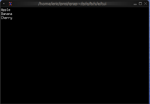
Basic Usage
use tui;
use tui::list;

let items = [
    line("Apple"),
    line("Banana"),
    line("Cherry")
];

list(
    #selected: &0,
    &items
)
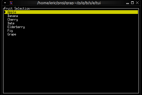
Interactive List with Navigation
use tui;
use tui::list;
use tui::block;
use tui::text;
use tui::input_handler;

let items = [
    line("Apple"), line("Banana"), line("Cherry"),
    line("Date"), line("Elderberry"), line("Fig"), line("Grape")
];

let last = array::len(items) - 1;
let selected = 0;
let scroll_pos = 0;
let visible = 5;

// Auto-scroll to keep selection visible
scroll_pos <- select selected {
    s if s < scroll_pos => s,
    s if s > (scroll_pos + visible - 1) => s - visible + 1,
    _ => never()
};

let handle_event = |e: Event| -> [`Stop, `Continue] select e {
    `Key(k) => select k.kind {
        `Press => select k.code {
            k@`Up if selected > 0 => {
                selected <- (k ~ selected) - 1;
                `Stop
            },
            k@`Down if selected < last => {
                selected <- (k ~ selected) + 1;
                `Stop
            },
            k@`Home => { selected <- k ~ 0; `Stop },
            k@`End => { selected <- k ~ last; `Stop },
            _ => `Continue
        },
        _ => `Continue
    },
    _ => `Continue
};

input_handler(
    #handle: &handle_event,
    &block(
        #border: &`All,
        #title: &line("Fruit Selection"),
        &list(
            #highlight_style: &style(#fg: `Black, #bg: `Yellow),
            #highlight_symbol: &"▶ ",
            #selected: &selected,
            #scroll: &scroll_pos,
            &items
        )
    )
)
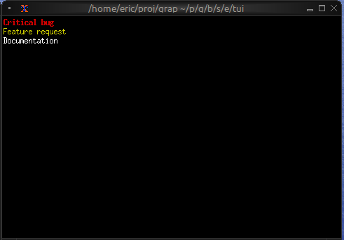
Styled Items
use tui;
use tui::list;
use tui::text;

let make_item = |text, priority| select priority {
    `High => line(#style: style(#fg: `Red, #add_modifier: [`Bold]), text),
    `Medium => line(#style: style(#fg: `Yellow), text),
    `Low => line(#style: style(#fg: `White), text)
};

let items = [
    make_item("Critical bug", `High),
    make_item("Feature request", `Medium),
    make_item("Documentation", `Low)
];

list(#selected: &0, &items)