The Container Widget
The container widget wraps a single child widget, providing padding and alignment control. Use it to position content within a fixed or flexible region.
Interface
val container: fn(
  ?#padding: &Padding,
  ?#width: &Length,
  ?#height: &Length,
  ?#halign: &HAlign,
  ?#valign: &VAlign,
  a: &Widget
) -> Widget
Parameters
- padding — space between the container’s edges and its child
- width — container width (
Fill,Shrink,Fixed(px), orFillPortion(n)) - height — container height
- halign — horizontal alignment of the child (
Left,Center,Right) - valign — vertical alignment of the child (
Top,Center,Bottom)
The positional argument is a reference to the child widget.
Examples
use gui;
use gui::text;
use gui::column;
use gui::container;
mod icon;
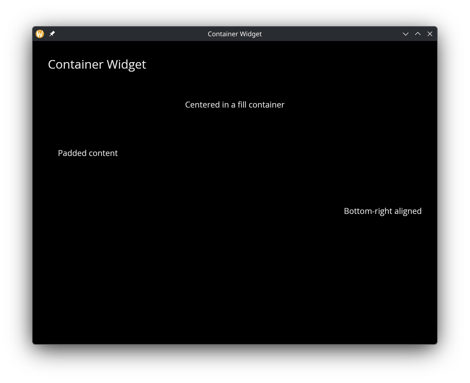
[&window(
#icon: &icon::icon,
#title: &"Container Widget",
&column(
#spacing: &15.0,
#padding: &`All(30.0),
#width: &`Fill,
&[
text(#size: &24.0, &"Container Widget"),
container(
#width: &`Fill,
#height: &`Fixed(100.0),
#halign: &`Center,
#valign: &`Center,
&text(&"Centered in a fill container")
),
container(
#padding: &`All(20.0),
&text(&"Padded content")
),
container(
#width: &`Fill,
#height: &`Fixed(80.0),
#halign: &`Right,
#valign: &`Bottom,
&text(&"Bottom-right aligned")
)
]
)
)]