The Scrollable Widget
The scrollable widget wraps content that may exceed the available space, providing scroll bars to navigate. It supports vertical, horizontal, or bidirectional scrolling.
Interface
val scrollable: fn(
  ?#direction: &ScrollDirection,
  ?#on_scroll: fn(a: {x: f64, y: f64}) -> Any,
  ?#width: &Length,
  ?#height: &Length,
  a: &Widget
) -> Widget
Parameters
- direction — scroll direction:
Vertical(default),Horizontal, orBoth - on_scroll — callback receiving the scroll offset as
{x, y}when the user scrolls - width — widget width
- height — widget height
The positional argument is a reference to the child widget to scroll.
Examples
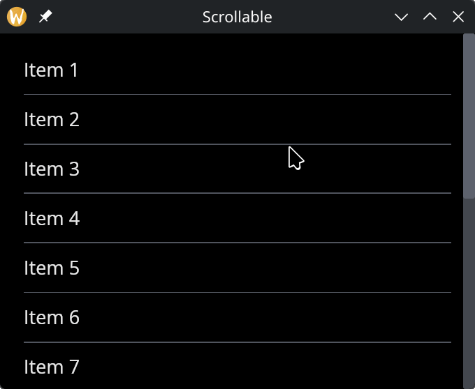
use gui;
use gui::text;
use gui::scrollable;
use gui::column;
use gui::rule;
mod icon;

let col = column(
    #spacing: &10.0,
    #padding: &`All(20.0),
    #width: &`Fill,
    &[
        text(&"Item 1"), horizontal_rule(),
        text(&"Item 2"), horizontal_rule(),
        text(&"Item 3"), horizontal_rule(),
        text(&"Item 4"), horizontal_rule(),
        text(&"Item 5"), horizontal_rule(),
        text(&"Item 6"), horizontal_rule(),
        text(&"Item 7"), horizontal_rule(),
        text(&"Item 8"), horizontal_rule(),
        text(&"Item 9"), horizontal_rule(),
        text(&"Item 10"), horizontal_rule(),
        text(&"Item 11"), horizontal_rule(),
        text(&"Item 12"), horizontal_rule(),
        text(&"Item 13"), horizontal_rule(),
        text(&"Item 14"), horizontal_rule(),
        text(&"Item 15")
    ]
);

[&window(
    #icon: &icon::icon,
    #title: &"Scrollable",
    #size: &{ width: 400.0, height: 300.0 },
    &scrollable(
        #height: &`Fill,
        #width: &`Fill,
        &col
    )
)]
See Also
- Column — commonly used inside scrollable for vertical lists
- Space & Rules — dividers between scrollable items