The Grid Widget
A layout container that arranges child widgets in a grid with a fixed number of columns. Items wrap to the next row automatically.
Interface
type GridColumns = [`Fixed(i64), `Fluid(f64)];
type GridHeight = [`AspectRatio(f64), `EvenlyDistribute(Length)];

val grid: fn(
  ?#spacing: &f64,
  ?#columns: &GridColumns,
  ?#width: &[f64, null],
  ?#height: &GridHeight,
  a: &Array<Widget>
) -> Widget
Parameters
#spacing– Space in pixels between grid cells, applied both horizontally and vertically. Defaults to0.0.#columns– How columns are determined.`Fixed(n)uses exactlyncolumns.`Fluid(min_width)calculates the column count so each column is at leastmin_widthpixels wide. Defaults to`Fixed(3).#width– Total width of the grid in pixels, ornullto use the available space. Defaults tonull.#height– How row heights are determined.`AspectRatio(ratio)sets each cell’s height relative to its width (e.g.1.0for square cells).`EvenlyDistribute(len)divides the givenLengthevenly among all rows. Defaults to`AspectRatio(1.0).- positional
&Array<Widget>– The child widgets to arrange in the grid. They fill left-to-right, top-to-bottom.
Examples
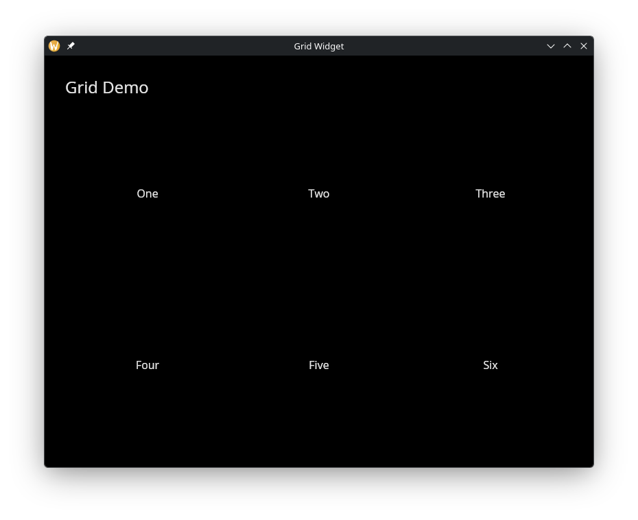
Colored Grid Items
use gui;
use gui::text;
use gui::grid;
use gui::container;
use gui::column;
mod icon;

let item = |label| container(
    #width: &`Fill,
    #halign: &`Center,
    #valign: &`Center,
    #padding: &`All(20.0),
    &text(#size: &16.0, &label)
);

let col = column(
    #spacing: &20.0,
    #padding: &`All(30.0),
    #width: &`Fill,
    &[
        text(#size: &24.0, &"Grid Demo"),
        grid(
            #columns: &`Fixed(3),
            #spacing: &10.0,
            #width: &800.0,
            &[
                item("One"),
                item("Two"),
                item("Three"),
                item("Four"),
                item("Five"),
                item("Six")
            ]
        )
    ]
);

[&window(#icon: &icon::icon, #title: &"Grid Widget", &col)]