The Table Widget
Displays data in rows and columns with configurable headers, alignment, and separators. Tables are built from TableColumn definitions and a 2D array of row widgets.
Interface
type TableColumn = {
  header: &Widget,
  width: &Length,
  halign: &HAlign,
  valign: &VAlign
};

val table_column: fn(
  ?#width: &Length,
  ?#halign: &HAlign,
  ?#valign: &VAlign,
  a: &Widget
) -> TableColumn;

val table: fn(
  ?#width: &Length,
  ?#padding: &[f64, null],
  ?#separator: &[f64, null],
  a: &Array<TableColumn>,
  a2: &Array<Array<Widget>>
) -> Widget
table_column Parameters
#width– Width of this column. AcceptsLengthvalues:`Fill,`Shrink, or`Fixed(f64). Defaults to`Shrink.#halign– Horizontal alignment of content within this column:`Left,`Center, or`Right. Defaults to`Left.#valign– Vertical alignment of content within this column:`Top,`Center, or`Bottom. Defaults to`Top.- positional
&Widget– The header widget for this column, typically a styledtextwidget.
table Parameters
#width– Total width of the table. AcceptsLengthvalues. Defaults to`Shrink.#padding– Padding in pixels around each cell, ornullfor no padding.#separator– Thickness in pixels of the line between rows, ornullfor no separators.- positional
&Array<TableColumn>– Column definitions created withtable_column. - positional
&Array<Array<Widget>>– Row data. Each inner array has one widget per column.
Examples
Product Table
use gui;
use gui::text;
use gui::table;
use gui::column;
mod icon;
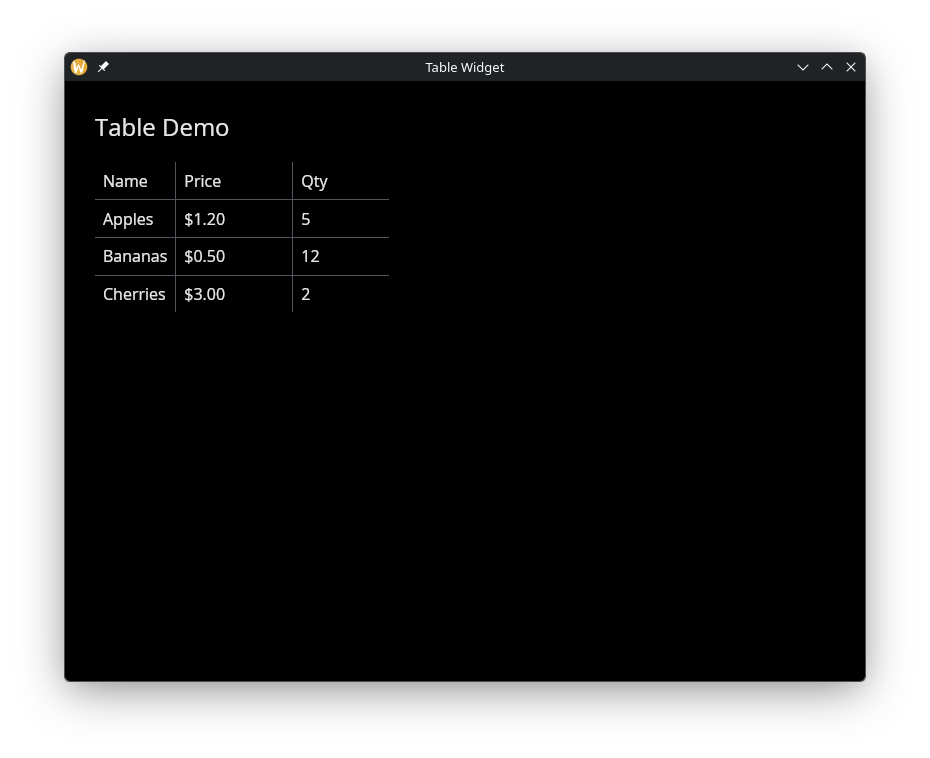
let cols = &[
table_column(#width: &`Fixed(200.0), &text(&"Name")),
table_column(#width: &`Fixed(100.0), #halign: &`Right, &text(&"Price")),
table_column(#width: &`Fixed(80.0), #halign: &`Center, &text(&"Qty"))
];
let rows = &[
[text(&"Apples"), text(&"$1.20"), text(&"5")],
[text(&"Bananas"), text(&"$0.50"), text(&"12")],
[text(&"Cherries"), text(&"$3.00"), text(&"2")]
];
let layout = column(
#spacing: &20.0,
#padding: &`All(30.0),
#width: &`Fill,
&[
text(#size: &24.0, &"Table Demo"),
table(#padding: &8.0, #separator: &1.0, cols, rows)
]
);
[&window(#icon: &icon::icon, #title: &"Table Widget", &layout)]